
おすすめツイート


Don’t assume creating a layout with Grid plus smart fallbacks is “twice as much work”. Turns out, it’s not.

Using CSS Grid to implement the same old 12-column grid designs is like making a film with a steadycam — and always standing still.
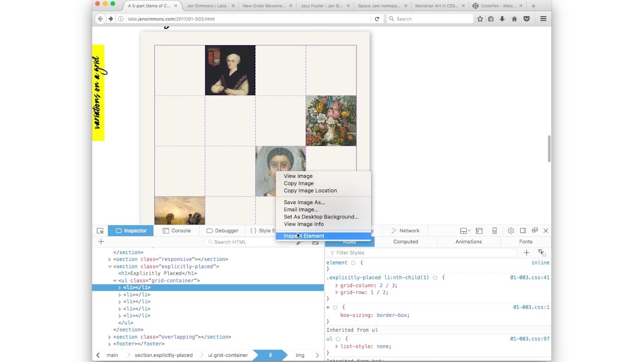
Use Firefox to see your lines with the Grid Inspector in Dev Tools: 1) Inspect. 2) Find where it says display:grid. 3) Click the waffle icon
Add / subtract <li>s. See what happens. Add more `1fr`. See what happens. Add a `2fr`, or `1.5fr`. See what happens. You’re doing it!
Have you not tried CSS Grid yet? Do! Open codepen.io. Make a list. On the <ul>, apply `display:grid; grid-template-columns: 1fr 1fr 1fr;`
By explicitly placing items, you can tell the browser to lay things out in such a way that items overlap. Overlapping is *amazing*!
No one is saying Thou Shalt Use CSS Grid. Especially not to ship the same old exact layouts. Let’s not get religious. Or anti-religious. / 6
No reason to HAVE to use CSS Grid. No guilt. No pressure. It’s a new opportunity, not a mandate. You *can* get amazing new results. / 5
…use CSS Grid to do something new. That isn’t possible without it. (With a simple fallback layout for browsers that don't support it.) / 4
…make the time to learn Grid. Learn the code, or if you don’t code, learn the new mental model of what’s newly possible. And use it to… / 3
…that’s the same, same mental model, same results, then use today’s tools. Nothing wrong w/that! At some point, take the time to learn… / 2
This week, my best advice for using CSS Grid is this: it’s very different from the frameworks we’ve been using. If you want a tool that… / 1
Remember, use the Firefox Grid Inspector to help you see what you are building. youtu.be/16enLRDbOyY?t=…
youtube.com
YouTube
Announcing CSS Grid & the Firefox Grid Inspector Tool
CSS Grid is not the last or only CSS tool you will use for layout. It’s a piece of a larger puzzle — that includes Flexbox, Writing Modes…
Learning Grid is easier than learning Flexbox. There is more to learn, but it makes more sense. (Especially since we’ve been misusing Flexb)
`minmax()` is a fantastic new way to define sizes. Example: `minmax(150px, 350px)` means make this thing a minimum of 150px & maximum of 350
Don’t assume using CSS Grid is harder than a layout framework. Learning something new takes effort. But once you know Grid it’s much easier.
Either let the auto-placement algorithm place items — in which case you don’t need breakpoints. Or explicitly place items — and then you do.
CSS Grid will let us use fixed-sized images again (if we want) in a responsive layout. We can easily combine fixed-size things with fluid.


United States トレンド
- 1. Bama 33.5K posts
- 2. Ty Simpson 5,869 posts
- 3. Georgia 51.9K posts
- 4. #UFC323 19.6K posts
- 5. #SECChampionship 4,003 posts
- 6. Ryan Williams 2,406 posts
- 7. Miami 207K posts
- 8. DeBoer 3,377 posts
- 9. Dawgs 11.8K posts
- 10. #NXTDeadline 6,961 posts
- 11. Texas Tech 30.4K posts
- 12. Messi 297K posts
- 13. Kirby 13.9K posts
- 14. #RollTide 2,682 posts
- 15. Grubb 1,984 posts
- 16. Harry Ford 2,380 posts
- 17. Zachariah Branch N/A
- 18. Slot 146K posts
- 19. Gunner 6,686 posts
- 20. Germie Bernard N/A
おすすめツイート
-
 الهلال الاحمر السوداني
@SRCS_SD -
 Nimra K🌻🇵🇸
@nimrafication -
 Gavin McFarland
@gavinmcfarland -
 R 'Nearest' Nabors (they/them)
@rachelnabors -
 Samuel Clay
@samuelclay -
 Shaun Usher
@ShaunUsher -
 catie turner
@hashtagcatie -
 Joe Dolson
@joedolson -
 HCL Ambassadors Program
@HCLAmbassadors -
 Enigma Bicycle Works
@Enigmabikes -
 Inrupt
@inrupt
Something went wrong.
Something went wrong.