
قد يعجبك


Download more than 500 color palettes from @edithwyoung's book, Color Scheme, in CMYK, RGB, and HEX codes. Then, listen to the podcast episode! policyviz.com/2022/12/20/col…
policyviz.com
Color Palettes from Edith Young's Color Scheme - PolicyViz
Learn more about Edith Young's most recent book and download an Excel file with all of the colors from the book.
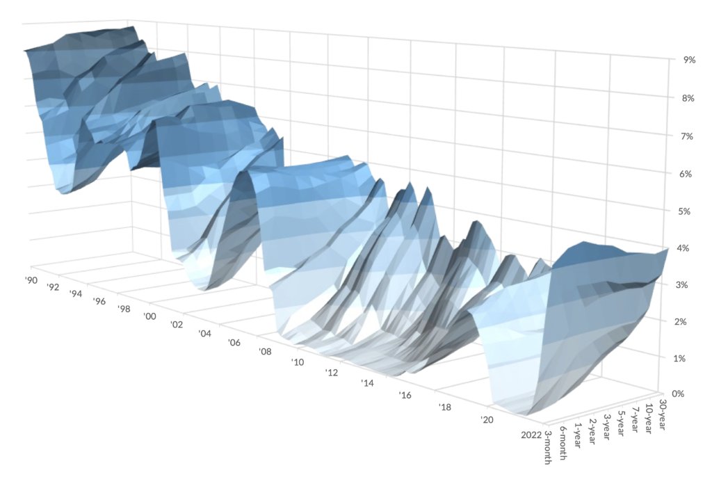
I was curious, so I updated the famous NYT Yield Curve in @msexcel (using quarterly data). Here's how I did it and why--with a downloadable Excel file to boot! | policyviz.com/2022/12/09/upd…
How do you get people to get away from the same old graphs time and time again? Maybe show them different alternatives! | policyviz.com/2022/11/28/get…
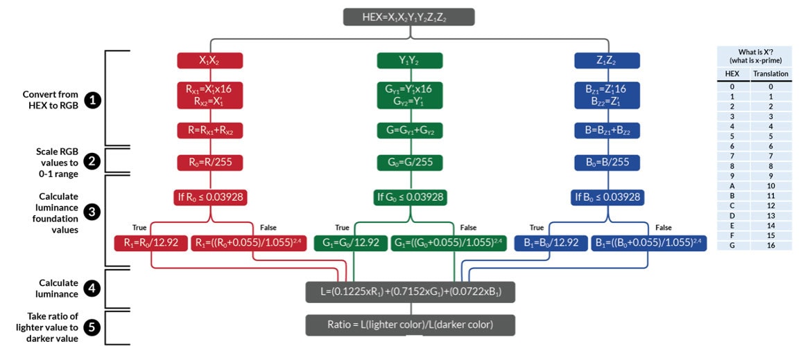
I built a color contrast checker in @msexcel. It's a multi-step process and enables you to do color accessibility checks for multiple color pairs quickly. See how I built it and download it for yourself. | policyviz.com/2022/11/01/col…
Some thoughts about creating data visualizations with outliers. | policyviz.com/2022/10/24/bre…
Dual axis charts are confusing, hard to read, and can be easily manipulated to suggest correlations when none exist. Here are some things to consider. | policyviz.com/2022/10/06/avo…
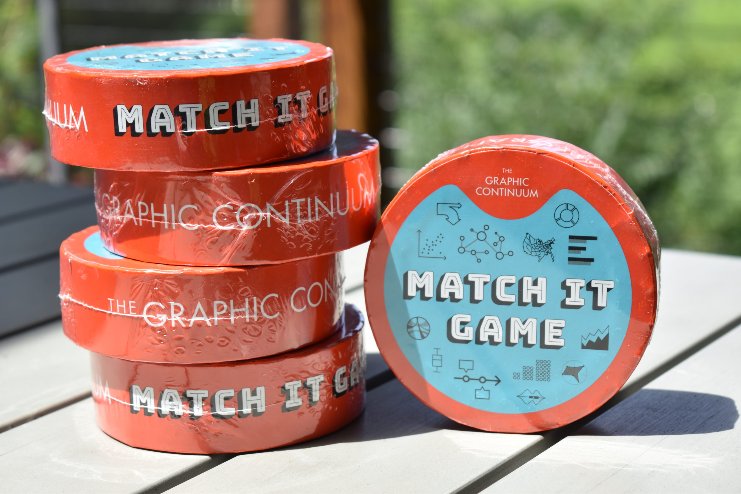
Back to school this week? Are you a K-12 teacher or instructor? Read this post and fill out the linked Google Form for your chance to win five FREE Match It data visualization card games! | policyviz.com/2022/08/22/mat…
My @UWMadison (& @IRP_UW) mentor and friend Robert (Bob) Haveman passed away last week. Bob was a major influence in my life and I'll miss him. I've written a short memorial to him on my site. | policyviz.com/2022/06/29/in-…
policyviz.com
In Memoriam: Robert Haveman - PolicyViz
A memorial to University of Wisconsin professor Robert Haveman.
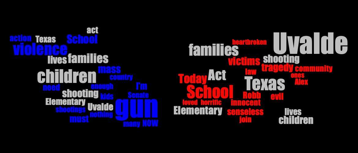
What are Senators Saying About the Uvalde, Texas School Shooting? A new analysis using Twitter data. | policyviz.com/2022/06/06/wha…
Need even more hockey data? Here's a behind-the-scenes look at how I collected, analyzed, and visualized data on @NHL goalie height and weight (plus other stuff). | policyviz.com/2022/02/23/the…
policyviz.com
The Data and DataViz Work Behind Ovechkin’s Chase of Gretzky’s Career Goal Record Post - PolicyViz
Here’s a run-down of the data and tools I used to examine changes in NHL goalie height and weight in a recent blog post about Wayne Gretzky and Alexander Ovechkin.
🏒🏒I had a lot of fun with this post on @NHL data that looks at goalie height & weight during Wayne Gretzky's and @ovi8's careers. Hopefully, I did @JoeBpXp, @Laughlin18, @JunksRadio, & @granthpaulsen proud. | policyviz.com/2022/02/23/ove…

Do data visualization awards separate the data from the design? New blog post on some reservations about #dataviz awards. | policyviz.com/2022/02/17/sho…

What (free!) #dataviz blogs, newsletters, places to practice, examples, and tools do I use? Check out this annotated list. (with s/o to @AnnKEmery, @flowingdata, @pbump, @storywithdata, @_cingraham, and many more). | policyviz.com/2022/02/14/fre…

Do you like to use diverging color palettes in your #dataviz? Make sure you're using them correctly and are labeling the midpoint. Some thoughts in a much too long post. | policyviz.com/2022/02/07/you…
What are the top and best #dataviz tools? Here's a slightly longer round-up than you might have been looking for. | policyviz.com/2022/02/01/the…
What I learned from judging a high school debate competition about being a better presenter. | When it comes to presentations, consider quality over quantity policyviz.com/2022/01/18/whe…
policyviz.com
When it comes to presentations, consider quality over quantity - PolicyViz
When it comes to being a great presenter, emphasize quality over quantity. This post will show you how.
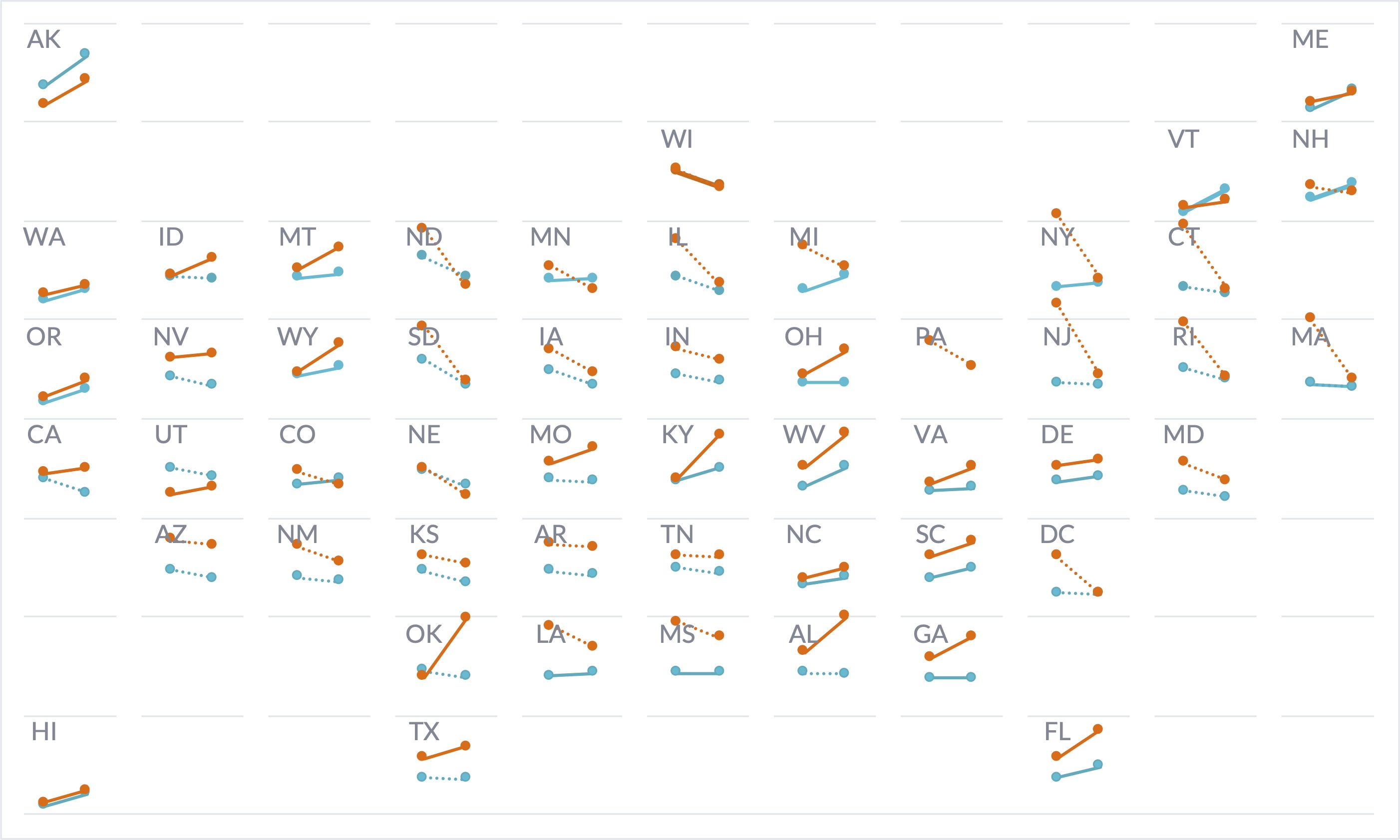
Make a @pbump-style tile grid map with slope charts in @msexcel! VLOOKUP + IF + line charts + scatterplot + error bars = awesomeness. | policyviz.com/2022/01/04/til…
Graphs are like X-rays | policyviz.com/2021/12/06/gra…

Learn how to wrap and align long labels in #Excel in this short blog post and video. | policyviz.com/2021/11/22/for…
policyviz.com
Formatting Long Labels in Excel - PolicyViz
Learn how to wrap your Excel graph labels on two lines AND align them to the left or right using this little trick.
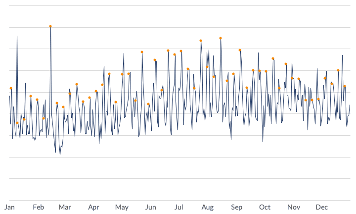
Making a NYT graph in Excel. Blog post and step-by-step video. | policyviz.com/?p=18101


United States الاتجاهات
- 1. #ALLOCATION 239K posts
- 2. #JUPITER 238K posts
- 3. The BIGGЕST 435K posts
- 4. #GivingTuesday 9,893 posts
- 5. #GMMTVxTPDA2025 665K posts
- 6. Good Tuesday 30.4K posts
- 7. rUSD N/A
- 8. Kanata 25K posts
- 9. #AreYouSure2 56.1K posts
- 10. Michael Dell N/A
- 11. JOSSGAWIN AT TPDA2025 97.7K posts
- 12. JIMMYSEA TPDA AWARD 2025 70.3K posts
- 13. Costco 30.4K posts
- 14. Dart 39.7K posts
- 15. Snow Day 7,687 posts
- 16. Penny 22.8K posts
- 17. Pentagon 57.7K posts
- 18. Hololive 16K posts
- 19. FedEx 3,992 posts
- 20. Elliss 6,245 posts


Something went wrong.
Something went wrong.