
Charts make your data easier to understand—but only if you choose the right one! 📊✨ This guide breaks down popular chart types, so you can show off your data in the clearest way possible—no more guessing! Check it out and make your next project look awesome! 🙌
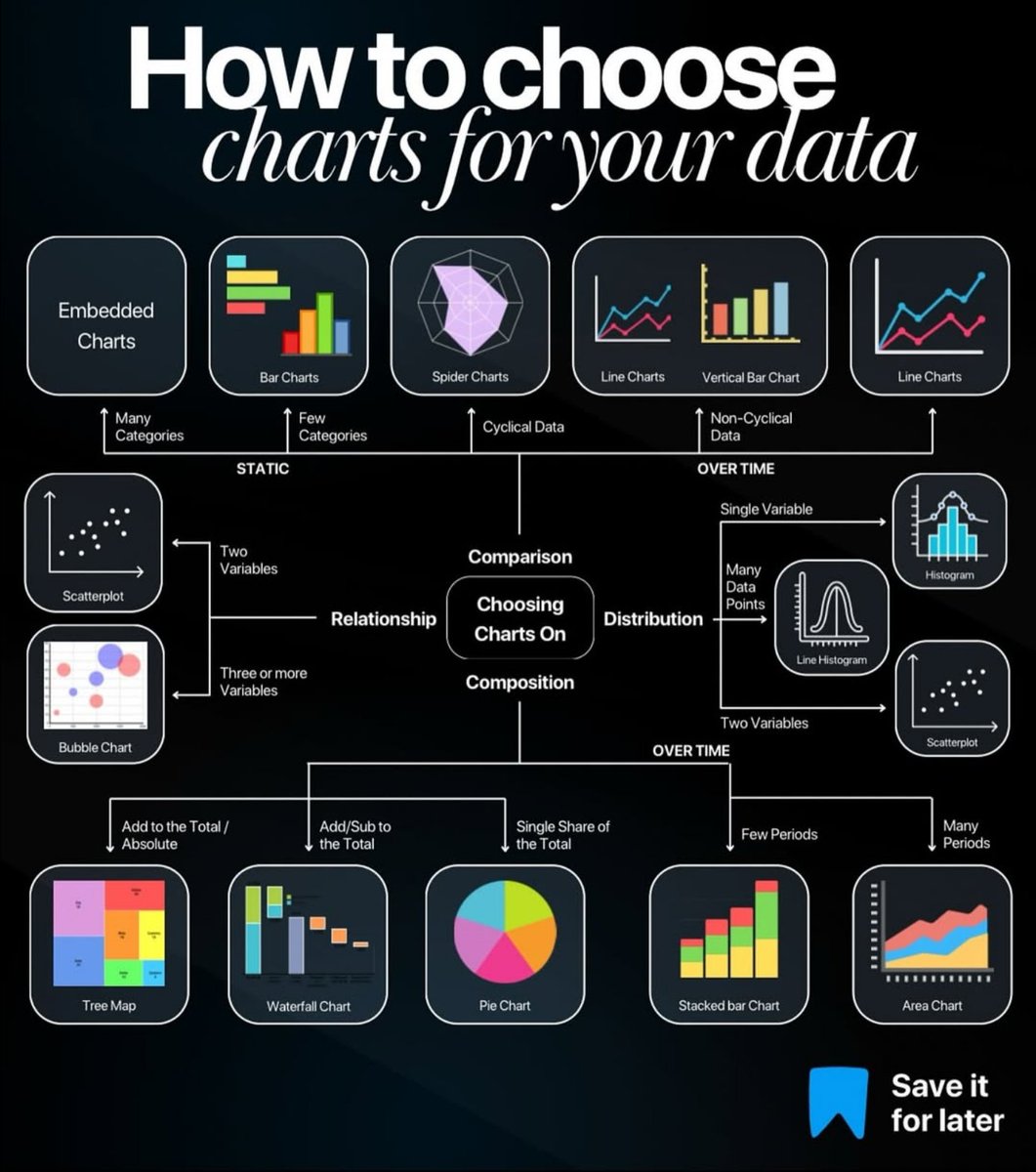

A clear chart can unlock hidden stories within data. Choosing the right one is key for impactful communication.

United States Trends
- 1. #DWTS 44.3K posts
- 2. Northern Lights 20K posts
- 3. Justin Edwards 1,430 posts
- 4. #Aurora 4,201 posts
- 5. Andy 59.5K posts
- 6. Louisville 12.9K posts
- 7. Elaine 46.2K posts
- 8. #RHOSLC 5,224 posts
- 9. Robert 98.9K posts
- 10. Kentucky 22.8K posts
- 11. Celtics 10.7K posts
- 12. #WWENXT 14.4K posts
- 13. Dylan 30.8K posts
- 14. Lowe 11.8K posts
- 15. Whitney 8,663 posts
- 16. Oweh 1,459 posts
- 17. #OlandriaxHarpersBazaar 1,182 posts
- 18. Jordan Walsh N/A
- 19. Alix 9,072 posts
- 20. Kam Williams N/A
Loading...
Something went wrong.
Something went wrong.