
Simplicity Metrics
@SimplicityMtrcs
Bringing your data to life. Infographics, research and more.
You might like


Check out this great animated infographic explaining ventilators for COVID-19 from @eleanor_lutz AKA Tabletop Whale tabletopwhale.com/2020/04/01/exp…
tabletopwhale.com
Explaining ventilators for COVID-19
An animated explanation of ventilators, designed with Dr. Sarah Low
How can you use illustration and interactive games to facilitate learning? Check out this hidden picture game for Aotearoa New Zealand made by @resn_has_no_i ow.ly/jokc50ylxr3
Check out this very cute and informative scrolling site about the creatures in the deepest parts of the ocean! 🐙neal.fun/deep-sea/
A gripping reality about air pollution in this data from @nytimes ow.ly/6tki50xs6l9
What better way to appreciate well-designed data than with more maps! And more work from @eleanor_lutz in an animated sketch of Jupiter ow.ly/OI0H50wTo1T
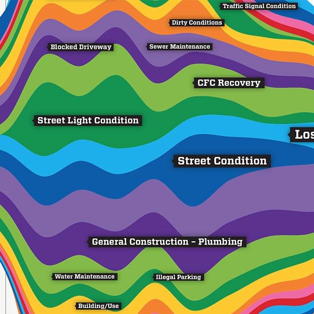
Well designed data can guarantee shock in numbers, like in this creative map of various routes for Pub Crawls in England (from@puddingviz) ow.ly/72Kv50wTnp6
How can infographic data and motion graphics combine to create beautiful displays of data? Take a look in Vox's Earworm video about falsettos in music youtube.com/watch?v=qJT2h5…
Get to the heart of your data! Check out these maps from Dylan Moriarty, brought to our attention by @robhawkes ow.ly/mUF450wx5yo
How can data show differences in urban planning? This amazing data spread shows the prevalence of water fountains in major cities of the world. water-fountains.org/us-nyc?l=en
How will self driving cars work? Check out some data sets and an animation from lyft: level5.lyft.com/dataset/?utm_c…
Check out the data behind the gender gap in this responsive scrolling site from Women Will. How does your data initiate change? ow.ly/YNxn50wducZ

I love this idea of taking vintage maps with digitally added elevation and shadows. Source: buff.ly/2I7iag8 #geography #geoscience #geo #geographyteacher #GIS #geospatial #cartography #spatial #mapping


Check out this visualization of data from wars of the 20th century by by Valentina D'Efilippo and Nicolas Pigelet. How can your data tell a story? poppyfield.org
Data visualization can be bright and beautifully designed, even when explaining complex subject matter. We admire this poster from Tabletop Whale (Eleanor Lutz) showing the differences between dangerous bacteria! ow.ly/NoYp50wdt1N
tabletopwhale.com
A field guide to dangerous bacteria
A medical infographic explaining common bacterial infections in human patients.
Design trends to expect this year - on a beautiful fun website! Scroll away... ow.ly/BL0R30iOI8N #graphicdesign
Great article about the spaces where design and politics intersect. ow.ly/jle630iOHHO #design #graphicdesign #politicaldesign
Check out these marketing trends for 2018. How many are you using? ow.ly/2Ax130iOHmD #digitalmarketing #strategy
Beautiful things happen when designers and data scientists work together! #datavisualization #design #dataisbeautiful ow.ly/u7rY30iOH7V

Have you heard about our grant program? We'll award two nonprofits a free, fully-produced 2 minute whiteboard explainer animation! Find out more here: nextdayanimations.com/nonprofit-grant Share to help us get the word out! #nonprofit #grant #whiteboardanimation

Great article about incorporating intersectional thinking into data visualization. #datavisualization #intersectionality #feminism ow.ly/9FmI30iOGI7


United States Trends
- 1. #FinallyOverIt 5,369 posts
- 2. #TalusLabs N/A
- 3. Summer Walker 17K posts
- 4. 5sos 21.6K posts
- 5. #criticalrolespoilers 4,121 posts
- 6. Justin Fields 9,999 posts
- 7. Jets 69.2K posts
- 8. #GOAI 3,141 posts
- 9. Patriots 152K posts
- 10. Go Girl 26.3K posts
- 11. #BlackOps7 16K posts
- 12. Jalen Johnson 8,755 posts
- 13. Wale 33.8K posts
- 14. 1-800 Heartbreak 1,386 posts
- 15. Drake Maye 21.2K posts
- 16. Judge 206K posts
- 17. Bihar 240K posts
- 18. Domain For Sale 12.3K posts
- 19. Robbed You 4,062 posts
- 20. Disc 2 1,018 posts


Something went wrong.
Something went wrong.