
你可能會喜歡


Consider TechCharts Membership- Weekly Global Equity Reports, breakout alerts, Educational Video - Classic Charting. blog.techcharts.net

Last part: chart to initiate the idea and then go find the story. It took several minutes for Stan to come to this point. Which is "the" way most technical savvy fund managers trade/invest. But they need to be able to show their clients "some" fundamental narrative or else…

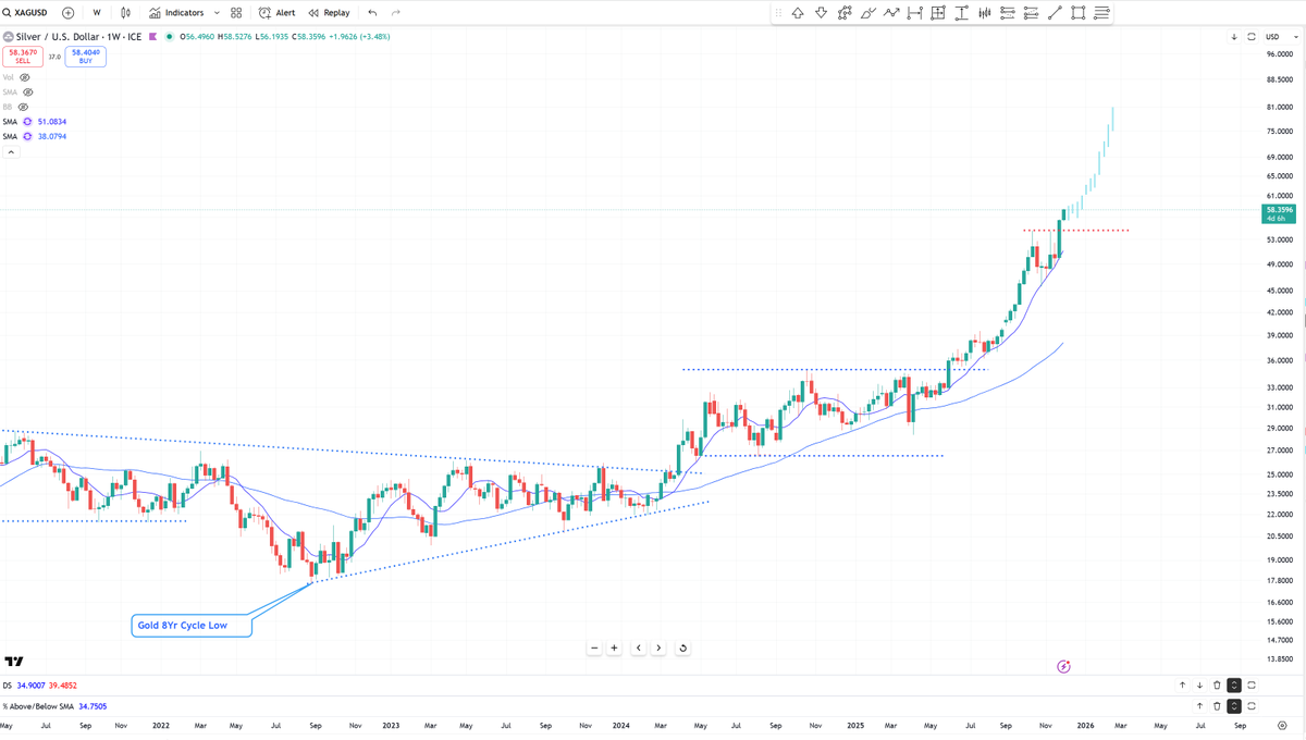
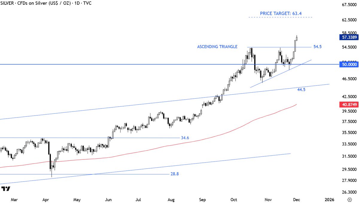
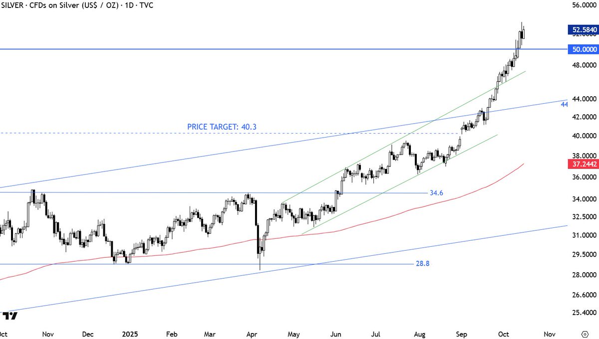
Silver back in a runaway, lockout move. The recent 6 week pause the midpoint of the total move, targeting $80. Similar to prior runaway moves, like 2004 + 2011.
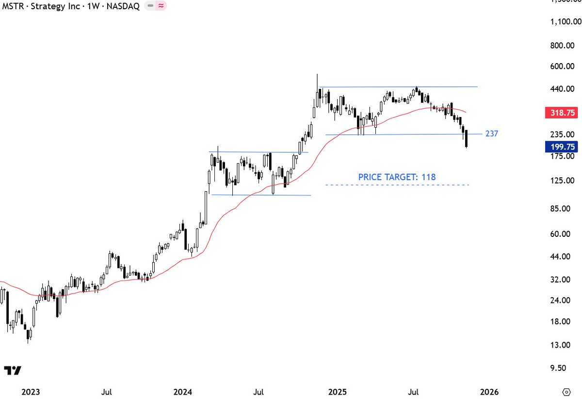
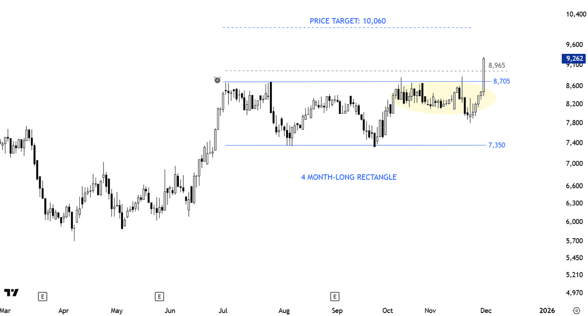
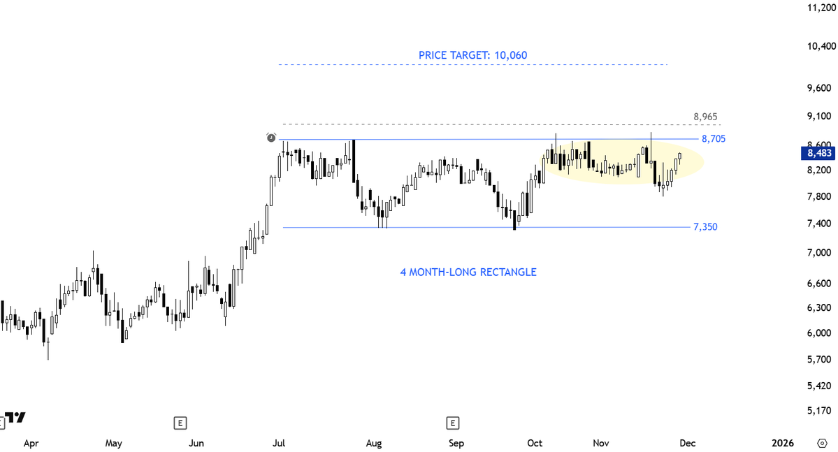
$MSTR resuming towards price target.
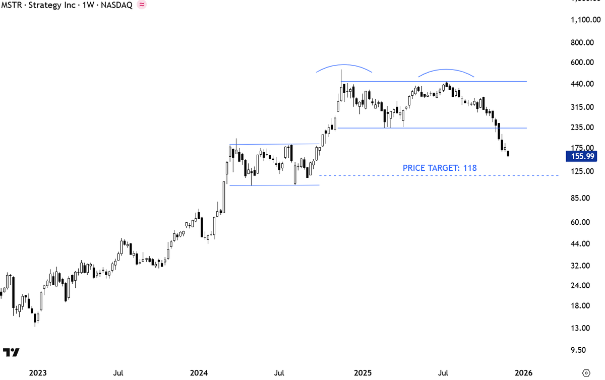
Weekly close below support. Already price below the 40 week (200-day) average. Possible double top with price target of 118. 237 turns into resistance. $MSTR
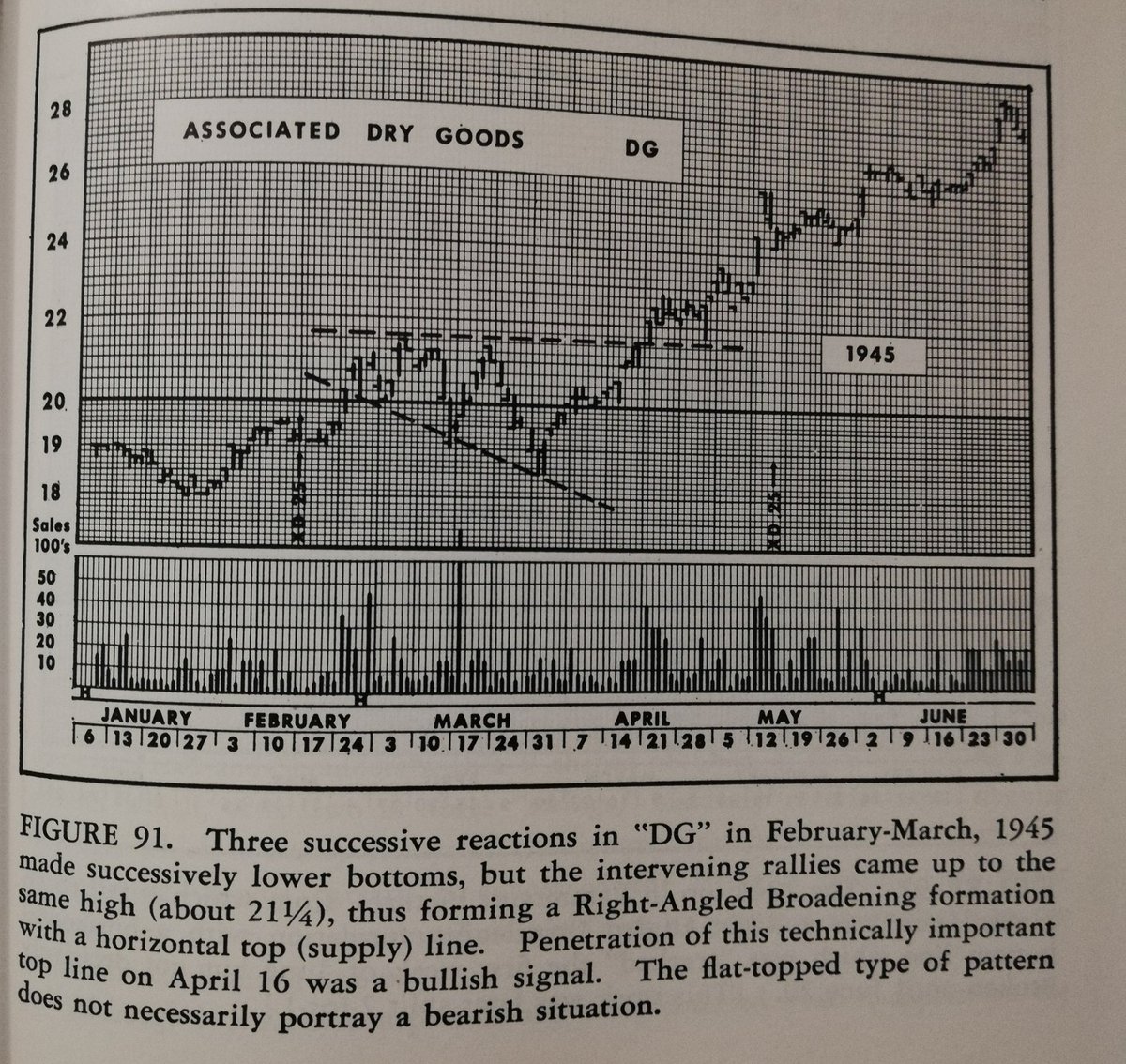
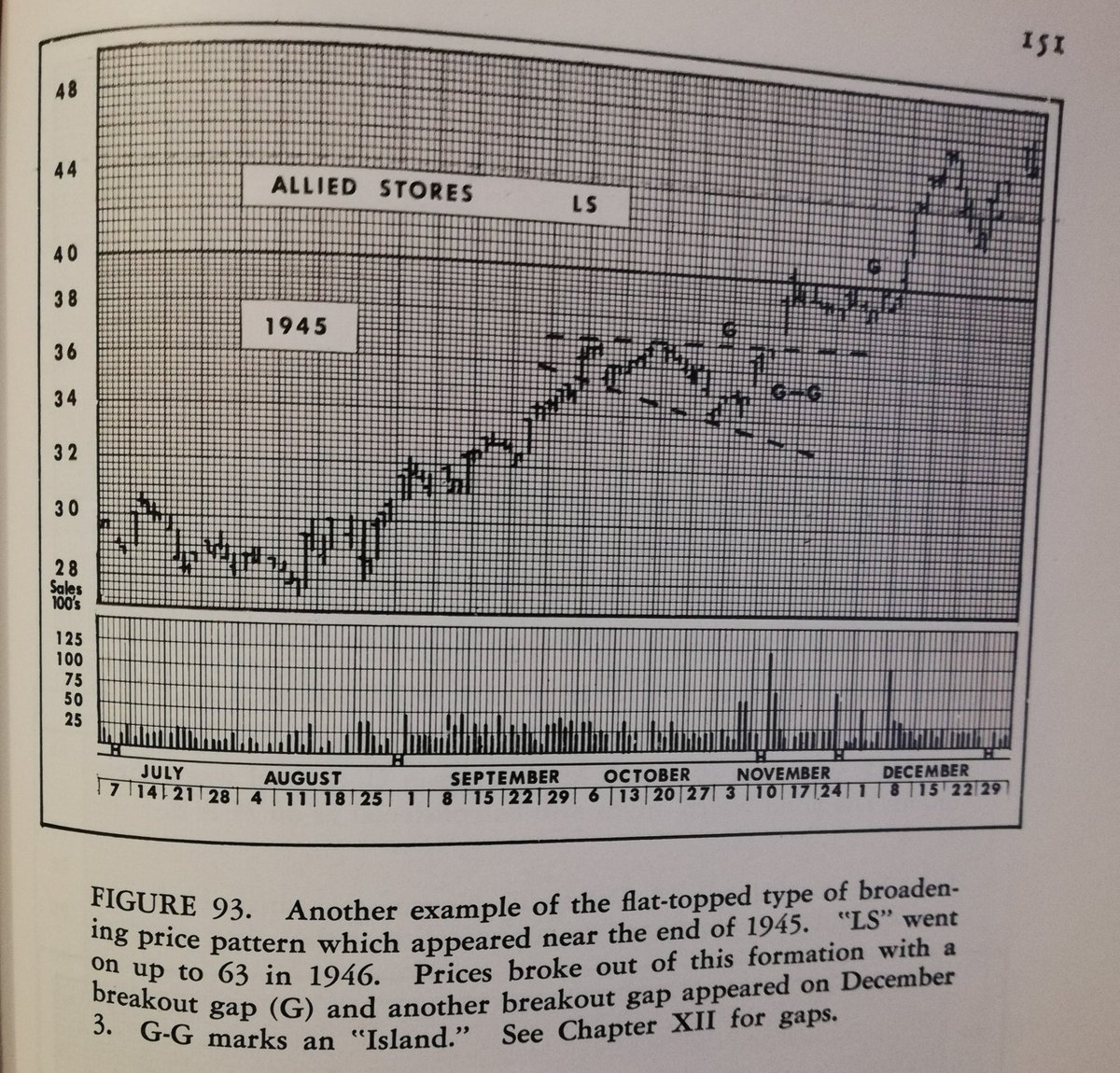
Horizontal breakout vs. Diagonal. Another good example to show why horizontal is better.
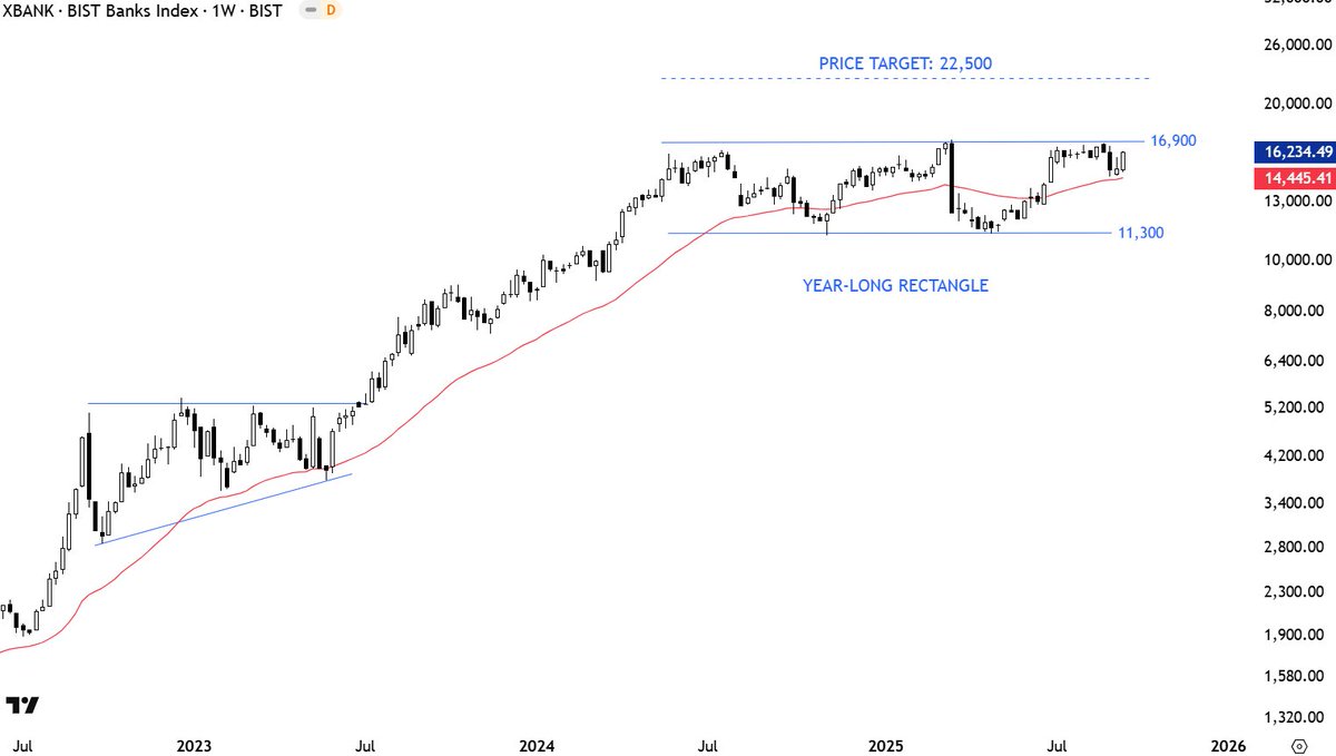
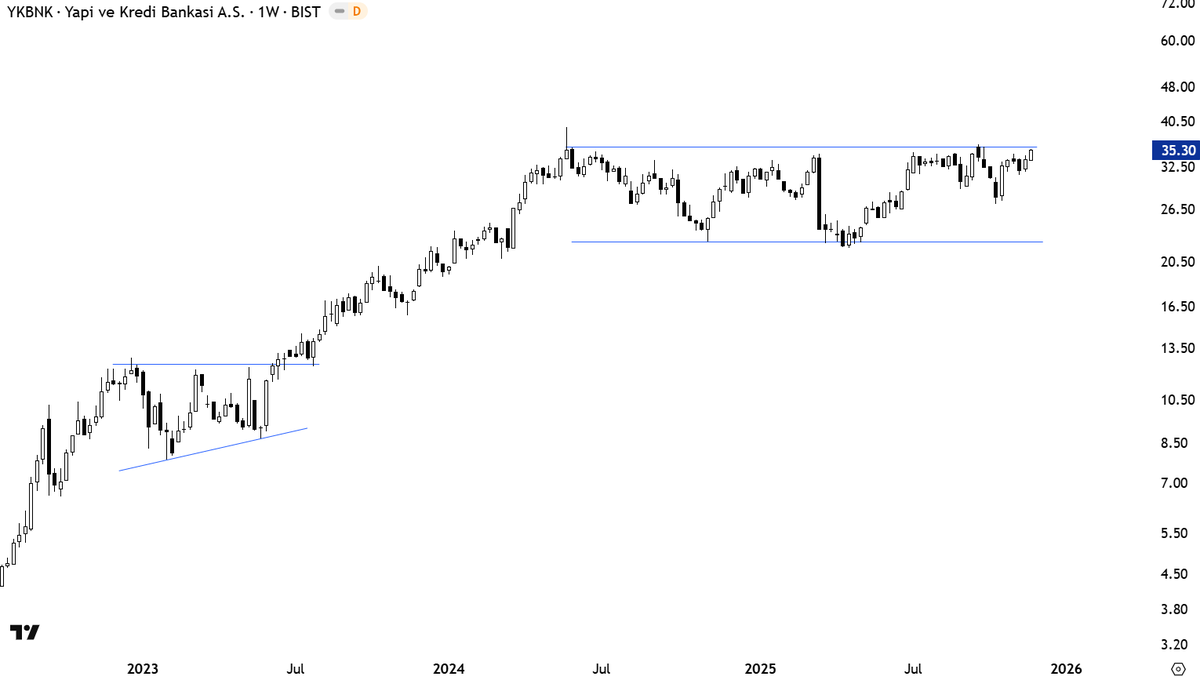
It is a valid horizontal resistance. Which means breakout could trigger a directional move. #BIST100 #BANKS.

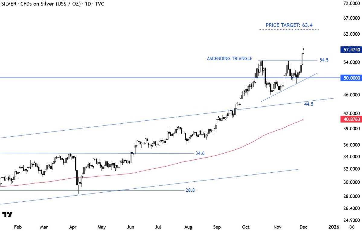
#SILVER correction low was 45.5. Someone commented: but you said 44.
Not predicting a top here. Just by looking at the strength of the rally, there is a higher probability of a short & quick pullback than continuation higher. No top reversal from classical charting perspective. It is only the steepness of the advance that alerts me for a…
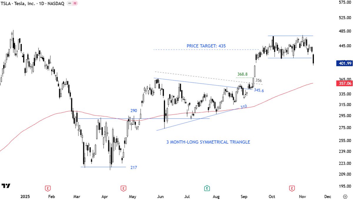
Breakouts in the direction of the overall trend has a higher chance of succeeding. $TSLA.
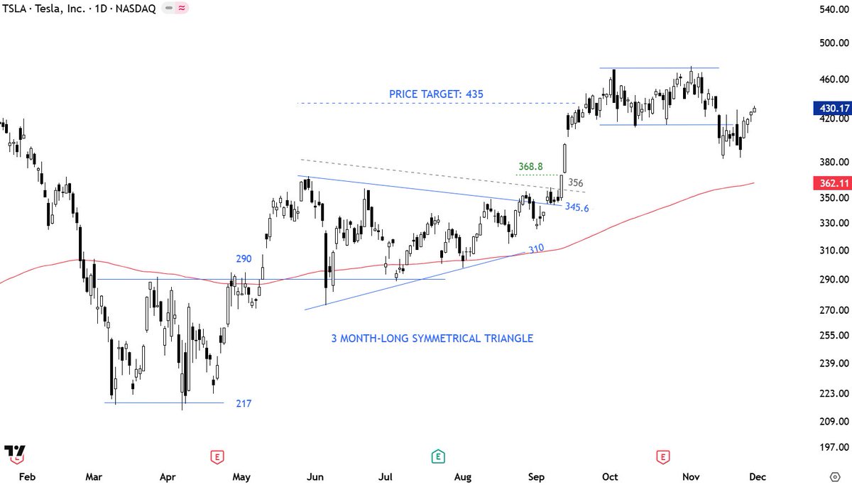
$TSLA Short-term consolidation completed on the downside. This is not a short trade for me. I avoid any short signal above the 200-day average. Price can test support area around 357-368.
Reminder 👇$BTCUSD
As price gets closer to strong support area, the base building can become choppy with lots of back and forth. $BTCUSD
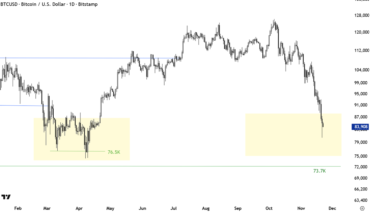
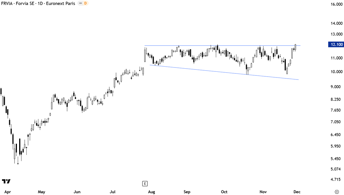
$BTCUSD looks more like a broadening pattern. If the upper boundary can be drawn flat, which I think is possible at 73.7K then the chart can look like what Edwards and Magee featured as broadening pattern.
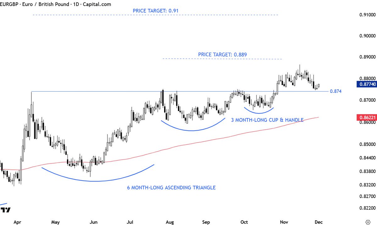
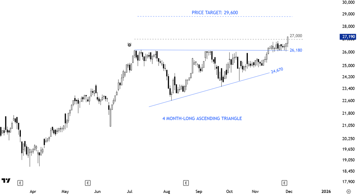
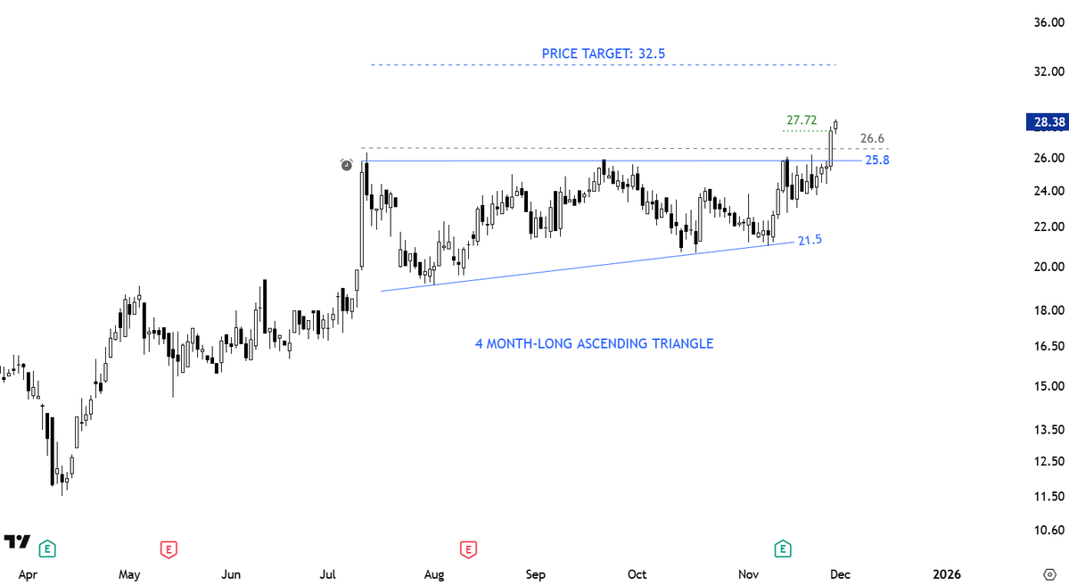
#TECHCHARTSMEMBERS Fresh #breakout from a text-book ascending triangle. Access >> tinyurl.com/3kfstunu
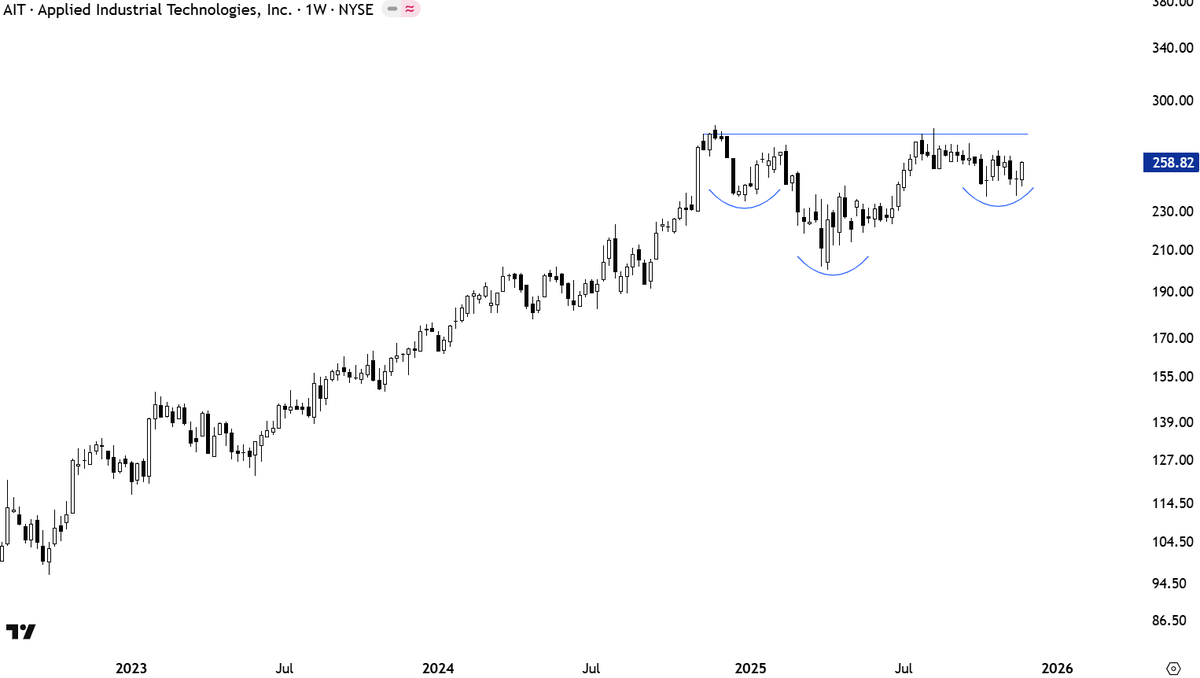
I am finalizing weekly charts review. I found some good looking developing setups which I will include in following reports. $AIT a rally towards 275 can form the right shoulder of a possible H&S continuation.
#breakout confirmed.
A higher low right below the several times tested horizontal boundary. From the latest #Watchlist #TECHCHARTSMEMBERS Access >> tinyurl.com/3yuftktn
This setup is on my radar for the coming week. A text-book #ascendingtriangle with a clean horizontal boundary. From the latest #watchlist #TECHCHARTSMEMBERS Access >> tinyurl.com/jenj5z7k
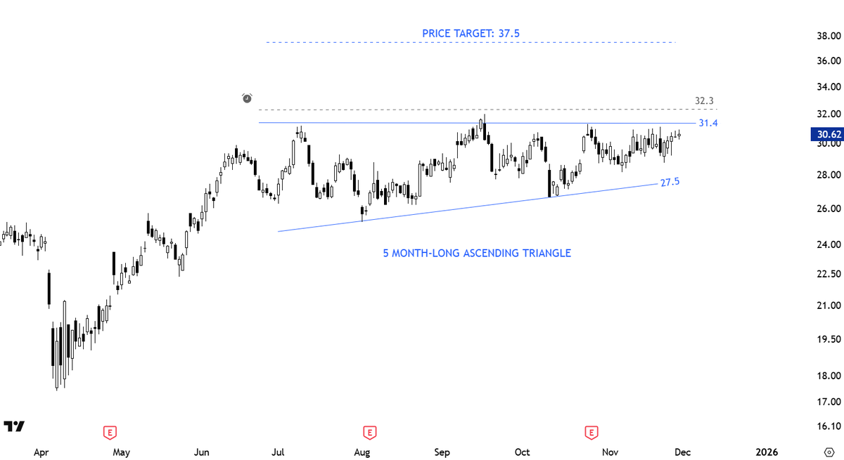
Some patterns have a directional bias. I.e. #ascendingtriangle has a bullish bias. The upward sloping lower boundary gives the pattern the bullish bias. Instead of prices revisiting the lows to form a rectangle, after each correction they meet buyers at higher levels. This shows…
Some patterns have a directional bias. I.e. #ascendingtriangle has a bullish bias. The upward sloping lower boundary gives the pattern the bullish bias. Instead of prices revisiting the lows to form a rectangle, after each correction they meet buyers at higher levels. This shows…


United States 趨勢
- 1. Lakers 46.1K posts
- 2. Giants 79.8K posts
- 3. #WWERaw 63.9K posts
- 4. Dillon Brooks 4,103 posts
- 5. Bron 21.6K posts
- 6. Patriots 117K posts
- 7. Drake Maye 22.1K posts
- 8. Dart 33.2K posts
- 9. Collin Gillespie N/A
- 10. Diaz 34K posts
- 11. Suns 14.2K posts
- 12. Devin Williams 7,236 posts
- 13. Pats 15K posts
- 14. Ryan Nembhard 2,884 posts
- 15. Gunther 13.7K posts
- 16. Joe Schoen 3,029 posts
- 17. Devin Booker 2,205 posts
- 18. Younghoe Koo 6,067 posts
- 19. Mets 18.2K posts
- 20. Abdul Carter 9,927 posts
你可能會喜歡
-
 Peter Brandt
@PeterLBrandt -
 Raoul Pal
@RaoulGMI -
 DonAlt
@CryptoDonAlt -
 Willy Woo
@woonomic -
 RookieXBT 🧲
@RookieXBT -
 Mark Minervini
@markminervini -
 Patrick Walker
@PatrickWalker56 -
 Trading Composure
@TradingComposur -
 jack schwager
@jackschwager -
 Linda Raschke
@LindaRaschke -
 Mark Newton CMT
@MarkNewtonCMT -
 Bob Loukas 🗽
@BobLoukas -
 Colibri Trader (a.k.a. Atanas)
@priceinaction -
 Rayner Teo
@Rayner_Teo -
 Bluntz
@Bluntz_Capital
Something went wrong.
Something went wrong.