#terribledataviz risultati di ricerca

This chart is one of the most useless things I've ever been presented with in my life. I cut it off but the title was "Year-to-Date" and if you mouse over, you can tell that it is not even year on the x-axis, just random data points. #BadAnalytics #TerribleDataViz


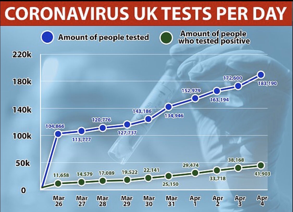
The Daily Mail getting in on the dodgy y-axis train. Combined with some iffy looking data points that seem to bear no relation to said dodgy y-axis! #terribledataviz

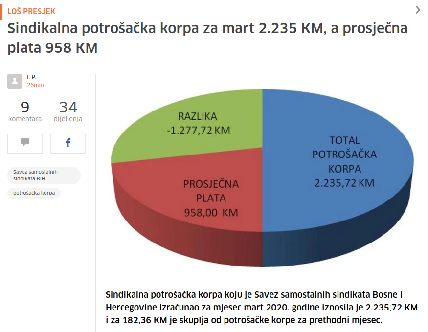
"Ma de stavi neki grafikon u članak, vidiš da je sad to popularno. I to u 3D ako može!" #terribledataviz

File this under #terribledataviz - ascending sack percentage on Y axis, descending Blitz % on X.

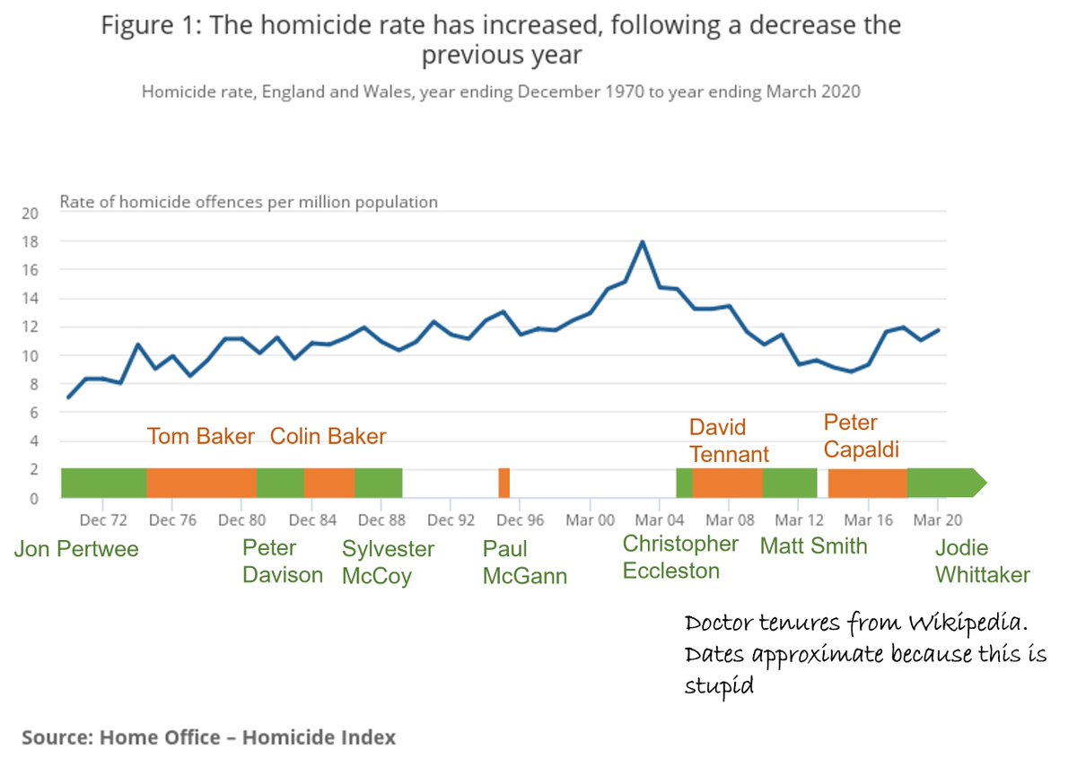
Briefly considered plotting this against rate of homicide *in* Doctor Who, then remembered the result would just be one big spike in 1981, with everything else compressed to a flat line, and the Y-axis running from "0" to "A quarter of the universe". #TerribleDataViz

An exploratory investigation of the available data reveals that the lack of Doctor Who has disastruous effects on society. But also worrying effects from the lovely soul that is Peter Capaldi #datadriven
This chart is one of the most useless things I've ever been presented with in my life. I cut it off but the title was "Year-to-Date" and if you mouse over, you can tell that it is not even year on the x-axis, just random data points. #BadAnalytics #TerribleDataViz
"Ma de stavi neki grafikon u članak, vidiš da je sad to popularno. I to u 3D ako može!" #terribledataviz
The Daily Mail getting in on the dodgy y-axis train. Combined with some iffy looking data points that seem to bear no relation to said dodgy y-axis! #terribledataviz
Something went wrong.
Something went wrong.
United States Trends
- 1. #GivingTuesday 11.9K posts
- 2. #ALLOCATION 257K posts
- 3. #JUPITER 258K posts
- 4. The BIGGЕST 451K posts
- 5. Good Tuesday 34.2K posts
- 6. #GMMTVxTPDA2025 802K posts
- 7. rUSD N/A
- 8. Susan Dell N/A
- 9. Michael Dell 1,278 posts
- 10. Kanata 27.1K posts
- 11. Taco Tuesday 11.9K posts
- 12. Costco 33.7K posts
- 13. #AreYouSure2 62.6K posts
- 14. Lucario 5,378 posts
- 15. Dart 41.1K posts
- 16. Trump Accounts 4,635 posts
- 17. JOSSGAWIN AT TPDA2025 120K posts
- 18. King Von N/A
- 19. JIMMYSEA TPDA AWARD 2025 80.7K posts
- 20. Pentagon 61.5K posts