#uxrules search results

Poor alignment creates tension and visual confusion. “Alignment is invisible order it builds calm and trust.” #webdesign #uiux #uxrules #founders #WordPress
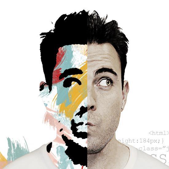
Ignoring emotion in visuals weakens brand connection. “Design should make people feel, not just look.” #wordpress #webdesign #uxrules #branding #businessgrowth
Layouts that ignore balance feel chaotic and cheap. “Good design is harmony—it creates user comfort.” #uxrules #uxdesign #smallbusiness
Overly creative layouts often harm usability. “Creativity must serve clarity, not compete with it.” #uxrules #uiux #businessgrowth
Broken visuals damage credibility within seconds. “Every pixel tells your story—make it consistent.” #webdesign #uxrules #businessgrowth
Flat design without contrast blends key actions into noise “Highlight what matters, let the rest stay subtle.” #webdesign #uxrules #conversion #businessgrowth
Bad typography makes good content feel untrustworthy. “Fonts are voice—choose ones that speak clearly.” #typography #uxrules #websitedesign
Too many fonts make layouts look cheap and unprofessional. “Typography harmony is silent elegance in design.” #typography #uxrules #businessgrowth
Visual noise hides your core message from users. “Less clutter, more impact—that’s true design.” #uxrules #uiux #startup #webdesign

Poor icon choices confuse instead of guiding attention. “Icons are mini messages make them clear.” #uiux #uxrules #websitedesign
Overly long onboarding makes users quit before starting. “Good design welcomes quickly, then guides deeper.” #uxrules #onboarding #startup
No favicon or branding makes a site forgettable. “Identity in design builds memory and meaning.” #branding #uxrules #founders
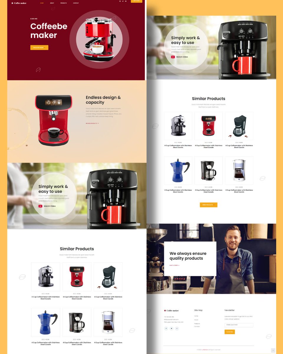
CTAs without urgency make users delay action. “Good design makes the next step feel inevitable.” #conversion #uxrules #founders #webdesign
Ignoring the hierarchy of buttons confuses priority. “Primary actions should shine, secondary stay subtle.” #uxrules #conversion #webdesign
No clear headline makes users ask, “What do you even do?” “Headlines are design’s first handshake with visitors.” #webdesign #uxrules #contentstrategy #founders
A homepage that hides pricing makes buyers suspicious. “Transparent design removes doubts and builds trust.” #webdesign #uxrules #pricing #businessgrowth
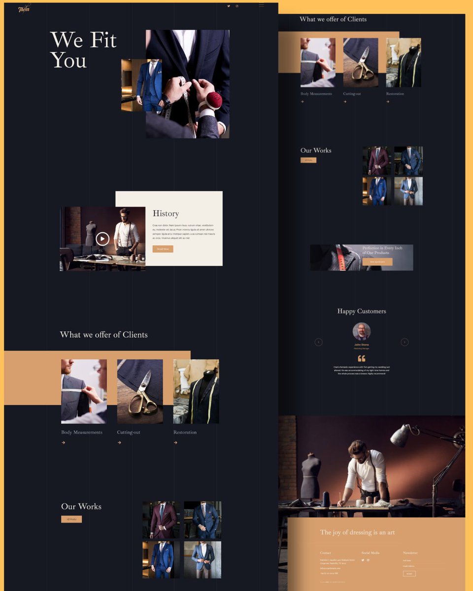
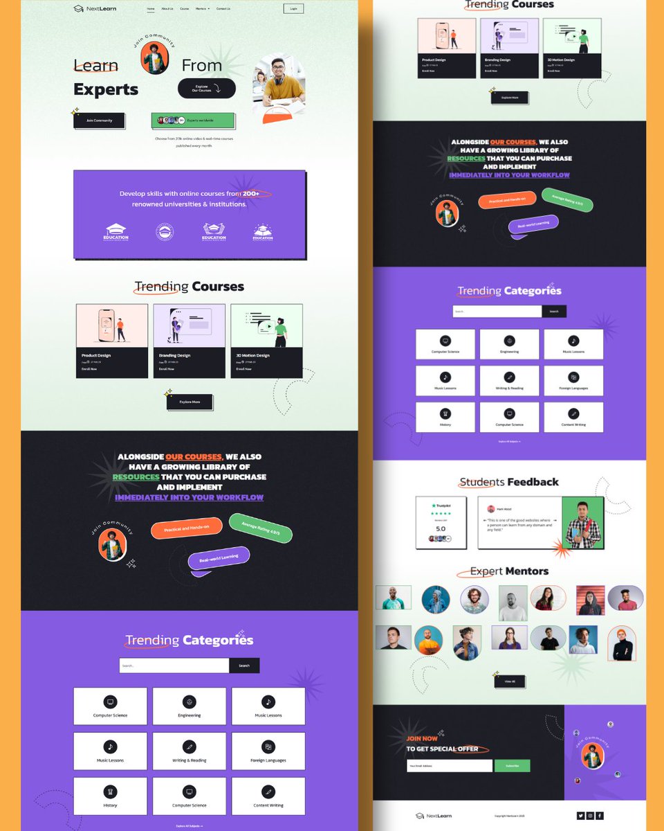
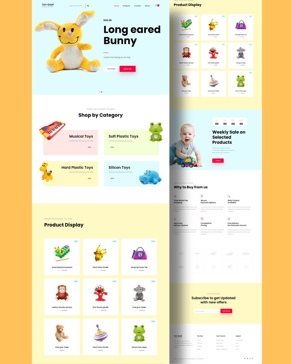
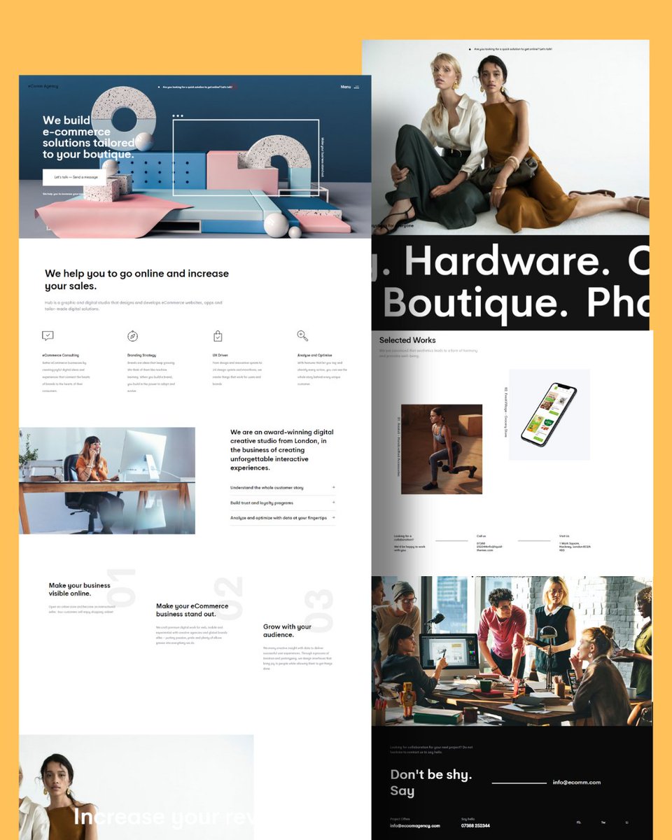
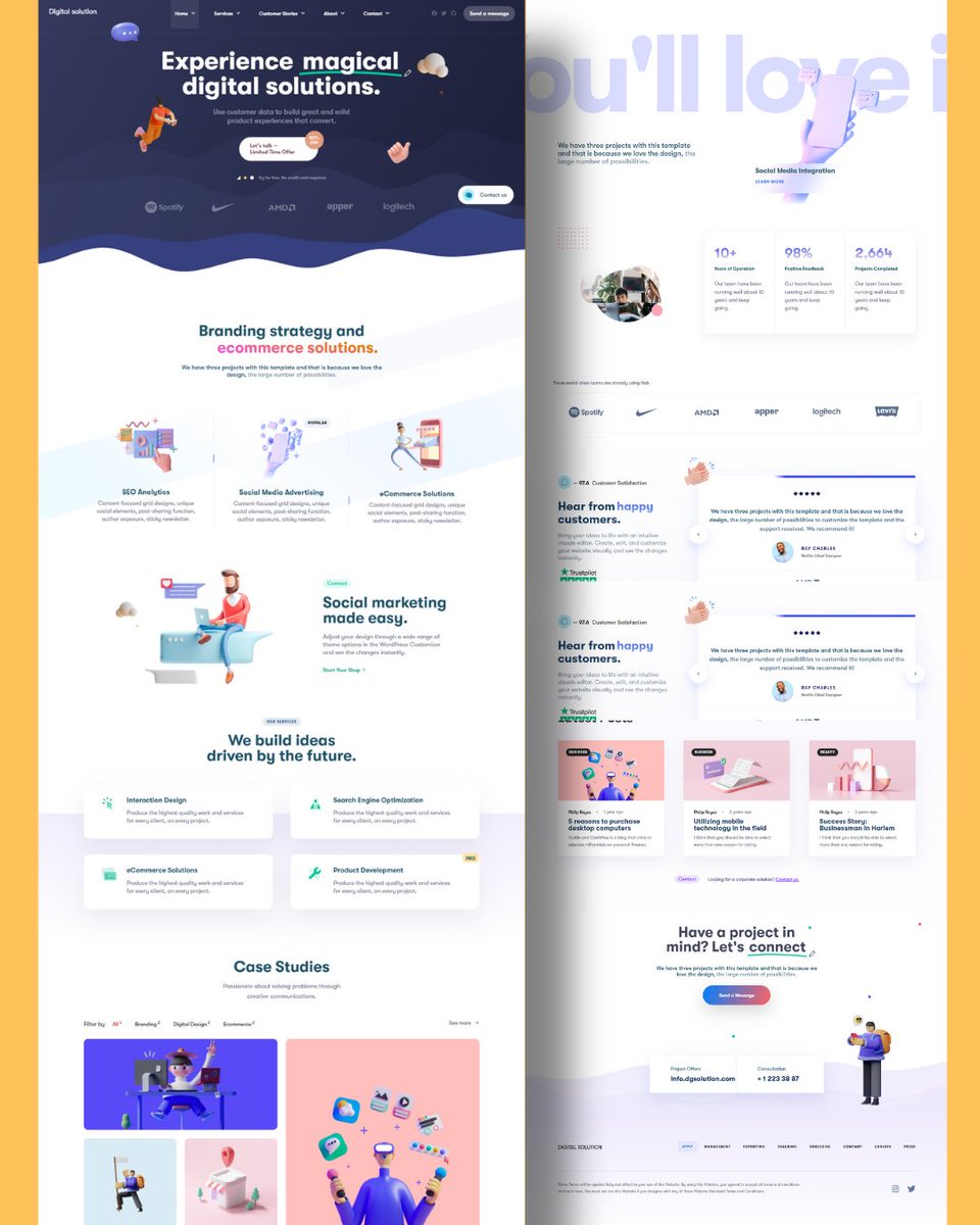
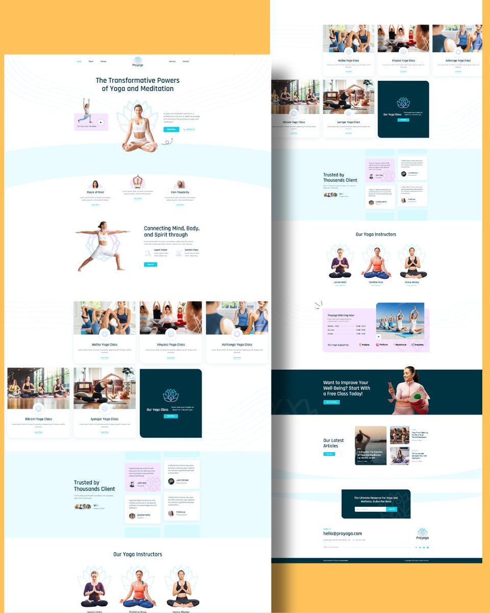
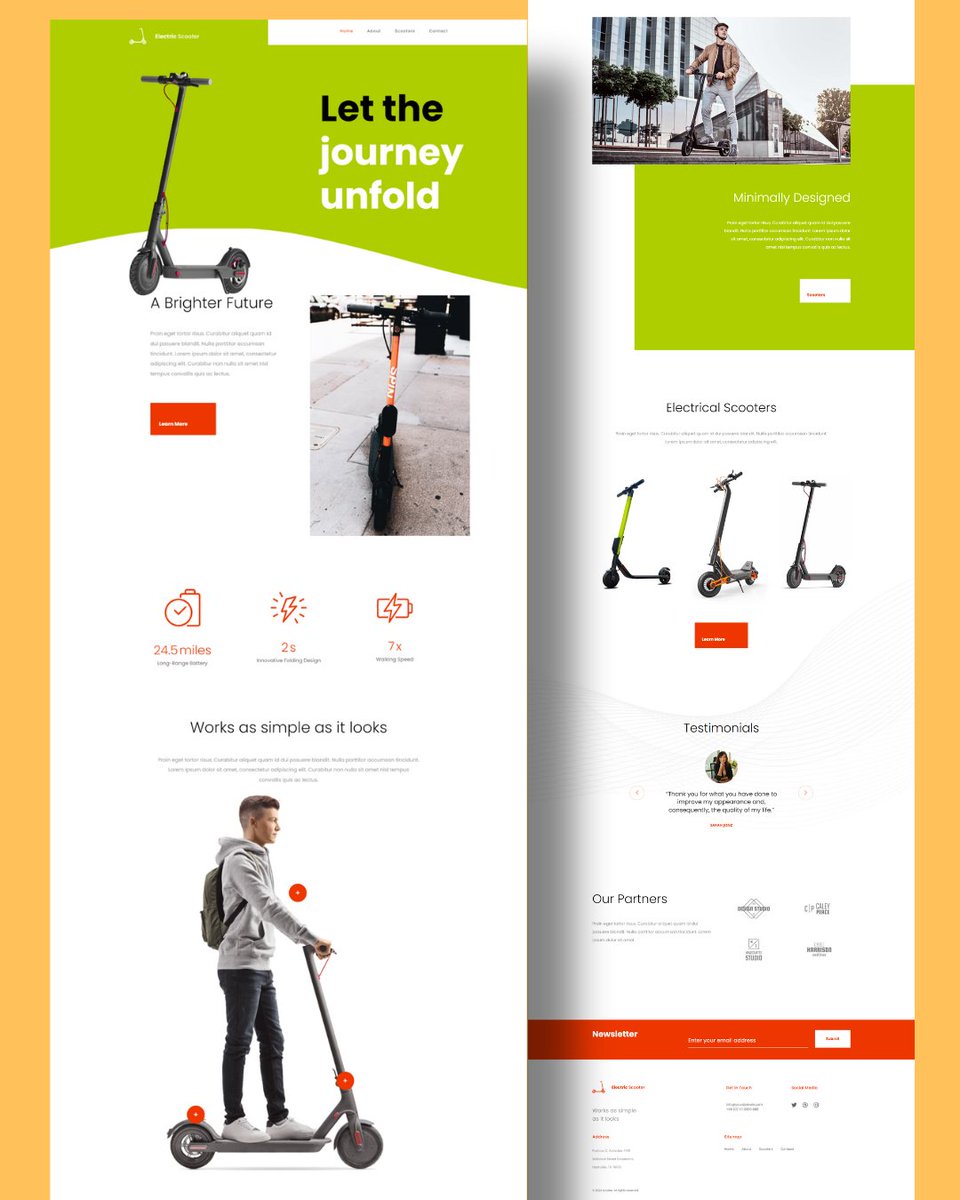
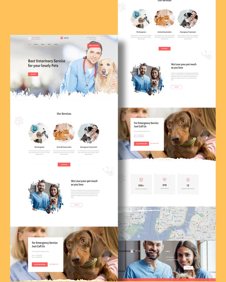
A clear visual hierarchy ensures that every element competes. “Order in design creates direction for action.” #uxrules #uiux #webdesign
Overcomplicated menus frustrate and cause exits. “Good navigation is invisible—it just works.” #uxrules #uiux #webdesigner
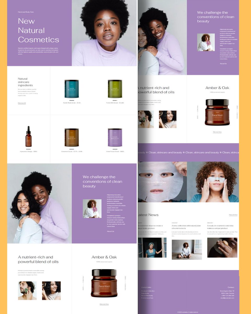
Ignoring white space makes layouts feel heavy. “Empty space isn’t wasted—it amplifies clarity.” #websiteDesign #wordpress #uxrules #uiuxdesign #websites #imranWebdev


These rules are meant to guide not broken. When you understand why it’s there. UIUX design is functional and functional things have rules you need to obey unless it’s art and be creative is all you do. And art is based on interpretation but UiUX isn’t. Not really. So it’s good…

31 Laws of UX and Design Principles (2025) uxness.in/2024/03/12-law… #UX #UI #designthinking #UserExperience #UXDesign #designprinciples
Overly creative layouts often harm usability. “Creativity must serve clarity, not compete with it.” #uxrules #uiux #businessgrowth
No favicon or branding makes a site forgettable. “Identity in design builds memory and meaning.” #branding #uxrules #founders
Poor alignment creates tension and visual confusion. “Alignment is invisible order it builds calm and trust.” #webdesign #uiux #uxrules #founders #WordPress
Ignoring emotion in visuals weakens brand connection. “Design should make people feel, not just look.” #wordpress #webdesign #uxrules #branding #businessgrowth
Overly long onboarding makes users quit before starting. “Good design welcomes quickly, then guides deeper.” #uxrules #onboarding #startup
Ignoring the hierarchy of buttons confuses priority. “Primary actions should shine, secondary stay subtle.” #uxrules #conversion #webdesign
Too many fonts make layouts look cheap and unprofessional. “Typography harmony is silent elegance in design.” #typography #uxrules #businessgrowth
Poor icon choices confuse instead of guiding attention. “Icons are mini messages make them clear.” #uiux #uxrules #websitedesign
Layouts that ignore balance feel chaotic and cheap. “Good design is harmony—it creates user comfort.” #uxrules #uxdesign #smallbusiness
Flat design without contrast blends key actions into noise “Highlight what matters, let the rest stay subtle.” #webdesign #uxrules #conversion #businessgrowth
No clear headline makes users ask, “What do you even do?” “Headlines are design’s first handshake with visitors.” #webdesign #uxrules #contentstrategy #founders
A homepage that hides pricing makes buyers suspicious. “Transparent design removes doubts and builds trust.” #webdesign #uxrules #pricing #businessgrowth
A clear visual hierarchy ensures that every element competes. “Order in design creates direction for action.” #uxrules #uiux #webdesign
🔥 Go-to sites to learn UX Laws → lawsofux.com Tools → uxdatabase.io Myths → uxmyths.com Guide → guidetouxr.com Course → kickassux.com Basics → theuxcookbook.com Podcast → beyonduxdesign.com

Visual noise hides your core message from users. “Less clutter, more impact—that’s true design.” #uxrules #uiux #startup #webdesign
Bad typography makes good content feel untrustworthy. “Fonts are voice—choose ones that speak clearly.” #typography #uxrules #websitedesign
Broken visuals damage credibility within seconds. “Every pixel tells your story—make it consistent.” #webdesign #uxrules #businessgrowth
CTAs without urgency make users delay action. “Good design makes the next step feel inevitable.” #conversion #uxrules #founders #webdesign

Layouts that ignore balance feel chaotic and cheap. “Good design is harmony—it creates user comfort.” #uxrules #uxdesign #smallbusiness
CTAs without urgency make users delay action. “Good design makes the next step feel inevitable.” #conversion #uxrules #founders #webdesign
Poor alignment creates tension and visual confusion. “Alignment is invisible order it builds calm and trust.” #webdesign #uiux #uxrules #founders #WordPress
Ignoring emotion in visuals weakens brand connection. “Design should make people feel, not just look.” #wordpress #webdesign #uxrules #branding #businessgrowth
Bad typography makes good content feel untrustworthy. “Fonts are voice—choose ones that speak clearly.” #typography #uxrules #websitedesign
Too many fonts make layouts look cheap and unprofessional. “Typography harmony is silent elegance in design.” #typography #uxrules #businessgrowth
Broken visuals damage credibility within seconds. “Every pixel tells your story—make it consistent.” #webdesign #uxrules #businessgrowth
Flat design without contrast blends key actions into noise “Highlight what matters, let the rest stay subtle.” #webdesign #uxrules #conversion #businessgrowth
Overly long onboarding makes users quit before starting. “Good design welcomes quickly, then guides deeper.” #uxrules #onboarding #startup
Poor icon choices confuse instead of guiding attention. “Icons are mini messages make them clear.” #uiux #uxrules #websitedesign
Visual noise hides your core message from users. “Less clutter, more impact—that’s true design.” #uxrules #uiux #startup #webdesign
A clear visual hierarchy ensures that every element competes. “Order in design creates direction for action.” #uxrules #uiux #webdesign
Overly creative layouts often harm usability. “Creativity must serve clarity, not compete with it.” #uxrules #uiux #businessgrowth
No clear headline makes users ask, “What do you even do?” “Headlines are design’s first handshake with visitors.” #webdesign #uxrules #contentstrategy #founders
A homepage that hides pricing makes buyers suspicious. “Transparent design removes doubts and builds trust.” #webdesign #uxrules #pricing #businessgrowth
No favicon or branding makes a site forgettable. “Identity in design builds memory and meaning.” #branding #uxrules #founders
Ignoring the hierarchy of buttons confuses priority. “Primary actions should shine, secondary stay subtle.” #uxrules #conversion #webdesign
Overcomplicated menus frustrate and cause exits. “Good navigation is invisible—it just works.” #uxrules #uiux #webdesigner
Ignoring white space makes layouts feel heavy. “Empty space isn’t wasted—it amplifies clarity.” #websiteDesign #wordpress #uxrules #uiuxdesign #websites #imranWebdev
Sites with no contact clarity lose trust and revenue. “Transparency in design builds stronger connections.” #Webdesign #websitedesign #uxrules #founders
Something went wrong.
Something went wrong.
United States Trends
- 1. Thanksgiving 414K posts
- 2. #InfoSecVPN N/A
- 3. National Guard 41.3K posts
- 4. Bayern 155K posts
- 5. Mbappe 69.8K posts
- 6. Arsenal 284K posts
- 7. Kimmich 3,847 posts
- 8. Denzel 3,965 posts
- 9. Golesh 2,961 posts
- 10. Olympiacos 17K posts
- 11. Lennart Karl 2,377 posts
- 12. Camp Haven 7,608 posts
- 13. Wine 40.3K posts
- 14. Pizza 48.4K posts
- 15. Fani Willis 21.4K posts
- 16. #ARSBAY 3,455 posts
- 17. Trumplican 3,755 posts
- 18. #WipersDayGiveaway N/A
- 19. Neuer 5,787 posts
- 20. Anthony Rendon N/A