#plotsofdata search results
Want to make your data look beautiful, but without learning coding skills? Try #PlotsOfData - an intuitive web-based tool for state-of-the-art #DataViz - Marten Postma & @joachimgoedhart in #PLOSBiology app: huygens.science.uva.nl/PlotsOfData/ paper: plos.io/2V3I5Kk

Super fast! took me some time to figure it out but at the end, I just copied directly from excel into the data windows and Voilà! #PlotsOfData

I highly recommend #PlotsOfData, a simple and intuitive webapp that produces publication-quality boxplots - thanks @joachimgoedhart! Webapp: huygens.science.uva.nl/PlotsOfData/ Paper: journals.plos.org/plosbiology/ar… @PLOSBiology

After downloading a plot from #PlotsOfData in PDF format it can be edited in Illustrator or Inkscape - example here ⬇️

Updated #PlotsOfData with option for dark theme; version for beta testing available here: huygens.science.uva.nl/PlotsOfData_be…

Some users of #PlotsOfData experience (frequent) disconnection from the server. If you do (or encounter other issues), let me know as this is valuable feedback that helps to improve the app

You are not alone! The number of people currently using #PlotsOfData can be accessed under the 'about' tab huygens.science.uva.nl/PlotsOfData/

Microglia vs metastasis, attaching muscles, mammalian brain wiring, beautiful graphs with #PlotsOfData #DataViz, comparing people's brains, anticipating protein folding needs - the latest @PLOSBiology homepage refresh journals.plos.org/plosbiology/

The #PlotsOfData app has been updated to implement the Okabe&Ito color blind friendly palette huygens.science.uva.nl/PlotsOfData/

In a new blog @the_Node I highlight several qualitative color schemes for data visualization that are color blind friendly: thenode.biologists.com/data-visualiza…
Apologies, #PlotsOfData is down - in the meantime you can use these mirrors: huygens.science.uva.nl/PlotsOfData2/ or: amsterdamstudygroup.shinyapps.io/PlotsOfData/

Very rewarding to see that #PlotsOfData was used to make the violinplots in this preprint by @ChrisToseland and colleagues biorxiv.org/content/10.110…

Making a figure with #PlotsOfData for a revision of our #preprint on Cdc42 GEFs and their effects in endothelial cells: biorxiv.org/content/10.110…

#plotsofdata looks to be a useful tool for creating nice boxplots etc, for anyone who isn't lucky enough to have a #GraphPad license or a head for #R :) journals.plos.org/plosbiology/ar…

#PlotsOfData by @joachimgoedhart. For anyone who doesn't want to do a deep dive into R, this web app is super easy to use and generates beautiful plots. huygens.science.uva.nl/PlotsOfData 4/6
Due to maintenance of the local power network, the server that runs our web apps #PlotsOfData, #VolcaNoseR, #PlotTwist, #SuperPlotsOfData, will be switched off from 7-17 (CEST) on Tuesday, 30th of April.
Apologies, #PlotsOfData is down - in the meantime you can use these mirrors: huygens.science.uva.nl/PlotsOfData2/ or: amsterdamstudygroup.shinyapps.io/PlotsOfData/

Perfect opportunity to advertise our free & open-source #dataViz apps that show all the data: huygens.science.uva.nl #PlotsOfData #SuperPlotsOfData #PlotTwist
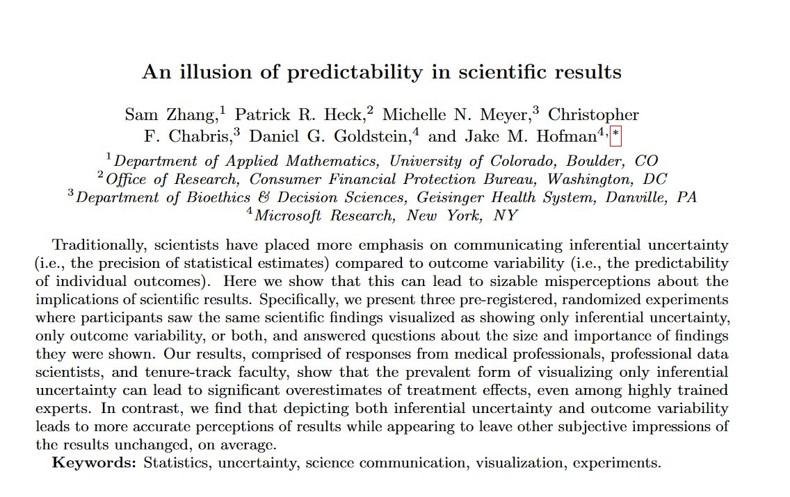
We are visualizing our data all wrong. Typically, academic graphs show statistical confidence intervals or standard errors. This paper shows that everyone from doctors to tenured faculty misread these graphs, assuming effects are larger. Show variability! jakehofman.com/pdfs/illusion-…


Sounds like they had the means in this case… I am at a PUI and graph pad is not readily available. I bought from a grant, but many at PUIs don’t have grants. In leaner times I used #PlotsOfData (fantastic web based tool), but it can’t do everything.
Also shoutout to @joachimgoedhart and his great #PlotsOfData tools
New PlotsOfData feature: Full control over the order of conditions in the plot, available in the 'Data upload' tab (in addition to ordering based on median value or alphabet/number) huygens.science.uva.nl/PlotsOfData/
@joachimgoedhart #PlotsofData is a great tool, thank you for making it so easy. However, it's been returning a "502 Bad Gateway: nginx/1.16.1" error all evening - any idea what's wrong? Thanks
Plot it with #PlotsOfData from @joachimgoedhart to visualize the replicates!
Check out these wonderful resources from @joachimgoedhart : huygens.science.uva.nl Especially #PlotsOfData or #SuperPlots And if you want to learn how to do it yourself, #Rstats twitter is great...
Updated #PlotsOfData with option for dark theme; version for beta testing available here: huygens.science.uva.nl/PlotsOfData_be…

Or use freeware solutions offered by python or #rstats - not a coder? No problem, use our apps: #PlotsOfData, #PlotTwist, VolcaNoser, ggPlotteR: huygens.science.uva.nl
@joachimgoedhart Thanks for following back! #PlotsofData looks really cool.
Very rewarding to see that #PlotsOfData was used to make the violinplots in this preprint by @ChrisToseland and colleagues biorxiv.org/content/10.110…

Shiny apps are a great way to harness the power of R without requiring coding skills. A good example (#ShamelessSelfPromotion) is #PlotsOfData: journals.plos.org/plosbiology/ar…
Agree– very important topic, very nice pre-print, very interesting thread on Twitter! Also make sure to check out #PlotsOfData!
Howto's are important and the GraphPad tutorial is a good start. Do you plan to provide a tutorial/code for #rstats or even a web-based tool? #PlotsOfData may provide a good starting point....
Want to make your data look beautiful, but without learning coding skills? Try #PlotsOfData - an intuitive web-based tool for state-of-the-art #DataViz - Marten Postma & @joachimgoedhart in #PLOSBiology app: huygens.science.uva.nl/PlotsOfData/ paper: plos.io/2V3I5Kk

Very happy that our manuscript on the #PlotsOfData web tool is out in @PLOSBiology. Here's a link to the paper: journals.plos.org/plosbiology/ar… And the app: huygens.science.uva.nl/PlotsOfData/ Some examples of #dataViz made with PlotsOfData:
I highly recommend #PlotsOfData, a simple and intuitive webapp that produces publication-quality boxplots - thanks @joachimgoedhart! Webapp: huygens.science.uva.nl/PlotsOfData/ Paper: journals.plos.org/plosbiology/ar… @PLOSBiology

Super fast! took me some time to figure it out but at the end, I just copied directly from excel into the data windows and Voilà! #PlotsOfData

#PlotsOfData can now retrieve and use csv data from a URL. Example below uses data taken from: github.com/zonination/per…

Happy with your plot? You can now 'clone' the setting which generates a URL that can be copied or bookmarked for future use. The URL can be used to launch PlotsOfData with the settings that you 'cloned' #PlotsOfData
Updated #PlotsOfData with option for dark theme; version for beta testing available here: huygens.science.uva.nl/PlotsOfData_be…

After downloading a plot from #PlotsOfData in PDF format it can be edited in Illustrator or Inkscape - example here ⬇️

You are not alone! The number of people currently using #PlotsOfData can be accessed under the 'about' tab huygens.science.uva.nl/PlotsOfData/

Microglia vs metastasis, attaching muscles, mammalian brain wiring, beautiful graphs with #PlotsOfData #DataViz, comparing people's brains, anticipating protein folding needs - the latest @PLOSBiology homepage refresh journals.plos.org/plosbiology/

This is what the actual data looks like - it would've taken just a couple of minutes to generate the plot in #PlotsOfData and completely for free (which could be an important point for the Dutch authors)

Very rewarding to see that #PlotsOfData was used to make the violinplots in this preprint by @ChrisToseland and colleagues biorxiv.org/content/10.110…

Cool to see #PlotsOfData used in this manuscript (stars were not provided by PlotsOfData: dev.biologists.org/content/early/…

Something went wrong.
Something went wrong.
United States Trends
- 1. Epstein 655K posts
- 2. Steam Machine 30.6K posts
- 3. Bradley Beal 2,278 posts
- 4. Boebert 19.8K posts
- 5. Valve 21.8K posts
- 6. Virginia Giuffre 35.9K posts
- 7. #BLACKROCK_NXXT N/A
- 8. Anthony Joshua 1,458 posts
- 9. Scott Boras N/A
- 10. Rosalina 62.2K posts
- 11. GabeCube 1,911 posts
- 12. Mace 27.3K posts
- 13. Mel Tucker N/A
- 14. Clinton 103K posts
- 15. H-1B 92.4K posts
- 16. Jordan Humphrey N/A
- 17. #NASDAQ_NXXT N/A
- 18. GPT-5.1 3,513 posts
- 19. AJ Brown 8,392 posts
- 20. Brad Beal N/A


