
Aderinsola Precious
@AdepsTech
Fast delivery Landing page builder || Figma || Experienced designer || Creates converting pages || Ecom designer #FigmatoReplo
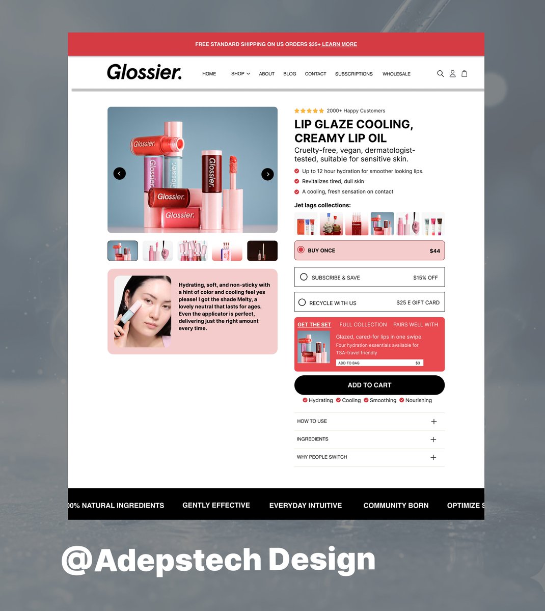
Every scroll on a PDP builds interest. But the Buy Box is where the decision happens. Optimize it → Watch your conversions rise. #EcomGrowth #EcommerceStrategy #Ecom #GrowthHacks

Customers don’t leave because of price. They leave because they’re confused. This is where listicle comes in because, it provides clarity, proof and benefits of the product Want one that converts? DM #ecommerce #conversionrate #conversionoptimization
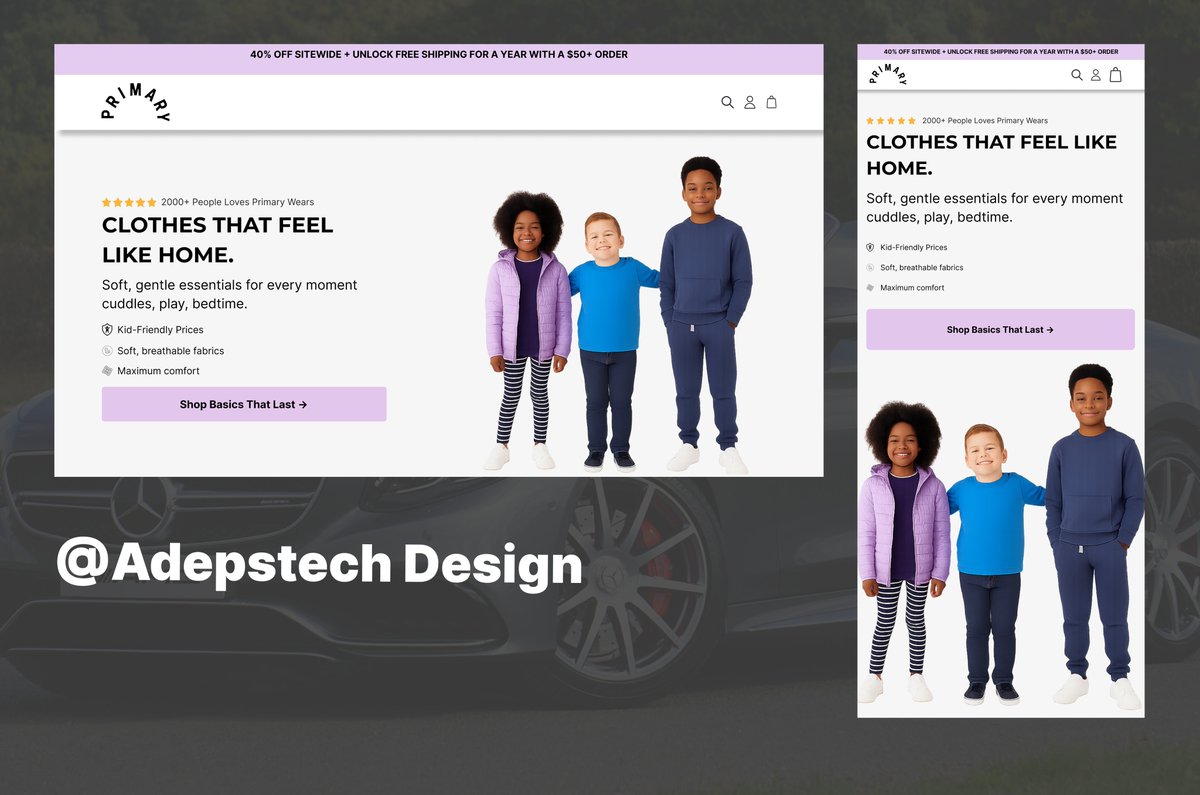
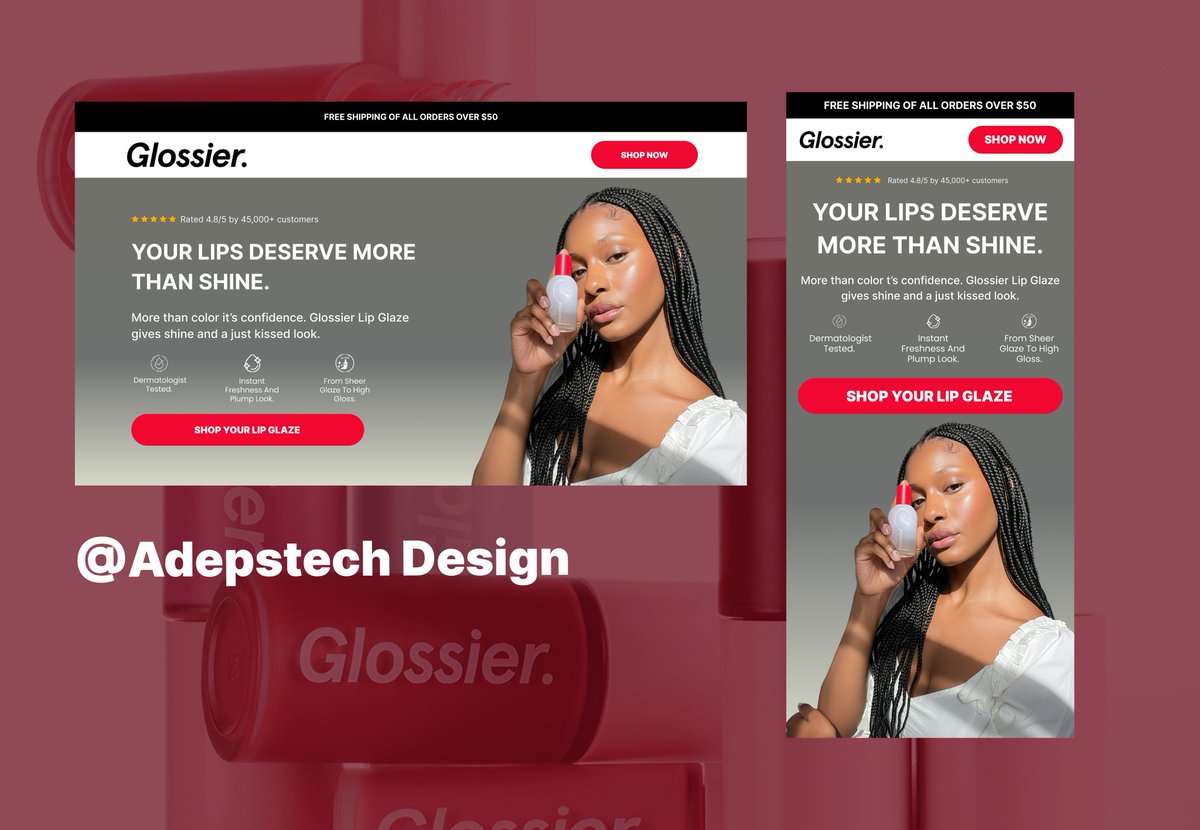
Your hero section is the gateway to your brand. When optimized, it builds trust, captures attention, and improves conversion performance. I design this on @figma #UXDesign #WebStrategy
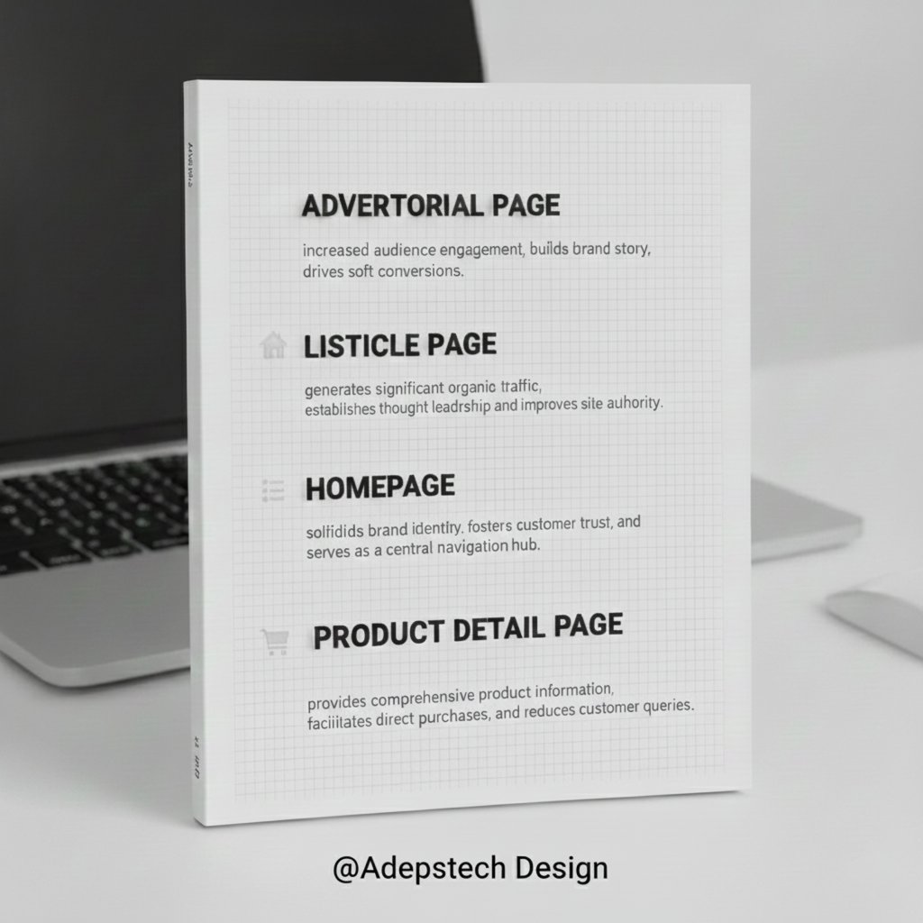
Your website is the engine of your brand. But is it running on all full capacity You need all key pages like a Homepage, Advertorial, Listicle, and PDP, To boost your brand growth. Don’t just build a site build a system that sells. Ready to Build a system that works? DM
Brand Owners: Are you telling your full story? Stop limiting your message to short ads. Advertorials provide the depth and trust needed to convert skeptical, high value customers. Elevate your brand narrative today Need one for your brand? DM #BrandBuilding #Advertorials
Your visitor doesn't care about your product's specs. They care about solving their pain point. The Benefit Section is your chance to connect emotionally. Show them the life they'll have after buying from you. It's the engine of conversion! Need help framing your benefits? DM
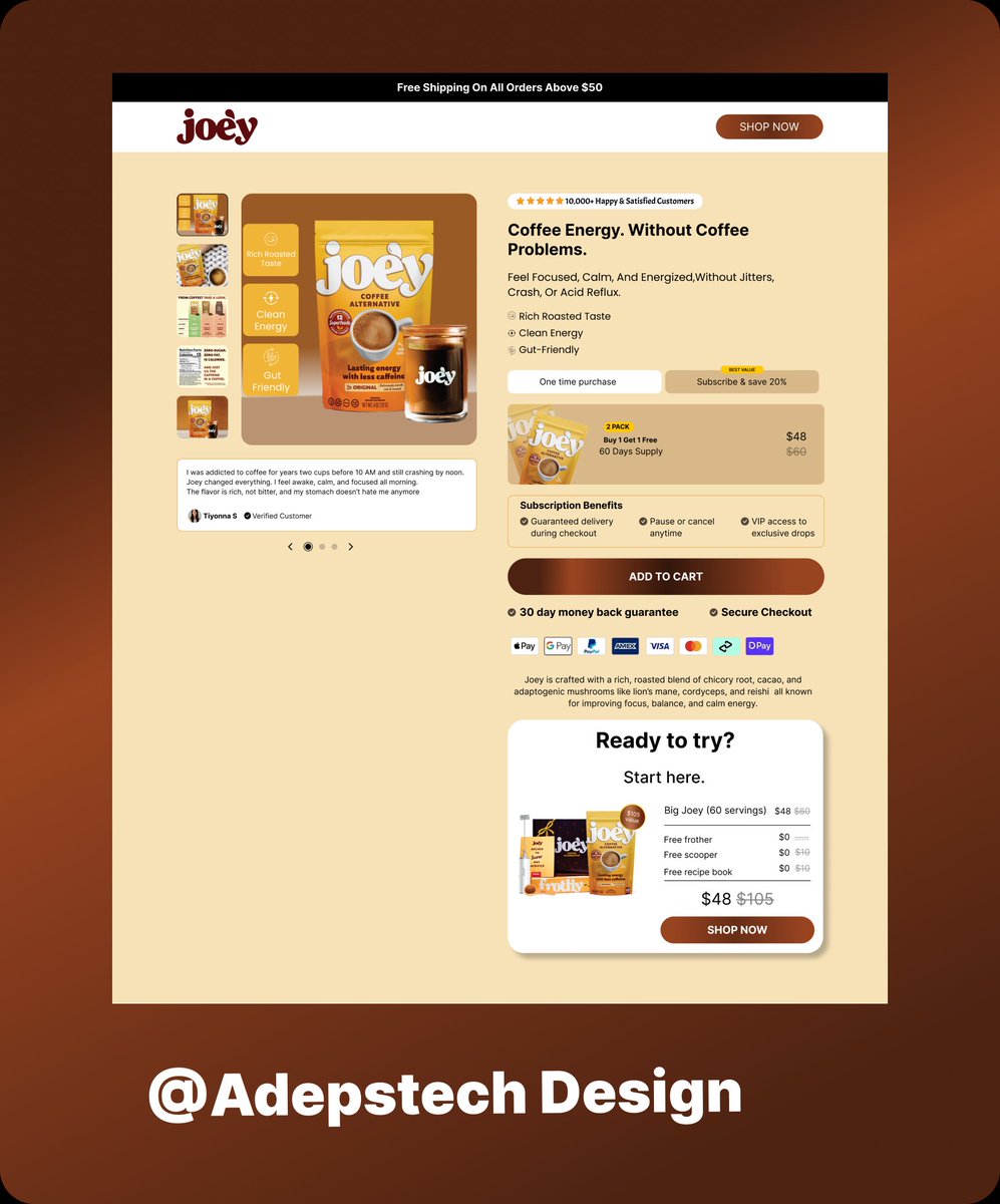
Why does your brand NEED an amazing Product Page? Because the PDP is the final stop before checkout! It must clearly communicate: Value: What problem does it solve? Trust: Social Proof (Reviews, Ratings). Clarity: Price, Specs, and Shipping info. Stop making users guess.
Poor Buy Box design leads to wasted ad spend and inconsistent conversions. Refining this section delivers measurable improvements across your product page I design conversion focused product pages need one for your brands?, DM #ecommerce #conversion
As a designer, my goal with every hero section is simple: Make your message instantly clear. Because if your visitor has to “figure it out,” they won’t. That’s what makes clarity your best conversion tool. Designed in @figma #UXDesign #BrandDesign #WebDesign
Most brands focus on fancy product photos. But real conversions happen in the Buy Box, the point where trust turns into action. I optimize that section for brands who want higher sales without extra traffic. DM me if you’re ready to scale smarter. #EcommerceStrategy #DTC
Your ads are getting clicks, but your product page isn’t converting? You don’t need better ads you need an advertorial page. It tells your story, builds trust, and sells without feeling salesy If you’re a brand owner, it’s time to upgrade your page. Design on @figma
Think of your hero section as your best salesperson working 24/7. It either gets attention or gets ignored. Winning formula ✅ Call out your customer ✅ State your value ✅ Point them forward Designed this one on @figma #WebDesign #FigmaDesign #UXDesign #BrandDesign
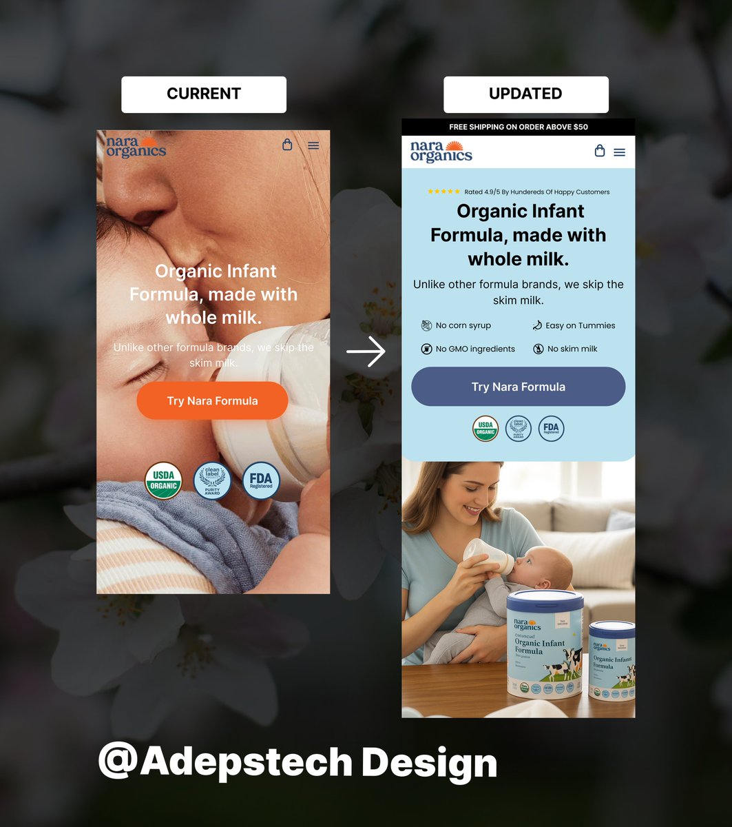
Before vs After of @NaraOrganics hero section @figma Before: –Product not displayed – No clear benefits – Zero clarity After: ✅ Benefit driven headline ✅ Clear product benefits ✅ Strong CTA Design for trust → Conversion follows. #FigmaDesign #WebDesign #redesign
Most brands: “Our product has XYZ.” Winning brands: “Here’s how your life gets better with XYZ.” That’s the power of a clear benefit section, it turns browsers into buyers. Need one like that on your page? DM me. #ecommerce #brandowners #onlinestore
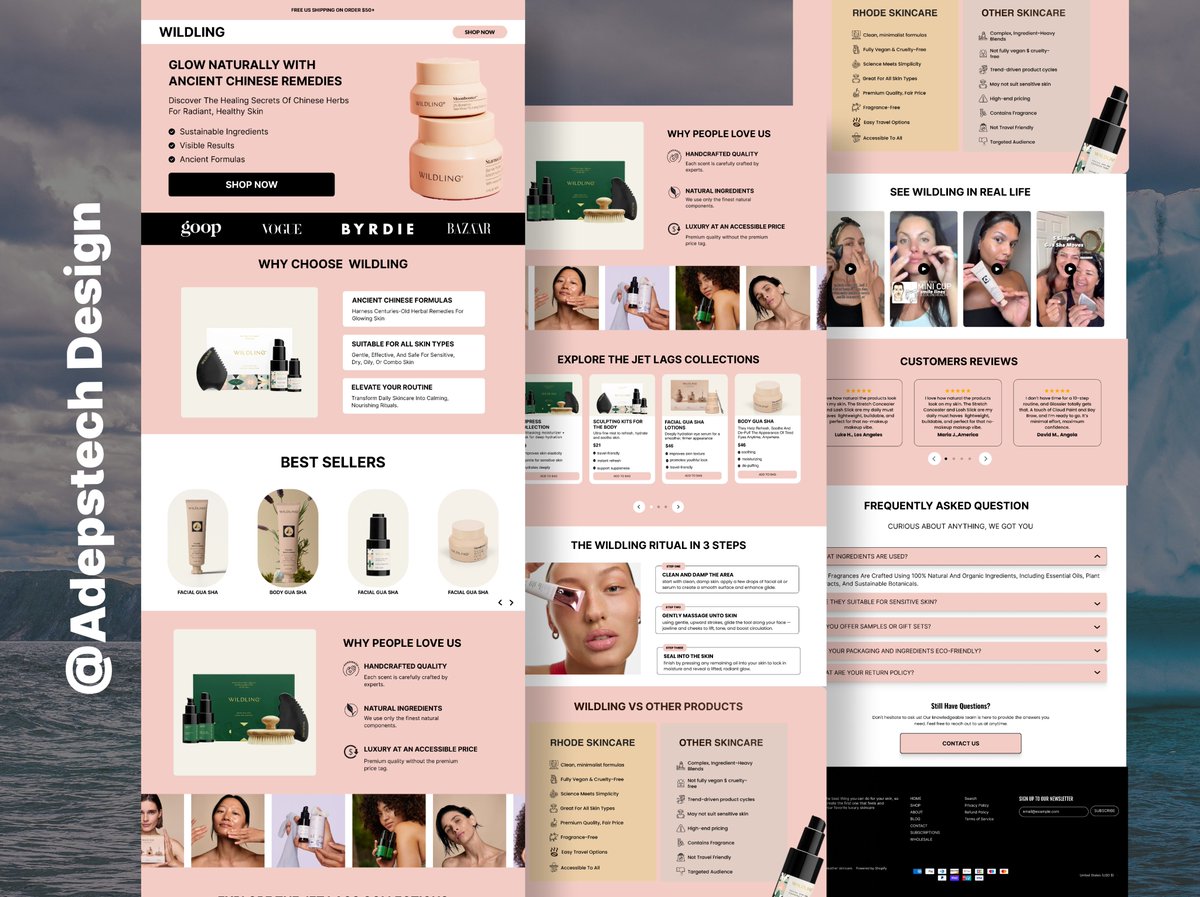
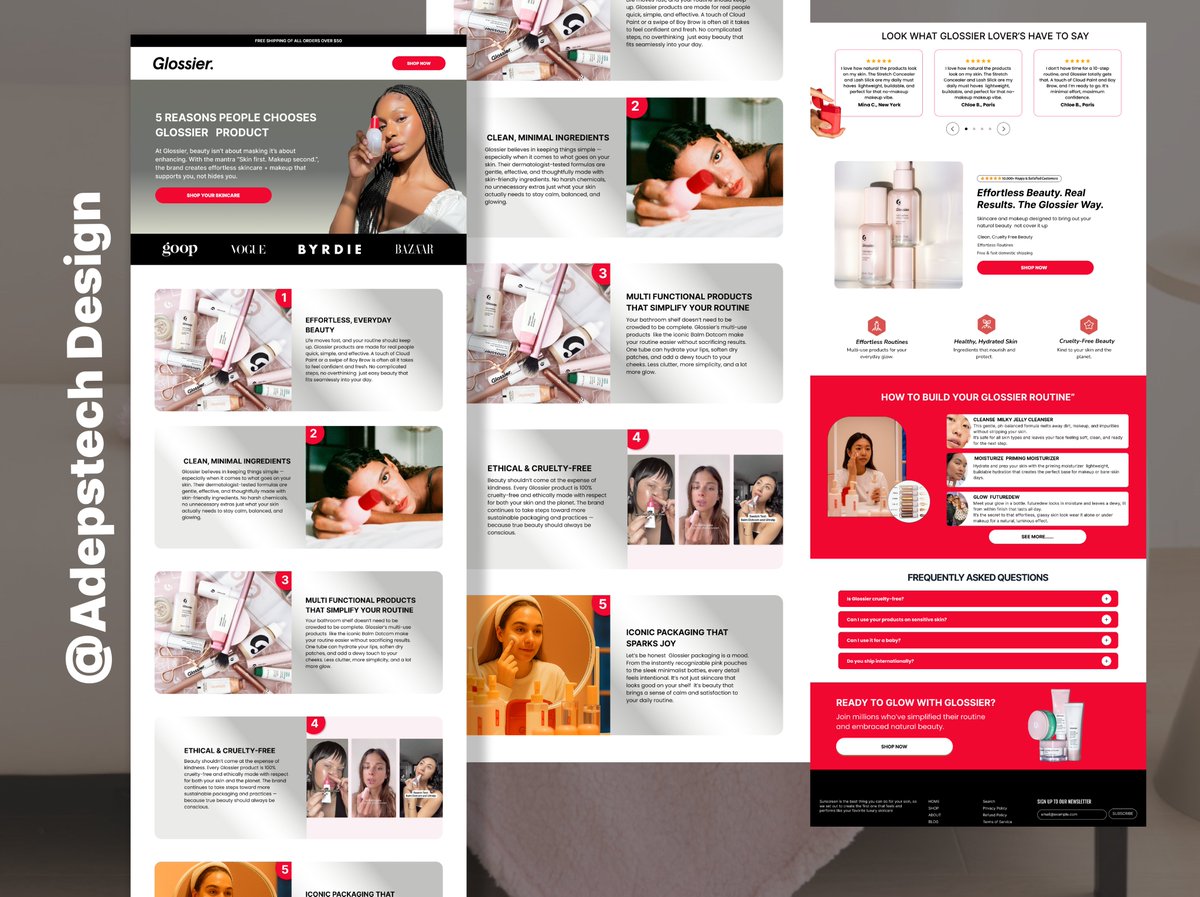
Your homepage is your brand’s digital storefront and it should sell. I design clean, conversion-focused homepages that highlight your products and move visitors to act. Need one for your brand? Let’s talk. #WebDesign #Homepage #FreelanceDesigne
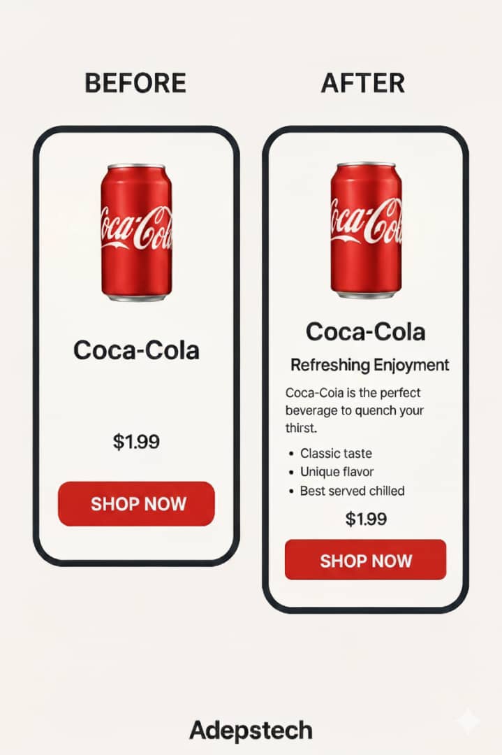
Design isn’t just about looks, it’s about clarity. Here’s how the AFTER Coca-Cola version communicates better ✅ Tells what’s being offered ✅ Supports it with a clear subheading ✅ Shows the benefit ✅ Ends with a CTA that converts #UXDesign #BeforeAfter #CocaCola #Redesign
Don’t lose buyers because your page doesn’t convince. A listicle page builds trust, shows value, and boosts sales. Let’s create one that turns browsers into buyers. #Marketing101 #Branding #EcommerceDesig
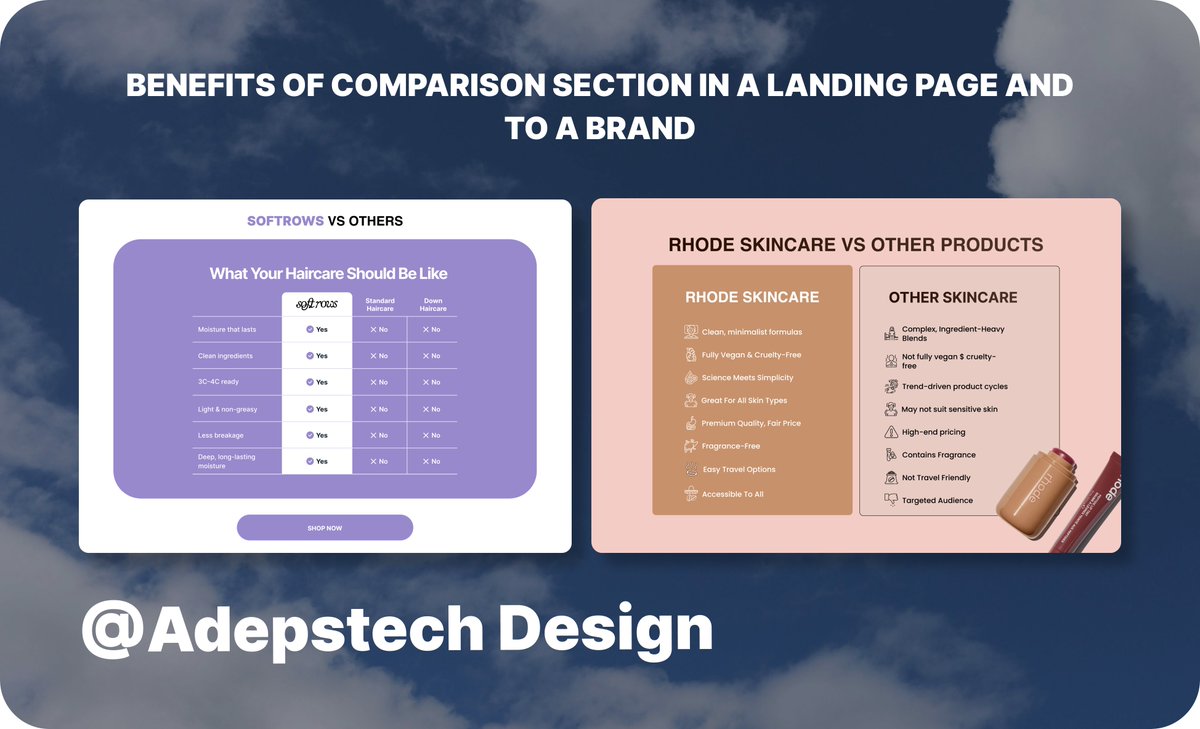
Ever wondered why top brands add a “comparison” section on their landing pages? It’s not just design, it’s strategy. ✅ Builds trust ✅ Clarifies value ✅ Speeds up decisions ✅ Boosts conversions Transparency sells.
I’ve seen brands double their leads just by improving their homepages. It’s not magic. It’s strategy, clarity, and design that converts. Want results like that? Let’s talk. #WebDesignExpert #BrandStrategy #BrandGrowth
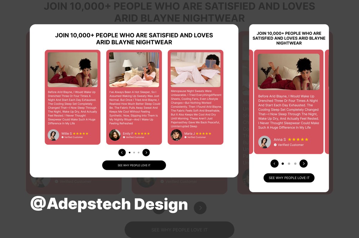
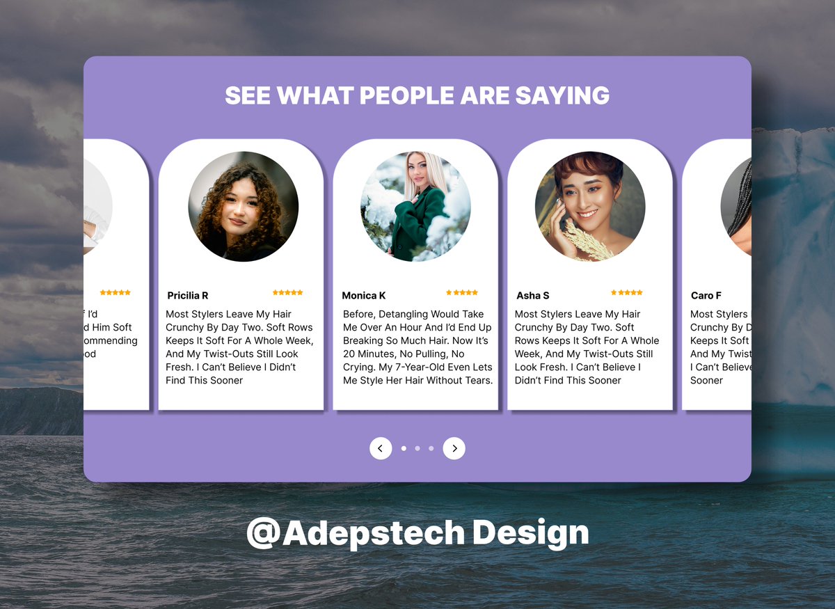
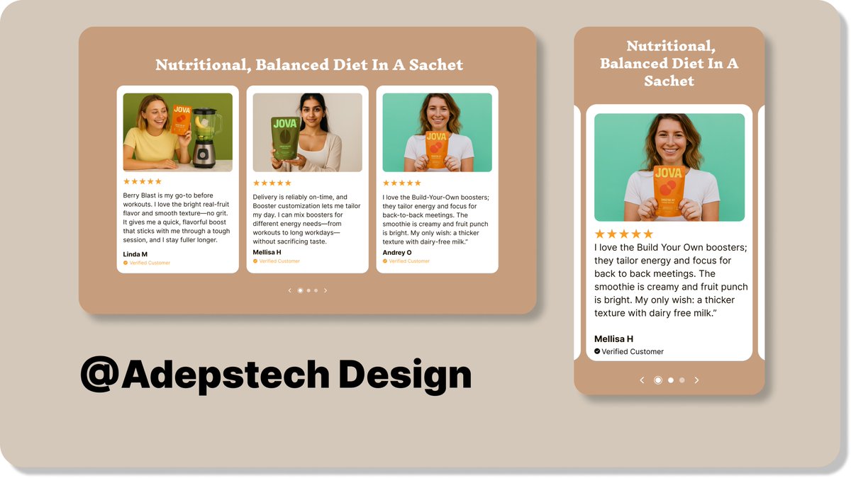
The number of brands that exclude the review area still astounds me. Instant credibility comes from actual people sharing real results. It sells better than any advertisement, so let your consumers speak for you. Need one like this for your brand? Dm #ecommerce #Brandsowner
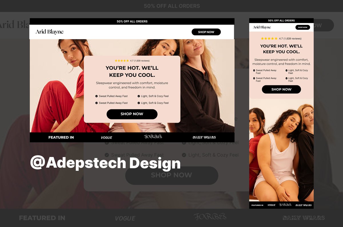
When a product detail page feels right, everything falls into place, trust builds, conversions rise, and the brand comes alive. That’s exactly what I aimed for with this Arid Blayne PDP I designed on @figma . Need one like this? DM


United States เทรนด์
- 1. #ForTT_Telegram_sam11adel N/A
- 2. Broncos 48K posts
- 3. Happy New Month 241K posts
- 4. Mariota 13.3K posts
- 5. Commanders 33.6K posts
- 6. Bo Nix 10.2K posts
- 7. #BaddiesUSA 27.7K posts
- 8. Riley Moss 2,302 posts
- 9. #RaiseHail 5,814 posts
- 10. #ITWelcomeToDerry 21K posts
- 11. Washington 120K posts
- 12. Treylon Burks 12.6K posts
- 13. Root 41.1K posts
- 14. Chrisean 10.2K posts
- 15. Dolly 14.9K posts
- 16. #RHOP 13.1K posts
- 17. Deebo 3,150 posts
- 18. Ertz 3,133 posts
- 19. Bobby Wagner 1,071 posts
- 20. Dan Quinn N/A
Something went wrong.
Something went wrong.