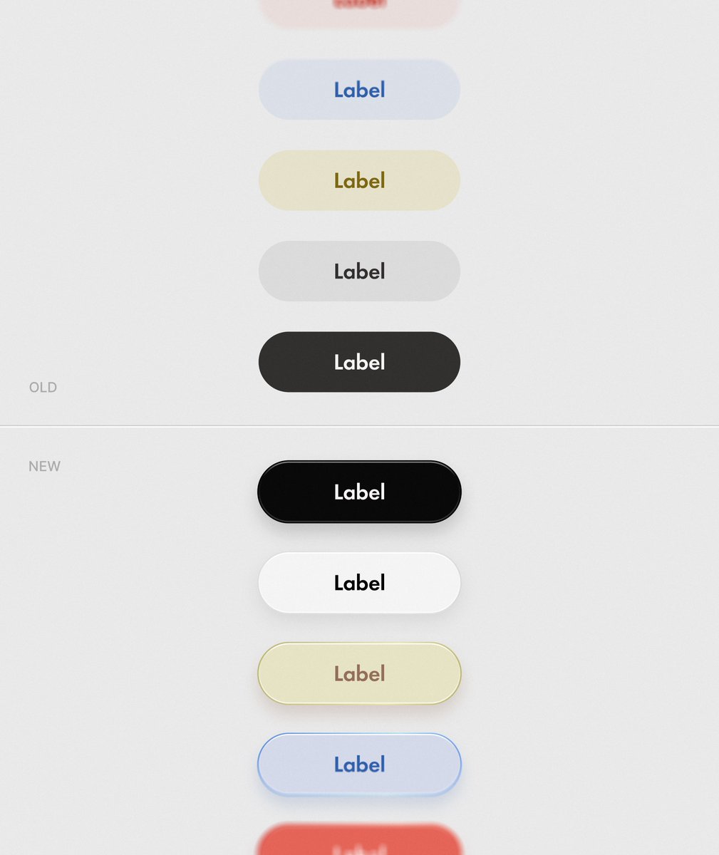
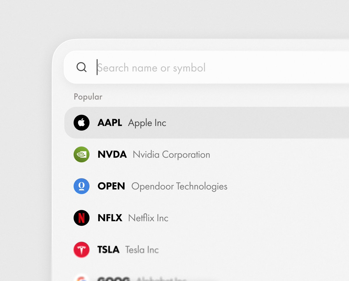
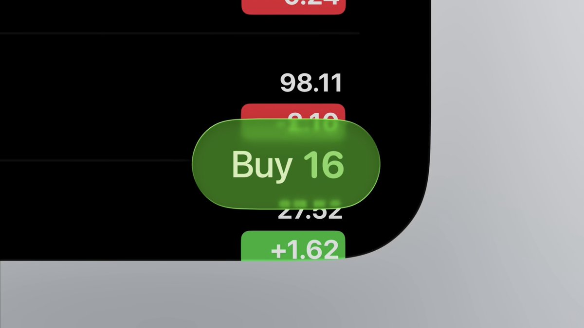
Early explorations of Wealthsimple’s new design direction. Still lots we can't share yet, but some exciting things ahead.

3-step design feedback hierarchy: First pass: Does it solve the problem? Second pass: Is it consistent with the system? Third pass: Is it aesthetically strong? Most junior designers reverse this. Big mistake. Always always start with solving the business problem.
another year of making. catch you in 2026 🦦 highlights from 25
year 2 of playful ideas my favorites from 2025…
Holy shit, Cursors visual browser editor is amazing Well done!!
Most designers spend 3 months perfecting pixels nobody cares about. I ship apps in 28 days because I focus on what actually moves the needle: business outcomes. Design - at its core - is visualized business strategy.
Give me a shopping app that looks like this, and I will spend my money on it.


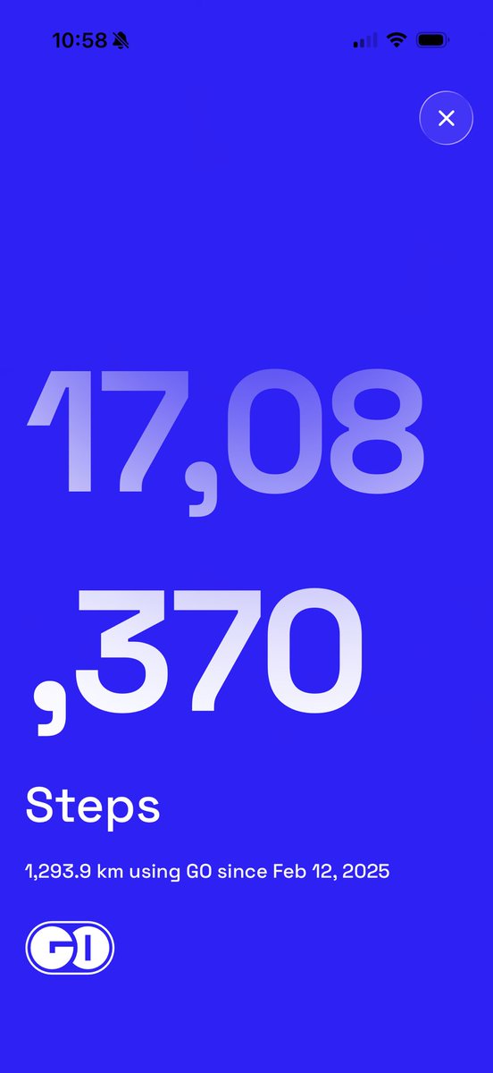
+ Added shareable cards! You can now share your today or overall step stats using our template or your own photo!
Okay, let’s do this. If your step count is higher than mine, share a screenshot in the comments and tag @goclub_app First 3 (or 3 picked at random) win a 1 year subscription.
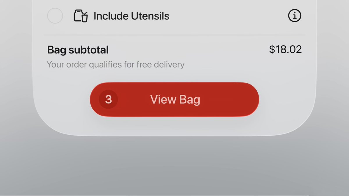
Using the blur trick for optical alignment
The latest App Store screenshots I designed 🍭 Grateful for all my amazing clients!
Made with @motiondotdev
New addition to the Design Engineer’s Gallery → Slider Component Featuring: › Fluid and stepped sliding modes › light ↔︎ dark theme › Elastic-like physics when over-dragged Play with it live → designengineer.lorenzodossi.com
Stop designing for other designers. Your users don't care about your 8px grid system or perfectly aligned spacing. They care about: Does this make sense? Can I complete my task quickly? Am I confident clicking this button? That's it. I've shipped products with "imperfect"…
I’ve been on iOS 26 since the first public beta. I just help someone with the previous iOS and by golly I didn’t realize how much I missed it. I actually don’t want UI elements morphing around and switching from light to dark based on what I’m scrolling past. UI should “get out…
Product sense
We're testing a new link experience, starting on iOS -- to make it easier for your followers to engage with your post while browsing links. For creators, a common complaint is that posts with links tend to get lower reach. This is because the web browser covers the post and…
slowed visual of the transition: I used an arc transition (inspired by Origami Studio) to compress on the initial tap before springing up into place for a little bit of dynamism.
United States Trends
- 1. Rams 56,4 B posts
- 2. Falcons 49,5 B posts
- 3. JIANKUI HE N/A
- 4. #HealingServiceDay1 22 B posts
- 5. Stafford 39,6 B posts
- 6. quinn 45 B posts
- 7. Camp Haven 9.021 posts
- 8. Dane 15,2 B posts
- 9. Bijan 31,9 B posts
- 10. Puka 21,5 B posts
- 11. #NewYearsAdviceFromTeyvat 2.160 posts
- 12. #GenshinMoonInvitation 2.179 posts
- 13. #WWERaw 51,3 B posts
- 14. #KingRezaPahlavi 67,4 B posts
- 15. Hudcon 12,5 B posts
- 16. Drake Maye 23,2 B posts
- 17. FDV 5min 1.802 posts
- 18. $LIT 10,1 B posts
- 19. QUICK TRADE 1.364 posts
- 20. Smart Money - Buy 2.217 posts
Something went wrong.
Something went wrong.


