
You might like


Back again by popular demand! Our 10-week online workshop, Intro to Modern Type Design with @TroughtonKel, will run again on 1/31–4/11. Create your own original typeface as you learn the methodologies and software used to produce high-quality digital type: letterformarchive.org/events/view/pu…


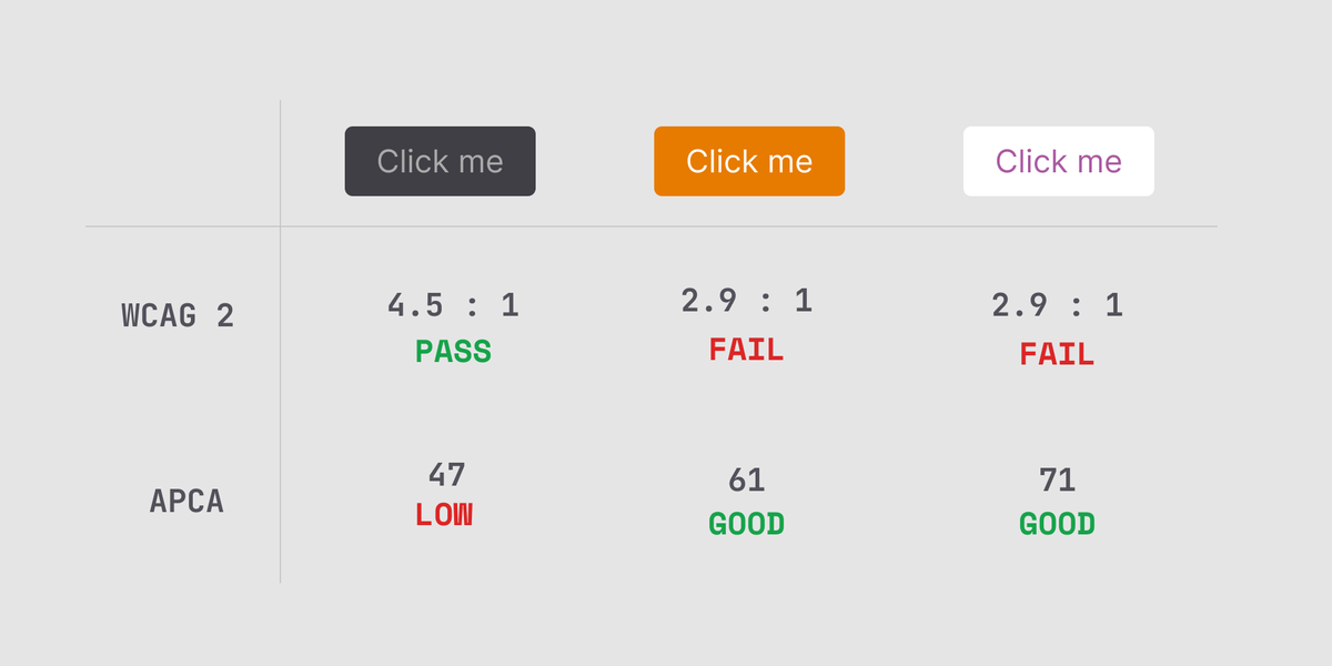
WCAG 3 will use a new color contrast method called APCA (Advanced Perceptual Contrast Algorithm). It's a big improvement over the current system but there are a lot of changes to get your head around. 🧵

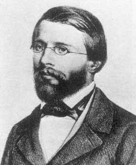
David Pocknell, my long-standing friend since the mid-1960s has died. I have never known someone who sought perfection in everything he did. He was an orderly man of extraordinary talent who touched many lives during his time on this little planet. A sad day and a sad loss.

Very sad to hear that the designer David Pocknell has died. He had a brilliant career as a graphic designer and then developed an equally successful practice as an innovative architectural designer. He died peacefully in his sleep surrounded by family.

theguardian.com/artanddesign/g… by Tim Sumner
theguardian.com
A celebration of the humble paper bag – in pictures
Graphic designer Tim Sumner has collected more than 1,000 bags from around the world

I regularly see managers complain about the performance of certain individuals who then go on to be outstanding performers at their next job. I’ve come to the realisations that the problem generally lies with the manager rather than the person being managed.

Just because you don’t post work or share it, doesn’t mean you’re not making an impact, growing or producing your best work. The only validation you need is the satisfaction that each new day is a new opportunity to be better than the person you were the day before.

Last year I created a library of brand iconography for PayPal Business. See here; grundini.com/index/work/pro…


When U&lc went from black and white to colour and lost typographic control and judgment it was over. Open the covers of these b/w versions and you see Herb Lubalin, Aaron Burns, Tony DiSpigna, Ed Benguiat, et al and you know you’re in safe hands. The rest are off for recycling.


Aardman’s @JamFactory: ‘I’m enthralled by the connection people have with our characters’ trib.al/aGjq7G8
inews.co.uk
Aardman's Gavin Strange: 'I'm enthralled by the connection people have with our characters'
Gavin Strange, director and designer at Aardman, talks Wallace, Gromit and the magic of turning clay into emotion


So very sad to hear of Sir Terence’s passing. He did so much for Design and through it for all of us - our homes, our culture and our society. RIP Terence. BBC News - Sir Terence Conran: 'Visionary' designer dies at 88 bbc.co.uk/news/uk-541312…
bbc.co.uk
Sir Terence Conran: 'Visionary' designer dies at 88
The founder of Habitat "revolutionised the way we live in Britain", his family say in a statement.
This... Hands Across the Sea: Connection Through Graphic Design with Pentagram - YouTube youtube.com/channel/UCnQ7z…

It’s been 10 years since Sketch first launched! Over the next few months, we’re inviting you to celebrate #10YearsOfSketch with us. Keep an eye on our social media for giveaways, limited edition swag, and a few walks down memory lane 😉 Which version of Sketch was your first?

‘A brilliant co-mix of text and graphic design in which sign, symbol and word are linguistically intertwined and reinvented.’ @thedailyheller Join us online on 2 September to hear the story behind @rianhughes’ brilliant new book ‘XX: A Novel, Graphic’ sbf.org.uk/whats-on/view/…

Text presented white-on-black appears larger and bolder than text set black-on-white. Darkmode’s two variations have been crafted to provide typographic consistency between modes. Read more and try now at daltonmaag.com/darkmode #DarkMode
Using unpublished, reordered, remade, refound or newly created artworks these limited edition magazines are a quick-fire collaboration between @c_ll_ct_v_ly and a range of creatives. c-visuals.online grundini.com/index/work/pro…

The art direction is over-trendy, It doesn’t communicate and actually gets in the way of a terrific fact

This one tonne block of water was on display at Tower Bridge. It's a fantasically simple way of illustrating what you're fighting against if you get in the river. But, whilst I do like this kind of typography normally, they made it so hard to read..... (h/t u/robslondon)


United States Trends
- 1. #LingOrm1st_ImpactFANCON 600K posts
- 2. Talus Labs 24.7K posts
- 3. #BUNCHITA 1,505 posts
- 4. #KirbyAirRiders 1,954 posts
- 5. Frankenstein 82.9K posts
- 6. Giulia 15.7K posts
- 7. taylor york 9,055 posts
- 8. #SmackDown 48.6K posts
- 9. #River 4,880 posts
- 10. Tulane 4,499 posts
- 11. Ketanji Brown Jackson 4,854 posts
- 12. Pluribus 31.4K posts
- 13. Aaron Gordon 5,305 posts
- 14. Justice Jackson 6,205 posts
- 15. Russ 14.4K posts
- 16. Tatis 2,261 posts
- 17. Connor Bedard 3,252 posts
- 18. Guillermo del Toro 26.1K posts
- 19. Keon 1,255 posts
- 20. Supreme Court 181K posts


Something went wrong.
Something went wrong.