
내가 좋아할 만한 콘텐츠


😓 UI design is hard, but it doesn't have to be 🥳 A lot of what makes up an intuitive, accessible, and beautiful interface design can be learned. Let’s quickly redesign an example interface using 16 logical design tips 👇

⚡️ UI design tip - Use a typeface with taller lowercase letters The height of lowercase letters in a typeface is known as the x-height. Typefaces with a taller x-height and greater letter spacing are generally easier to read. 👇

❖ Component interactive states in my @PracticalUI Figma design system. • Default • Hover • Press • Focus • Disabled #ux #designsystem

⚡️ UI design tip - Ensure interface elements have a 3:1 contrast ratio Star ratings, like the following example, often lack sufficient contrast. Simply adding a darker border gives them sufficient 3:1 contrast, which means more people will be able to see the rating 🙌 #ux #a11y

⚡️ UI design tip: Ensure similar looking elements function similarly In this example, the “verified” badges look similar to the primary “follow all” button. They’re not interactive elements, so they should look different to the primary button to help avoid confusion. Thoughts?

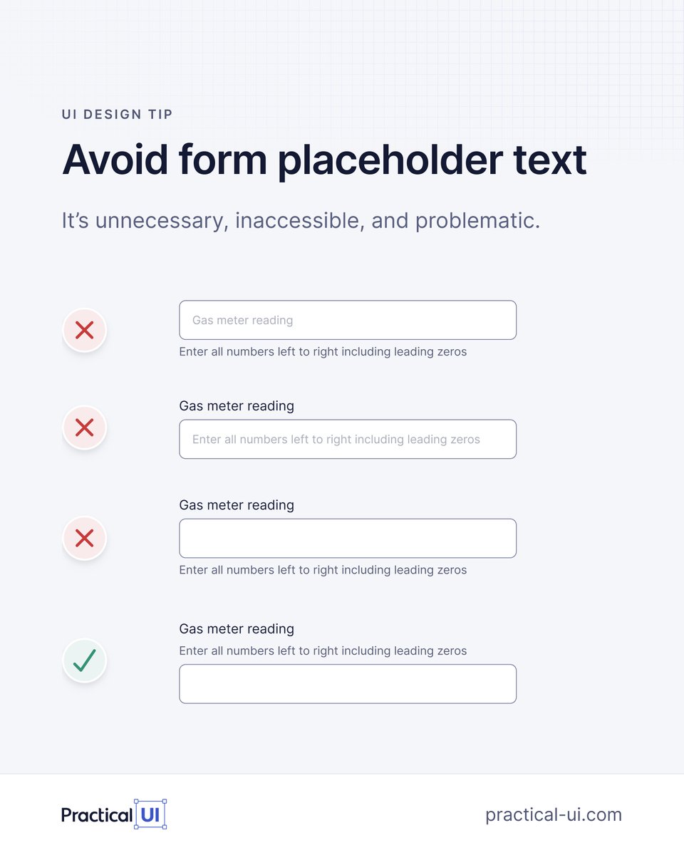
🙅♂️ Avoid form placeholder text 1. It disappears on focus so you forget what the field is for. 2. It can look like the field is filled. 3. Low contrast / inaccessible. Display label and hint above inputs so they're always visible and aren't covered by autocomplete menus.
UI design isn't magic ✨ Over nearly 2 decades working as a product designer, I’ve realised that most of my UI design decisions are governed by a system of logical guidelines. Here's a quick example of some logic-driven design guidelines in action 👇
⚡️ UI design tip: Ensure spacing looks balanced for buttons with icons Handy little Figma button trick I learned from Jordan Amblin 👇 ✅ Wrap the label in an auto layout frame with 4px padding. ✅ Apply 12px padding to the button. ✅ Apply a boolean to the icon.

🎨 UI design tip: Name colours based on how they're used Here's my simple but powerful token naming structure to keep colours organised 👇 [element.tone.emphasis.state] This is just 1 of 100+ guidelines from my @PracticalUI design book. Get 40% off this Black Friday week 🙌
![AdhamDannaway's tweet image. 🎨 UI design tip: Name colours based on how they're used
Here's my simple but powerful token naming structure to keep colours organised 👇
[element.tone.emphasis.state]
This is just 1 of 100+ guidelines from my @PracticalUI design book. Get 40% off this Black Friday week 🙌](https://pbs.twimg.com/media/GdeojrNXkAAHJyc.jpg)
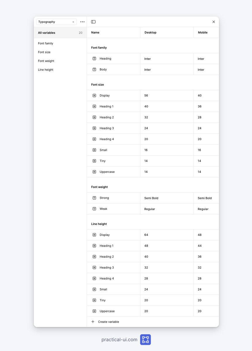
❖ How to create typography variables in Figma👇 Text styles use variables for: ◆ Font family ◆ Font weight ◆ Font size ◆ Line height Makes it faster & easier to customise typography. From my @PracticalUi Figma design system. What do yours look like?
🚨 40% off my UI design book @PracticalUI this week only 🥳 Ends Monday 27 November at midnight EST Link below 👇 PS I'm working on adding some free updates to the book as well as a Figma design system that follows the book's guidelines 🙌 #ux #uxdesign

💥 16 little UI design rules that make a big impact UI design might appear to be a magical art form, but a lot of it is made up from logical rules or guidelines. We’ll redesign an example interface using 16 of 100+ guidelines from my book - @PracticalUI A mega thread👇

🚨 Launch alert 🚀 My UI design book @PracticalUI 📘 is live on @ProductHunt 🥳 I spent thousands of hours over 1.5 years crafting a book to teach anyone how to design user interfaces using logical rules. I'd love your support and feedback. Thanks 🙏 👉 producthunt.com/posts/practica…


United States 트렌드
- 1. Bills 118K posts
- 2. Falcons 34.9K posts
- 3. Josh Allen 16.3K posts
- 4. Bijan 21.3K posts
- 5. Snell 6,273 posts
- 6. phil 136K posts
- 7. Bears 51.1K posts
- 8. Joe Brady 3,447 posts
- 9. Caleb 33.7K posts
- 10. Drake London 5,661 posts
- 11. Freddie 14.3K posts
- 12. McDermott 4,945 posts
- 13. #NLCS 7,225 posts
- 14. Chris Moore 2,001 posts
- 15. Commanders 33.1K posts
- 16. #RaiseHail 5,531 posts
- 17. Penix 5,413 posts
- 18. Dan Quinn 1,112 posts
- 19. James Cook 3,638 posts
- 20. Matt Gay N/A
내가 좋아할 만한 콘텐츠
-
 Adham Dannaway
@AdhamDannaway -
 Andrew Hart
@AndrewHartAR -
 ClickHouse
@ClickHouseDB -
 Attila Vaszka | Webflow Developer & Designer
@attilavaszka -
 Sage Canaday
@SageCanaday -
 Lightfield
@lightfld -
 Jen Abel
@jjen_abel -
 Werner Keil
@wernerwedge -
 Hiroki Sayama
@HirokiSayama -
 💀Kennytv.eth 📺✘🌟| themoonverse.io
@moonhunterken -
 Jennifer Reif
@JMHReif -
 Aaron Shirk
@aaronshirkmusic -
 Chris Tourtellotte
@CTourtellotte -
 Kent Barber
@kentbarber -
 Avi Patchava
@avipatch
Something went wrong.
Something went wrong.