
Aruodore
@coding_this
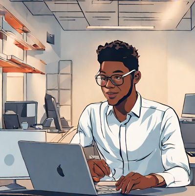
Web & Systems Dev • Go / 3D WebGL Artist • reach me at [email protected] Building @getqrcode

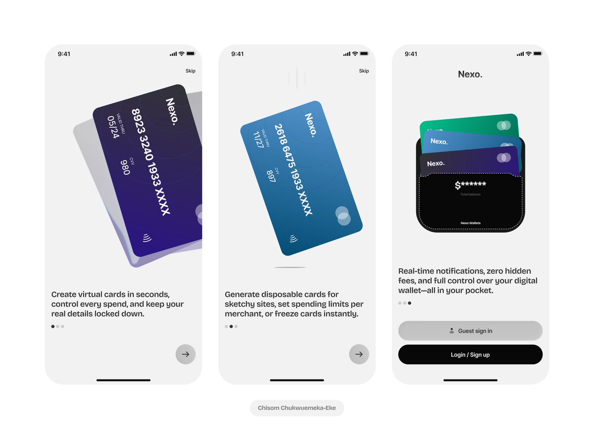
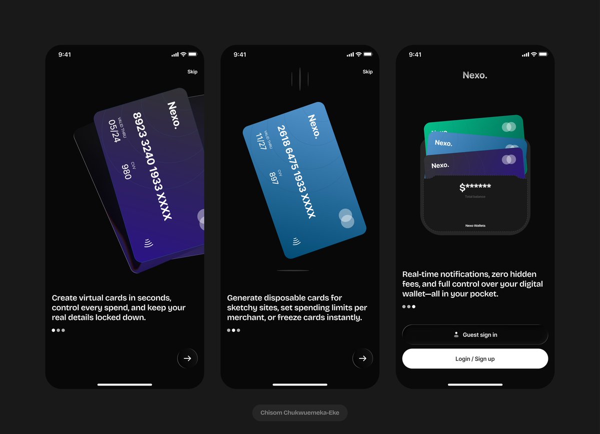
Nexo cards home page Trying to explore glassmorphism on this project What do you think?

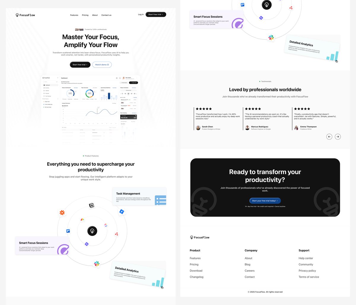
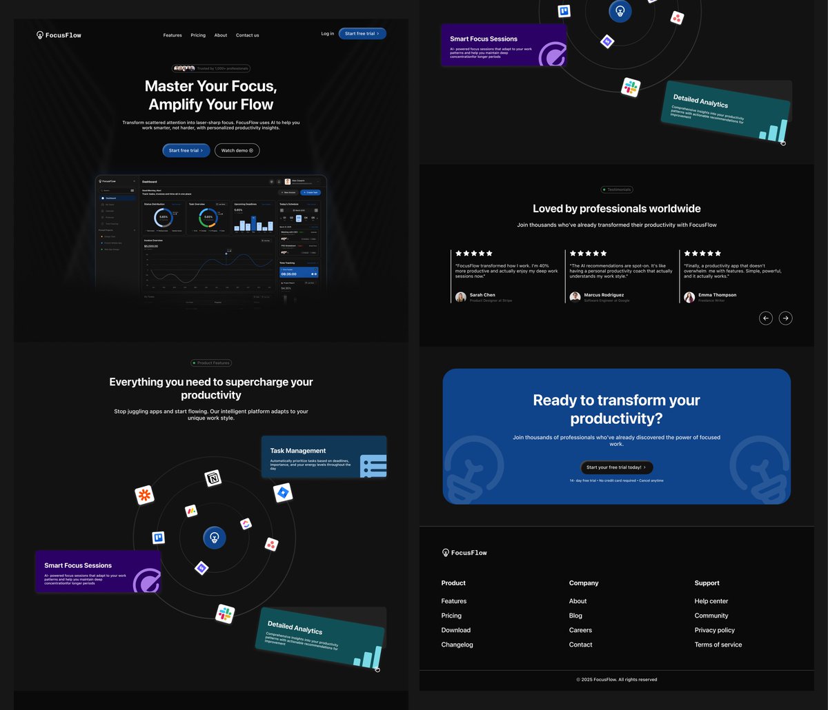
A landing page I designed for Focus Flow — A productivity app Which looks better; Light mode or Dark mode?
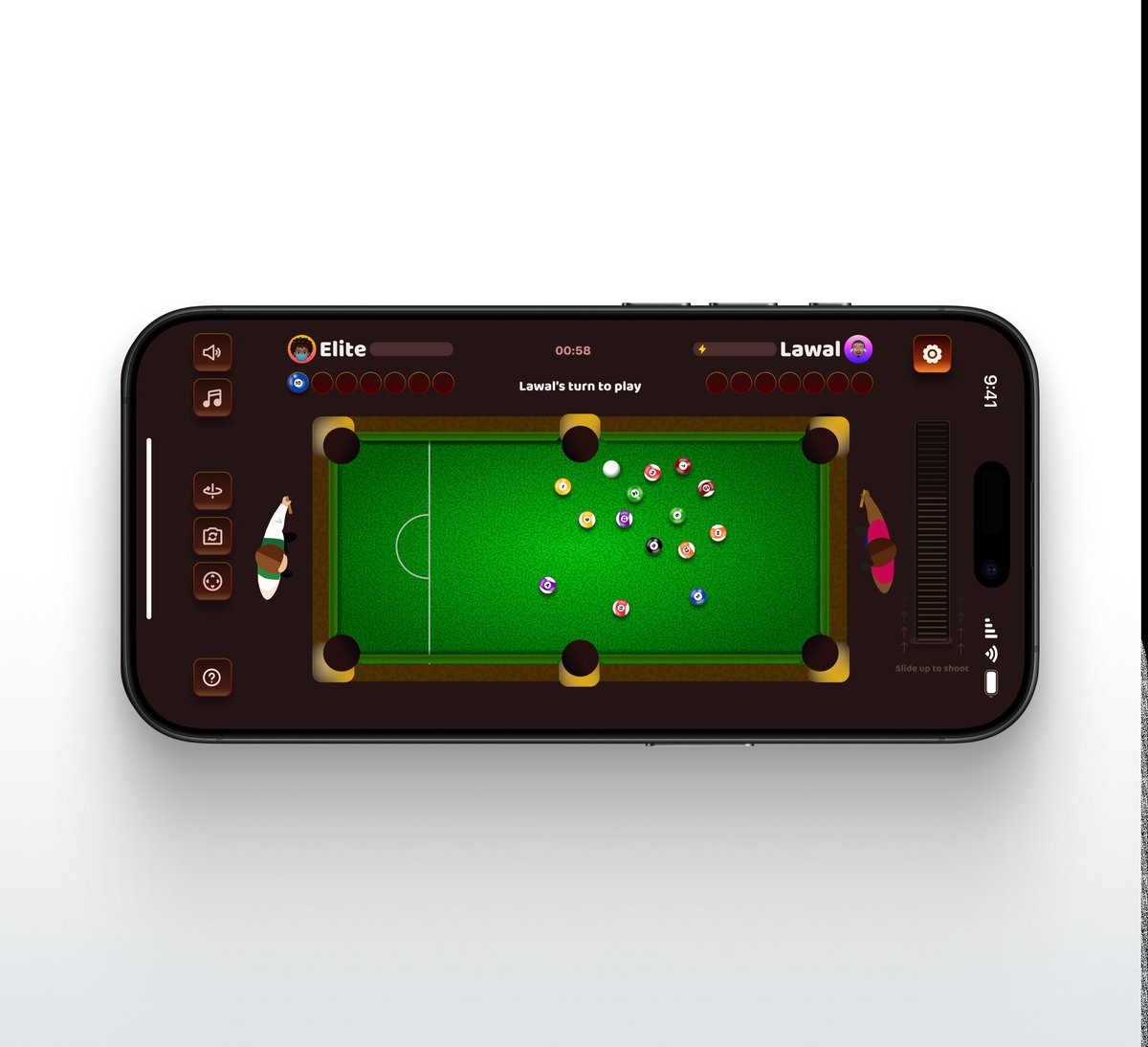
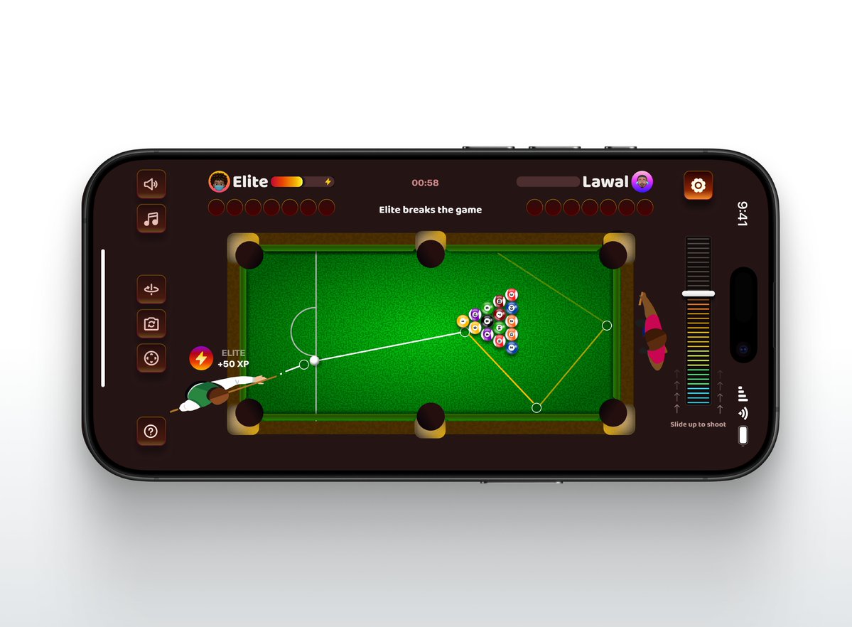
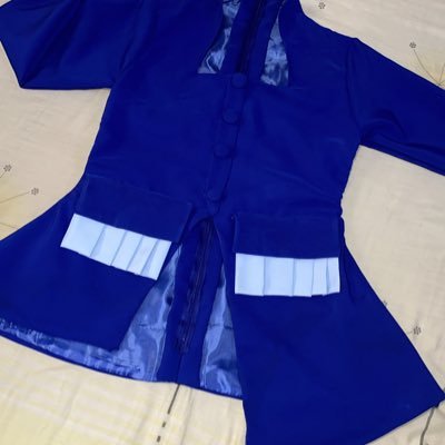
Lawal's turn to play🎱
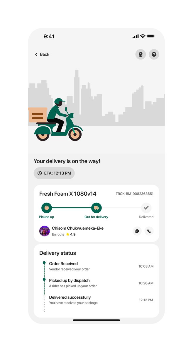
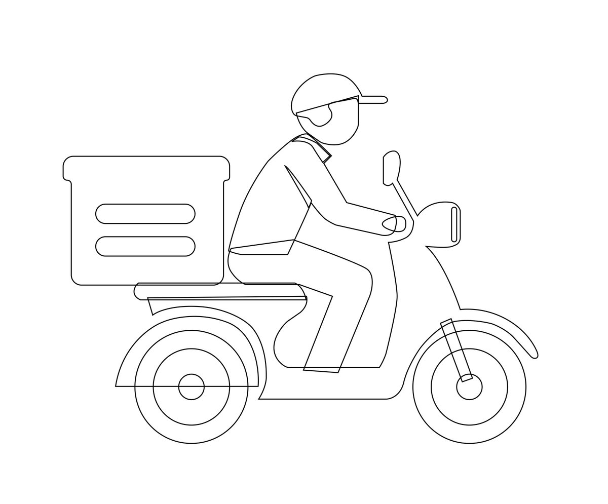
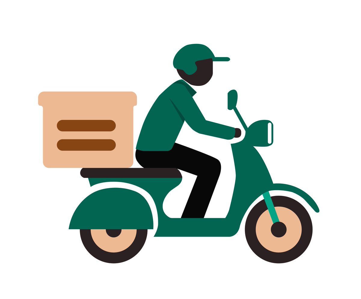
Been playing with micro-interactions in product design lately Here’s a delivery screen I illustrated + designed + animated 😂 Would love to hear your thoughts!
UI done! Animation next😁
One of the reasons I love being a designer is because I can randomly think of something enter Figma and bring it to life🤭

Of course there’s light mode👩🏾🍳

Hey X 👋🏽 I’m Chisom, a Product Designer with experience designing fintech apps, dashboards, AI products, onboarding flows, and full product experiences for startups. Over the years, I’ve worked on: - Fintech products - SaaS dashboards - AI-powered products - Health & EdTech…


We don't stop cooking. A few shots from an ongoing project we’re building at the studio for Bech 32 ✨
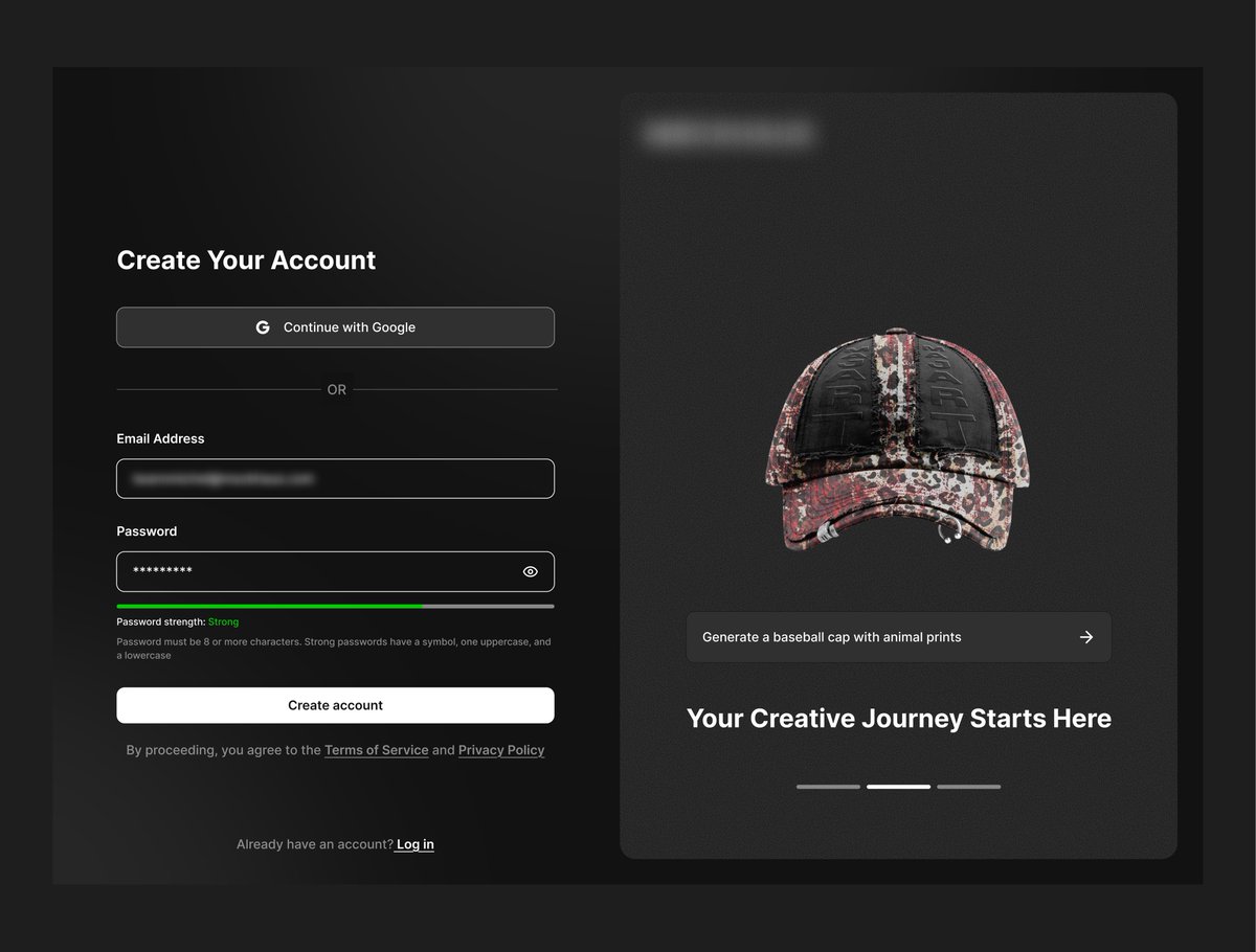
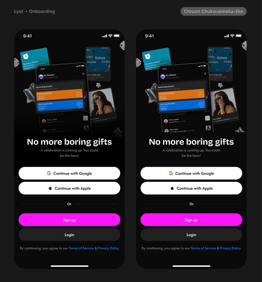
Sign up screens for a project I finished in August. Dev in progress 👩🏾🍳

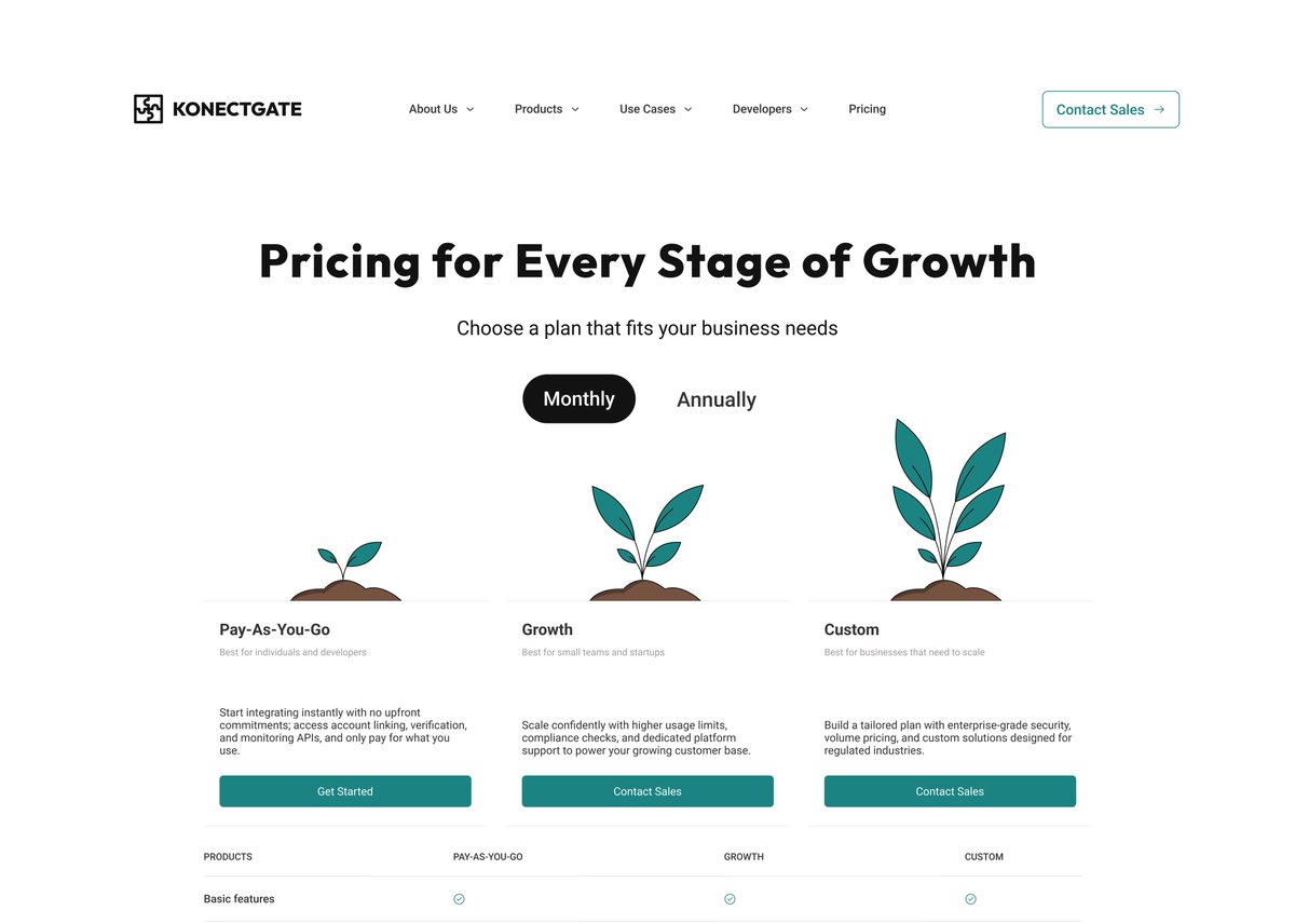
Pricing page for konectgate 🧍🏾♀️
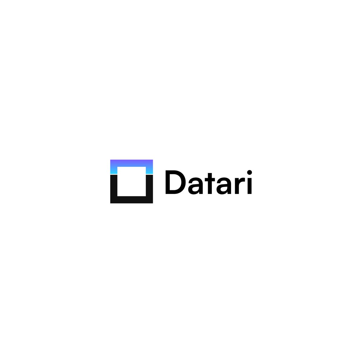
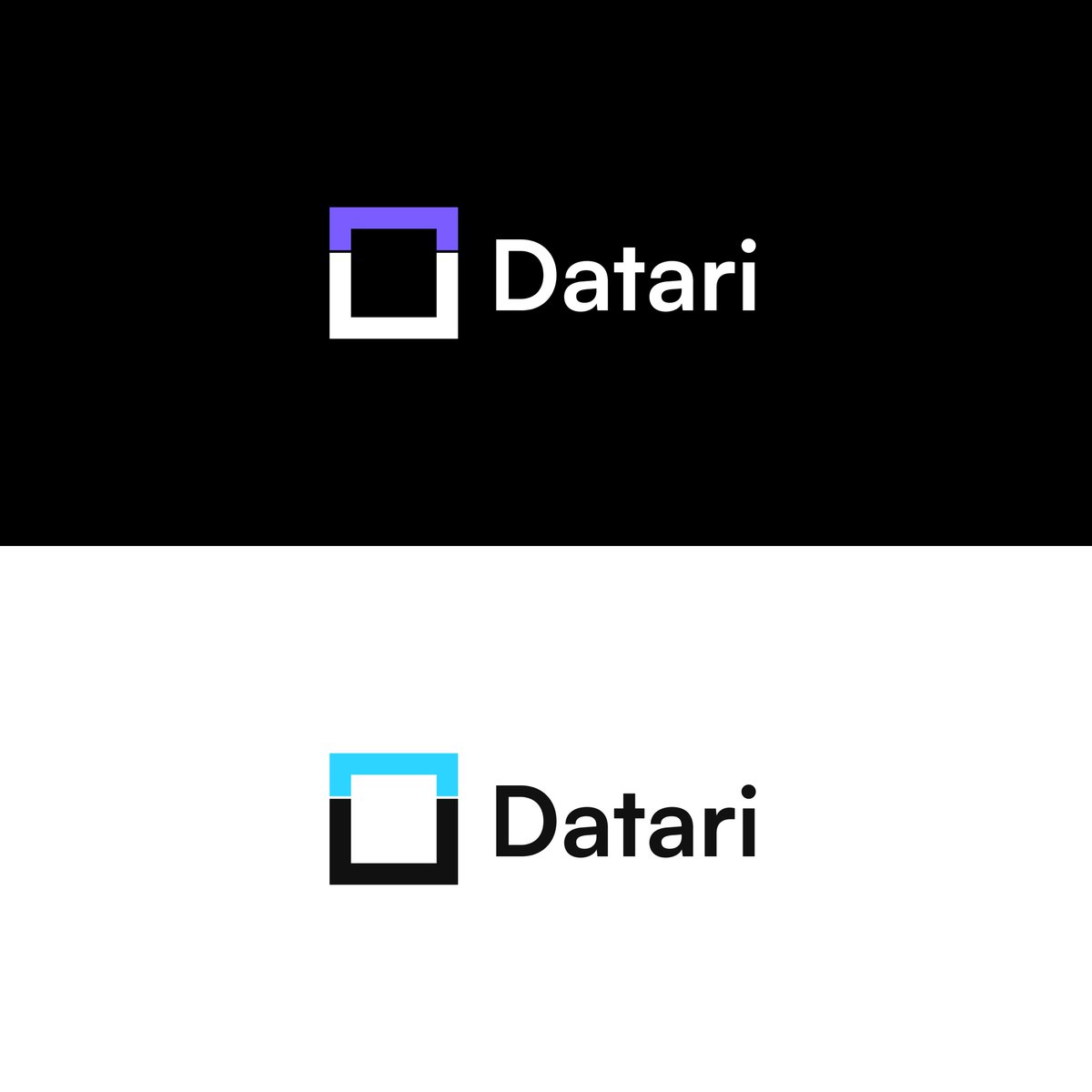
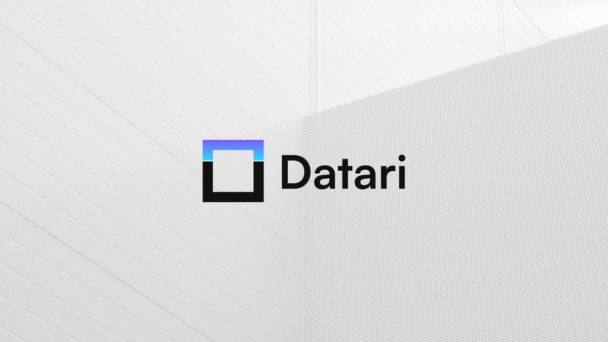
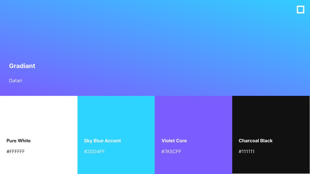
Datari Branding ⚡️🔵🟣 Seeing the system come alive across screens, icons, print, and everyday interactions. A clean, modern identity built for intelligence, clarity, and real-time security.
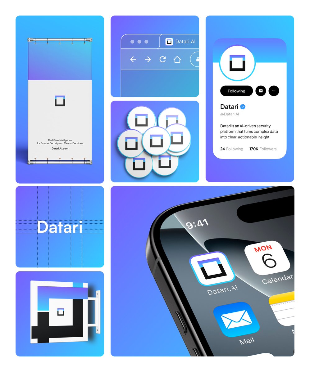
A minimal mark, a bold foundation, and a gradient that represents constant data flow. Logo + color palette locked in. On to the next phase.
Hi guys, I’m working on a project and I need help deciding between A and B 🧎♀️

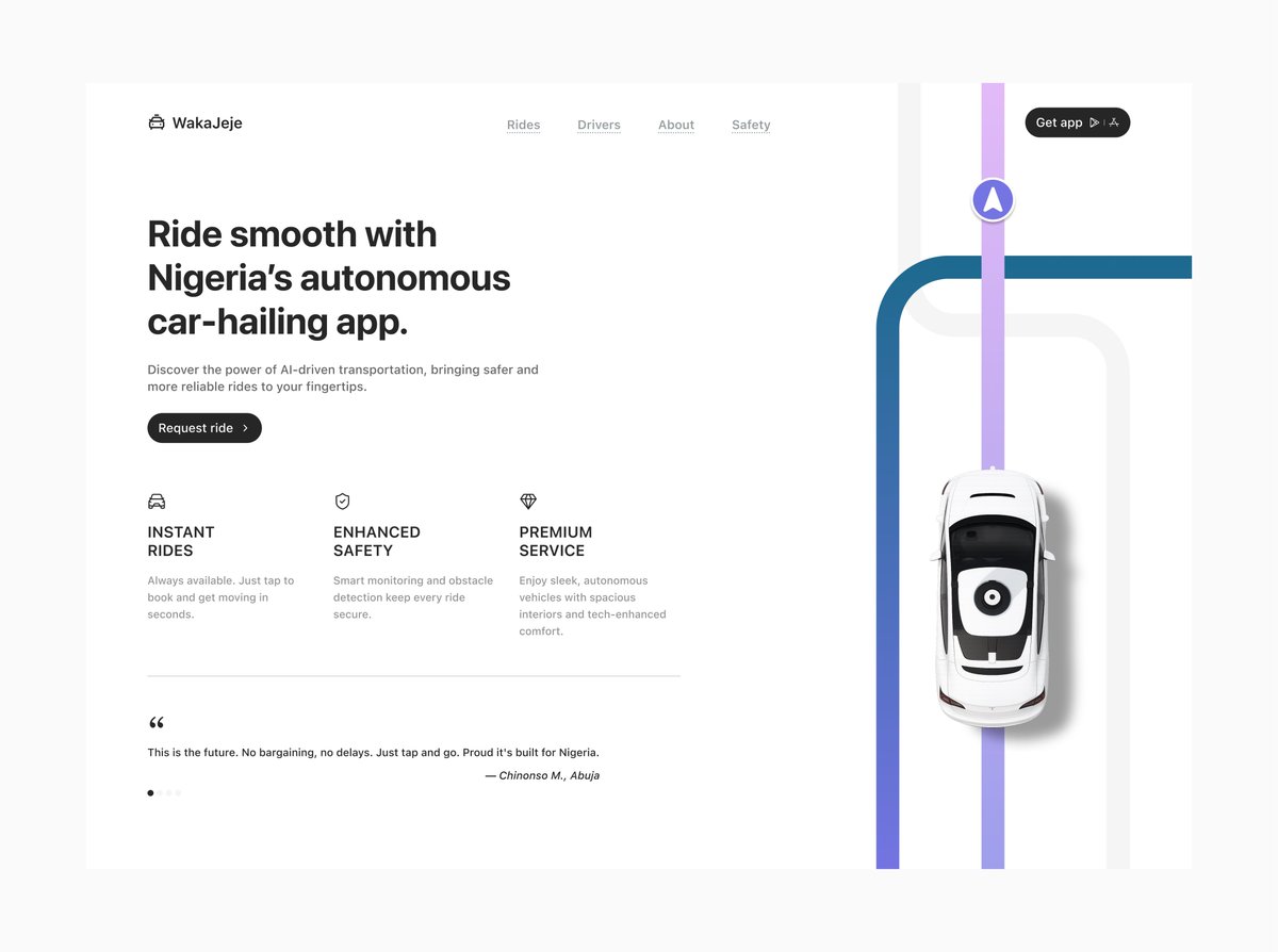
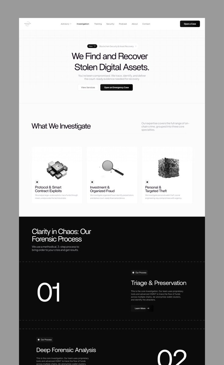
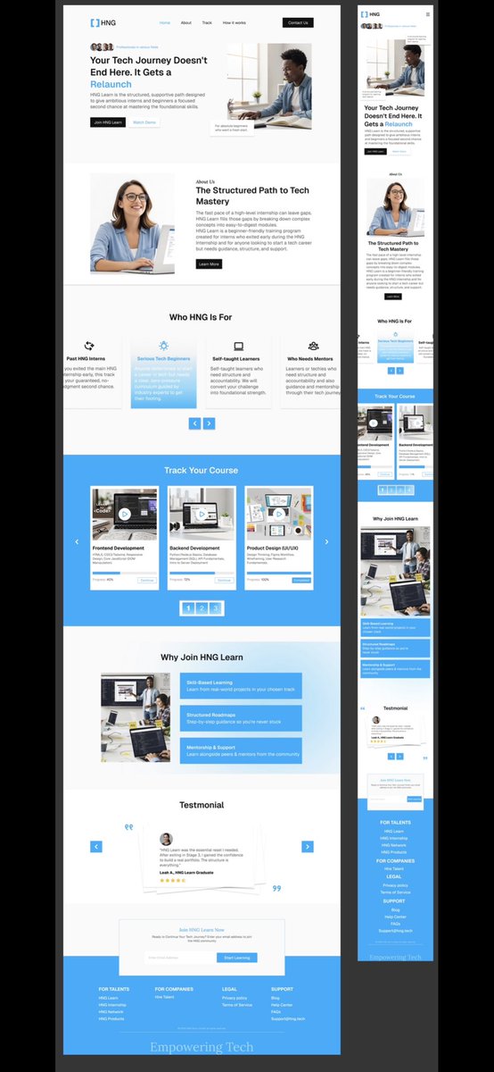
A trustworthy QR code service shows the customer where they are going *before* they commit. No blind leaps of faith. Transparency in the digital journey builds immediate trust in your brand integrity. Security should be visible, not just promised.
I have been experimenting with Mono, Serif, Slab and just anything but Sans Serif for interface design In select cases, i use these typefaces throughout - but in most cases, i use them side-by-side a suitable sans serif type In this case, i'm using the Roboto family - Roboto as…


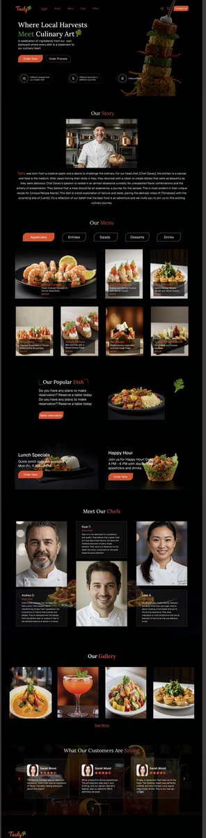
Just wrapped up this landing page for a modern restaurant. What do you think of the design?


United States Trendler
- 1. Comet 27.1K posts
- 2. Amorim 51.9K posts
- 3. Fame 55.1K posts
- 4. Letitia James 11.2K posts
- 5. TPUSA 81.5K posts
- 6. Ugarte 13.4K posts
- 7. Matt Campbell 1,073 posts
- 8. Sun Belt Billy N/A
- 9. Eurovision 178K posts
- 10. Ingram 2,447 posts
- 11. Spaghetti 10.5K posts
- 12. fnaf 2 16.8K posts
- 13. Sac State N/A
- 14. Manchester United 48.8K posts
- 15. West Ham 46.8K posts
- 16. Obamacare 29K posts
- 17. Brennan Marion 1,633 posts
- 18. Faulkner 2,727 posts
- 19. #TNFonPrime 1,116 posts
- 20. #MUNWHU 7,668 posts
Something went wrong.
Something went wrong.