
Dholiya Deep
@cx_deep_
Product Designer | UX/UI Specialist driving 40% higher user satisfaction | Expert in User Research & High-Fidelity Prototyping | Figma Advanced
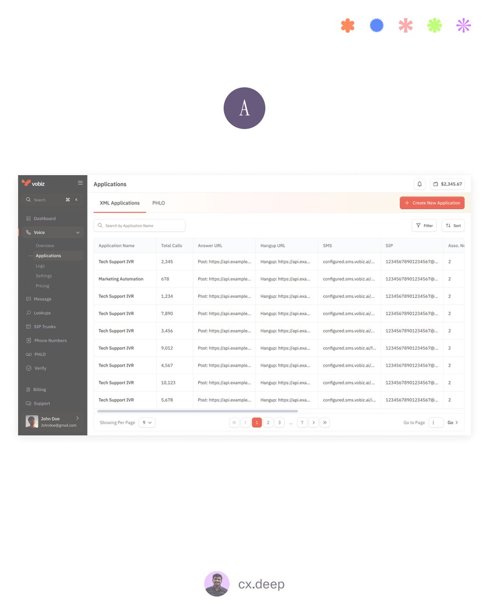
A/B Testing My XML Application Page — Need Your Feedback 👇 I’m testing two different layouts for the XML Applications page, and both solve the same problem in very different ways. Here’s the breakdown: Version A — Table-First Layout - Shows all XML applications in a clean…

The design industry is changing faster than we think. Not because of new tools — but because of new expectations. Today, users want: - Instant clarity (no guessing what your product does) - Context-aware interfaces (personalized, not generic) - Effortless workflows (fewer…
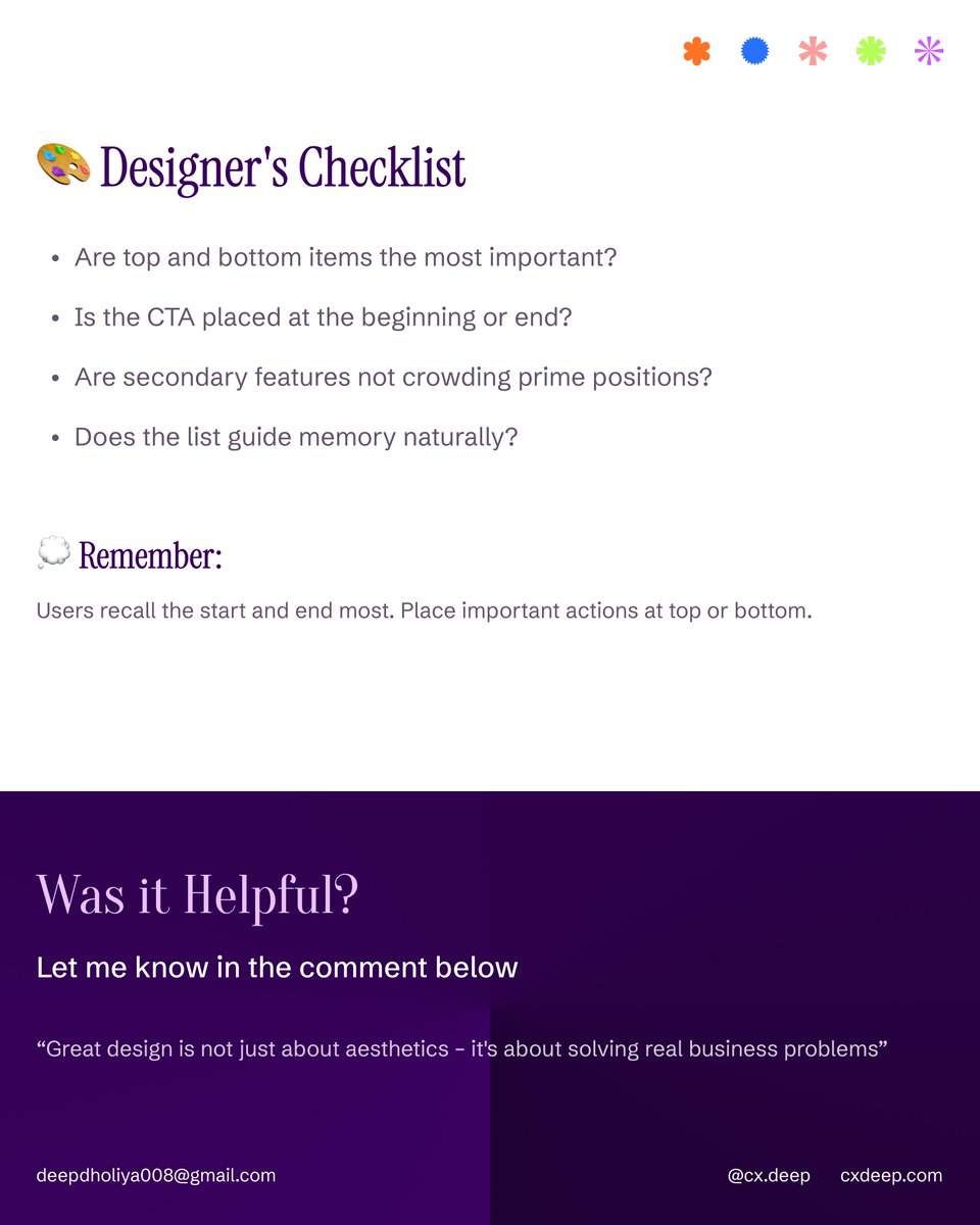
Ever wondered why users click the first or last button — but ignore the middle ones? That’s the Serial Position Effect at work. Users remember the start and end, not what’s in between. Here’s how to apply it in UX 👇 - Top = Prime Spot: Place your most important actions first…


I’ve noticed this in a lot of projects lately — founders or teams say, “Let’s just tweak the messaging. The design’s fine.” But here’s the thing — design and copy aren’t two different layers. They’re two sides of the same story. When you change what you say, you automatically…
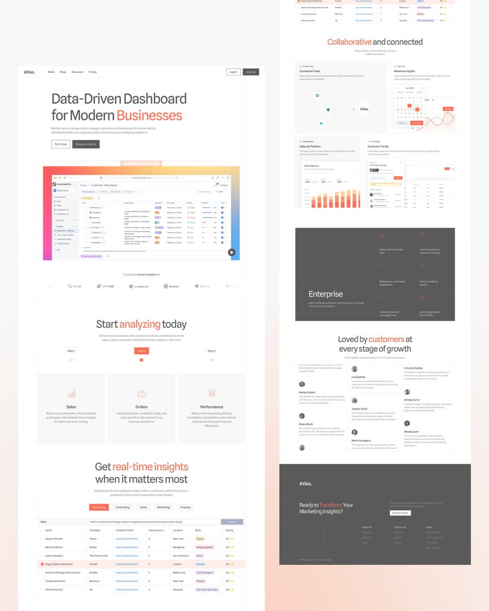
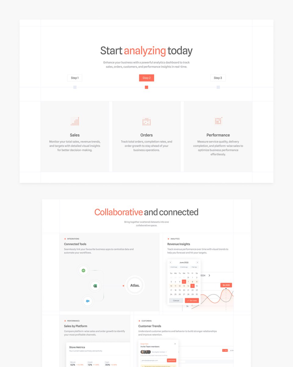
Modern Business Landing Page Crafted a clean and data-driven landing page focused on clarity, contrast, and conversion. Every section is designed to guide the user seamlessly — from discovery to action. - Strong visual hierarchy - Clear call-to-actions - Balanced typography &…

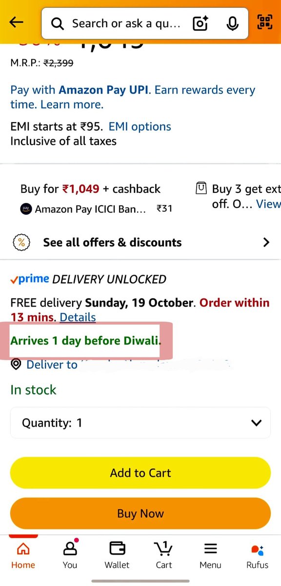
Sometimes, great UX isn’t about design — it’s about words. ✨ Today while purchasing a shirt on Amazon, I noticed something subtle but genius in their UX writing. Right below the delivery info, it said: “Arrives 1 day before Diwali.” That’s it. One simple line — but incredibly…
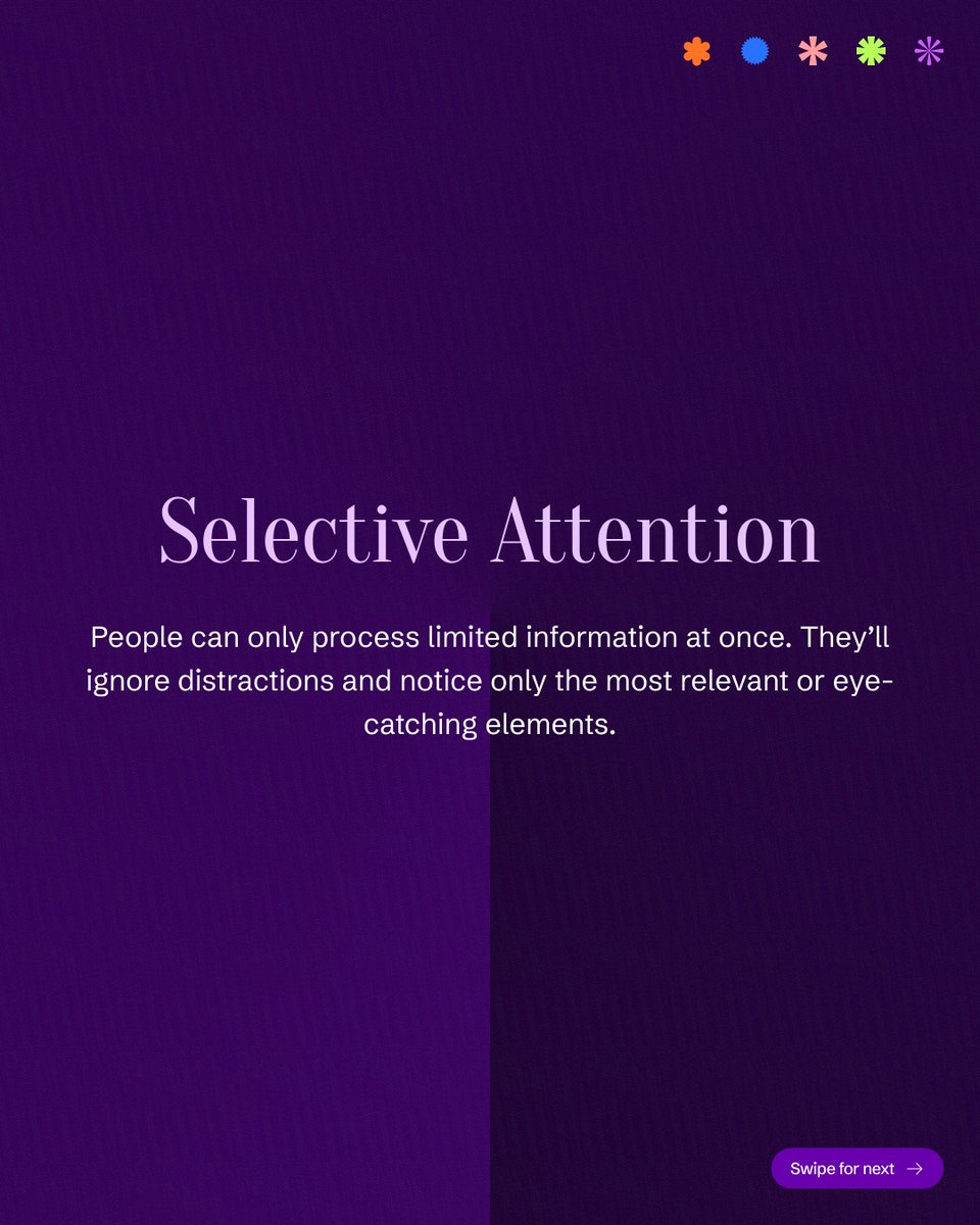
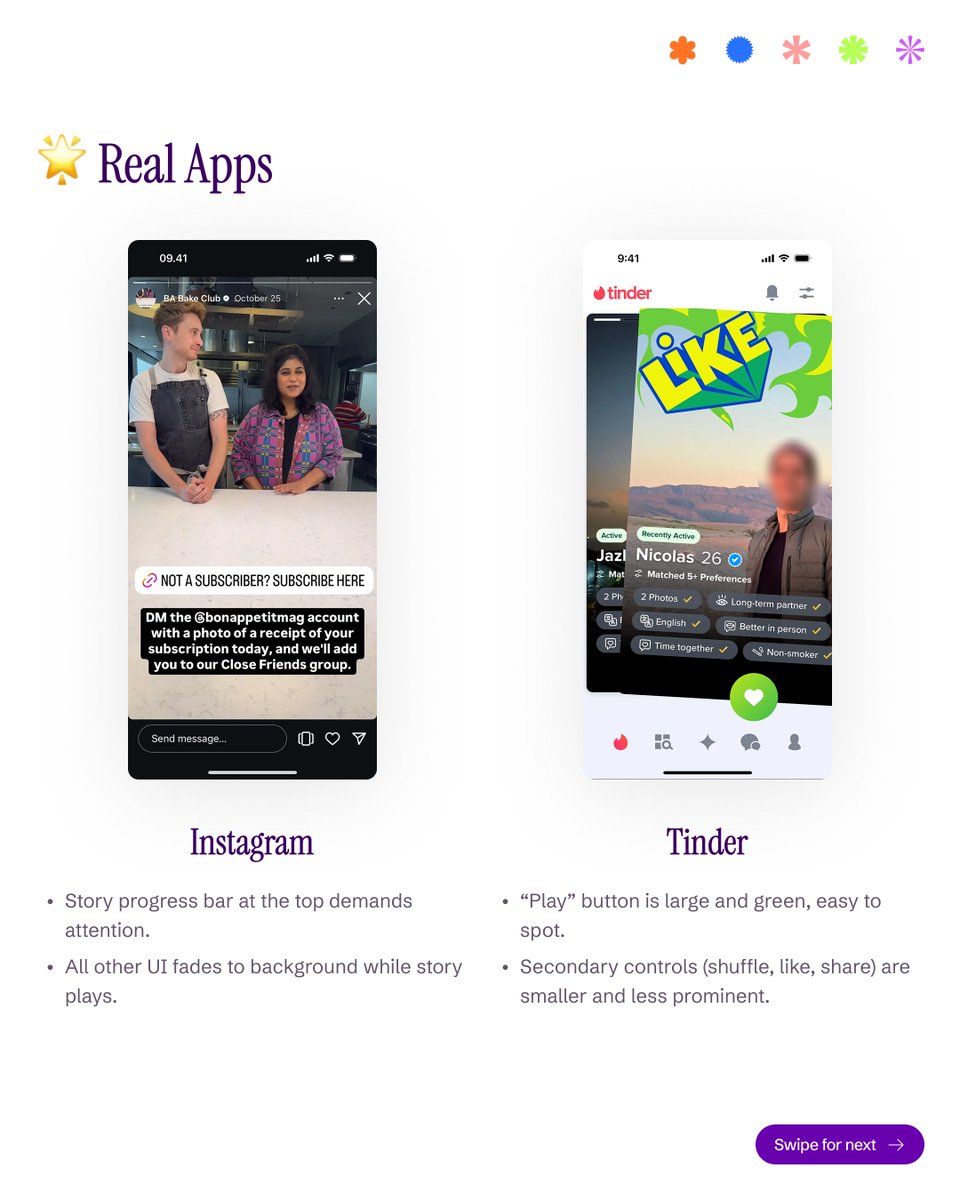
Your users don’t see everything — they see what stands out. 👀 Selective Attention in UX is all about focus. When everything screams for attention, users hear nothing. Guide their eyes with contrast, motion, and clarity — not clutter. #uxdesign #uidesign #lawsofux…


Sleek dark UI with neon highlights and soft gradients crafted for a futuristic tech vibe. #DesignCommunity #NEON #gradients #figmadesign #figmacommunity #UIDesign #UXDesign
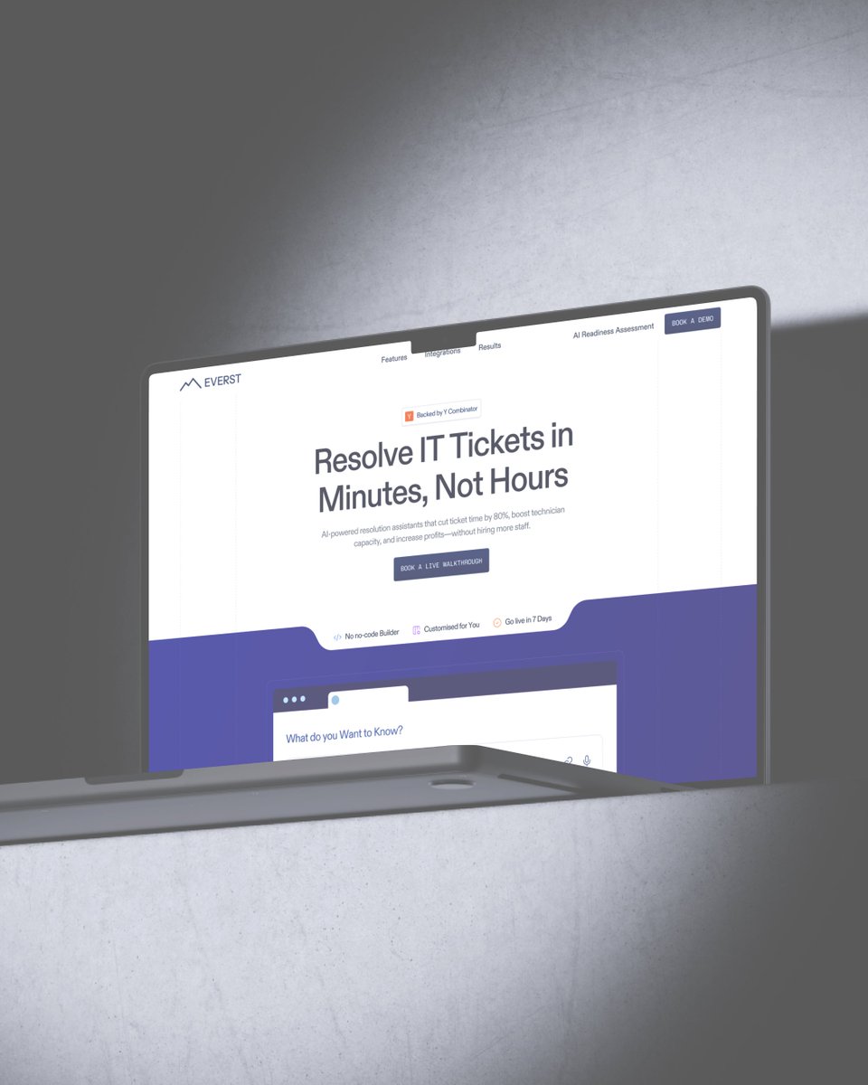
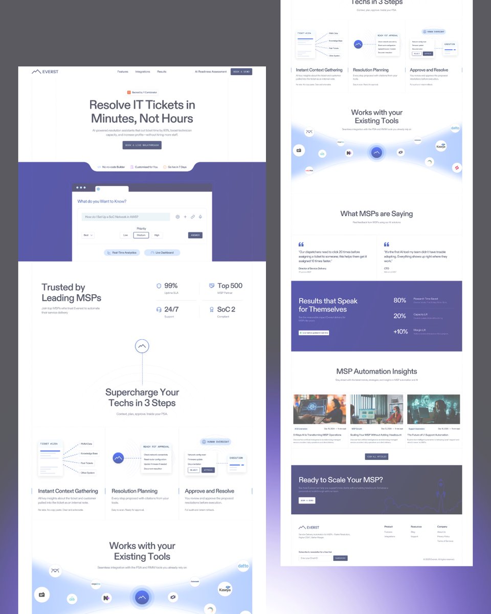
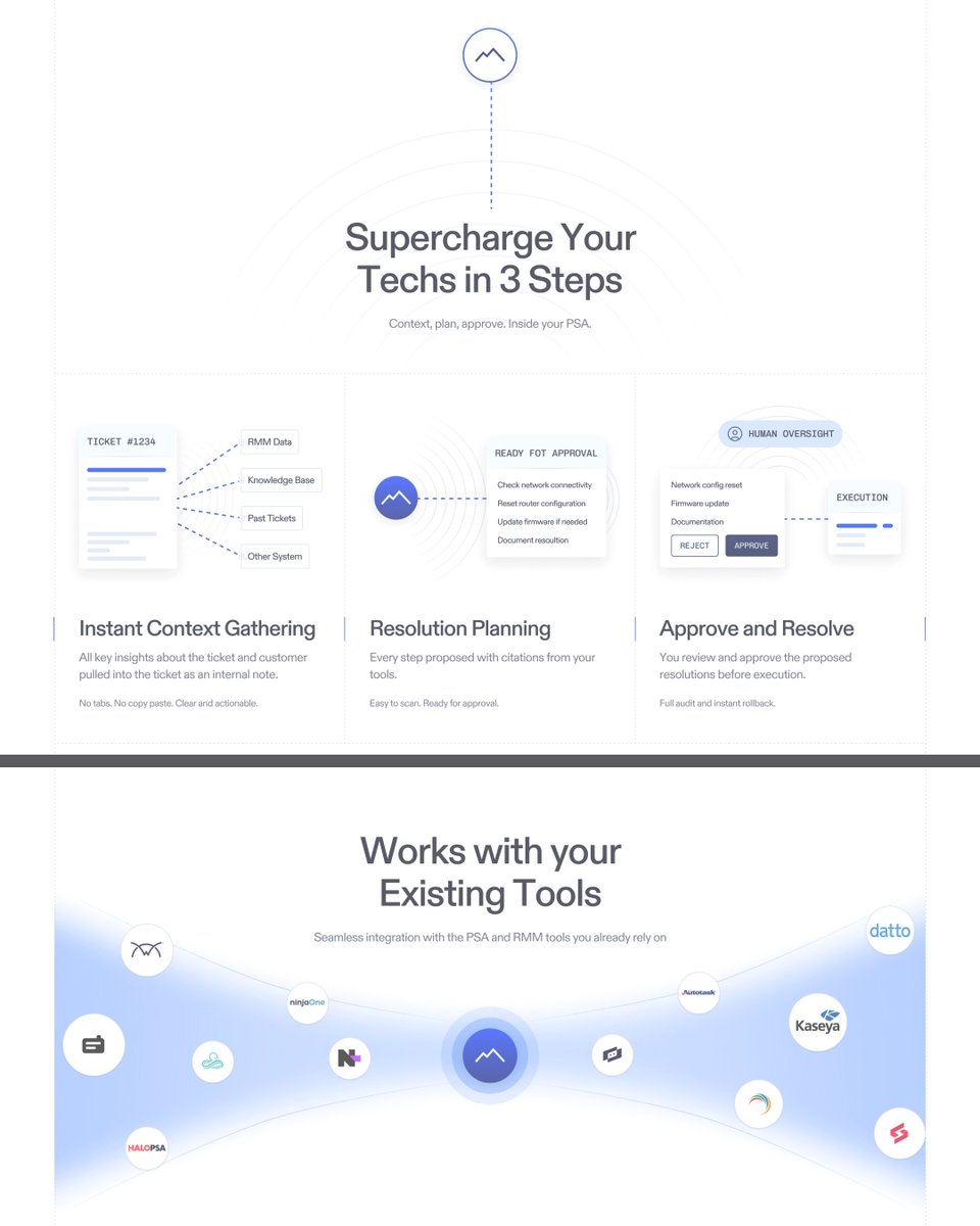
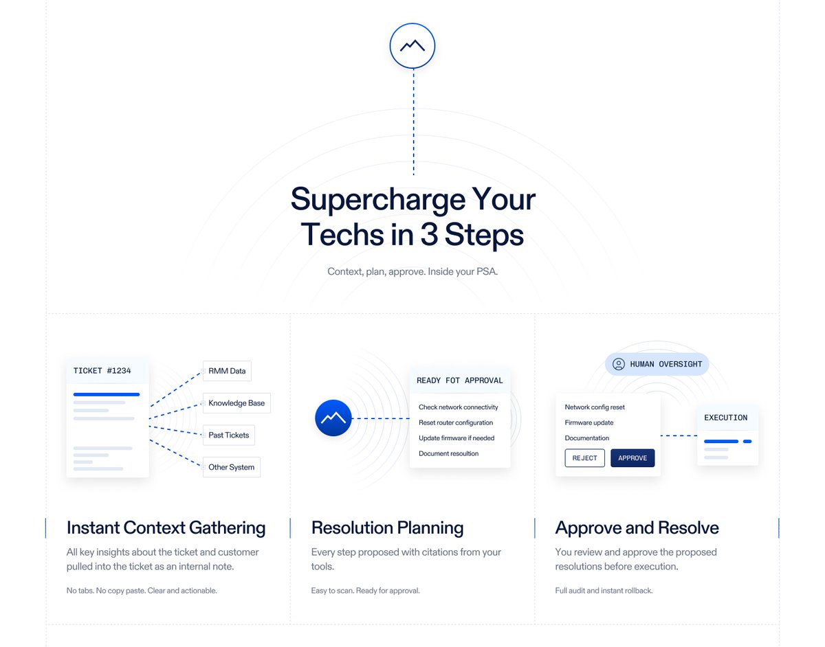
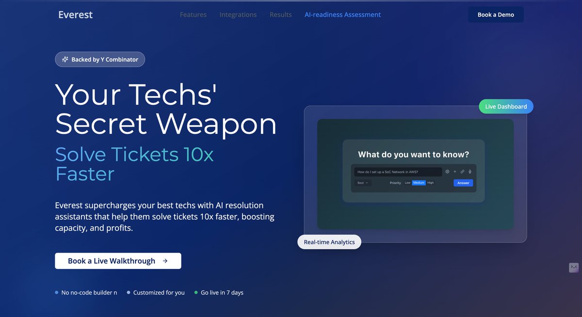
Redesigning Concept for Everest — The AI Assistant for IT Teams A modern redesign for Everest, an AI-powered platform that helps IT teams resolve tickets faster and smarter. The goal was to simplify communication, highlight trust signals, and guide users toward conversion. ✨…
Where data meets design — turning crypto stats into pure visual gold. 🚀 #uidesign #dashboardui #neumorphism #cryptoui #framerdesign

Clean. Structured. Effortless. This design proves — clarity always wins. 💡 #uidesign #uxinspiration #saasdesign #minimaldesign #cleanui
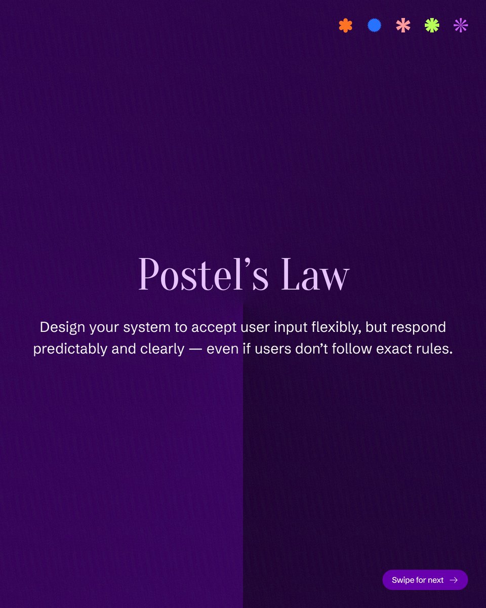
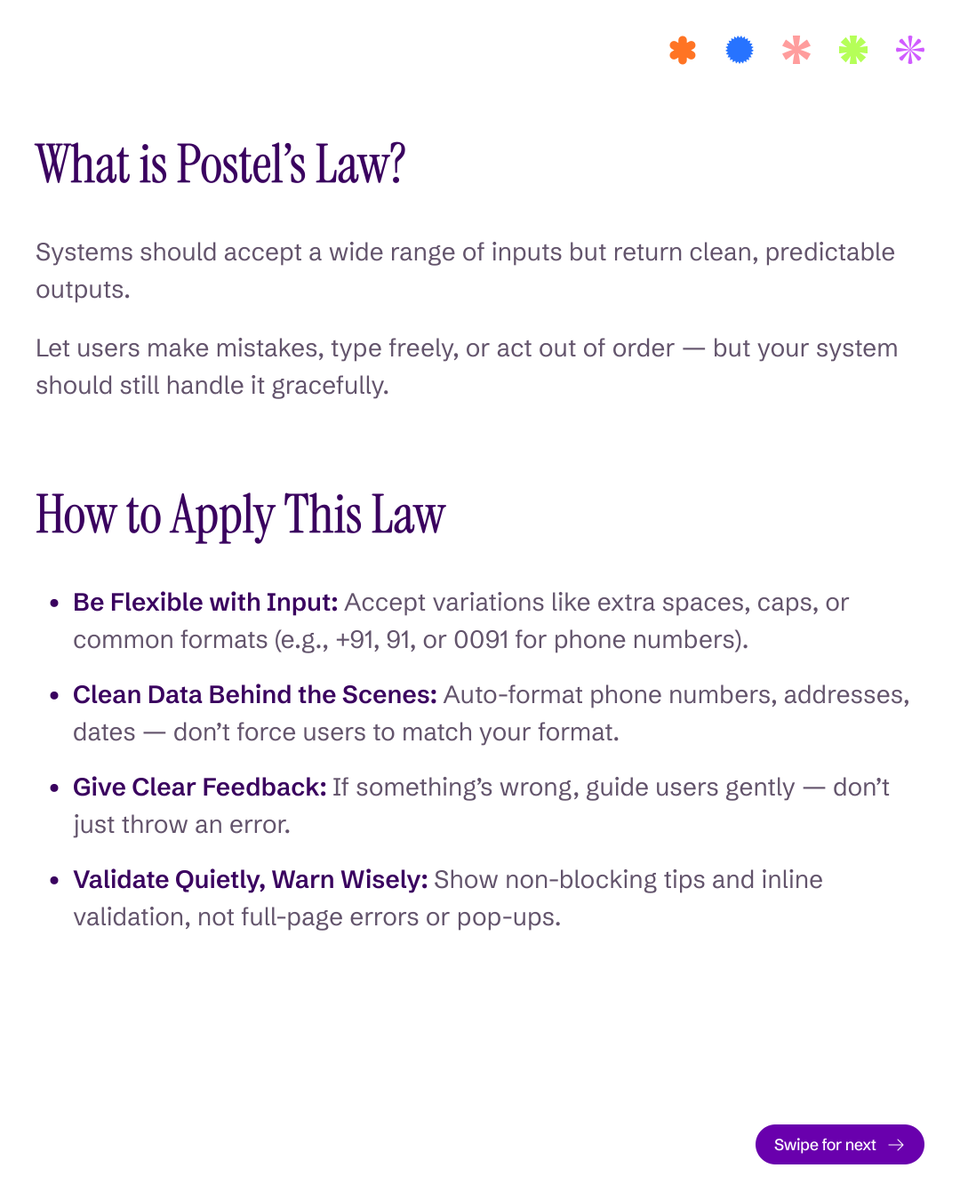
“Ever entered your number with +91 and got an error? 😤 That’s where bad UX breaks trust.” Postel’s Law reminds us — great design forgives user mistakes. Don’t force users to “follow your rules.” Instead, make your system smart enough to understand theirs. ✅ Accept flexible…
🚀 Before vs After — Everest Website Redesign (Personal Project) ✨ A cluttered hero section can dilute the message. So I reimagined the PDP with clarity, focus, and trust. What was wrong (Before): Overloaded with gradient + visuals, distracting from the message. Headline…

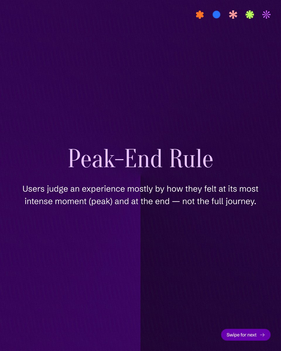
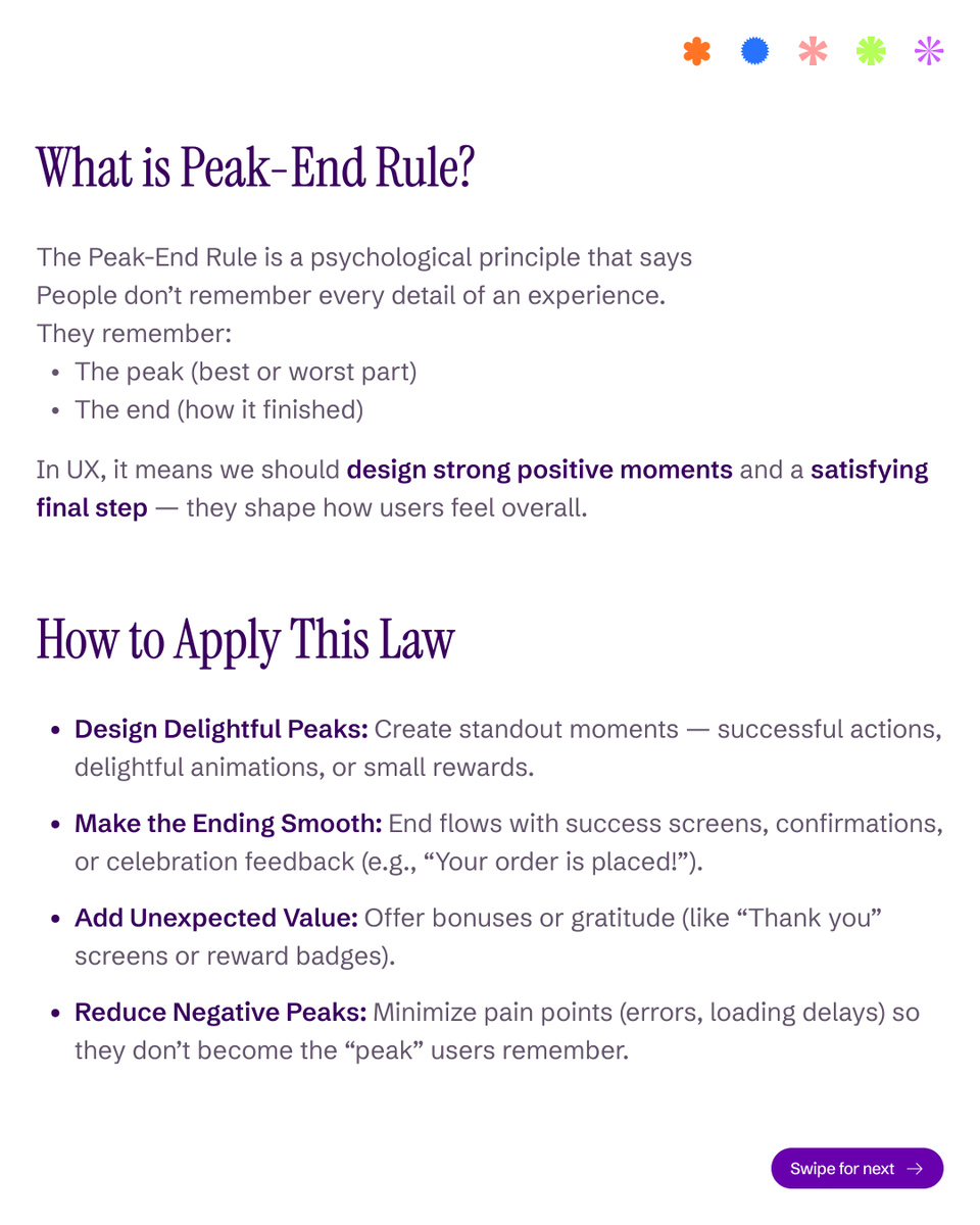
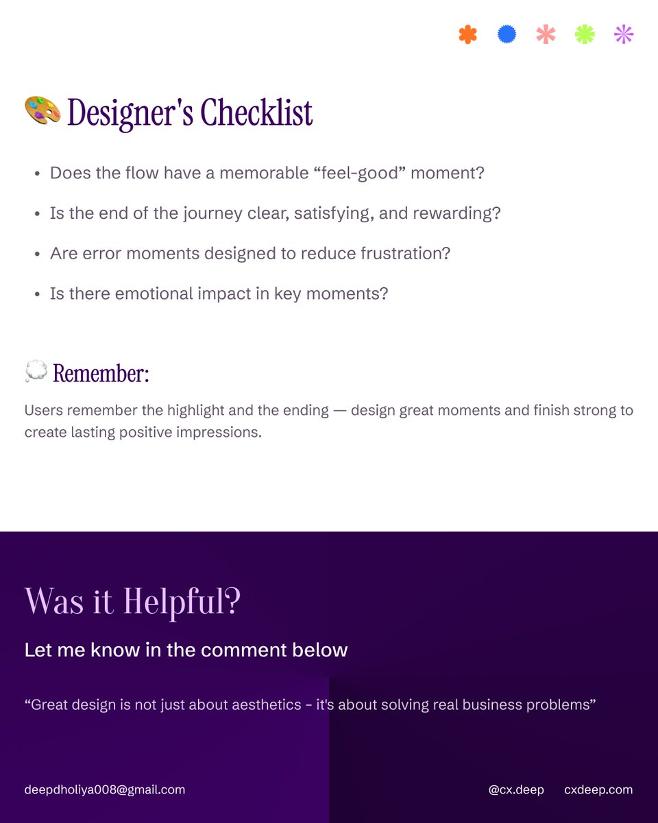
Users don’t remember the journey — they remember the moments 🔑 UX Law: The Peak-End Rule They recall: The peak (best or worst moment) The end (how it finished) Your design takeaway: ✅ Create delightful peaks (animations, success moments, rewards) ✅ End flows smoothly…

Ever noticed this? Give users a long form → they’ll take forever (or quit). Make it short, guided, and fast → they’ll finish in minutes. That’s Parkinson’s Law in UX: 👉 Work (or effort) expands to fill the space/time you allow. ✨ How to beat it as a designer: Break big…


PDPs in 2025: What’s Changing Fast 1. AI shopping agents (like OpenAI’s) now “shop for users” → clear, structured PDPs win visibility. 2. AR/3D previews are no longer fancy — they’re expected. 3. 51% of sites still fail at basic PDP UX (Baymard, 2025). 4. Mobile-first PDPs…
We redesigned Glamzei’s PDP page as a personal project — focusing on clarity, trust, and conversion. A cluttered PDP creates more friction than function. -It overwhelms users, causing: -less time spent on page -missed value cues -fewer checkouts A well-structured PDP, on the…

Most of your product is probably wasted. That’s the truth of the Pareto Principle (80/20 Rule): 👉 80% of user value comes from just 20% of your features. As a designer, your job isn’t to add more — it’s to identify and polish the core 20% that users love. ✅ Prioritize the top…


Google recently redesigned its Phone Dialer. But is the new one really an improvement? Let’s break it down 👇 Old Dialer Swipe to answer/decline felt natural and built on Android muscle memory. Simple with only 2 clear options. But gesture-only wasn’t always obvious for…

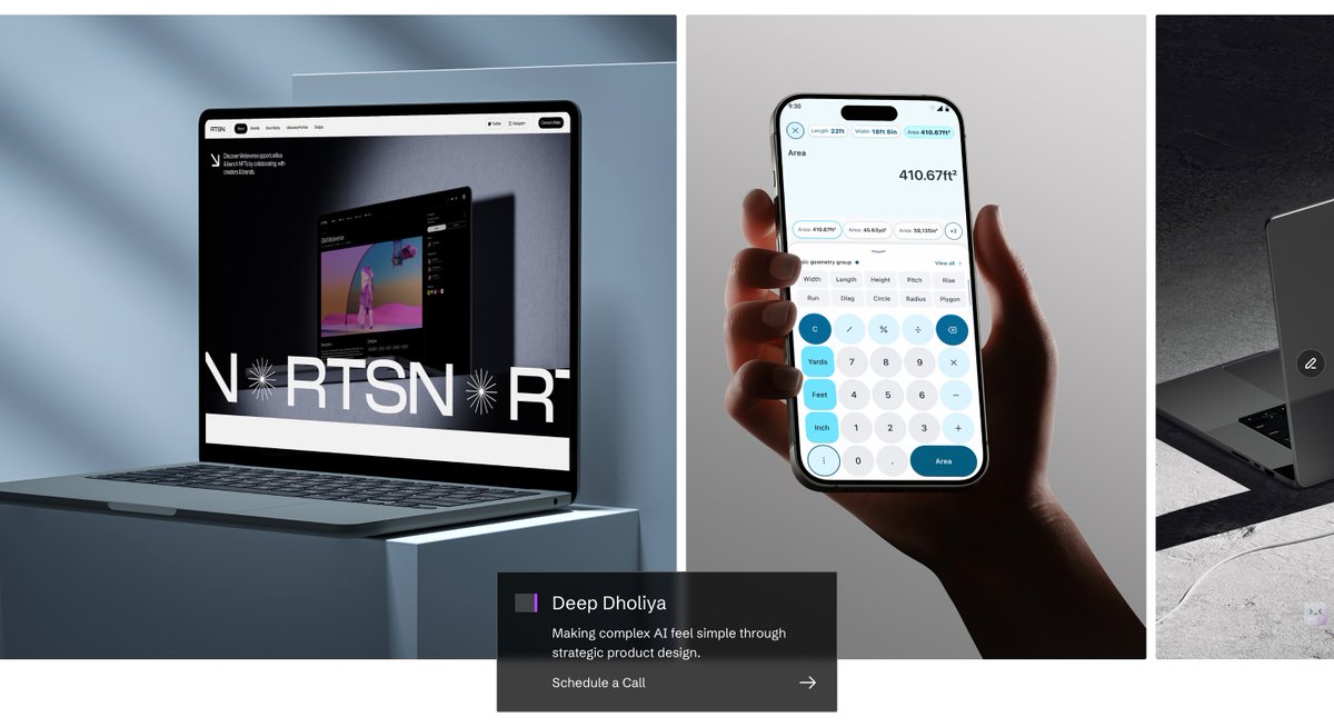
It’s live! 🚀 My Portfolio is finally out. A curated space showcasing my work in Product Design, AI, and CRO. From case studies to real-world design solutions — it’s all in one place. 👉 Explore here: cxdeep.com 💬 What’s the first thing you check when visiting a…


United States Trends
- 1. #GMMTV2026 1.08M posts
- 2. MILKLOVE BORN TO SHINE 197K posts
- 3. Good Tuesday 22.4K posts
- 4. WILLIAMEST MAGIC VIBES 25.3K posts
- 5. TOP CALL 9,348 posts
- 6. #WWERaw 78.3K posts
- 7. AI Alert 8,142 posts
- 8. Barcelona 147K posts
- 9. Moe Odum N/A
- 10. Brock 42.2K posts
- 11. Purdy 28.6K posts
- 12. Alan Dershowitz 2,842 posts
- 13. Check Analyze 2,425 posts
- 14. Bryce 21.4K posts
- 15. Token Signal 8,615 posts
- 16. Keegan Murray 1,563 posts
- 17. Dialyn 8,065 posts
- 18. Market Focus 4,669 posts
- 19. Timberwolves 3,942 posts
- 20. Finch 15K posts
Something went wrong.
Something went wrong.