

The best typography doesn’t stand out. It disappears into the message and enhances the rhythm. Great type choices are felt, not noticed.

People don’t visit websites to admire your layout. They come to do something — fast, clear, and pain-free. Design like you’re clearing the road, not building a maze.
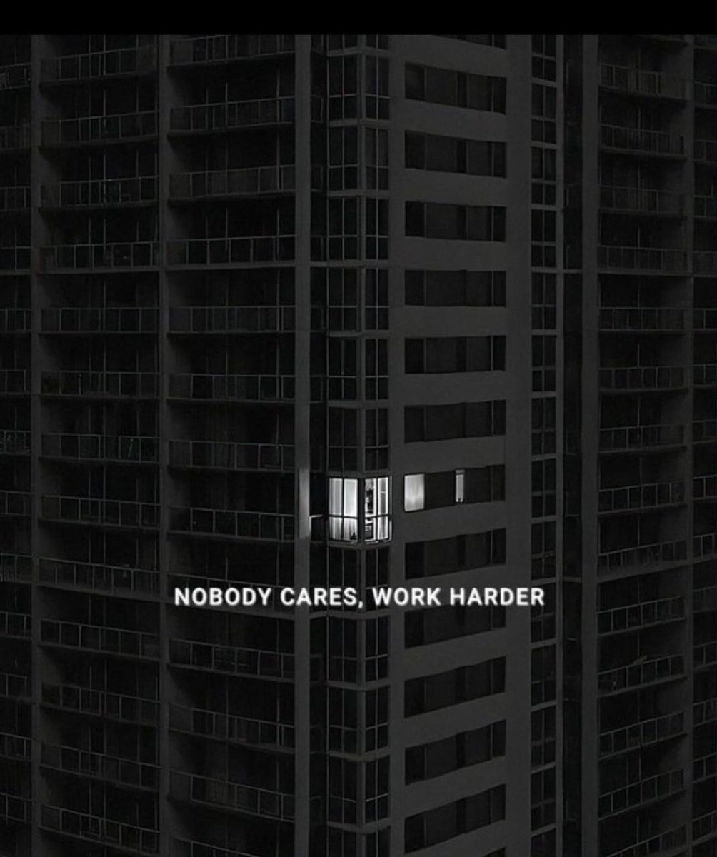
One day I’m designing user flows. Next day I’m studying blood flows. Balance? Nah, just controlled chaos.
Stop chasing perfection in Framer. Launch something, break it, fix it better. Speed > ego.
Stop designing like you're solving a puzzle. Your users aren't here to think — they're here to flow. UX is just empathy… with a layout grid.

Layouts don’t fail because of color—they fail because of structure. Try this: → Use a 12-column grid → Build with auto layout → Group content by intent → Add breathing room Structure first. Style later.
If your Framer site feels heavy, simplify your layers and compress assets. Speed is part of UX too.
Struggling to learn Figma fast? Try this: - Recreate real UIs - Master auto layout early - Use variants & components - Explore the plugin store weekly Figma rewards muscle memory.
It took me 10 minutes to design this hero using ChatGPT, it's so OVER designers!


United States Trends
- 1. Veterans Day 356K posts
- 2. Woody 11.3K posts
- 3. Toy Story 5 13.4K posts
- 4. Luka 83K posts
- 5. Nico 140K posts
- 6. Gambit 39.7K posts
- 7. Travis Hunter 3,412 posts
- 8. Payne 11.7K posts
- 9. Mavs 32.3K posts
- 10. Vets 31.7K posts
- 11. Sabonis 3,627 posts
- 12. Battlenet 3,393 posts
- 13. Pat McAfee 5,054 posts
- 14. #JonatanVendeHumo 3,330 posts
- 15. Wike 111K posts
- 16. Jonatan Palacios 2,134 posts
- 17. Antifa 185K posts
- 18. Bond 72.9K posts
- 19. Kyrie 7,704 posts
- 20. SBMM 1,166 posts
Something went wrong.
Something went wrong.