
Paint & Paper Library
@paint_library
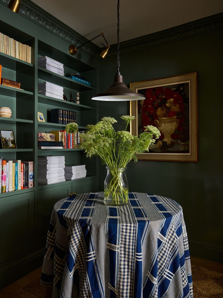
Paint & Paper Library offers a distinguished palette of 180 colours, manufactured to exceptionally high standards in the UK.
Anda mungkin suka


Serving as the hub of the home, kitchens allow you to embrace bolder hues or utilise neutral shades that provide a simple, understated backdrop Truffle is traditional taupe that works well on kitchen cabinetry. Credits: @joshnapkitchendesigner @howdensjoinery
Despite their boldness, deep blue-greens offer an inherent tranquillity due to their relationship with the natural world. Consider shades from this palette to create impact within your schemes, whilst maintaining a calm, restorative feel. 1. Iguana 2. Malachite 3. Nori 4. Teal


@home__stead selected Sand III, a soft and elegant light neutral, for the walls of her kitchen and dining space. Pairing with Truffle on the island unit, she creates the perfect, inviting neutral palette for a soothing environment.
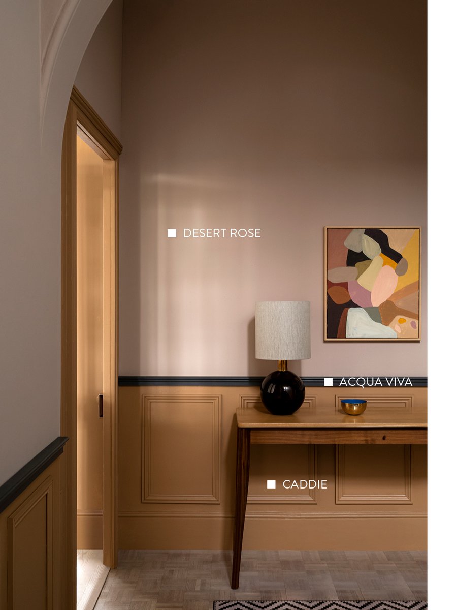
Whilst they are transitional areas, hallways and staircases offer plenty of scope when it comes to interior design. Discover four inspiring ways to approach these spaces, with schemes that will enhance architectural features and set the tone for the rooms that follow.


Inside the light, contemporary family home of @leo_kinderdesign, who utilised the Architectural Colours to introduce subtle, softly spoken shades into each space. paintandpaperlibrary.com/blog/a-light-c… Photography: @ellen.christina.hancock 1. Willow III 2. Slate I 3. Willow I 4. Plaster II


Copper Beech is an enticing deep brown, derived from Italian majolica and used in the old Chateau de Madrid. Introduce this shade on woodwork to add richness and design impact. 1. @emeraldblenkin 2. @home.at.the.rectory @peas.in.my.pod 3. @makingspacesnet @renovating_harrogate
In your kitchen, combine soft neutral walls with a complementary dark-hued neutral on woodwork to achieve effortless harmony, elegance and depth of colour. Walls: Sand IV Cabinets & Woodwork: Bronze Credit: @a.modest.semi
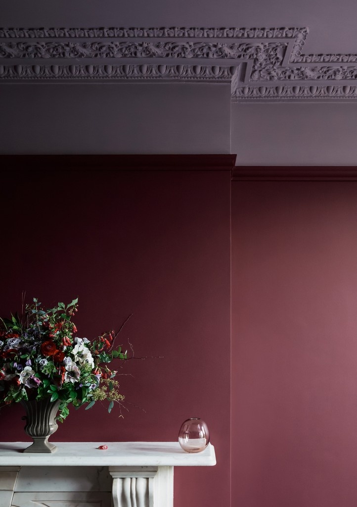
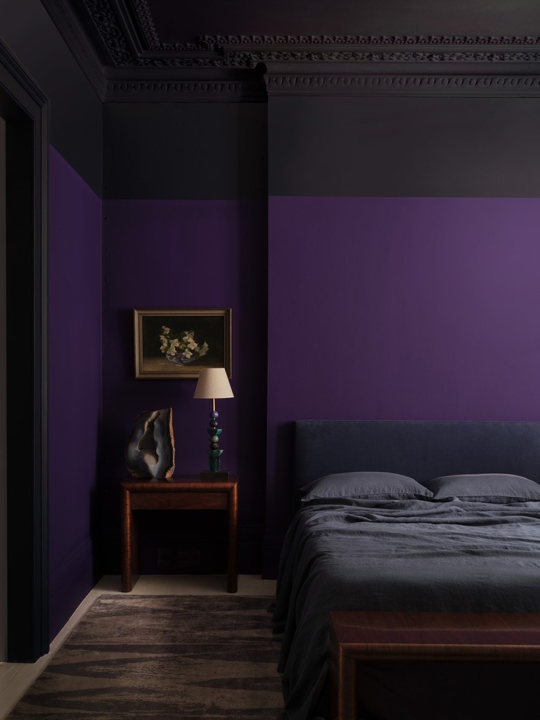
Historically associated with wealth and opulence, purple shades have an unrivalled ability to infuse an atmosphere of luxury, depth and tranquillity. 1. Plum Brandy 2. Grenache, Lady Char's Lilac 3. Purple Azurite, Plimsoll 4. Copper Beech

Using neutrals enables you to incorporate accessories, furnishings and patterned fabrics without overwhelming your scheme. @houseofhetheringtons drenched this space in the gentle Stone III, introducing accents of Sencha and Scarlet 'n' Rust on the skirting and fireplace.
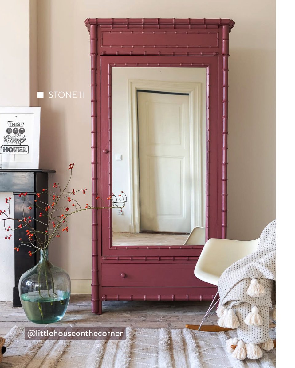
Bedrooms that contain architectural detailing provide a wealth of opportunities to incorporate coordinating colour pairings. Use cornicing, skirtings and window shutters as hosts for colour, pairing characterful shades like Ruse with complementary neutrals, Topi and Stone II.

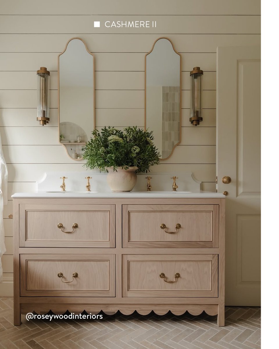
Discover five neutrals from the Architectural Colours that create a gentle, soothing living environment. paintandpaperlibrary.com/advice/the-bes… 1. Canvas I @thehousethatblackbuilt 2. Powder I @bobbins.at.home 3. Stone II, Soumak @littlehouseonthecorner 4. Cashmere II @roseywoodinteriors


Midelt Sage is an elegant pistachio green that adds an attractive, rich colour highlight to woodwork and cabinetry. Combine with a complementary wallpaper such as Honesty - Chelsea Green II for a beautifully considered scheme, ideally suited to a bedroom. Credit: @kerryvillers


In your kitchen scheme, introduce alluring, richly coloured hues like Grenache that will define the mood of the space and create an ambient setting that reflects the wider interior aesthetic of the home. Credit: @totheshireborn
Enveloping a living space in a single warm neutral hue can infuse an atmosphere of calm, with no strong contrasts to draw the eye. Select a shade with soothing, earthy undertones such as Powder V. Credit: @restoringnumber46 @ameliaallenphotography


Slate I can be used in place of pure white in many schemes to produce a living environment that feels noticeably more comfortable and easy on the eye. Credit: @dhowelldesigns #slatei #neutralhome #neutralinterior #whitepaint #neutralkitchen

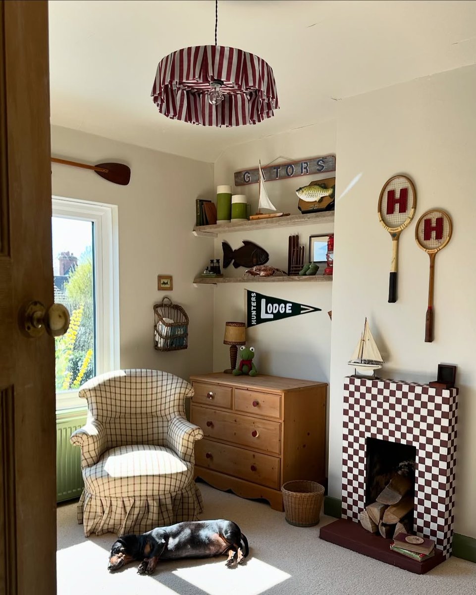
In small spaces within the home, consider utilising dark paint shades to create impact with a luxurious, immersive feel. 1. Copper Beech @home.at.the.rectory 2. Nori @alicegrace_collection 3. Plimsoll @cherieleeinteriors 4. Geisha @laurastephensid


Michelle Burnett of Cush Interiors chose to complement the architectural detailing on the ceiling with a statement shade, Kasbah, which is harmoniously accompanied by Plaster IV on the surrounding walls. Photography by kenwalsh.ie

Using the Architects' finishes, transform wooden furniture into bespoke, statement pieces for the home, achieving unrivalled durability and profound depth of colour across the complete Paint & Paper Library palette. Colour: Scarlet 'n' Rust
Neutrals are a classic choice for front doors, beautifully complementing a variety of home exteriors and architectural styles to create an entrance with enduring appeal. 1. Stone II 2. Wattle V 3. Fuji

@maddalenaminerva featured Paint & Paper Library in the renovation of her London townhouse, including warm neutrals, contemporary blue-greys and richly coloured greens. Explore the project at paintandpaperlibrary.com/blog/maddalena… 1. Sand V 2. Blanket 3. Fynbos 4. Copper Beech


United States Tren
- 1. Cloudflare 233K posts
- 2. Gemini 3 33.1K posts
- 3. Saudi 151K posts
- 4. Jamal Khashoggi 7,269 posts
- 5. Salman 45.5K posts
- 6. #AcousticPianoCollection 1,340 posts
- 7. Piggy 74K posts
- 8. Robinhood 4,568 posts
- 9. Olivia Dean 4,366 posts
- 10. Pat Bev N/A
- 11. Merch 66.3K posts
- 12. Antigravity 3,597 posts
- 13. CAIR 28.9K posts
- 14. #LaSayoSeQuedóGuindando 1,805 posts
- 15. #UnitedNationsBarbie 1,493 posts
- 16. La Chona 1,946 posts
- 17. Taco Tuesday 15.9K posts
- 18. #MSIgnite 1,135 posts
- 19. Lane Kiffin 15.6K posts
- 20. Presidential Walk of Fame 4,331 posts
Anda mungkin suka


Something went wrong.
Something went wrong.