
你可能會喜歡


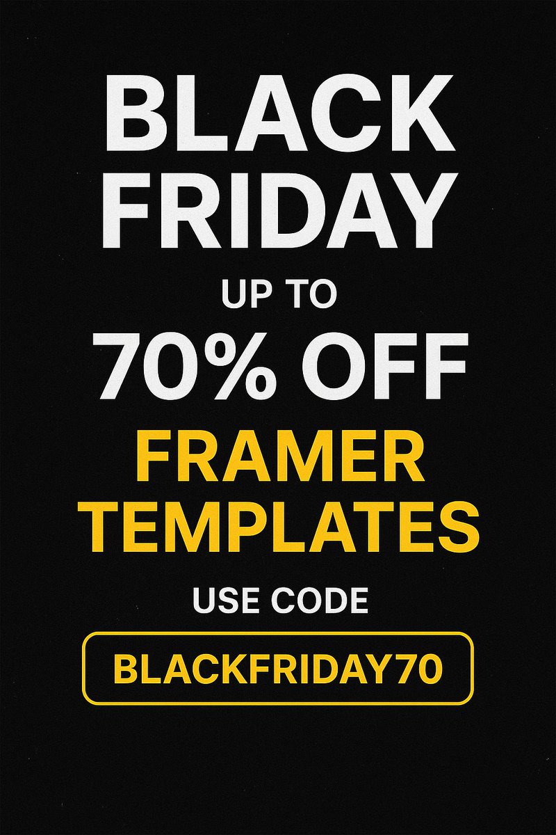
🔥 Black Friday Mega Deal! 🔥 My premium Framer templates are now available at up to 70% OFF! Level up your website design for the lowest price of the year. Buy Now : uiuxoceandesign.lemonsqueezy.com Use code BLACKFRIDAY70 at checkout. ⚡ Limited-time offer — don’t miss out!
Real Estate Website Design behance.net/rajesh_godhani… A great real estate website doesn’t just look good — it builds trust at first glance. Clear structure, clean visuals, fast performance, and a seamless property browsing experience make all the difference.

The client came to me saying, “We want a premium skincare website… but our budget is tight.” Instead of cutting corners, we focused on smart design choices clean layout, strong visuals, & a simple user flow. The result? A high-end landing page that looks far above their budget.
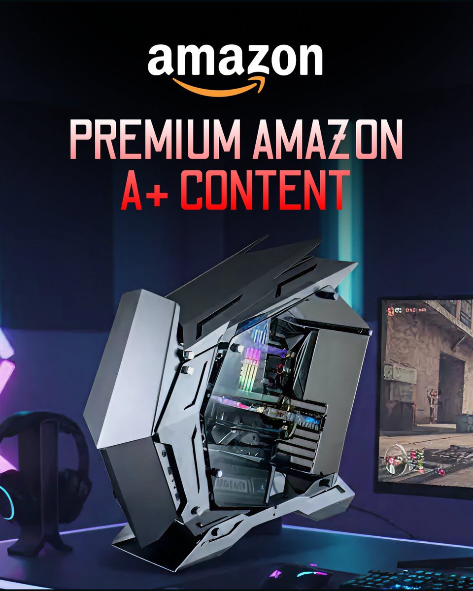
✨ Premium Amazon A+ Content isn’t just about product listings — it’s about storytelling that sells. High-quality visuals, comparison charts, and branded modules help your product stand out, boost trust, and drive conversions. behance.net/gallery/238251…
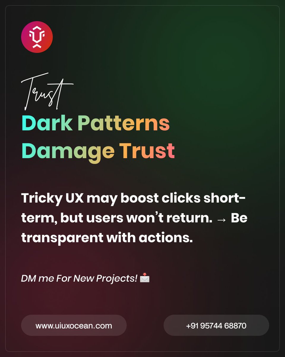
Dark Patterns Damage Trust Tricky UX may boost clicks short-term, but users won’t return. → Be transparent with actions. DM me For New Projects! 💌 🌐 uiuxocean.com 📞 +91 95744 68870 #UIDesign #UXDesign #UserExperience #UXTips #UIDesigner #UXDesigner
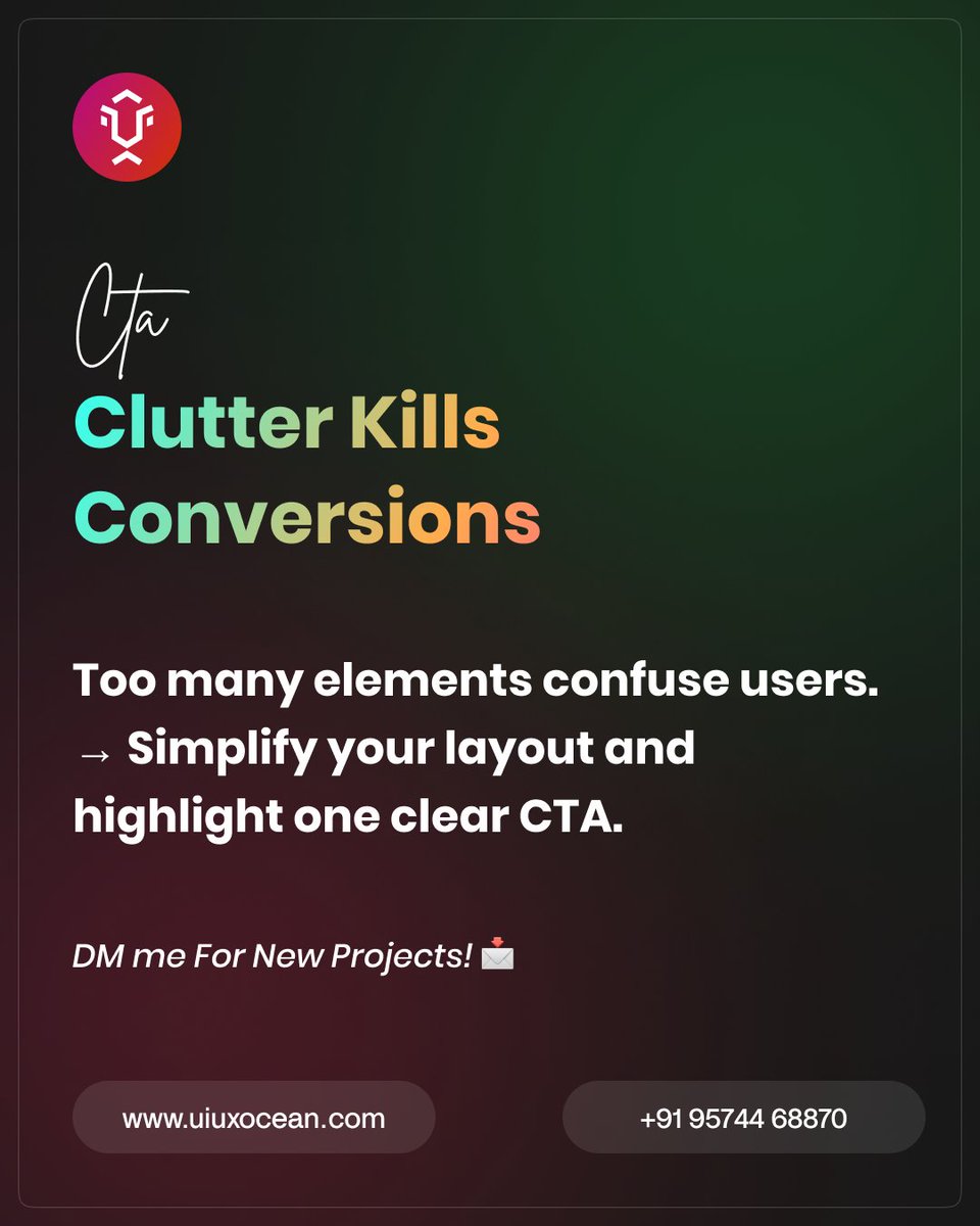
Clutter Kills Conversions Too many elements confuse users. → Simplify your layout and highlight one clear CTA.
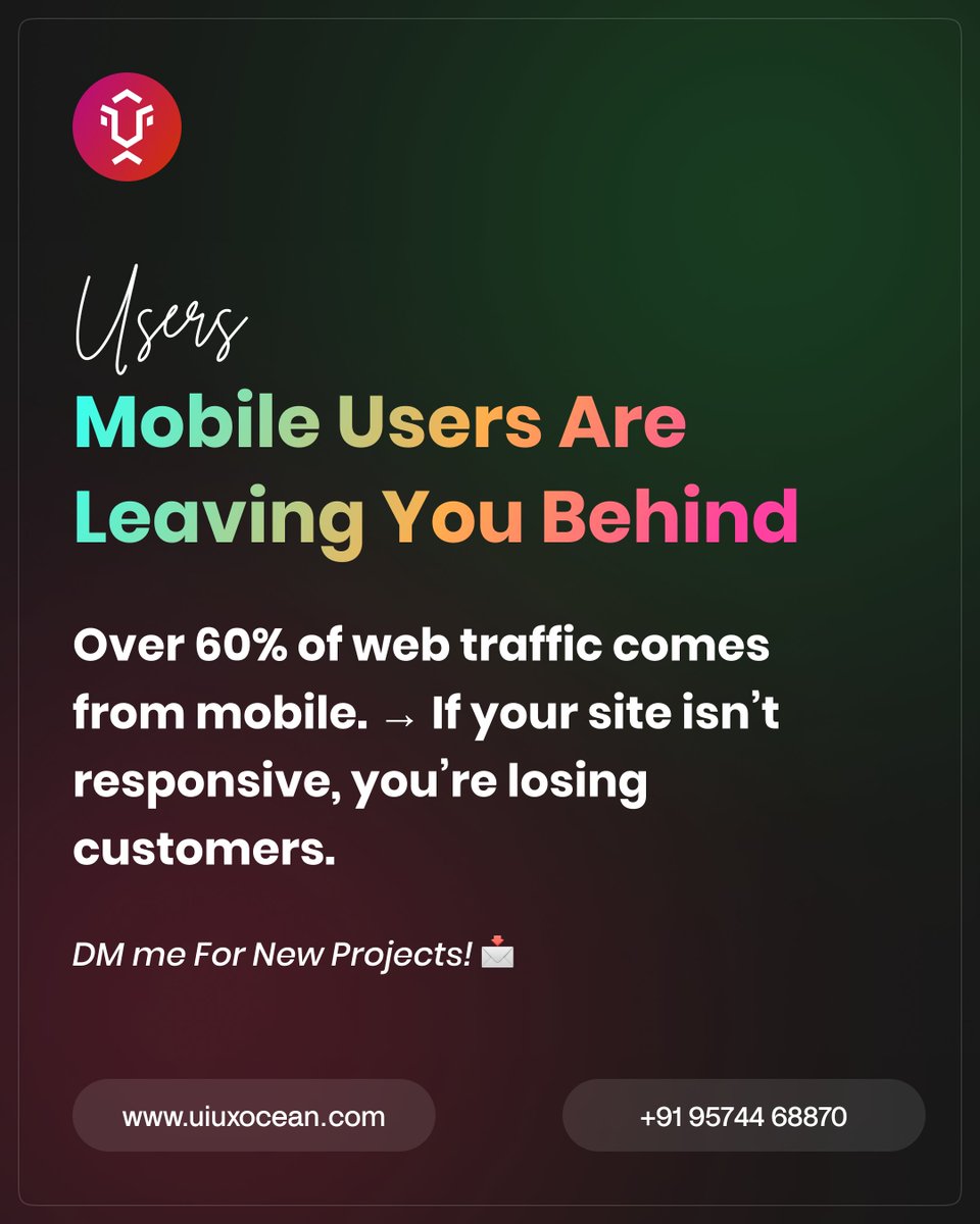
Mobile Users Are Leaving You Behind Over 60% of web traffic comes from mobile. → If your site isn’t responsive, you’re losing customers. DM me For New Projects! 💌

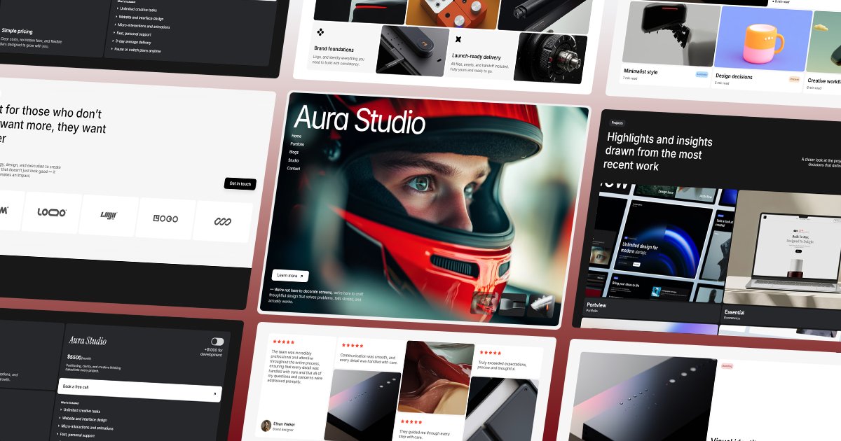
🎉 Huge Giveaway 🎉 You can grab my soon to be 5th or 6th @Framer template "AuraStudio" before it's even released only for the next 48hrs!! Just do this: 1⃣ Like & Follow 2⃣ Comment 3⃣ Repost This one comes with features that bring fluidity and motion to your site 👇
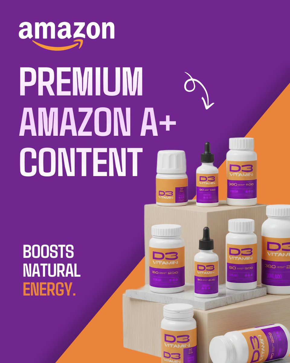
Amazon A+ Content Design | Premium EBC Content Design Preview : behance.net/gallery/236669… Here’s a look at a conversion-focused Amazon A+ Content design for a Vitamin D3 supplement. 👉 DM me if you’d like me to design high-converting Amazon A+ pages for your supplement brand!
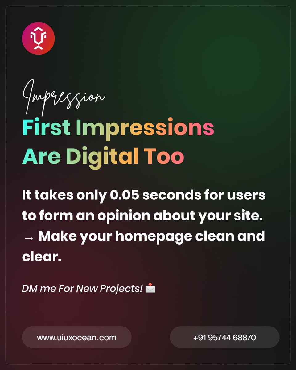
First Impressions Are Digital Too. It takes only 0.05 seconds for users to form an opinion about your site. → Make your homepage clean and clear. DM me For New Projects! 💌
✨ Amazon A+ Content | EBC Content Design✨ Full Preview ==> behance.net/gallery/236520… Your product deserves to shine and Amazon A+ Content helps make that happen. With rich visuals, comparison charts, and storytelling modules, you can turn casual browsers into loyal customers.

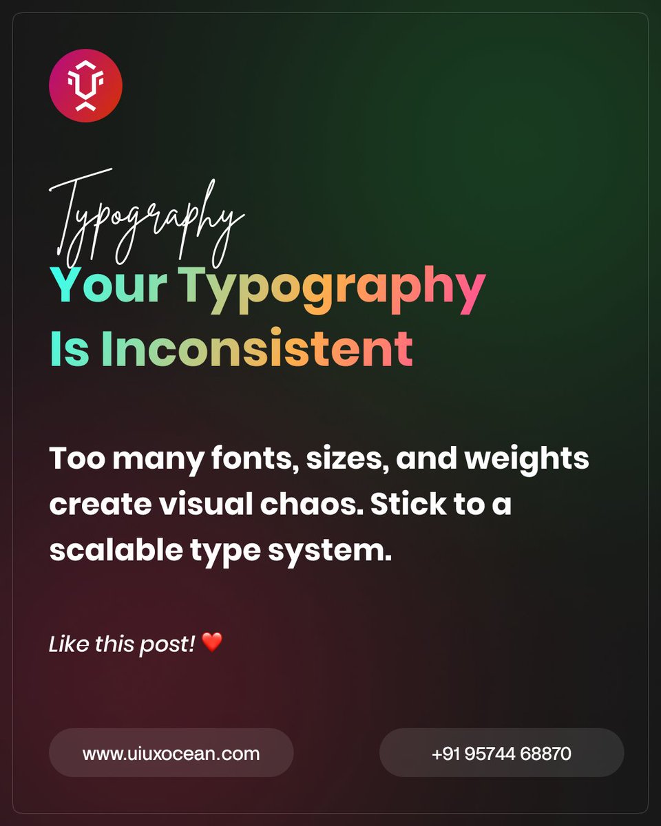
Your Typography Is Inconsistent. Too many fonts, sizes, and weights create visual chaos. Stick to a scalable type system.
Stop Ignoring Error States. 404s, form errors, and empty states are part of the UX. Design them well to keep users calm and guided.

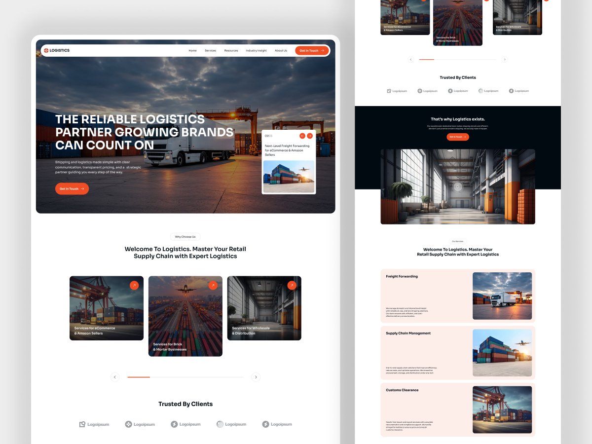
Shipping & Logistics Website Design behance.net/rajesh_godhani… I design modern, user-friendly shipping and logistics websites that help businesses showcase their services, track shipments, and generate more leads.
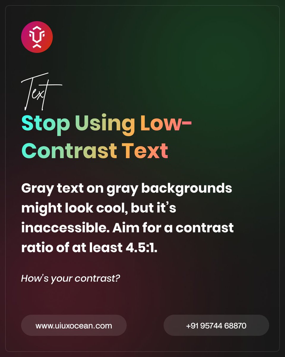
Stop Using Low-Contrast Text. Gray text on gray backgrounds might look cool, but it’s inaccessible. Aim for a contrast ratio of at least 4.5:1. How’s your contrast?
Your Website Is Slow and Users Hate It. 53% of users leave if a site takes more than 3 seconds to load. Optimize images and code. Need performance tips? Like this post! ❤️

I still can’t wrap my head around this. This is by far my biggest reward from the partner program yet. Honestly, it feels surreal—I never imagined I’d be making this much money… even while I’m asleep. 😅

Icons Should Be Recognizable, Not Creative. If users need to think about what an icon means, you’ve failed. Use familiar symbols. Ever seen a confusing icon? Share below! 👀

Stock Market App - Login Flow behance.net/rajesh_godhani… A smart stock market app that helps users track live market data, analyze trends, and manage their investments with ease.


United States 趨勢
- 1. #AEWDynamite 19.7K posts
- 2. #TusksUp N/A
- 3. Giannis 77.5K posts
- 4. #Survivor49 2,602 posts
- 5. #TheChallenge41 1,997 posts
- 6. Ryan Leonard N/A
- 7. Skyy Clark N/A
- 8. Claudio 28.8K posts
- 9. Jamal Murray 5,798 posts
- 10. #ALLCAPS 1,191 posts
- 11. Steve Cropper 5,014 posts
- 12. Kevin Overton N/A
- 13. Will Wade N/A
- 14. Ryan Nembhard 3,419 posts
- 15. Achilles 5,345 posts
- 16. Tyler Herro 1,728 posts
- 17. Diddy 72.7K posts
- 18. Dark Order 1,767 posts
- 19. Hannes Steinbach N/A
- 20. Klingberg N/A
你可能會喜歡
-
 David Fi
@davidfidesign -
 morgan breier
@morgan_breier -
 Nadeeka Athukorala
@nadeeka_design -
 Jojo Noon
@jojonoonwave -
 Maiane • UI/UX Designer
@sheisacreative -
 Ben On Some Growth Shit
@bendoingzen -
 Ayoola Daniel✨👒
@hiayoola -
 Muhammad Saeed | محمد سعيد
@muhamadsaeedd -
 Anjan_UXD
@bhulani_anjan -
 Vrashal Verma
@VrashalVerma
Something went wrong.
Something went wrong.