
The Design Blog
@thedsgnblog
The Design Blog is a carefully curated platform for design and creative inspiration featuring works of designers, studios, and creatives from around the world.
You might like


We are excited to announce the launch of the new and improved The Design Blog! Our new platform comes with many useful features and will continue celebrating and uplifting professional and emerging designers and creatives worldwide. thedsgnblog.com
Porto Rocha’s goal was to create an institutional brand with an anti-institutional spirit. It needed to provide the structure and recognition that the previous identity lacked, establishing a clear mark for Kunsthalle Basel. Read more: linkly.link/2GrUF


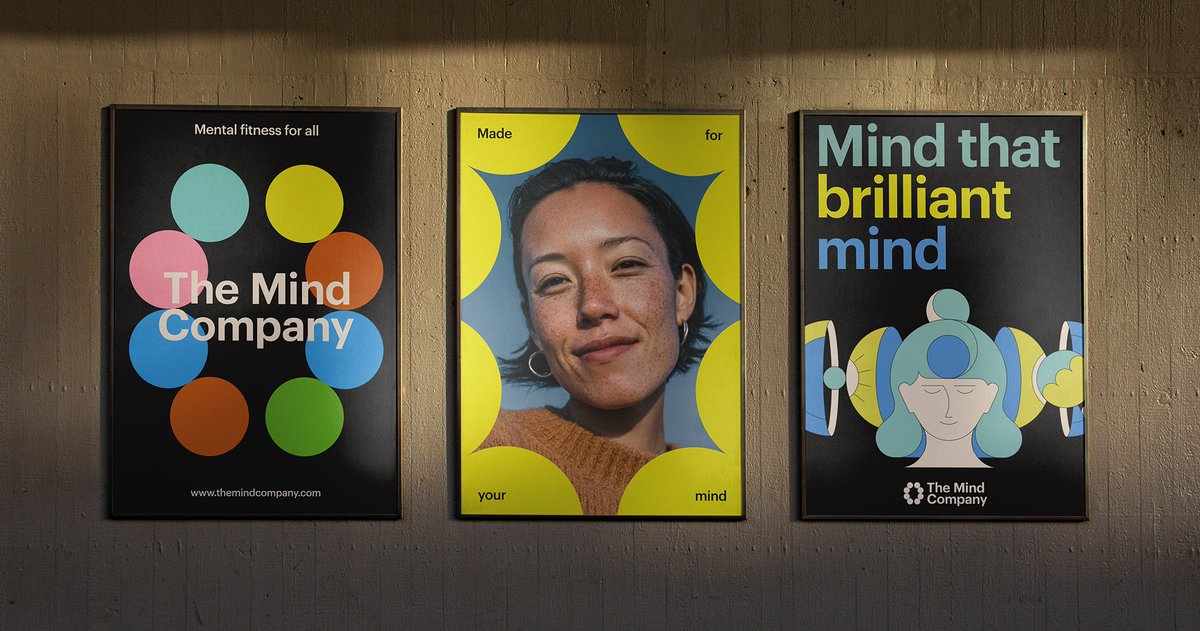
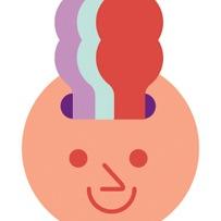
Goodside's vibrant rebrand for The Mind Company makes mental fitness feel fun, energizing, and accessible. An abstract mark powers a flexible system that ties everything together, while bold type and messaging were built to get your mind moving. Read more: linkly.link/2GQZc


Creating a brand for Origo meant staying close to what really matters: ingredients, process, and care. Origo refers to the origin, which became the foundation for @Heystudio's identity that feels handmade, approachable, and quietly confident. Read more - linkly.link/2FabQ


Lulla is a contemporary homage to Italian dining. Isometric’s visual identity for the restaurant is joyful and inviting, embodying the restaurant’s ethos of fresh, flavor-forward food, where every detail is thoughtfully considered. Read more - linkly.link/2FYPb


The Young Jerks designed a brand identity for Good Greens Flower Shop, an L.A.-based brand that pays tribute to the rich history of cannabis culture. Read more - linkly.link/2F2xt


Inspired by the hot, arid, and dusty landscapes of Western Australia, Seachange transformed a coffee brand into LOOT, drawing on bold Western themes in an elevated and premium manner. Read more: 2ly.link/27PmD #branding #packaging #design


Wedge’s identity and packaging for Festif is inspired by 1920s European posters, where artworks pop against dark black backgrounds with strong typographic intentions. Read more - 2ly.link/26jrL #packaging #design #branding #typography


Milieu engaged Breathe studio to design the interiors and the sustainability features for Park Street Apartments - 2ly.link/26iWc


The Colour Club studio’s challenge was to combine Japanese street culture and tradition with a modern twist, giving Tsukiyo a unique identity in Sydney’s competitive food scene. Read more - 2ly.link/26i3I #packaging #branding #identity #design


As Saint Urbain embarked on this project, they delved deeply into the vibrant street culture, graffiti, and signage of CDMX for inspiration. Read more - 2ly.link/26gKH #branding #packaging #design


Mindt Studio’s creative direction drew inspiration from bárur’s namesake—waves—representing balance, motion, and transformation. Read more - 2ly.link/26f0k


Outline’s holistic brand work highlighted how Soprana’s casual atmosphere blends Italian hospitality with locally sourced ingredients, ultimately attracting visitors and locals alike. Read more - bit.ly/Soprana #design #branding #logodesign


Wine Packaging Design Inspired by the Authenticity of Nighttime Gatherings by FAENA Read more - bit.ly/Gota-Wine #branding #packaging #design


CENTER worked with Molly Baz to craft a design system for her new mayo brand that pays homage to the sandwich shops, delis, and diners that gave birth to the quintessentially American go-anywhere food. Read more - bit.ly/Ayoh #branding #design #packaging


To develop the new visual identity for Regina, Dennis went deep into the hotel's history, uncovering timeless elements. This informed a solution inspired by the past and reinvented for today. Read more - bit.ly/regina-by-denn… #branding #identitydesign #design


Post-modernist Apartment Design that Combines Bold Colors, Art, and Geometric Shapes by Ksoul Studio. Read more - bit.ly/ksoul-studio #interiordesign #interiors #design


Glasfurd and Walker created a geometric identity for Bacaro that was influenced by the traditional Venetian bar. Read more - bit.ly/bacaro-identity #branding #design #logodesign


Seeing an opportunity to reclaim the history of innovation, Ostermoor turned to design studio Parker for a rebrand, steeped in heritage and craft but with the ambition to chart a new path for the DTC mattress industry. Read more - bit.ly/ostermoor


Design Layers is a free online conference by Readymag on Oct 10th. It features talks from Yah-Leng Yu (Foreign Policy, Verònica Fuerte (Hey), Abb-d Taiyo (Driftime), Cat How (How & How), and Samar Maakaroun (Pentagram). Learn more and register for free: bit.ly/DesignLayersCo…


United States Trends
- 1. Veterans Day 128K posts
- 2. Nico Harrison 11.1K posts
- 3. #csm220 1,020 posts
- 4. Mainz Biomed N/A
- 5. United States Armed Forces N/A
- 6. Vets 15.6K posts
- 7. Wike 22.7K posts
- 8. Good Tuesday 34.3K posts
- 9. SoftBank 10.3K posts
- 10. #MYNZ 1,122 posts
- 11. #tuesdayvibe 2,131 posts
- 12. Armistice Day 14.3K posts
- 13. #Gratitude 1,802 posts
- 14. Made in China 3,805 posts
- 15. Fritz 8,317 posts
- 16. Nasdaq 37K posts
- 17. Centel N/A
- 18. Taco Tuesday 12.6K posts
- 19. #RemembranceDay 14.8K posts
- 20. Sally Kirkland N/A
You might like
-
 Dieline
@TheDieline -
 Creative Bloq
@CreativeBloq -
 D&AD
D&AD
@dandad -
 Inspiration Grid
@inspirationgrid -
 Slanted Publishers
@slanted_blog -
 TM Broadcast International
@TM_Broadcast -
 Fontfabric.com
@Fontfabric -
 Poseidon 🌊
@SpursJourno -
 Typeverything
@typeverything -
 People Development
@PeopleDevelop1 -
 Izquierda Revolucionaria
@IzquierdaRevol -
 Mindsparkle Mag
@mindsparklemag -
 mabel poblet
@mabelpoblet -
 RainyDiamond
@RainyDiamondFN
Something went wrong.
Something went wrong.