#complementarycolours 搜尋結果


Me in my new @cosmowright tee by @miskiart (from @theyetee)! Rockin' it for #SGDQ2014 #complementarycolours


#ComplementaryColours No.05. RGB: Orange 253 164 48/ Navy 1 19 48/ Blue 13 105 172/ Sky 147 204 236. Photo: Carl Kleiner. #elmwood_melbourne


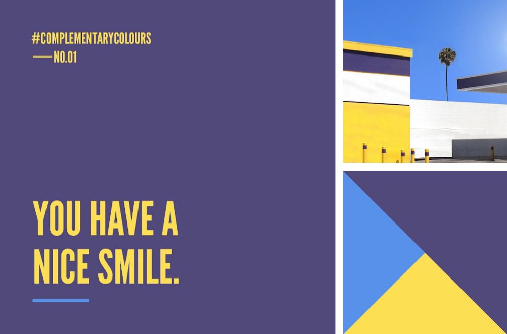
#ComplementaryColours No.01. RGB: Yellow 254 223 83 / Light Blue 87 145 234 / Dark Blue 80 73 121. Photo: George Byrne #elmwood_melbourne


#ComplementaryColours No.03. RGB: Blue 126 204 238 / Grey 91 96 96 / Yellow 250 209 65. Photo: _julian.f_ #elmwood_melbourne

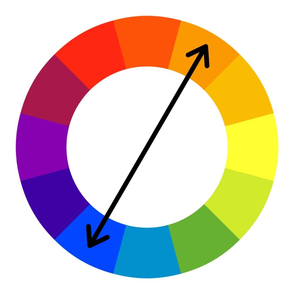
Kicking off #ComplementaryColours from #elmwood_melbourne. Find a great pic. Show RGB breakdown. Use colours to write a ‘compliment’. *wink*

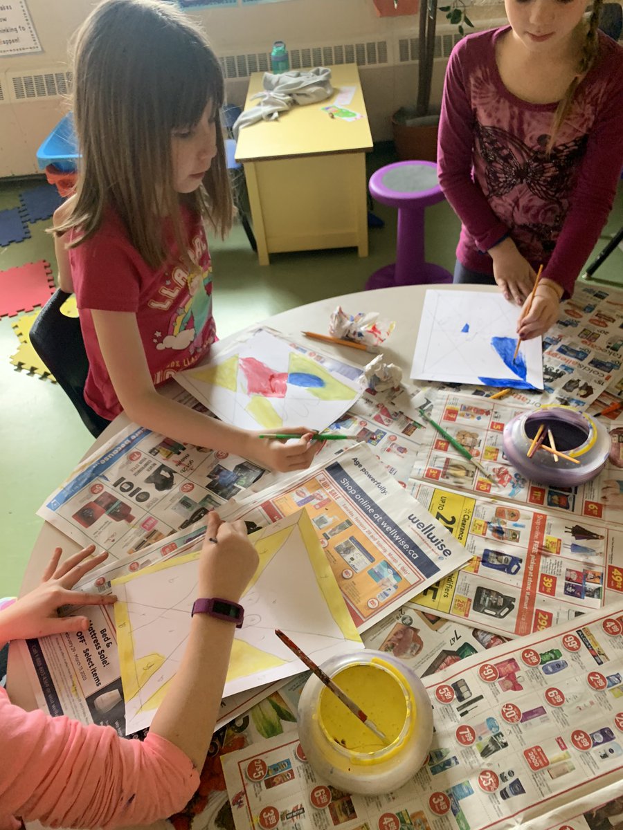
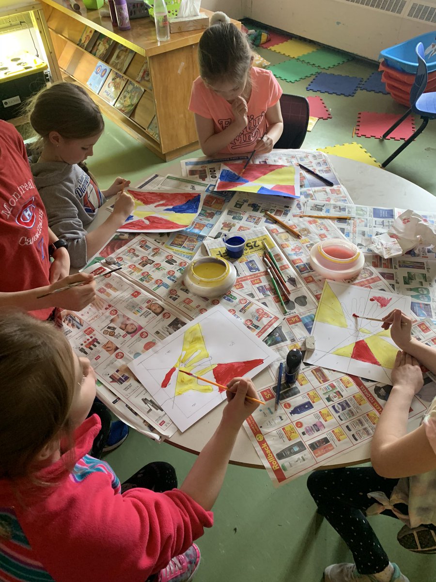
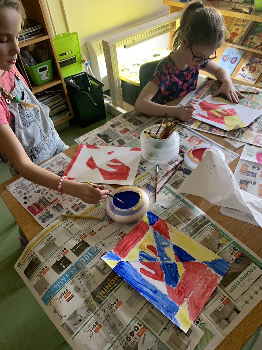
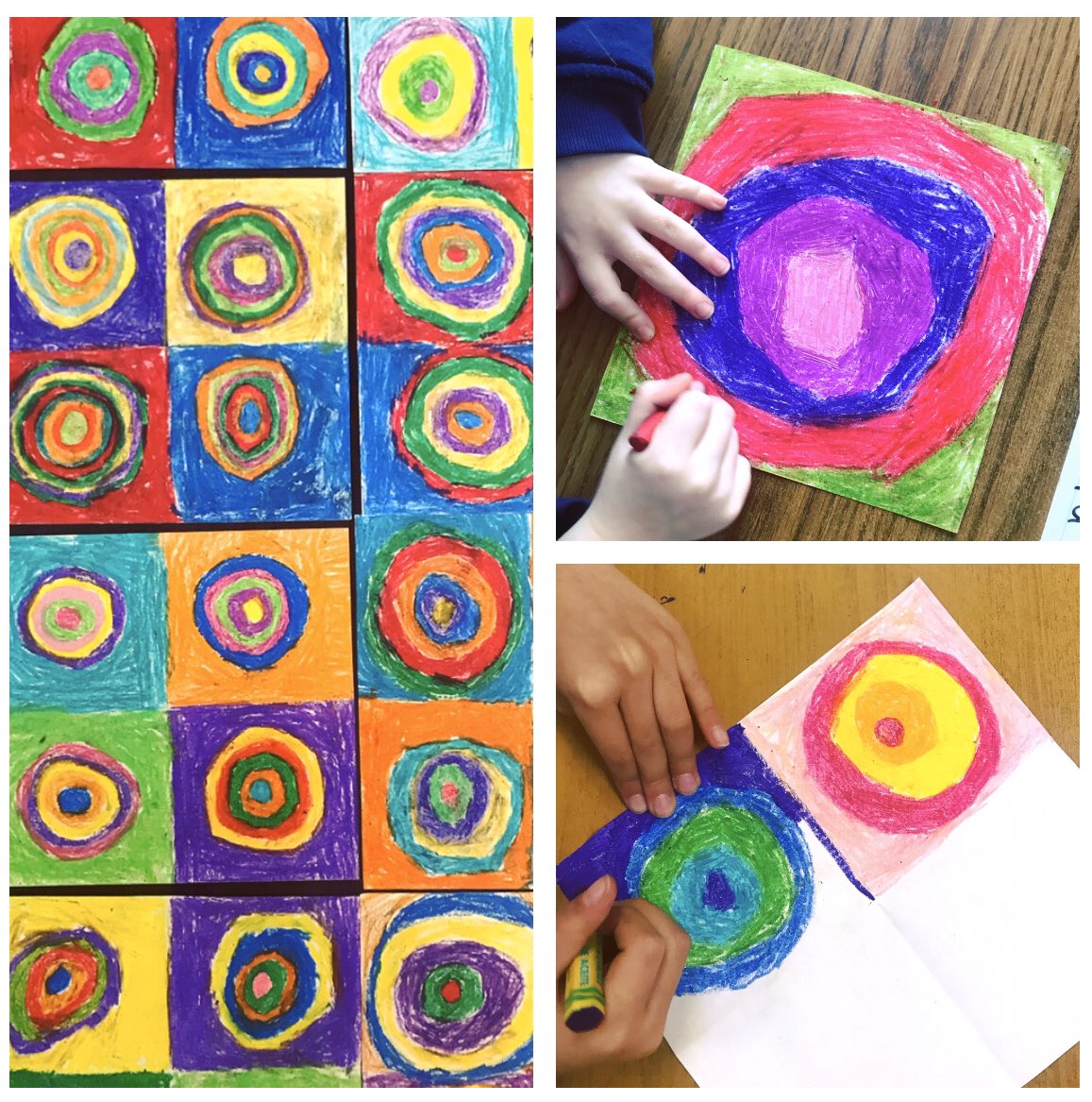
Our collaborative inspired art is ready!! We listened to music while choosing our colours just like #wassilykandinsky ! What music do you hear when you see colour? What colour do you see when you hear music? #synaesthesia #complementarycolours #warmcoolcolours @HCDSB_StFrancis
Rather too conventional pickings this morning for my taste but cheering nonetheless. #complementarycolours
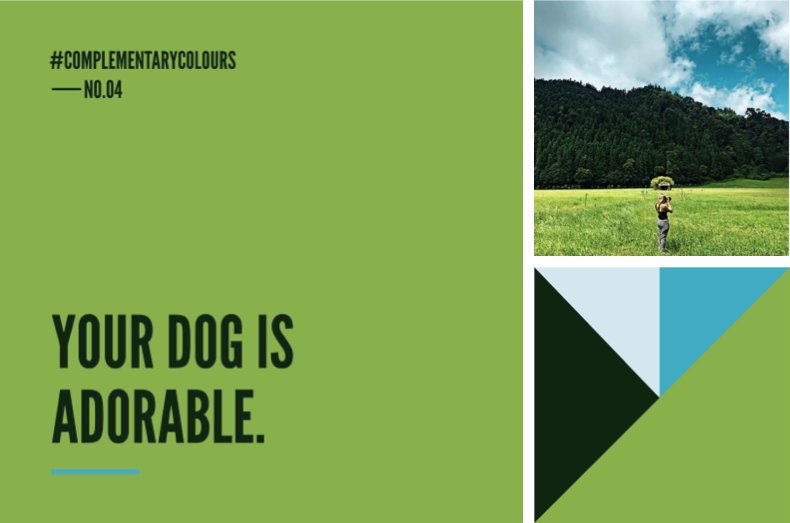
#ComplementaryColours No.04. RGB: Green 136 176 75 / Dk Green 16 38 18 / Lt Blue 211, 231, 238 / Sky Blue 66 171 197. Photo: Tom Blachford.
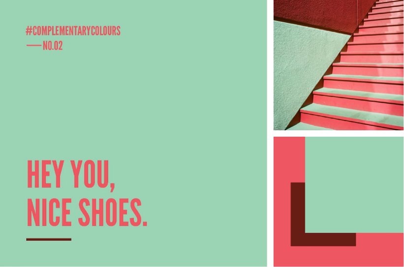
#ComplementaryColours No.02. RGB: Pink 238 86 95 / Blue 154 211 179 / Burgundy 102 29 19. Photo: huwbennett #elmwood_melbourne

blue skies and clouds above barren land make for best colour theory #artdump #complementarycolours #firedtoanotherspaceandtime


It’s simple and I love this question! It's called complementary color. I try to define the least amount of color combinations to create contrast and give the most color value 💙🌻 Blue is said to be cool, comfortable, and calm, while yellow is said to be cheerful and bright.


This vibrant red chilli pepper stands out against the lush green leaves, showcasing the power of complementary colours. #complementarycolours #naturephotography #photographytips #brentmail #brentmailphotography #shareinspirecreate


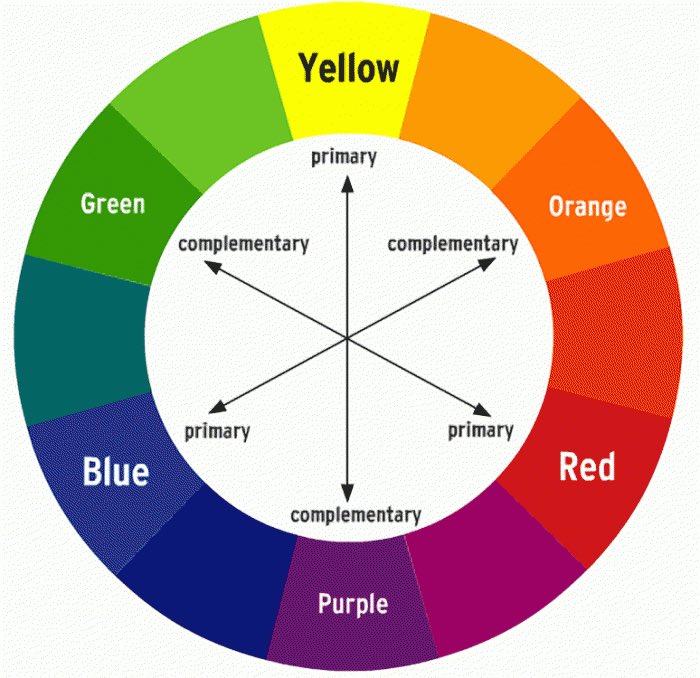
Do not trust a color guide that uses the wrong version of the word “complementary!” Also, blue is not the complement to pink/red, it’s green. Orange’s complement is blue. Yellow’s is purple. These pairings will feel stale to anyone truly wanting to experiment with color.


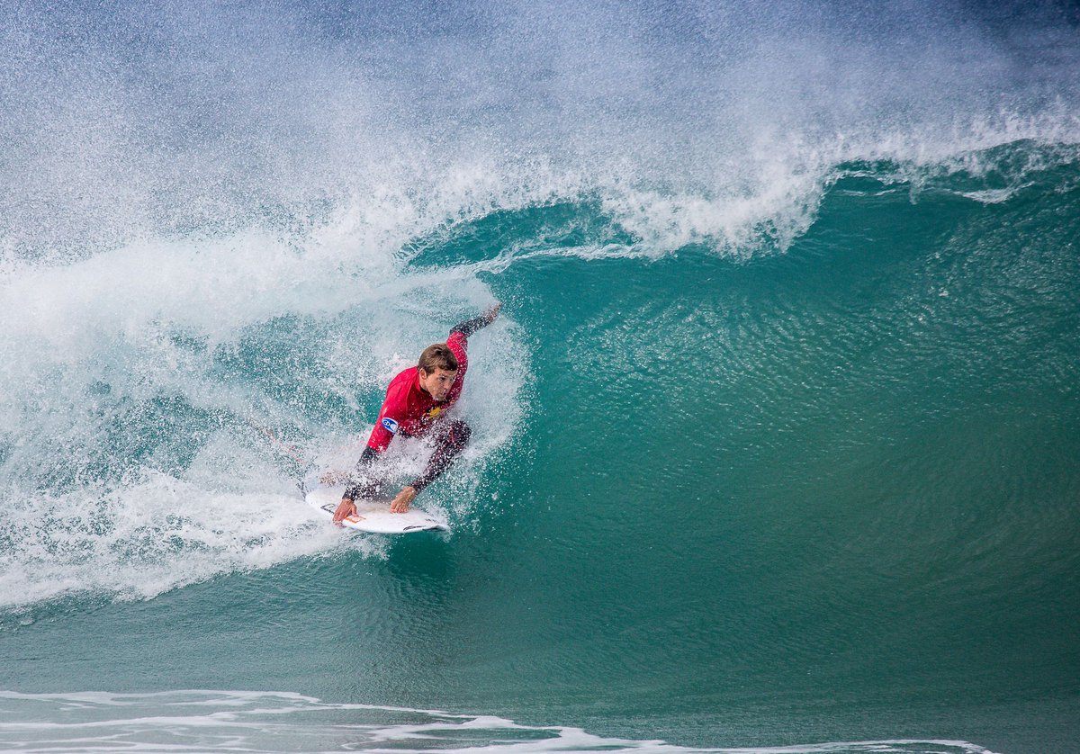
The surfer's red shirt against the deep blue ocean creates a striking contrast, making the action pop. Complementary colours like these capture dynamic moments perfectly. #complementarycolours #surfphotography #photographytip #brentmail #brentmailphotography #shareinspirecreate
Complementary colours in action! This ginger cat on vibrant blue stairs shows how opposite hues create stunning visual harmony. Have you noticed how they make everyday scenes pop? #complementarycolours #photographytips #brentmail #brentmailphotography #shareinspirecreate

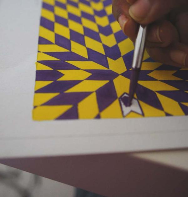
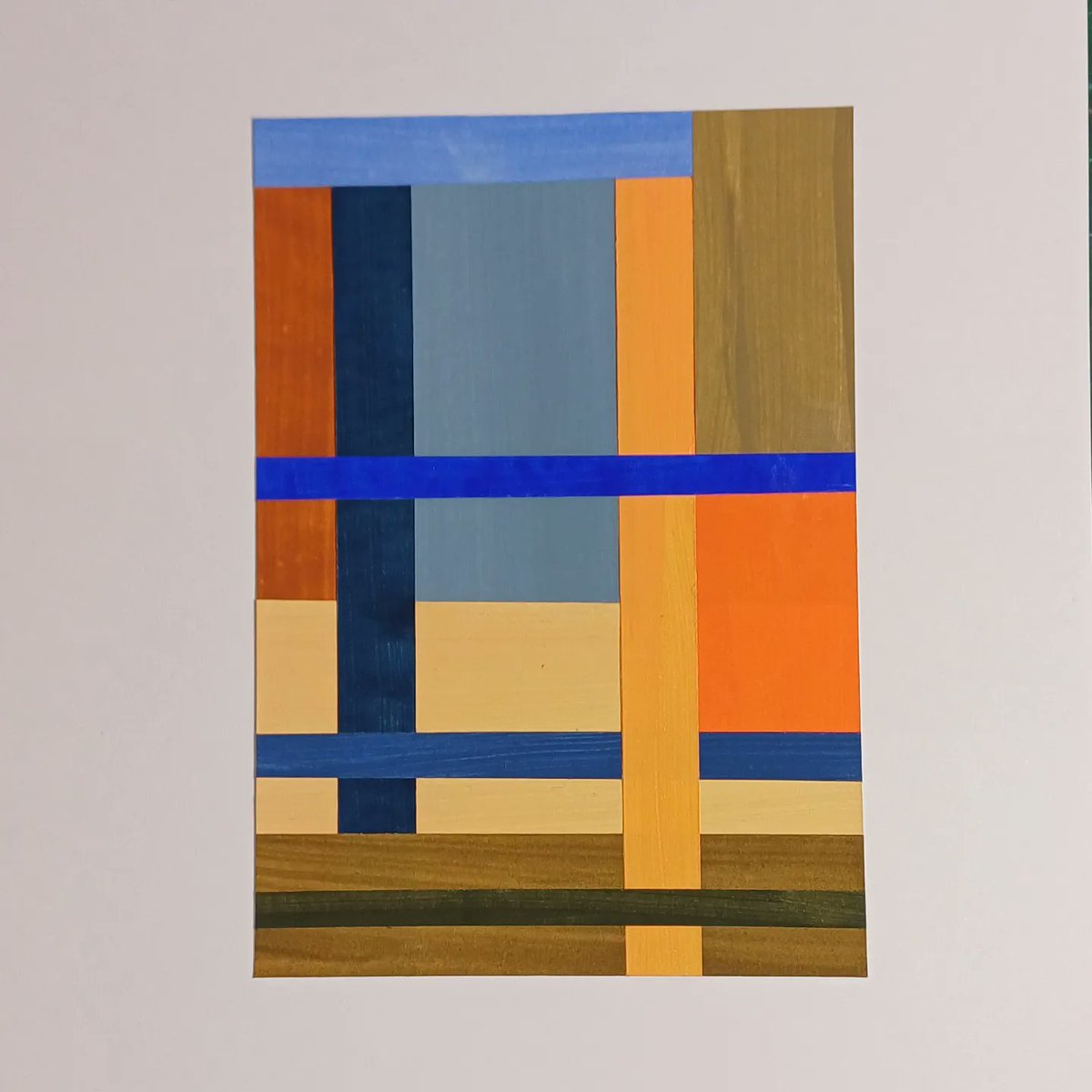
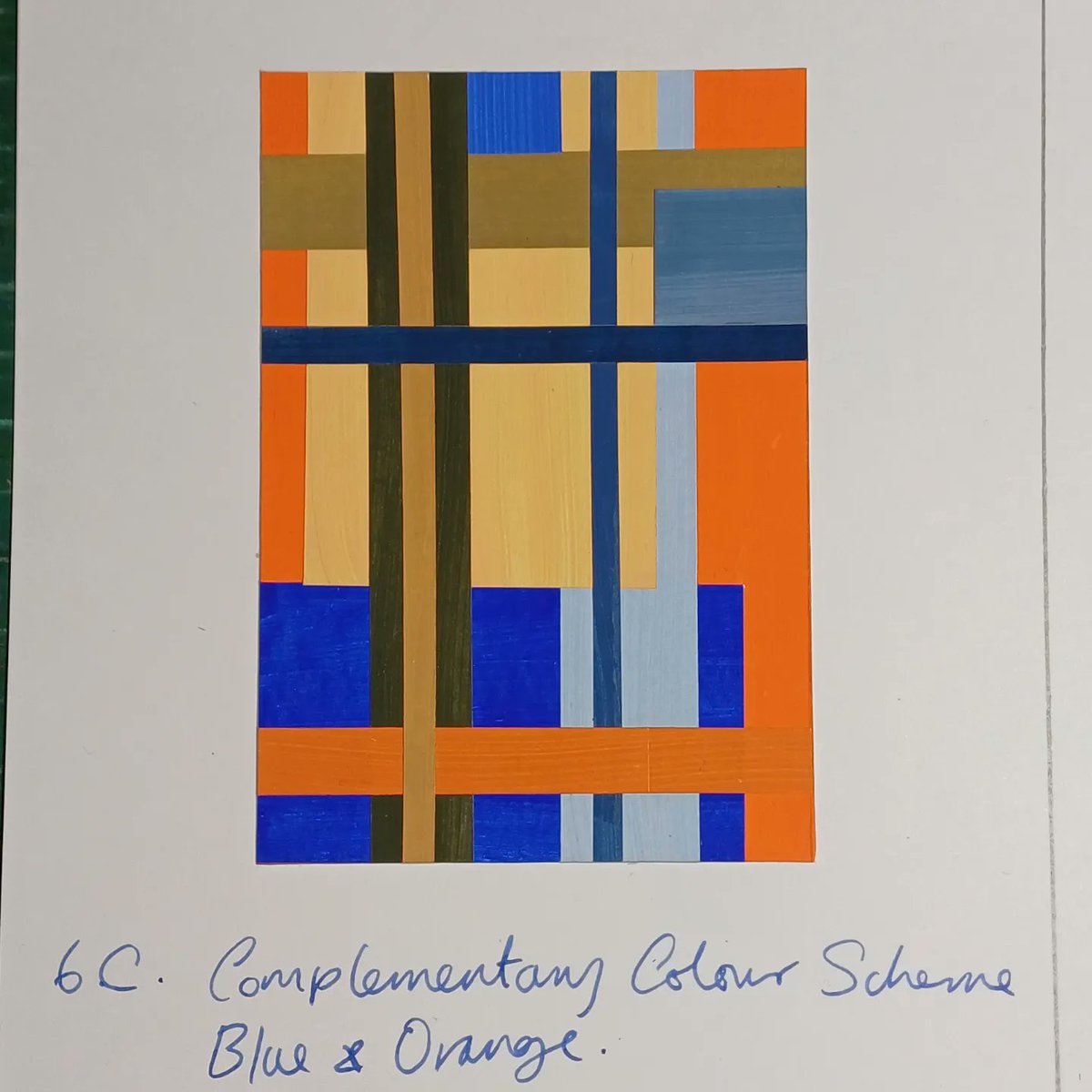
My favourite colour scheme studies so far, #complementarycolours blue and orange, and 10 of their muted colours and chromatic greys. I'm following the lessons in #davidhornungcolourworkshop book. #davidhornung #ColourAWorkshopForArtists #colourtheory #colourstudies


the point of complementary colors isnt to mix them, its to have them COMPLEMENT eachother!!!

"Dynamic Duos: A Deep Dive into the World of Complementary Colour Schemes in Design" linkedin.com/pulse/dynamic-… #DynamicDuos #ComplementaryColours #ColorHarmony #GraphicDesigners #CreativeExpression #Colour #LinkedIn #InfinitySTS #Article #Color #Infinity


fun fact, complementary colours are colours that are on opposite sides of the colour wheel like blue and orange so i fear skk don’t have a complementary palette

some fun addition on how you can use complementary colors to help u pick which color to go on the light/shadow areas!
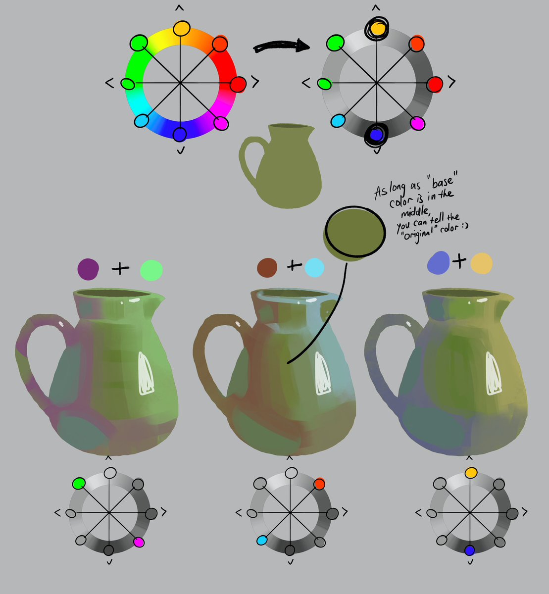

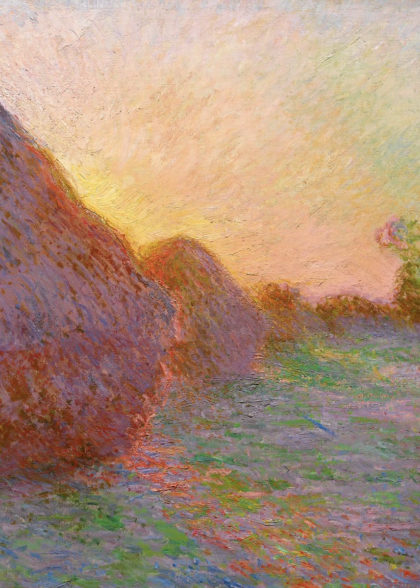
COLOR Monet used complementary colors to highlight areas of his painting. Complementary colors are located on opposite sides of the color wheel and draw the viewer’s eye when the colors are used together.

A thread on understanding the importance of 'complementary colors' in science figures 🎨👇🏼 (tl;dr, it will enhance color harmony, make your data 'pop', highlight antagonistic reactions, and keep your images color-blind accessible)


A complementary tetradic combines four colors: it starts on ‘alternate analogous’ dyad, but includes their complementaries. This gives a multicolor, diverse and vibrant design, but way more complicated than other schemes that’s why it isn’t used that much


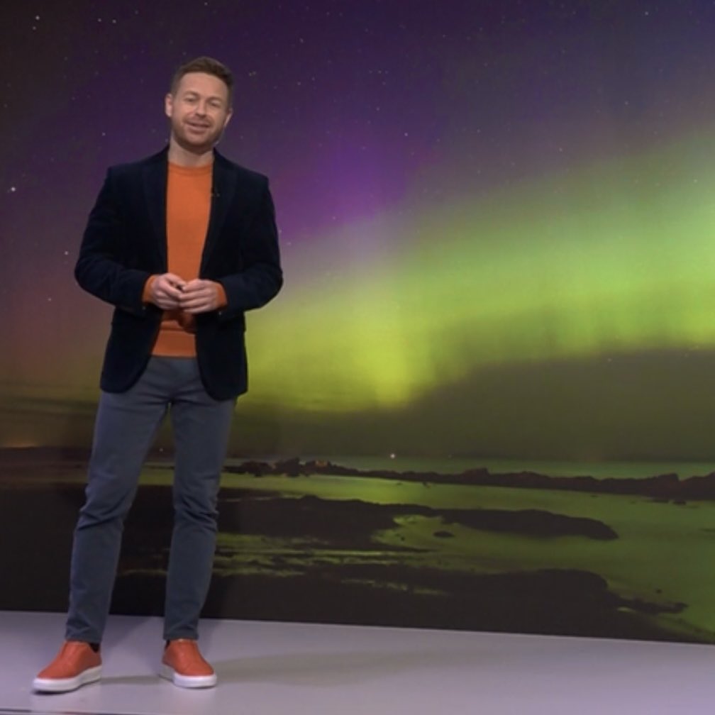
God damn this is beautiful. I really should be asleep but it's too overwhelming... I can't. #complementarycolours 💙

This vibrant red chilli pepper stands out against the lush green leaves, showcasing the power of complementary colours. #complementarycolours #naturephotography #photographytips #brentmail #brentmailphotography #shareinspirecreate
Complementary colours in action! This ginger cat on vibrant blue stairs shows how opposite hues create stunning visual harmony. Have you noticed how they make everyday scenes pop? #complementarycolours #photographytips #brentmail #brentmailphotography #shareinspirecreate
The surfer's red shirt against the deep blue ocean creates a striking contrast, making the action pop. Complementary colours like these capture dynamic moments perfectly. #complementarycolours #surfphotography #photographytip #brentmail #brentmailphotography #shareinspirecreate
#ComplementaryColours No.05. RGB: Orange 253 164 48/ Navy 1 19 48/ Blue 13 105 172/ Sky 147 204 236. Photo: Carl Kleiner. #elmwood_melbourne
#ComplementaryColours No.01. RGB: Yellow 254 223 83 / Light Blue 87 145 234 / Dark Blue 80 73 121. Photo: George Byrne #elmwood_melbourne


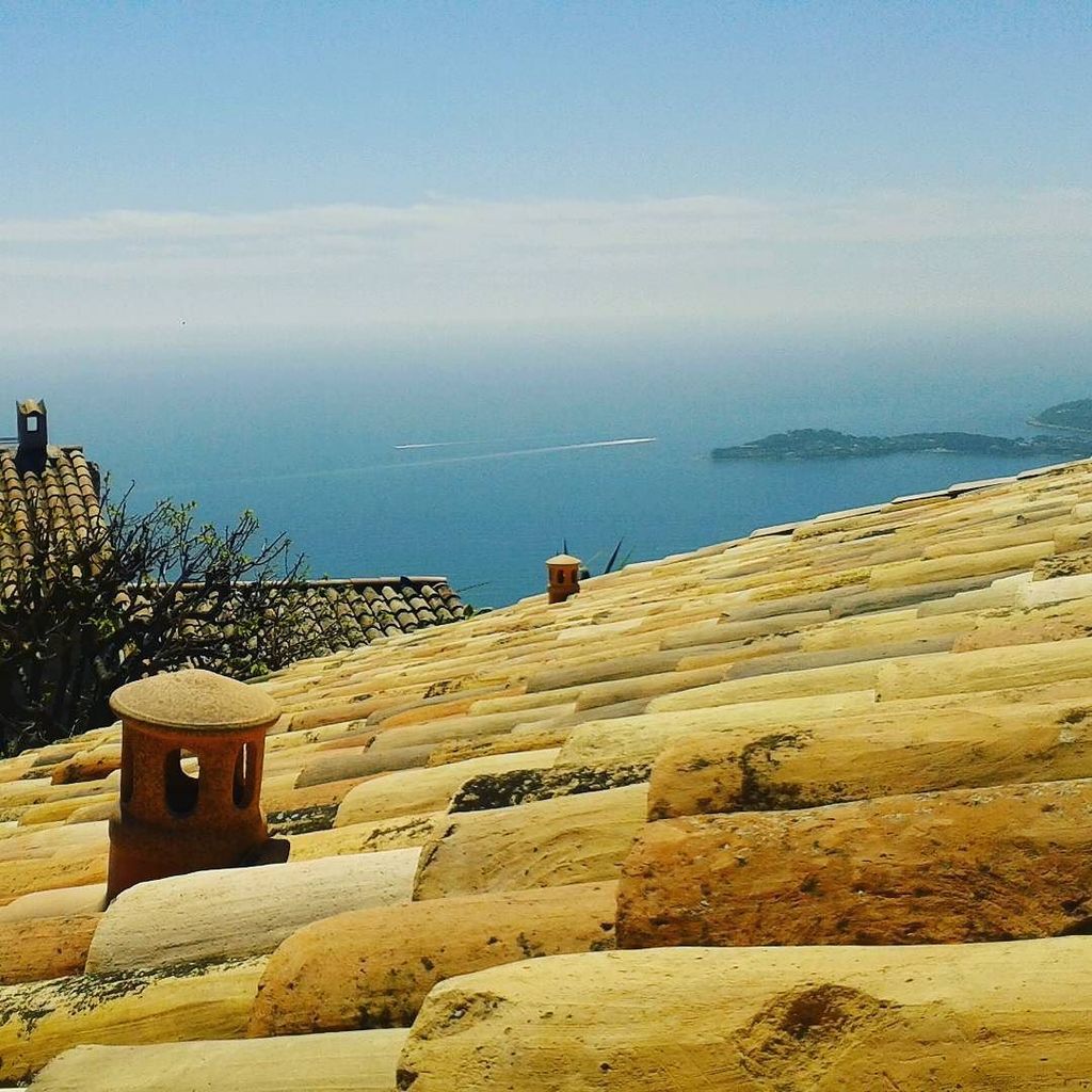
Ready to fall. #readytofall#riseagainst #clarendon #complementarycolours #cotedazur#erasmuslife#rooftop#frenchriv…
#ComplementaryColours No.03. RGB: Blue 126 204 238 / Grey 91 96 96 / Yellow 250 209 65. Photo: _julian.f_ #elmwood_melbourne

When photographing products and food, try placing them on a background that is a complementary or analogous colour to create an aesthetically pleasing image to capture the viewer. #complementarycolours #complementarycolors
#ComplementaryColours No.02. RGB: Pink 238 86 95 / Blue 154 211 179 / Burgundy 102 29 19. Photo: huwbennett #elmwood_melbourne

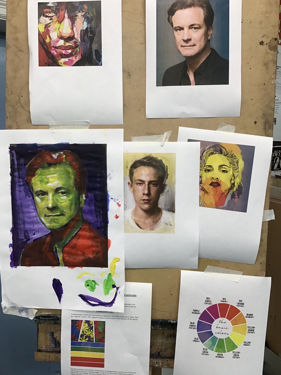
Just finished a #complementarycolours session for @ShrewsburyHigh ’becoming a sixth former’ day. #gdst #gdstskills #alevelart #shrewsbury #Shropshire #ShropshireHour #TuesdayMotivation #colinfirth @IE_Today @ISC_schools #ShropshireSchools #becomingasixthformer
#ComplementaryColours No.04. RGB: Green 136 176 75 / Dk Green 16 38 18 / Lt Blue 211, 231, 238 / Sky Blue 66 171 197. Photo: Tom Blachford.
Kicking off #ComplementaryColours from #elmwood_melbourne. Find a great pic. Show RGB breakdown. Use colours to write a ‘compliment’. *wink*
Something went wrong.
Something went wrong.
United States Trends
- 1. #socideveloper_com N/A
- 2. ARMY Protect The 8thDaesang 53.5K posts
- 3. #DaesangForJin 50.4K posts
- 4. #lip_bomb_RESCENE N/A
- 5. #2025MAMAVOTE 83.5K posts
- 6. #ENHYPEN 142K posts
- 7. Black Friday 282K posts
- 8. ilya 19.4K posts
- 9. Shane 23.7K posts
- 10. Ravens 59.8K posts
- 11. Lamar 47.3K posts
- 12. Mnet 185K posts
- 13. Bengals 53.3K posts
- 14. Third World Countries 33.5K posts
- 15. Mr. President 20.4K posts
- 16. Sarah Beckstrom 239K posts
- 17. Joe Burrow 21.8K posts
- 18. Hudson 12K posts
- 19. Connor 15.2K posts
- 20. Jungwoo 131K posts