#datasciencesimplified 검색 결과

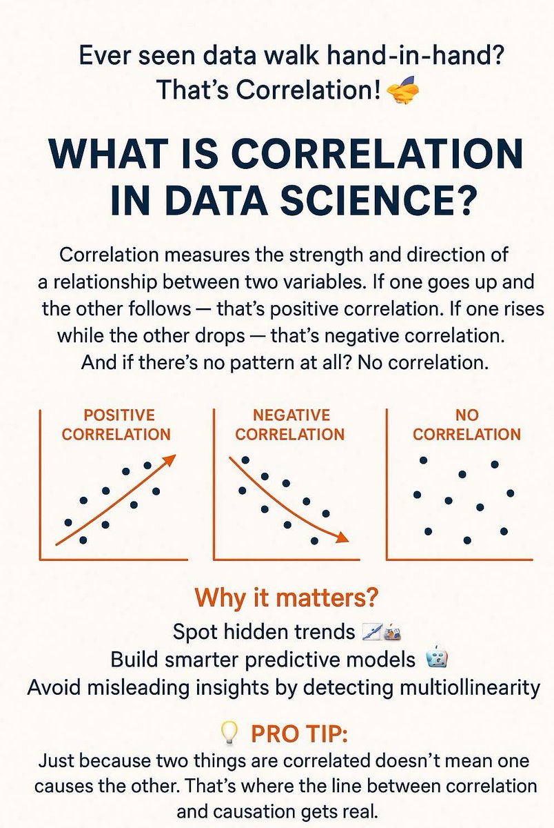
Ever seen data walk hand-in-hand? That’s Correlation! What is Correlation in Data Science? Correlation measures the strength and direction of a relationship between two variables. If one goes up and the other follows — that’s positive correlation. #DataScienceSimplified

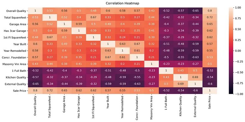
✨Day 39: Correlation Heatmaps!🌡️ They are like color-coded guides to correlation patterns. In this Correlation Map brighter shades mean strong positive correlation and darker ones negative correlation🎨 #DataScienceSimplified
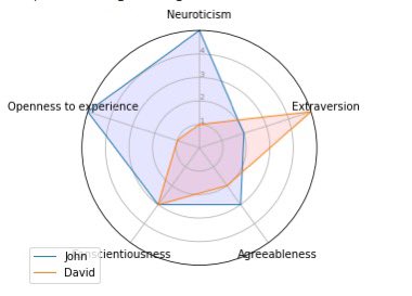
✨Day 43: Radar Charts! They are like dynamic spokes of data representation. Picture “Skill Assessment”– each spoke represents a skill, and the area enclosed showcases proficiency. #DataScienceSimplified
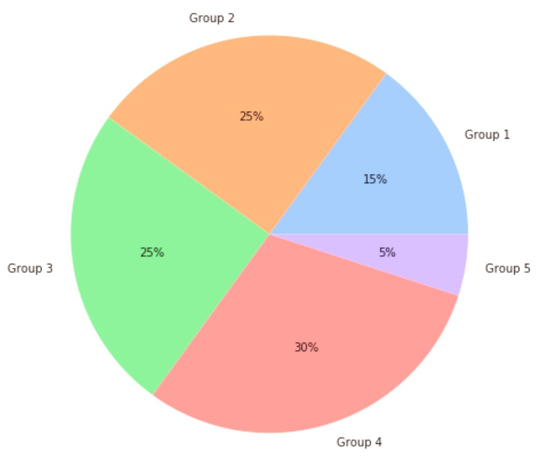
✨Day 34: Pie Charts in Data! 🥧 Pie charts are like slices of a data pie. Picture ‘Expense Categories’ – each slice shows the proportion of your budget. The key? When you add up all the slices, it sums up to 100%, giving a complete view. #DataScienceSimplified
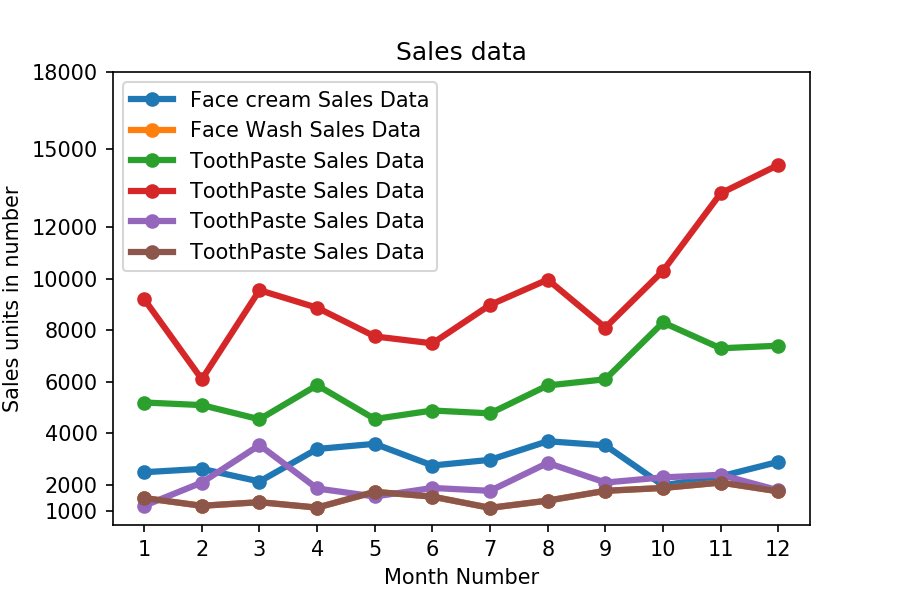
✨Day 35: Line Charts! 📈 They are like storytelling timelines for data trends. Picture ‘Stock Prices Over Time’ – each point connects, revealing the journey. You can also use line charts for ‘Temperature Changes,’ ‘Sales Growth,’ or ‘Population Trends.’ #DataScienceSimplified
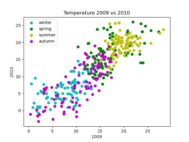
✨Day 36: Scatter Plots! Scatter plots are like friendship maps for variables. Picture Hours Studied vs Exam Scores – each point shows the connection. You can also use scatter plots for “Income vs Spending”, “Temperature vs Ice Cream Sales”... #DataScienceSimplified
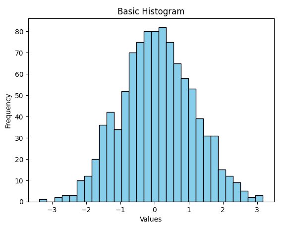
✨Day 37: Histograms! 📊 Histograms are like visual summaries for data distributions. Imagine ‘Exam Scores’ – each bar shows the frequency of scores within a range. You can also use histograms for “Income Distribution” or “Age Groups” #DataScienceSimplified
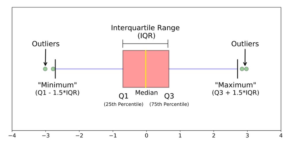
✨Day 38: Box Plots! They are nice for revealing key statistics and pointing out outliers. Picture ‘Income Distribution’ – the box shows where most incomes lie, the whiskers reveal the data’s spread and any dots outside are potential outliers. #DataScienceSimplified
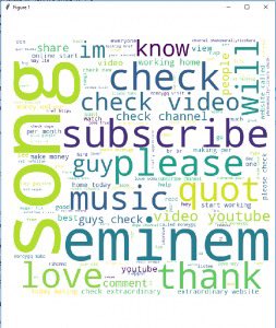
✨Day 40: Word Clouds! ☁️ They are visual summaries for text data. Imagine ‘Customer Feedback’ – frequent words appear larger, highlighting major themes. You can also use word clouds for “Social Media Sentiments”, “Employee Comments”,… #DataScienceSimplified
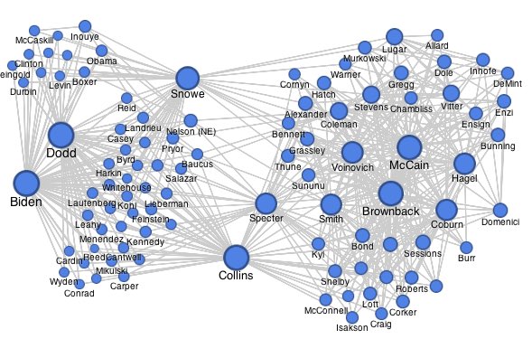
✨Day 42: Network Graphs! They are like interconnected webs of relationships. Imagine “Social Connections”– each node represents a person, and the links showcase friendships. It’s an easy way to explore data connections 🕸️ #DataScienceSimplified
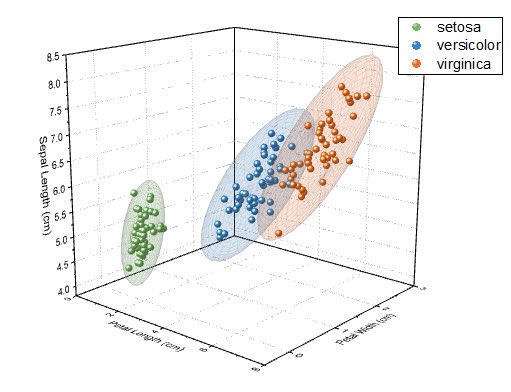
✨Day 44: 3D Scatter Plots! 🌐 They are like data galaxies where each point tells a three-dimensional story. Imagine “Customer Profiles” – x, y, and z coordinates represent Age, Purchase Frequency, and Satisfaction Level. #DataScienceSimplified
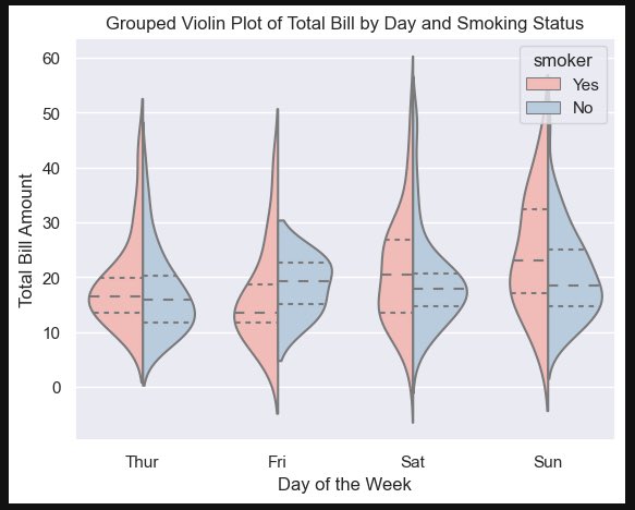
✨Day 45: Violin Plots! 🎻 Picture ‘Income Ranges’ – the widened areas reveal denser data, while the slim sections indicate sparse regions. You can also use violin plots for “Customer Spendings”, “Exam Scores by Subject”,…🎶 #DataScienceSimplified
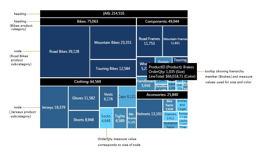
✨Day 41: Treemaps! 🌳 They are like organized maps for hierarchical data. Picture “Expense Breakdown”– each rectangle represents a category, and its size shows the proportion of spending. It’s like a visual journey through structured data branches! 📊🗺️ #DataScienceSimplified
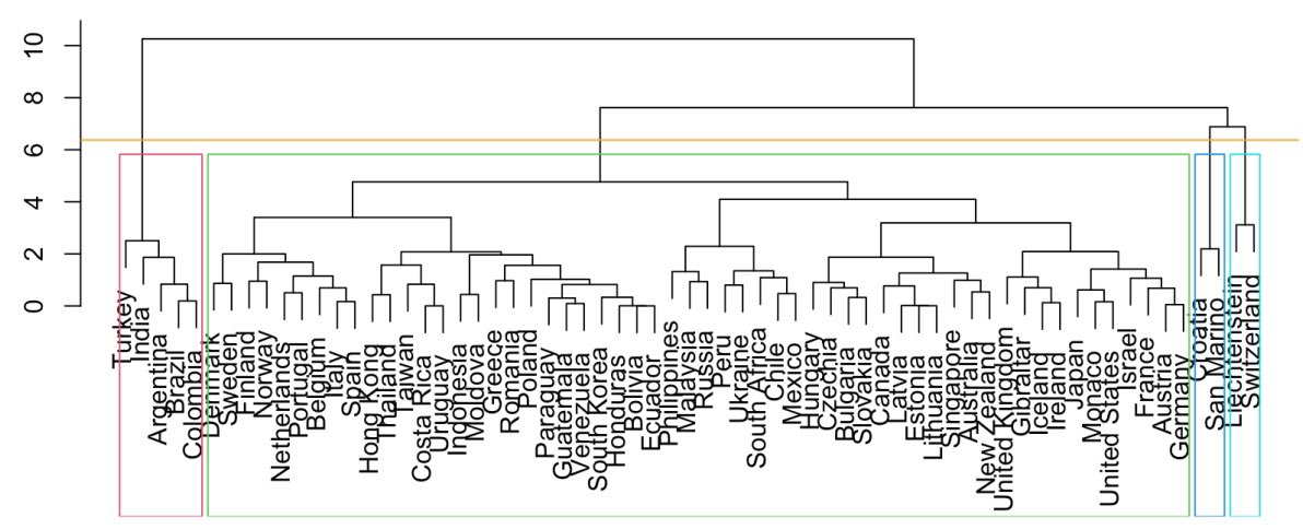
✨Day 48: Dendrograms! 🌳 Dendrograms are visual family trees for hierarchical clustering. In this example, I used a dendrogram to group countries based on specific characteristics, revealing clusters and insights into similarities between nations. 🌍 #DataScienceSimplified

🔍 𝐄𝐯𝐞𝐫 𝐰𝐨𝐧𝐝𝐞𝐫𝐞𝐝 𝐡𝐨𝐰 𝐃𝐚𝐭𝐚 𝐒𝐜𝐢𝐞𝐧𝐜𝐞 𝐫𝐞𝐚𝐥𝐥𝐲 𝐰𝐨𝐫𝐤𝐬? From data collection to predictions — our latest poster breaks it down step by step! 💡 #amypotechnologies #amypo #datasciencesimplified #datascience #learndatascience #datasciencelearning


#DataScienceSimplified #AIvsML #MachineLearning101 #DeepLearningExplained #SupervisedLearning #UnsupervisedLearning #BigData #StructuredData #DataAnalystVsDataScientist #InfinityLearningMumbai #LearnDataScience #DataForBeginners #TechEducationIndia #EducationalCarousel

p-value explained simply: A p-value tells you how likely your results are due to random chance. – Low p (< 0.05)? Reject the null. – High p? It might just be randomness. Stats ≠ magic. It’s just probability. #Statistics #DataScienceSimplified
✨Day 33: Bar Charts! 📊 Bar charts are like visual storytellers for data. Imagine plotting ‘Favorite Colors’ – each bar represents a color’s popularity. (So every color would be a bar and its height it’s frequency) 🌈 #DataScienceSimplified
✨Day 32: Hypothesis Testing! 🧪 In the world of data, it’s like being a detective. You form a hypothesis, like suspecting a new drug is effective. Then, you collect evidence (data), analyze it, and determine if your hypothesis stands. 🔍 #DataScienceSimplified

🌟 Introducing the next level of data visualization: The Sankey Chart! 🚀 For #SankeyMaster, dive deep into flow optimization! 🌍✨ #DataScienceSimplified #SankeyChart #Visual #sankeymaster #sankey 👉apps.apple.com/app/apple-stor…


💡 "Analytics without the headaches." Say goodbye to complexity—drag-and-drop interfaces, prebuilt templates, and instant share links make advanced analytics effortless. 🔍 Get started now at dataanalyzerpro.com #AnalyticsMadeEasy #AIAnalytics #DataScienceSimplified

#DataScienceSimplified #AIvsML #MachineLearning101 #DeepLearningExplained #SupervisedLearning #UnsupervisedLearning #BigData #StructuredData #DataAnalystVsDataScientist #InfinityLearningMumbai #LearnDataScience #DataForBeginners #TechEducationIndia #EducationalCarousel
🔍 𝐄𝐯𝐞𝐫 𝐰𝐨𝐧𝐝𝐞𝐫𝐞𝐝 𝐡𝐨𝐰 𝐃𝐚𝐭𝐚 𝐒𝐜𝐢𝐞𝐧𝐜𝐞 𝐫𝐞𝐚𝐥𝐥𝐲 𝐰𝐨𝐫𝐤𝐬? From data collection to predictions — our latest poster breaks it down step by step! 💡 #amypotechnologies #amypo #datasciencesimplified #datascience #learndatascience #datasciencelearning
Ever seen data walk hand-in-hand? That’s Correlation! What is Correlation in Data Science? Correlation measures the strength and direction of a relationship between two variables. If one goes up and the other follows — that’s positive correlation. #DataScienceSimplified
p-value explained simply: A p-value tells you how likely your results are due to random chance. – Low p (< 0.05)? Reject the null. – High p? It might just be randomness. Stats ≠ magic. It’s just probability. #Statistics #DataScienceSimplified
✨Day 50: Data Cleaning! It’s the process of correcting or removing inaccurate records, ensuring data quality and reliability. Key steps include: handling missing data, correcting errors and standardising data formats. 🧹🫧 #DataScienceSimplified
✨Day 48: Dendrograms! 🌳 Dendrograms are visual family trees for hierarchical clustering. In this example, I used a dendrogram to group countries based on specific characteristics, revealing clusters and insights into similarities between nations. 🌍 #DataScienceSimplified
✨Day 45: Violin Plots! 🎻 Picture ‘Income Ranges’ – the widened areas reveal denser data, while the slim sections indicate sparse regions. You can also use violin plots for “Customer Spendings”, “Exam Scores by Subject”,…🎶 #DataScienceSimplified
✨Day 44: 3D Scatter Plots! 🌐 They are like data galaxies where each point tells a three-dimensional story. Imagine “Customer Profiles” – x, y, and z coordinates represent Age, Purchase Frequency, and Satisfaction Level. #DataScienceSimplified
✨Day 43: Radar Charts! They are like dynamic spokes of data representation. Picture “Skill Assessment”– each spoke represents a skill, and the area enclosed showcases proficiency. #DataScienceSimplified
✨Day 42: Network Graphs! They are like interconnected webs of relationships. Imagine “Social Connections”– each node represents a person, and the links showcase friendships. It’s an easy way to explore data connections 🕸️ #DataScienceSimplified
✨Day 41: Treemaps! 🌳 They are like organized maps for hierarchical data. Picture “Expense Breakdown”– each rectangle represents a category, and its size shows the proportion of spending. It’s like a visual journey through structured data branches! 📊🗺️ #DataScienceSimplified
✨Day 40: Word Clouds! ☁️ They are visual summaries for text data. Imagine ‘Customer Feedback’ – frequent words appear larger, highlighting major themes. You can also use word clouds for “Social Media Sentiments”, “Employee Comments”,… #DataScienceSimplified
✨Day 39: Correlation Heatmaps!🌡️ They are like color-coded guides to correlation patterns. In this Correlation Map brighter shades mean strong positive correlation and darker ones negative correlation🎨 #DataScienceSimplified
✨Day 38: Box Plots! They are nice for revealing key statistics and pointing out outliers. Picture ‘Income Distribution’ – the box shows where most incomes lie, the whiskers reveal the data’s spread and any dots outside are potential outliers. #DataScienceSimplified
✨Day 37: Histograms! 📊 Histograms are like visual summaries for data distributions. Imagine ‘Exam Scores’ – each bar shows the frequency of scores within a range. You can also use histograms for “Income Distribution” or “Age Groups” #DataScienceSimplified
✨Day 36: Scatter Plots! Scatter plots are like friendship maps for variables. Picture Hours Studied vs Exam Scores – each point shows the connection. You can also use scatter plots for “Income vs Spending”, “Temperature vs Ice Cream Sales”... #DataScienceSimplified
✨Day 35: Line Charts! 📈 They are like storytelling timelines for data trends. Picture ‘Stock Prices Over Time’ – each point connects, revealing the journey. You can also use line charts for ‘Temperature Changes,’ ‘Sales Growth,’ or ‘Population Trends.’ #DataScienceSimplified
✨Day 34: Pie Charts in Data! 🥧 Pie charts are like slices of a data pie. Picture ‘Expense Categories’ – each slice shows the proportion of your budget. The key? When you add up all the slices, it sums up to 100%, giving a complete view. #DataScienceSimplified

💡 "Analytics without the headaches." Say goodbye to complexity—drag-and-drop interfaces, prebuilt templates, and instant share links make advanced analytics effortless. 🔍 Get started now at dataanalyzerpro.com #AnalyticsMadeEasy #AIAnalytics #DataScienceSimplified

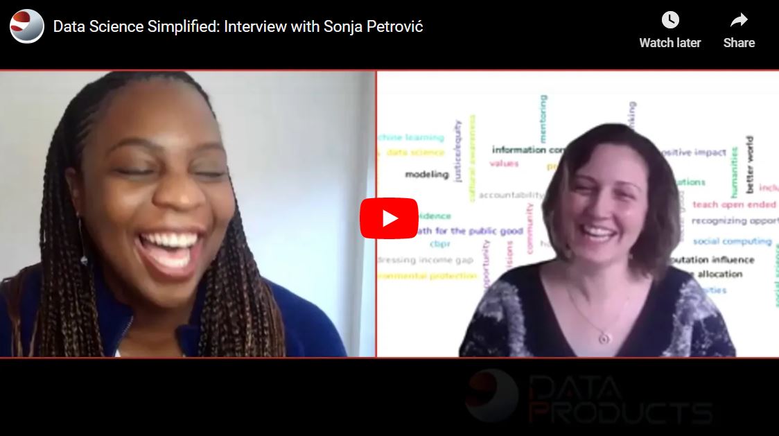
Dr. Sonja Petrović (Assoc. Prof, IIT) talks about an exciting new initiative – SoReMo – advocating for ethical, equitable approaches in computation, modeling, and design. dataproducts.io/2021/01/data-s… #dataproducts #dataanalytics #datasciencesimplified #design #computation
🔍 𝐄𝐯𝐞𝐫 𝐰𝐨𝐧𝐝𝐞𝐫𝐞𝐝 𝐡𝐨𝐰 𝐃𝐚𝐭𝐚 𝐒𝐜𝐢𝐞𝐧𝐜𝐞 𝐫𝐞𝐚𝐥𝐥𝐲 𝐰𝐨𝐫𝐤𝐬? From data collection to predictions — our latest poster breaks it down step by step! 💡 #amypotechnologies #amypo #datasciencesimplified #datascience #learndatascience #datasciencelearning
✨Day 39: Correlation Heatmaps!🌡️ They are like color-coded guides to correlation patterns. In this Correlation Map brighter shades mean strong positive correlation and darker ones negative correlation🎨 #DataScienceSimplified
✨Day 43: Radar Charts! They are like dynamic spokes of data representation. Picture “Skill Assessment”– each spoke represents a skill, and the area enclosed showcases proficiency. #DataScienceSimplified
✨Day 34: Pie Charts in Data! 🥧 Pie charts are like slices of a data pie. Picture ‘Expense Categories’ – each slice shows the proportion of your budget. The key? When you add up all the slices, it sums up to 100%, giving a complete view. #DataScienceSimplified
✨Day 35: Line Charts! 📈 They are like storytelling timelines for data trends. Picture ‘Stock Prices Over Time’ – each point connects, revealing the journey. You can also use line charts for ‘Temperature Changes,’ ‘Sales Growth,’ or ‘Population Trends.’ #DataScienceSimplified
✨Day 36: Scatter Plots! Scatter plots are like friendship maps for variables. Picture Hours Studied vs Exam Scores – each point shows the connection. You can also use scatter plots for “Income vs Spending”, “Temperature vs Ice Cream Sales”... #DataScienceSimplified
✨Day 37: Histograms! 📊 Histograms are like visual summaries for data distributions. Imagine ‘Exam Scores’ – each bar shows the frequency of scores within a range. You can also use histograms for “Income Distribution” or “Age Groups” #DataScienceSimplified
✨Day 40: Word Clouds! ☁️ They are visual summaries for text data. Imagine ‘Customer Feedback’ – frequent words appear larger, highlighting major themes. You can also use word clouds for “Social Media Sentiments”, “Employee Comments”,… #DataScienceSimplified
✨Day 38: Box Plots! They are nice for revealing key statistics and pointing out outliers. Picture ‘Income Distribution’ – the box shows where most incomes lie, the whiskers reveal the data’s spread and any dots outside are potential outliers. #DataScienceSimplified
✨Day 42: Network Graphs! They are like interconnected webs of relationships. Imagine “Social Connections”– each node represents a person, and the links showcase friendships. It’s an easy way to explore data connections 🕸️ #DataScienceSimplified
✨Day 44: 3D Scatter Plots! 🌐 They are like data galaxies where each point tells a three-dimensional story. Imagine “Customer Profiles” – x, y, and z coordinates represent Age, Purchase Frequency, and Satisfaction Level. #DataScienceSimplified
✨Day 45: Violin Plots! 🎻 Picture ‘Income Ranges’ – the widened areas reveal denser data, while the slim sections indicate sparse regions. You can also use violin plots for “Customer Spendings”, “Exam Scores by Subject”,…🎶 #DataScienceSimplified
✨Day 41: Treemaps! 🌳 They are like organized maps for hierarchical data. Picture “Expense Breakdown”– each rectangle represents a category, and its size shows the proportion of spending. It’s like a visual journey through structured data branches! 📊🗺️ #DataScienceSimplified
✨Day 48: Dendrograms! 🌳 Dendrograms are visual family trees for hierarchical clustering. In this example, I used a dendrogram to group countries based on specific characteristics, revealing clusters and insights into similarities between nations. 🌍 #DataScienceSimplified
Ever seen data walk hand-in-hand? That’s Correlation! What is Correlation in Data Science? Correlation measures the strength and direction of a relationship between two variables. If one goes up and the other follows — that’s positive correlation. #DataScienceSimplified

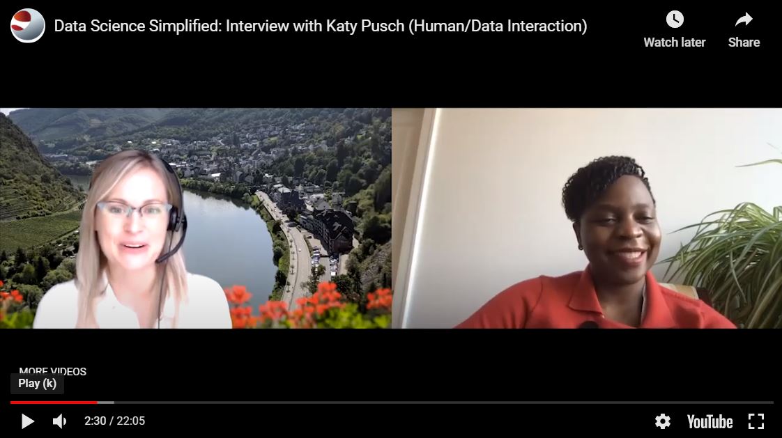
Katy Pusch talks about the methods (and pitfalls) of human/data interaction in our latest episode of Data Science Simplified: lnkd.in/dKRTJEk #datasciencesimplified #dataproducts #datascience #datasciencetraining
Something went wrong.
Something went wrong.
United States Trends
- 1. Halloween 2.95M posts
- 2. #DoorDashTradeorTreat N/A
- 3. #sweepstakes 2,047 posts
- 4. #SwapSilently 8,378 posts
- 5. #smackoff 1,188 posts
- 6. Jessica Lange 33.7K posts
- 7. Disney 95.6K posts
- 8. YouTube TV 43K posts
- 9. ESPN 77.3K posts
- 10. Hulu 22.8K posts
- 11. Coven 10.6K posts
- 12. Monangai 1,127 posts
- 13. Grier 15.7K posts
- 14. Evan Peters 22.5K posts
- 15. ryan murphy 7,141 posts
- 16. Trick or Treat 438K posts
- 17. Ridiculousness 5,780 posts
- 18. #FursuitFriday 13.3K posts
- 19. McDaniel 15.3K posts
- 20. YTTV 2,259 posts