#designtermoftheweek نتائج البحث

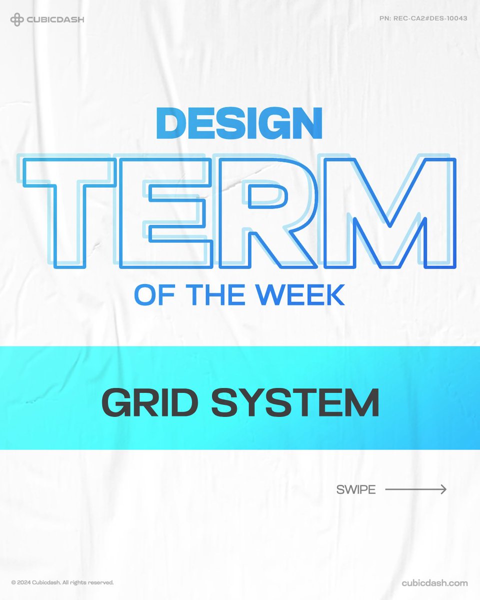
Design Term of the Week: Grid System Grid systems are the backbone of organized design! They use vertical and horizontal lines to align your content and balance for a clean and structured layout. #GridSystem #DesignTermoftheWeek #Cubicdash

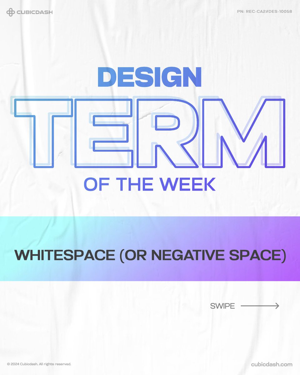
Design Term of the Week Whitespace or negative space, is important in design because it helps your content stand out and be more readable. Designs look balanced, creating a better overall look. #Whitespace #DesignTermoftheWeek #Cubicdash

Have you wondered how letters can turn into a masterpiece? It can be about a small overlooked detail. Kerning! It allows graphic designers to adjust the text, so the spacing is consistent and type is legible. #Kerning #DesignTermoftheWeek #Cubicdash


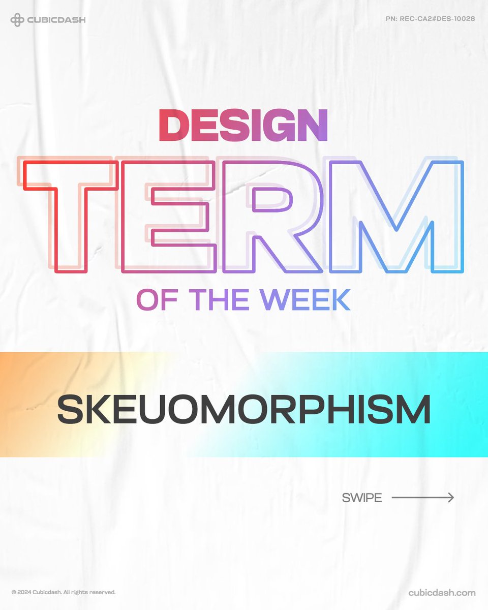
Design Term of the Week: Skeuomorphism Skeuomorphism was once popular for adding realistic textures and details to digital designs but was taken over by flat design and minimalism. Now, it's making a comeback. #Skeuomorphism #DesignTermoftheWeek #Cubicdash

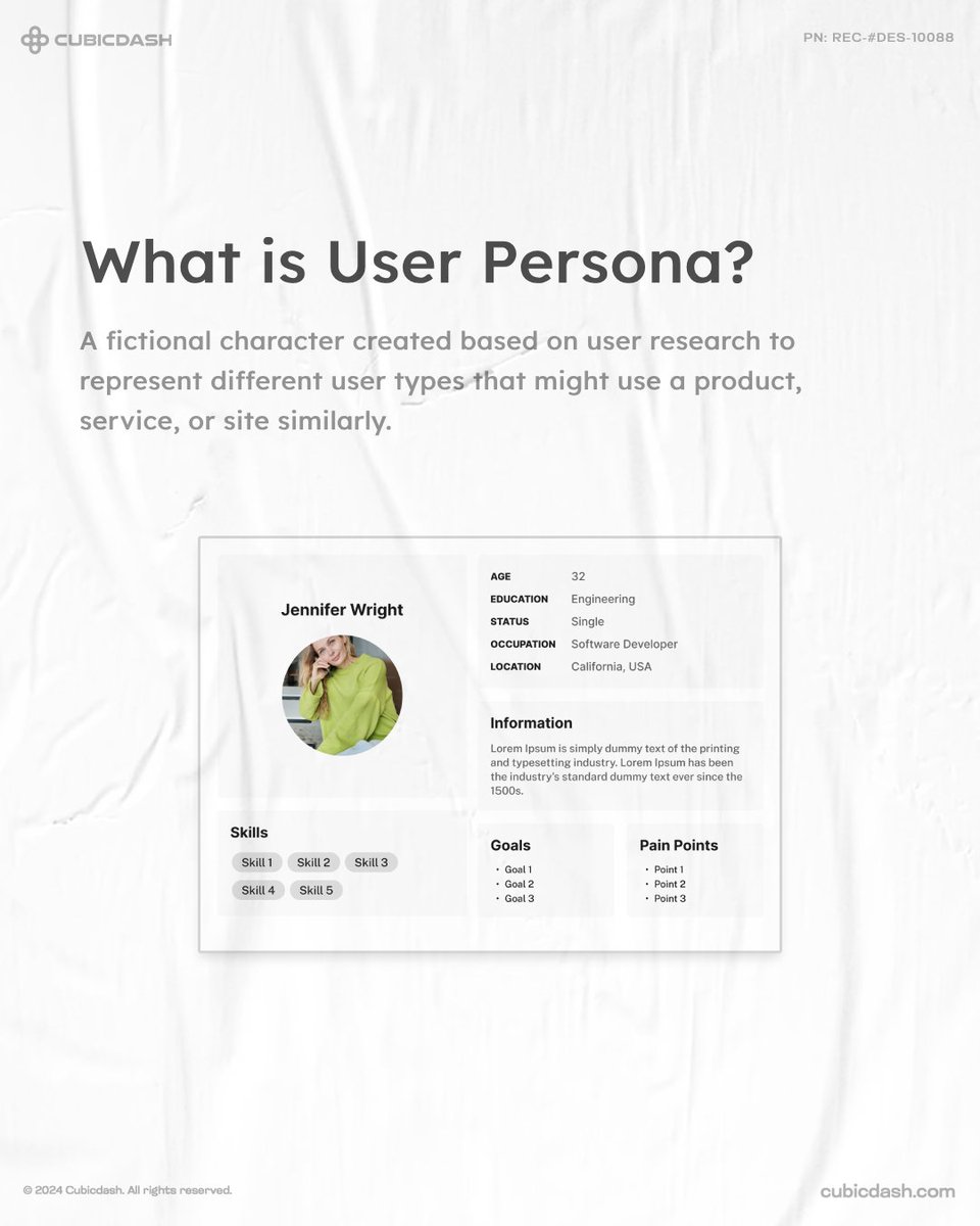
A user persona is your ideal customer profile. It helps focus marketing, tailor products, and speak your customer's language. For eg., Apple targets tech-savvy, design-conscious users. How has your brand defined its audience? #UserPersona #DesignTermoftheWeek #cubicdash

Design Term of the Week The golden ratio is a classic design principle that creates harmony and balance through perfect proportions. Do you know artists like Leonardo da Vinci used it to structure their masterpieces? #GoldenRatio #DesignTermoftheWeek #Cubicdash

Design Term of the Week Parallax scrolling adds depth to the user experience, creating a visually dynamic journey through content. Using the right design tools, you can quickly transform any idea from wireframe to final product. #ParallaxScrolling #DesignTermoftheWeek #Cubicdash


Design Term of the Week: Affordance Affordances are cues that hint at how users may interact with something, whether physical or digital. It helps improve usability, task efficiency, and engagement. #Affordance #DesignTermoftheWeek #Cubicdash


Design Term of the Week Parallax scrolling adds depth to the user experience, creating a visually dynamic journey through content. Using the right design tools, you can quickly transform any idea from wireframe to final product. #ParallaxScrolling #DesignTermoftheWeek #Cubicdash
A user persona is your ideal customer profile. It helps focus marketing, tailor products, and speak your customer's language. For eg., Apple targets tech-savvy, design-conscious users. How has your brand defined its audience? #UserPersona #DesignTermoftheWeek #cubicdash
Design Term of the Week The golden ratio is a classic design principle that creates harmony and balance through perfect proportions. Do you know artists like Leonardo da Vinci used it to structure their masterpieces? #GoldenRatio #DesignTermoftheWeek #Cubicdash
Design Term of the Week Whitespace or negative space, is important in design because it helps your content stand out and be more readable. Designs look balanced, creating a better overall look. #Whitespace #DesignTermoftheWeek #Cubicdash
Design Term of the Week: Grid System Grid systems are the backbone of organized design! They use vertical and horizontal lines to align your content and balance for a clean and structured layout. #GridSystem #DesignTermoftheWeek #Cubicdash
Design Term of the Week: Skeuomorphism Skeuomorphism was once popular for adding realistic textures and details to digital designs but was taken over by flat design and minimalism. Now, it's making a comeback. #Skeuomorphism #DesignTermoftheWeek #Cubicdash
Have you wondered how letters can turn into a masterpiece? It can be about a small overlooked detail. Kerning! It allows graphic designers to adjust the text, so the spacing is consistent and type is legible. #Kerning #DesignTermoftheWeek #Cubicdash
Design Term of the Week Whitespace or negative space, is important in design because it helps your content stand out and be more readable. Designs look balanced, creating a better overall look. #Whitespace #DesignTermoftheWeek #Cubicdash
Design Term of the Week: Grid System Grid systems are the backbone of organized design! They use vertical and horizontal lines to align your content and balance for a clean and structured layout. #GridSystem #DesignTermoftheWeek #Cubicdash
Have you wondered how letters can turn into a masterpiece? It can be about a small overlooked detail. Kerning! It allows graphic designers to adjust the text, so the spacing is consistent and type is legible. #Kerning #DesignTermoftheWeek #Cubicdash
Design Term of the Week: Skeuomorphism Skeuomorphism was once popular for adding realistic textures and details to digital designs but was taken over by flat design and minimalism. Now, it's making a comeback. #Skeuomorphism #DesignTermoftheWeek #Cubicdash
Design Term of the Week The golden ratio is a classic design principle that creates harmony and balance through perfect proportions. Do you know artists like Leonardo da Vinci used it to structure their masterpieces? #GoldenRatio #DesignTermoftheWeek #Cubicdash
Design Term of the Week Parallax scrolling adds depth to the user experience, creating a visually dynamic journey through content. Using the right design tools, you can quickly transform any idea from wireframe to final product. #ParallaxScrolling #DesignTermoftheWeek #Cubicdash
Design Term of the Week: Affordance Affordances are cues that hint at how users may interact with something, whether physical or digital. It helps improve usability, task efficiency, and engagement. #Affordance #DesignTermoftheWeek #Cubicdash
A user persona is your ideal customer profile. It helps focus marketing, tailor products, and speak your customer's language. For eg., Apple targets tech-savvy, design-conscious users. How has your brand defined its audience? #UserPersona #DesignTermoftheWeek #cubicdash
Something went wrong.
Something went wrong.
United States Trends
- 1. #DWTS 10.8K posts
- 2. Robert 99.5K posts
- 3. Elaine 36.8K posts
- 4. #WWENXT 7,406 posts
- 5. Carrie Ann N/A
- 6. Whitney 11.9K posts
- 7. #DWCS 1,624 posts
- 8. Young Republicans 37.4K posts
- 9. Jackson Chourio 1,639 posts
- 10. D’Angelo 378K posts
- 11. Charlie 739K posts
- 12. Politico 237K posts
- 13. #LHHATL N/A
- 14. Dennis Quaid 1,438 posts
- 15. #AriZZona N/A
- 16. Erika Kirk 94.4K posts
- 17. Teoscar 3,505 posts
- 18. Cornelia 1,697 posts
- 19. Josh Briggs N/A
- 20. Matt Cardona 1,228 posts