#designtip search results

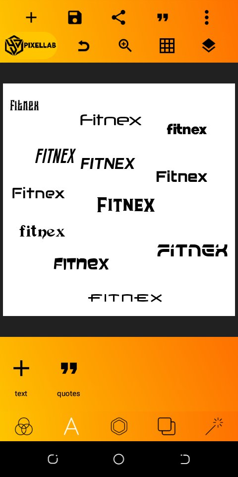
Too many fonts leads to visual chaos. Stick to 2 (or max 3) typefaces in a design One for headings, one for body, and maybe an accent. It keeps your work clean, readable & professional. #designtip💡

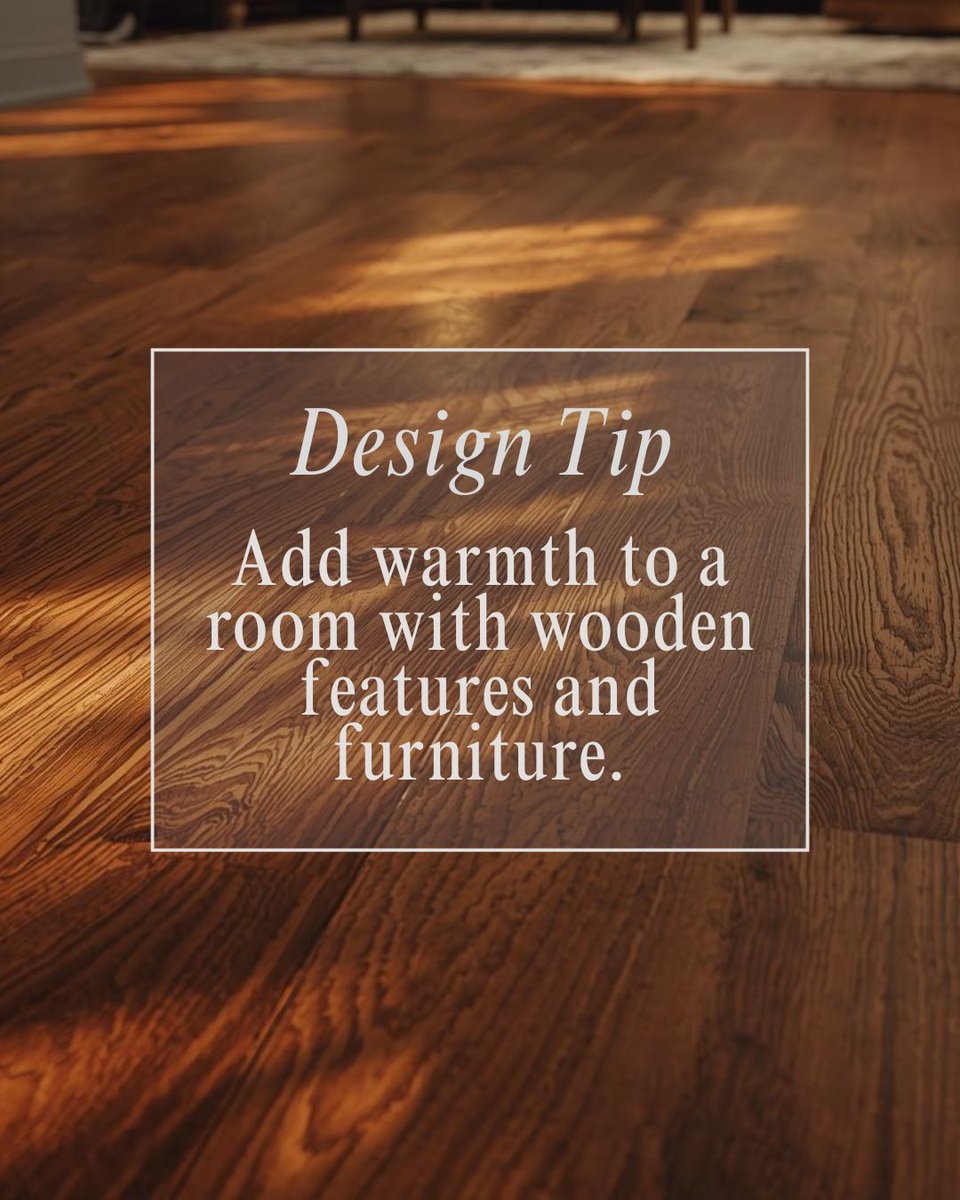
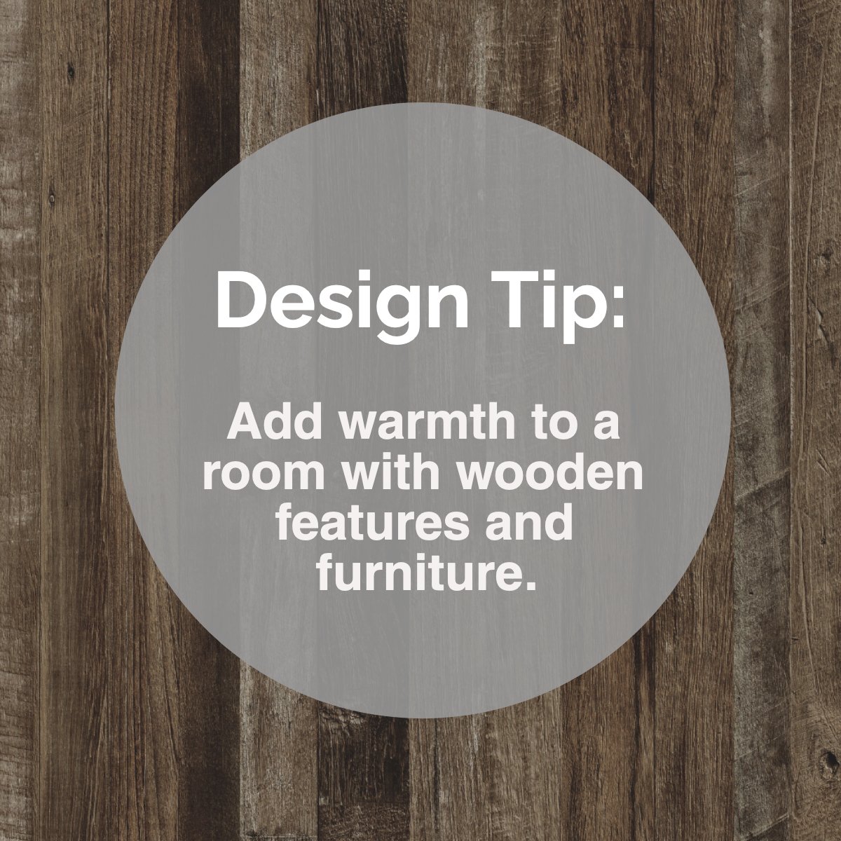
Design Tip: The warmest finish for interiors? Wood stands out as the clear winner. 😉 #designtip #homedecor #designlikeapro #designideas #wood #warmth #featuresandfurniture


Design Tip: The warmest finish for interiors? Wood stands out as the clear winner. 😉 #designtip #homedecor #designlikeapro #designideas #wood #warmth #featuresandfurniture


Design Tip: The warmest finish for interiors? Wood stands out as the clear winner. 😉 #designtip #homedecor #designlikeapro #designideas #wood #warmth #featuresandfurniture

✨ Logo Spacing 101 ✨ Your logo and wordmark need room to breathe. Too close 👉 clash. Too far 👉 disconnected. Think of spacing as the handshake between your logo and wordmark ,not too tight, not too loose, just balanced. #DesignTip #Logo


Design Tip: The warmest finish for interiors? It’s wood that beats others hands down. 🛌 #designtip #homedecor #designlikeapro #designideas #wood #warmth #featuresandfurniture #castleteamdoesitagain #castleinbrooklyn #kwnyc #castleteamrealestate #carolcastlekwnyc


#DesignTip for creating forms → Keep screen readers in mind and use clear labels and instructions so everyone can navigate easily.

Food & design have more in common than you think! 🍕🎨 Here’s a tasty tip: Ever noticed how a perfectly plated dish looks balanced and appetizing? 🤤 #DesignTip #FoodieDesigner 👇


✏️ Quick Design Tip! Want that hand-drawn feel without picking up a pencil? 🎨 Follow this tutorial to see how vector brushes can bring your designs to life with texture and charm #DesignTip #VectorBrushes

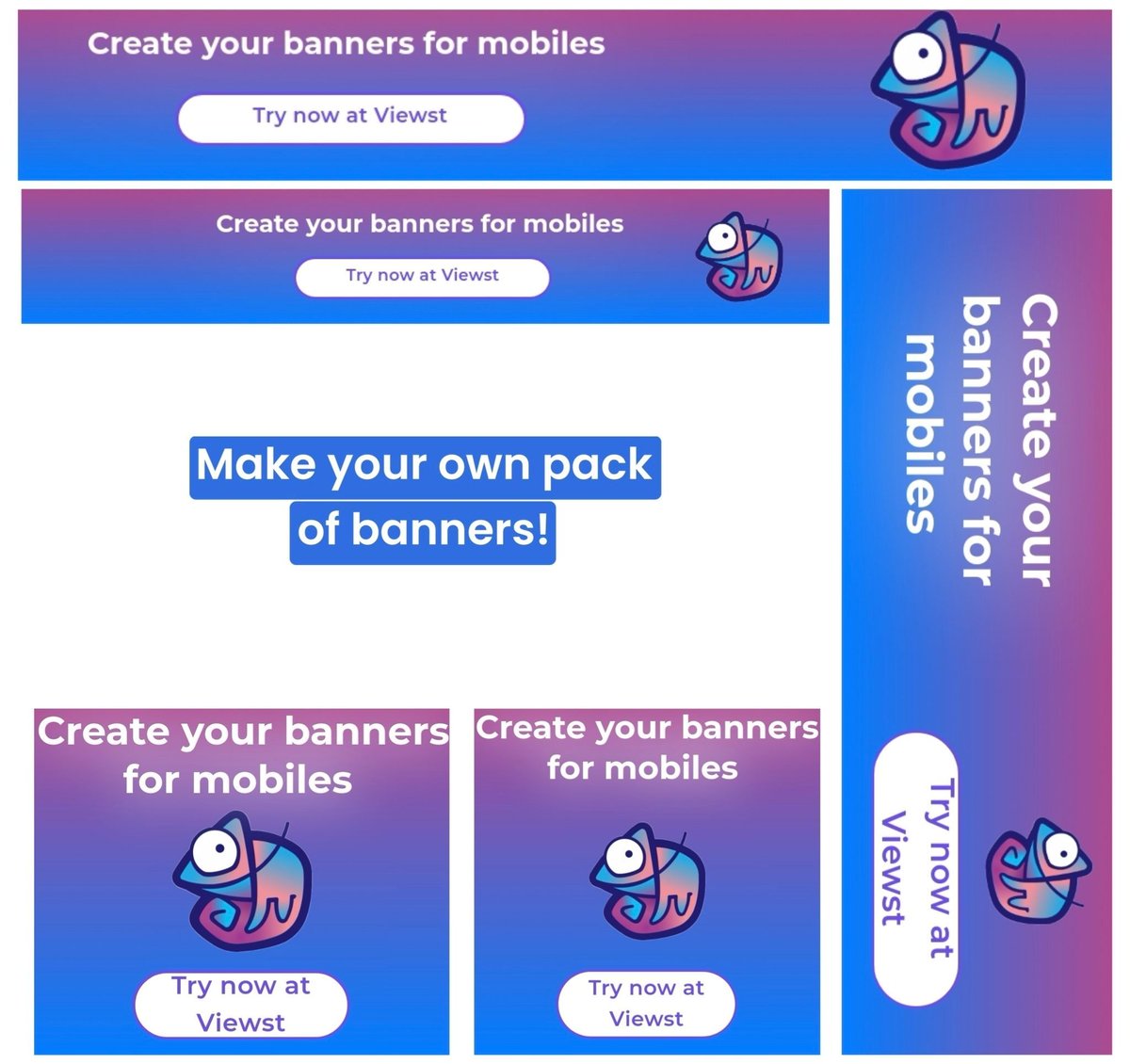
What to do if you’re tired of manual resizing? The answer is simple: click one button at Viewst.com, grab a pack of fully-prepared ratios and resize to all needed formats. You can create a project like this 👇 within a minute. #DesignTip #AdTech #BannerAds
White space is your friend when creating images for social media. E.g. Festive Menus for #Hospitality sector - design separate images for Starters, Mains, Desserts, Sides & Drinks so your delicious offerings are beautifully presented & easier to read on phones! #DesignTip
LOOK Design Tip 178: Tiles are pixels that can create an atmosphere #LOOKdesign #designtip #kevinkelly


LOOK Design Tip 176: Flimsy things become monumental in aggregate #LOOKdesign #designtip #kevinkelly


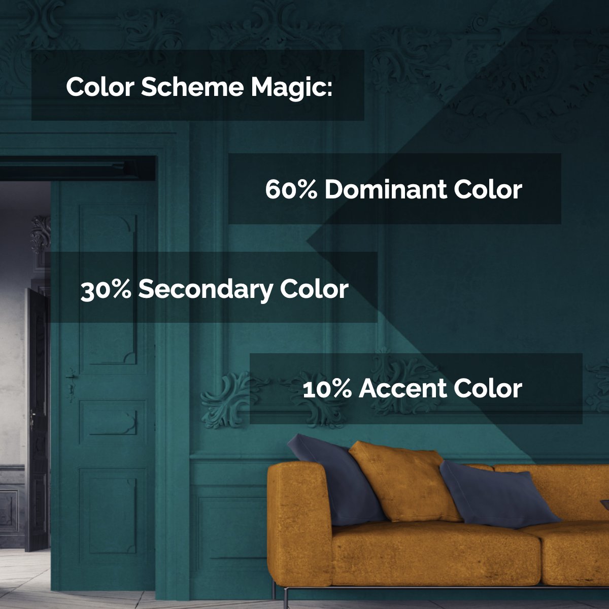
How much do you know about the color theory? In color theory, a color scheme is the choice of colors used in various artistic and design contexts. 🎨 #colorschememagic #designtip #dominantcolor #secondarycolor #accentcolor #protip


Design Tip: The warmest finish for interiors? Wood stands out as the clear winner. 😉 #designtip #homedecor #designlikeapro #designideas #wood #warmth #featuresandfurniture

How much do you know about the color theory? In color theory, a color scheme is the choice of colors used in various artistic and design contexts. 🎨 #colorschememagic #designtip #dominantcolor #secondarycolor #accentcolor #protip


Design Tip: The warmest finish for interiors? It’s wood that beats others hands down. 🛌 #designtip #homedecor #designlikeapro #designideas #wood #warmth #featuresandfurniture


How much do you know about the color theory? In color theory, a color scheme is the choice of colors used in various artistic and design contexts. 🎨 #colorschememagic #designtip #dominantcolor #secondarycolor #accentcolor #protip


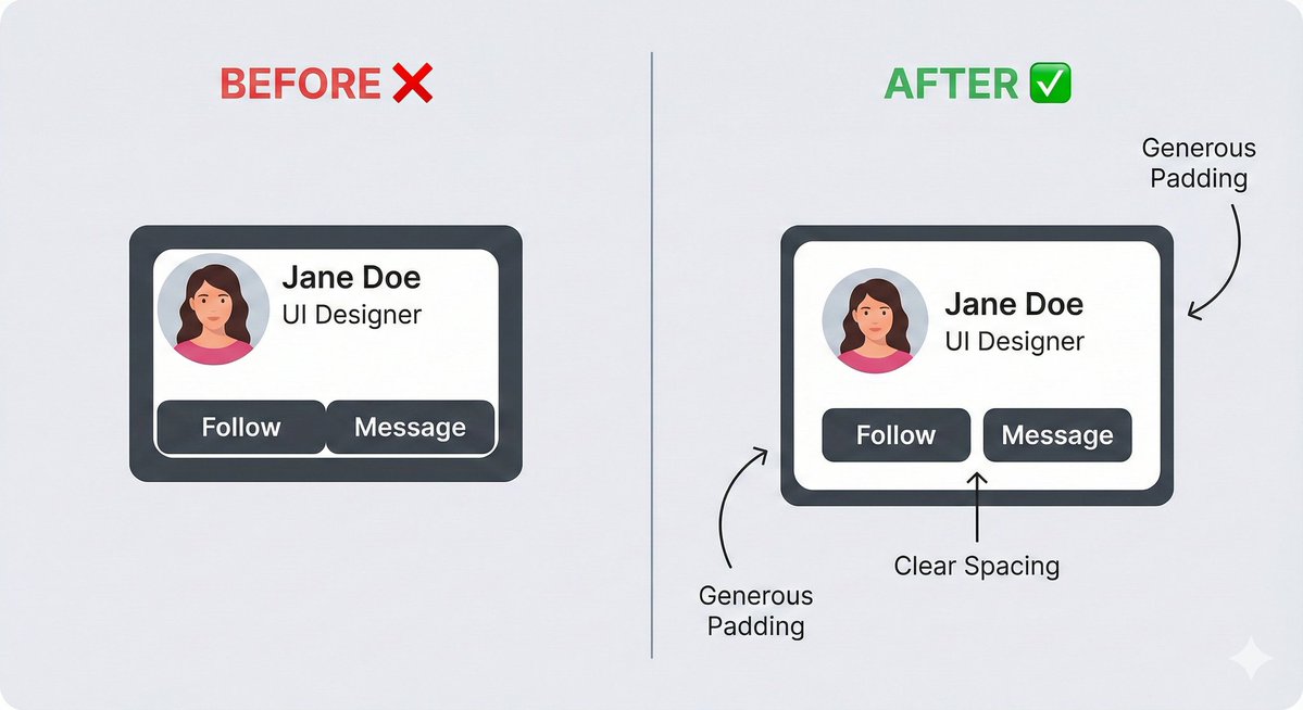
And if it still feels cluttered? Add even more padding. White space isn't 'empty' space. It's 'breathing room.' It is the #1 thing that separates amateur designs from professional ones. Give your elements space to exist. #UIUX #Frontend #DesignTip #WebDev

Design Tip: The warmest finish for interiors? Wood stands out as the clear winner. 😉 #designtip #homedecor #designlikeapro #designideas #wood #warmth #featuresandfurniture

Contrast is key. 🔑 Sufficient color contrast helps users with low vision. Aim for a 4.5:1 contrast ratio for text and 3:1 for graphics. #DesignTip


How much do you know about the color theory? In color theory, a color scheme is the choice of colors used in various artistic and design contexts. 🎨 #colorschememagic #designtip #dominantcolor #secondarycolor #accentcolor #protip


Design Tip: The warmest finish for interiors? Wood stands out as the clear winner. 😉 #designtip #homedecor #designlikeapro #designideas #wood #warmth #featuresandfurniture

Design Tip: The warmest finish for interiors? Wood stands out as the clear winner. 😉 #designtip #homedecor #designlikeapro #designideas #wood #warmth #featuresandfurniture
How much do you know about the color theory? In color theory, a color scheme is the choice of colors used in various artistic and design contexts. 🎨 #colorschememagic #designtip #dominantcolor #secondarycolor #accentcolor #protip

@RSS_Enterprises 🎨 Design Tip: Pick colors that reflect you! Neutrals calm, pastels warm, and bold tones add personality. Transform your space with RSS Interior & Exterior Pvt. Ltd. 🏡 #DesignTip #RSSInteriors #ColorHarmony


#Random #designtip Don't forget to #Rasterize first! #Photoshop #DesignCommunity 🖥
Design Tip: The warmest finish for interiors? Wood stands out as the clear winner. 😉 #designtip #homedecor #designlikeapro #designideas #wood #warmth #featuresandfurniture

Monday Design Question! ☕️ If you could instantly fix ONE visual thing on your brand's social media today, what would it be? (Logo size, color palette, post consistency, etc.) My vote: Color consistency! Getting that right changes everything. What's yours? 👇 #DesignTip

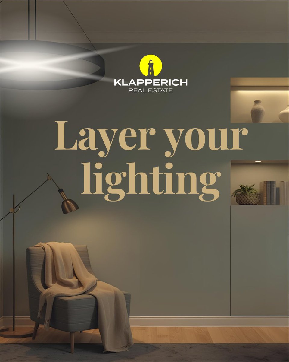
#DesignTip: Layer your #lighting. Combine ambient (overhead), task (focused), and accent (decorative) lighting to create depth and mood in a room. This approach makes spaces feel more dynamic and functional, especially when paired with dimmers for flexibility.

Most small businesses don’t realize this 3 common logo mistakes are silently hurting their brand 1️⃣ Following trends instead of being timeless 2️⃣ Overcomplicating the design 3️⃣ Ignoring scalability Simple. Clear. Scalable. = Strong brand #LogoDesign #Branding #DesignTip


💡 #DesignTip: Less is more in UX design! Focus on simplicity & functionality to keep users engaged. Experiment with colors, fonts & layout for a seamless experience. Connect & share your #graphicdesign & #productdesign ideas! 🎨🖌✏️ #uxdesign #designtrends #designersunite

A quick #designtip to remember: Contrast isn’t just color; it’s clarity. If you want users to pause on what’s important, give it a reason to shine. #GraphicDesigner #UIUXDesign


Design Tip: The warmest finish for interiors? Wood stands out as the clear winner. 😉 #designtip #homedecor #designlikeapro #designideas #wood #warmth #featuresandfurniture
Design Tip: The warmest finish for interiors? Wood stands out as the clear winner. 😉 #designtip #homedecor #designlikeapro #designideas #wood #warmth #featuresandfurniture
Design Tip: The warmest finish for interiors? Wood stands out as the clear winner. 😉 #designtip #homedecor #designlikeapro #designideas #wood #warmth #featuresandfurniture
Too many fonts leads to visual chaos. Stick to 2 (or max 3) typefaces in a design One for headings, one for body, and maybe an accent. It keeps your work clean, readable & professional. #designtip💡
Design Tip: The warmest finish for interiors? Wood stands out as the clear winner. 😉 #designtip #homedecor #designlikeapro #designideas #wood #warmth #featuresandfurniture
✨ Logo Spacing 101 ✨ Your logo and wordmark need room to breathe. Too close 👉 clash. Too far 👉 disconnected. Think of spacing as the handshake between your logo and wordmark ,not too tight, not too loose, just balanced. #DesignTip #Logo
Food & design have more in common than you think! 🍕🎨 Here’s a tasty tip: Ever noticed how a perfectly plated dish looks balanced and appetizing? 🤤 #DesignTip #FoodieDesigner 👇


Grab all the books with bright covers and arrange them in rainbow order - red, orange, yellow, green, blue, and purple. You can even mix up the different shades of each color or pair them together to create a unique look. #designtips #designtip

LOOK Design Tip 178: Tiles are pixels that can create an atmosphere #LOOKdesign #designtip #kevinkelly


LOOK Design Tip 176: Flimsy things become monumental in aggregate #LOOKdesign #designtip #kevinkelly

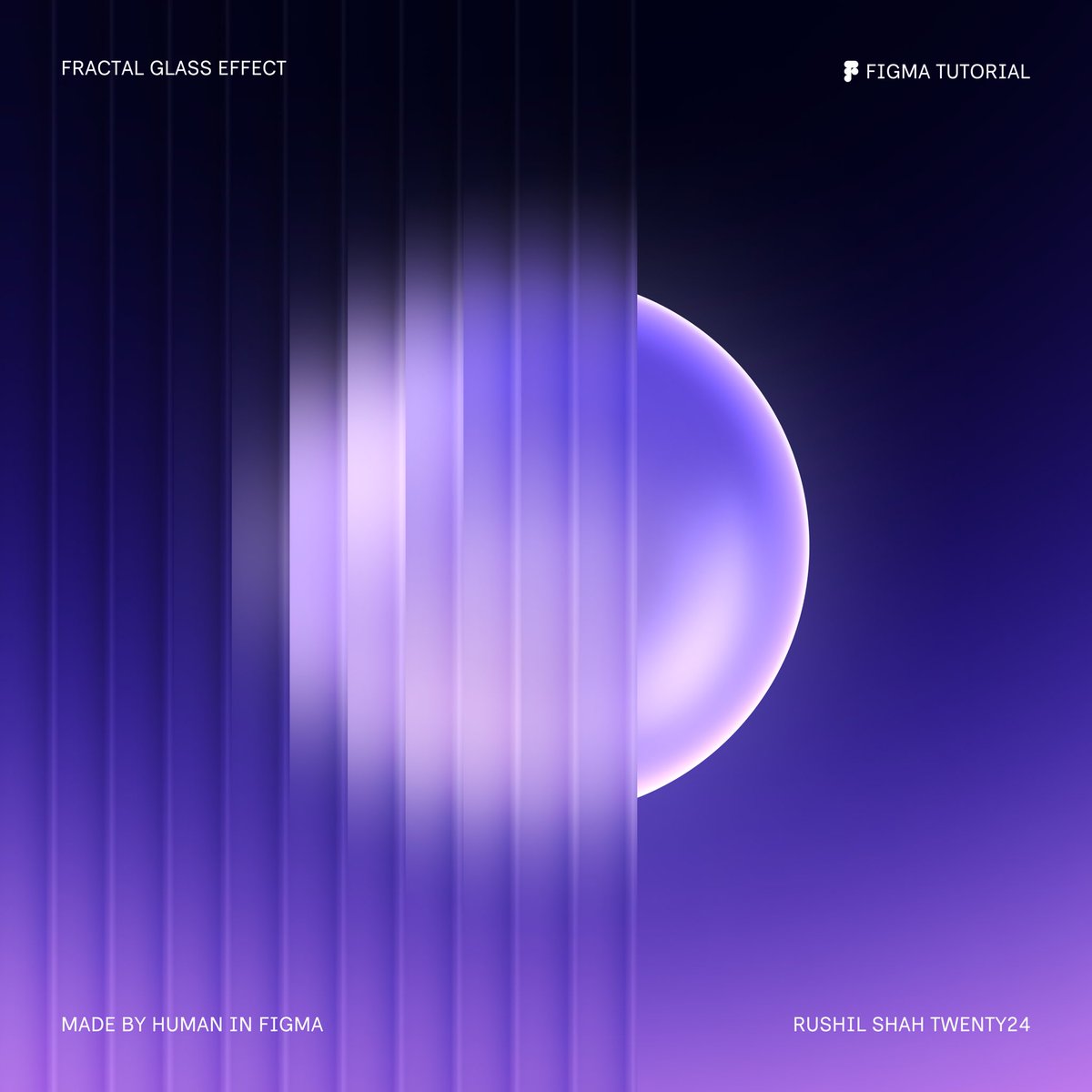
Fractal Glass Tutorial! ✨ Learn how to create stunning fractal glass effects using gradients and a simple blur effect in @Figma with just a few easy steps. Let’s get started! 👇 #FigmaTutorial #DesignTip

Stop Overcomplicating Your Designs!🚀 As a designer, too many elements or too many fonts are not needed Too much going on. Overcomplicated designs don’t impress, they confuse. Here’s what you should do instead: #GraphicDesign #DesignTip #MinimalistDesign


Design Tip: The warmest finish for interiors? It’s wood that beats others hands down. 🛌 #designtip #homedecor #designlikeapro #designideas #wood #warmth #featuresandfurniture #castleteamdoesitagain #castleinbrooklyn #kwnyc #castleteamrealestate #carolcastlekwnyc
Something went wrong.
Something went wrong.
United States Trends
- 1. Sonny Gray 3,468 posts
- 2. #yummymeets N/A
- 3. Dick Fitts N/A
- 4. #GMMTV2026 4.21M posts
- 5. Red Sox 4,303 posts
- 6. Brandon Clarke N/A
- 7. Thankful 51.2K posts
- 8. #csm221 3,284 posts
- 9. National Treasure 4,015 posts
- 10. Gone in 60 1,261 posts
- 11. Giolito N/A
- 12. Happy Thanksgiving 19K posts
- 13. Chaim N/A
- 14. #OurCosmicClue_Wooyoung 25.5K posts
- 15. Hegseth 122K posts
- 16. Raising Arizona N/A
- 17. Mark Kelly 254K posts
- 18. Mainz Biomed N/A
- 19. Joe Ryan N/A
- 20. Ghost Rider 1,463 posts