#energyflowchart resultados da pesquisa


SO NIFTY! @Livermore_Lab: US #EnergyFlowChart details sources of production, how #energy is being used and wasted


RT @Sustainable2050: 60% of energy wasted @renesugar: @Livermore_Lab 2013 US #EnergyFlowChart 1.usa.gov/1myXqem


Awesome diagram!: New U.S. #EnergyFlowChart details sources of production, use, and waste... @Livermore_Lab

chart #win RT @Livermore_Lab: 2013 #EnergyFlowChart Released: Americans are using more energy 1.usa.gov/1myXqem

MT @livermore_lab: New U.S. #EnergyFlowChart details #energy sources, usage, waste, ow.ly/n92B4

@Sustainable2050 MT @Livermore_Lab 2013 #EnergyFlowChart: Americans are using more energy 1.usa.gov/1myXqem

The @Livermore_Lab #EnergyFlowChart for 2013 is out: Americans are using more energy 1.usa.gov/1myXqem
If you enjoyed the new #EnergyFlowChart, then energy expert @RogerAines is worth a follow. #FollowFriday #FF

Helps focus my business model --“@Livermore_Lab: 2013 #EnergyFlowChart US using more energy 1.usa.gov/1myXqem http://t.co/HNKn2JllPb”

America's Energy Report Card for your consideration: @Livermore_Lab #EnergyFlowChart Released 1.usa.gov/1myXqem

Good: Wind E > 18%; Bad: E > 2% RT@Livermore_Lab 2013 #EnergyFlowChart: US uses more energy 1.usa.gov/1myXqem


@Livermore_Lab #EnergyFlowChart: where US #energy is produced, consumed & wasted (a mere 60%) 1.usa.gov/1qb5Rgf


RT @Livermore_Lab: New #EnergyFlowChart: American use up slightly, emissions almost unchanged j.mp/1EjA9Ub

RT @Livermore_Lab: New U.S. #EnergyFlowChart details sources of production, how #energy is used and how much waste buff.ly/12SMRqs

“@gonufrio @FIMAit @GianniGirotto At least 60% of energy gets wasted #EnergyFlowChart 1.usa.gov/1myXqem

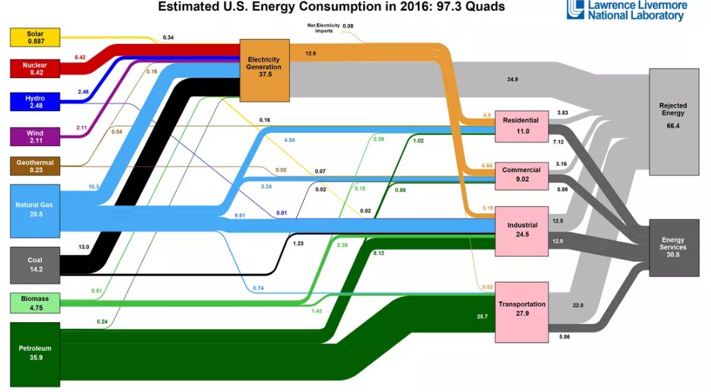
The @BerkeleyLab #energyflowchart tracking U.S. energy from source > use > waste may not look as expected. zondits.com/article/14063/…
The @BerkeleyLab #energyflowchart tracking U.S. energy from source > use > waste may not look as expected. ow.ly/jvjp30aUVOb

Check out the latest #EnergyFlowChart from Lawrence Livermore National Laboratory #EnergyConsumption ow.ly/5iUJ30aSH8b

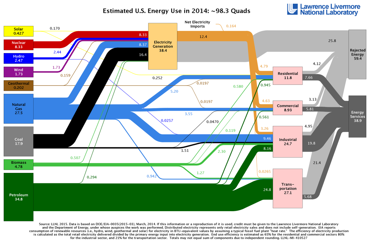
RT @Livermore_Lab: Solar energy use jumped dramatically -- by 33% -- in 2014 j.mp/1c4Qkhj #EnergyFlowChart


Updated for 2014 RT @Livermore_Lab New #EnergyFlowChart: American use up slightly, emissions almost unchanged j.mp/1EjA9Ub
RT @Livermore_Lab: New #EnergyFlowChart: American use up slightly, emissions almost unchanged j.mp/1EjA9Ub

The new #EnergyFlowChart is up for 2014. Also, check out the new website flowcharts.llnl.gov

I have new blog post up about my favorite #energyflowchart, by @Livermore_Lab. plugsmart.com/our-energy-whe…
@Livermore_Lab #EnergyFlowChart: where US #energy is produced, consumed & wasted (a mere 60%) 1.usa.gov/1qb5Rgf

RT @livermore_lab: 2013 #EnergyFlowChart Released: Americans are using more energy 1.usa.gov/1myXqem
RT @Sustainable2050: 60% of energy wasted @renesugar: @Livermore_Lab 2013 US #EnergyFlowChart 1.usa.gov/1myXqem
@MeganLeslieMP MT @Livermore_Lab 2013 #EnergyFlowChart: Americans are using more energy 1.usa.gov/1myXqem
@AmyAHarder MT @Livermore_Lab 2013 #EnergyFlowChart: Americans are using more energy 1.usa.gov/1myXqem
@MilesCorak MT @Livermore_Lab 2013 #EnergyFlowChart: Americans are using more energy 1.usa.gov/1myXqem
@RockyMtnInst MT @Livermore_Lab 2013 #EnergyFlowChart: Americans are using more energy 1.usa.gov/1myXqem
@JustinWolfers MT @Livermore_Lab 2013 #EnergyFlowChart: Americans are using more energy 1.usa.gov/1myXqem
MT @livermore_lab: New U.S. #EnergyFlowChart details #energy sources, usage, waste, ow.ly/n92B4
chart #win RT @Livermore_Lab: 2013 #EnergyFlowChart Released: Americans are using more energy 1.usa.gov/1myXqem
If you enjoyed the new #EnergyFlowChart, then energy expert @RogerAines is worth a follow. #FollowFriday #FF
The @Livermore_Lab #EnergyFlowChart for 2013 is out: Americans are using more energy 1.usa.gov/1myXqem
RT @Sustainable2050: 60% of energy wasted @renesugar: @Livermore_Lab 2013 US #EnergyFlowChart 1.usa.gov/1myXqem
SO NIFTY! @Livermore_Lab: US #EnergyFlowChart details sources of production, how #energy is being used and wasted
Check out the latest #EnergyFlowChart from Lawrence Livermore National Laboratory #EnergyConsumption ow.ly/5iUJ30aSH8b
America's Energy Report Card for your consideration: @Livermore_Lab #EnergyFlowChart Released 1.usa.gov/1myXqem
@Sustainable2050 MT @Livermore_Lab 2013 #EnergyFlowChart: Americans are using more energy 1.usa.gov/1myXqem

New U.S. #EnergyFlowChart - sources of production, how #energy is being used & how much waste exists RT@Livermore_Lab
“@gonufrio @FIMAit @GianniGirotto At least 60% of energy gets wasted #EnergyFlowChart 1.usa.gov/1myXqem
Helps focus my business model --“@Livermore_Lab: 2013 #EnergyFlowChart US using more energy 1.usa.gov/1myXqem http://t.co/HNKn2JllPb”

MT @Livermore_Lab: New U.S. #EnergyFlowChart details production, how #energy is being used + how much waste exists. |
Awesome diagram!: New U.S. #EnergyFlowChart details sources of production, use, and waste... @Livermore_Lab
RT @Livermore_Lab: Solar energy use jumped dramatically -- by 33% -- in 2014 j.mp/1c4Qkhj #EnergyFlowChart
Good: Wind E > 18%; Bad: E > 2% RT@Livermore_Lab 2013 #EnergyFlowChart: US uses more energy 1.usa.gov/1myXqem
Something went wrong.
Something went wrong.
United States Trends
- 1. Good Monday 32.7K posts
- 2. #MondayMotivation 27K posts
- 3. Victory Monday N/A
- 4. Jamaica 64.8K posts
- 5. Category 5 16.8K posts
- 6. #MondayVibes 1,988 posts
- 7. Hurricane Melissa 40.1K posts
- 8. #MondayMorning 1,052 posts
- 9. Tomlin 13.5K posts
- 10. Austin Reaves 51.4K posts
- 11. GameStop 55.7K posts
- 12. Hochul 21.7K posts
- 13. Tanzania 59.9K posts
- 14. Milei 585K posts
- 15. Talus Labs 18.3K posts
- 16. South China Sea 18.3K posts
- 17. Ron Paul N/A
- 18. #BreachLAN2 3,708 posts
- 19. Dolly 13.3K posts
- 20. #BaddiesAfricaReunion 11.8K posts