#excelfordatavisualizationassignments результаты поиска

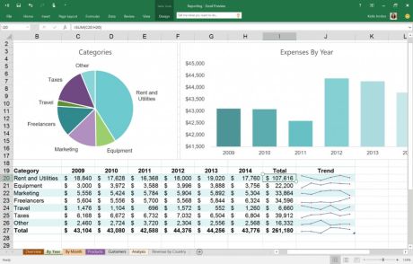
Excel Dashboard : PivotTables and Data Modelling For more: visit quadexcel.com quadexcel.com/wp/excel-dashb…

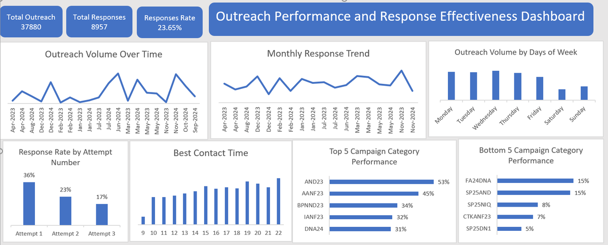
Week 2 at Excelerate: Built this dashboard to answer one question: what’s actually driving outreach performance? #DataDriven #EDA #Excel #AnalyticsDashboard #LearningByDoing

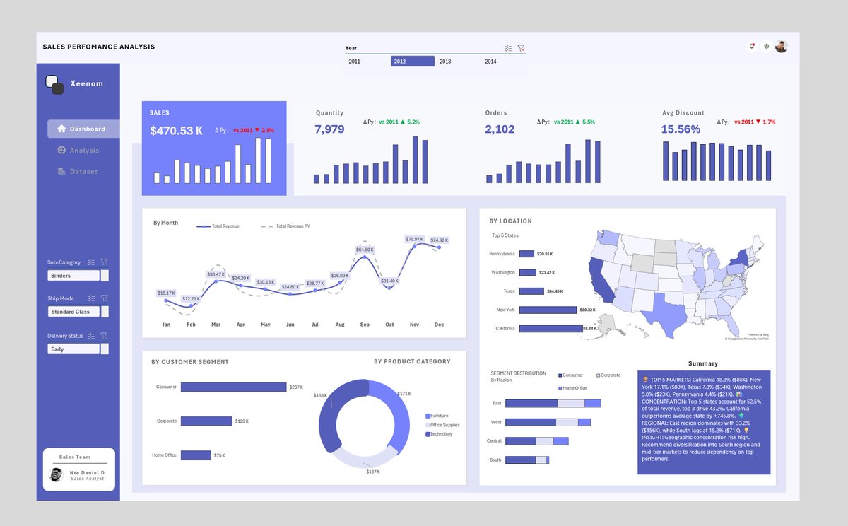
𝗚𝗼𝗼𝗱 𝗺𝗼𝗿𝗻𝗶𝗻𝗴 ☀️ Most people think you need Power BI or Tableau to build professional dashboards. You don't. I built this entire sales dashboard in Excel. What's inside: → 4 years of sales data with interactive filters → Geographic performance by state → Customer…

*Dominar EXCEL. Hoja de ruta visual, que resume lo que puedes hacer: Desde Fórmulas hasta Análisis de datos y automatización. Guárdala. Estúdiala. Compártela. UNA IMAGEN QUE VALE MAS QUE MIL TUTORIALES ⬇️


No lie: Use the REPT function to visualize data. 🤯

These 10 Microsoft Excel projects will definitely boost your portfolio and job prospects as a Data Analyst:

Most of us learn Excel charts quickly. But 99% of us never improve on their charts. Here are 15 Excel chart designs and tricks to level up your charts in Excel! 🧵

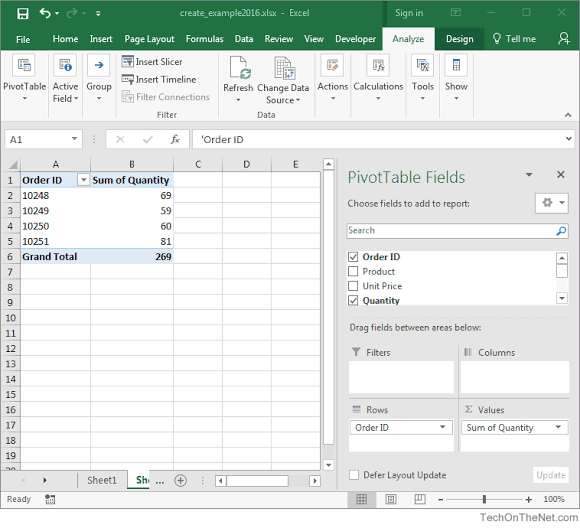
Excel Pivot Table When it comes to data analysis in Excel, understanding the distinction between qualitative and quantitative data is key.

Creating Project Timeline or Gantt Chart with MS Excel - #excel excelzoom.com/creating-proje…
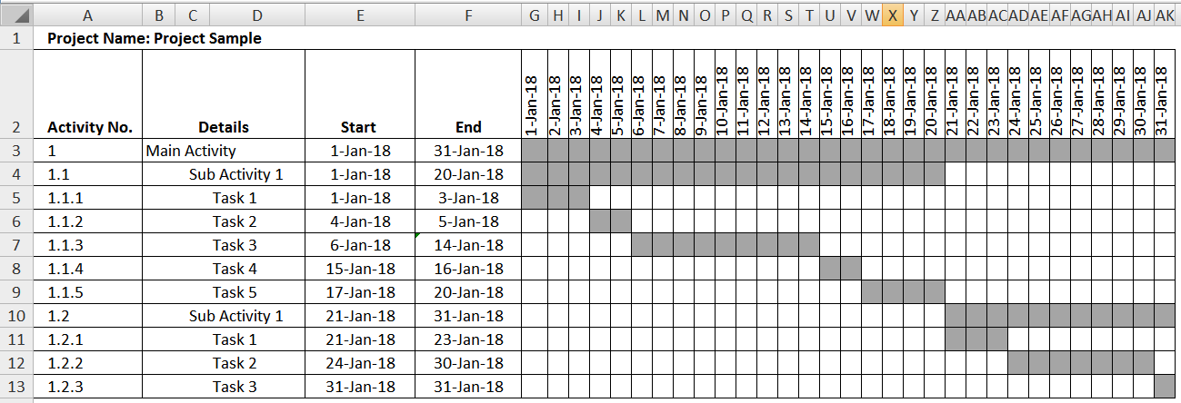
Creating Project Timeline or Gantt Chart with MS Excel - #excel excelzoom.com/creating-proje…
Creating Project Timeline or Gantt Chart with MS Excel - #excel excelzoom.com/creating-proje…
9. Analyze Data Analyzing, summarizing, and visualizing large data sets can be time-consuming, but not with Analyze Data. Let Excel do the work for you by selecting Analyze Data under the Home tab, typing in how you want to summarize your data, and inserting it into your sheet.
4. Creating Charts Lets say you want to create a compelling data chart but don’t know where to begin… QA is here to help! Select data you want to graph > QA > Charts tab > browse the charts QA made. Now you can select any chart you like and insert it right into your worksheet.
6. Sparklines (SL) Visualizing data trends have never been easier, thanks to SL! SL are mini in-cell line charts that visualize data. To insert SL, go to the Insert tab > Line > insert the range you want to visualize and hit okay. Lastly, fill the SL down using the fill handle.

تظهر عَظَمَة برنامج الإكسل عند تحليل البيانات ؛ هذا موضوع رهيب يعلمك كيف تحللها ويشرح طريقة إنشاء الرسوم البيانية 😍✅ كنز ؛ خذ نظرة عليه learnexcel.co/2016/04/01/exc…
تظهر عَظَمَة برنامج الإكسل عند تحليل البيانات ؛ هذا موضوع رهيب يعلمك كيف تحللها ويشرح طريقة إنشاء الرسوم البيانية 😍✅ learnexcel.co/2016/04/01/exc…
Something went wrong.
Something went wrong.
United States Trends
- 1. Merry Christmas 412K posts
- 2. Pro Bowl 28.4K posts
- 3. The AsterDEX 45.8K posts
- 4. Ben Sasse 2,721 posts
- 5. Happy Festivus 4,319 posts
- 6. Happy Holidays 115K posts
- 7. Steve Rogers 20.2K posts
- 8. #AvengersDoomsday 160K posts
- 9. Larry Nassar 29.7K posts
- 10. Neymar 20.3K posts
- 11. Cam Jurgens 1,059 posts
- 12. Endgame 122K posts
- 13. Soccer 30.2K posts
- 14. Jordan Davis 1,331 posts
- 15. Byron Murphy N/A
- 16. Chris Evans 10.7K posts
- 17. Jalen Carter 1,132 posts
- 18. Brohm 2,284 posts
- 19. Semenyo 57.1K posts
- 20. Nuns 6,104 posts