#infovisualisation search results

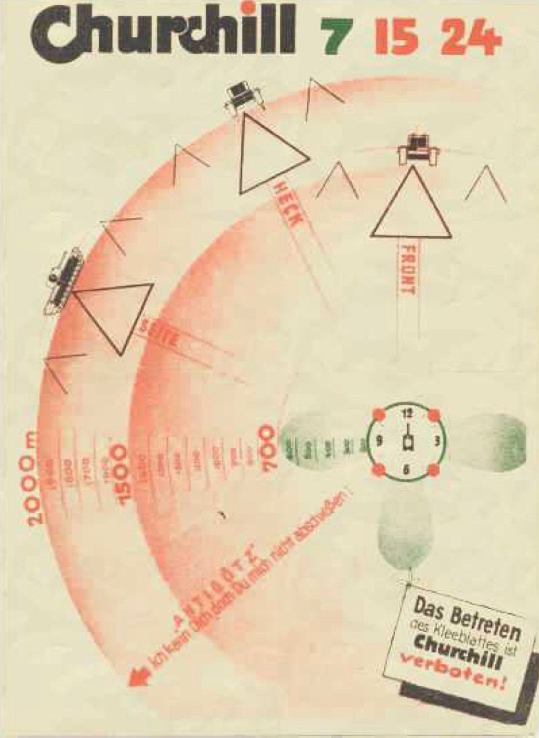
Effective #InfoVisualisation from WW2 Tiger Tank Manual. Distance and orientation of various enemy tanks through the muzzle viewfinder. Right info, right form to take action #UCCDH
Visualisation of the state of roads on a map ux.stackexchange.com/q/125474?atw=1 #infovisualisation
Styling a hint for relative numerical value ux.stackexchange.com/q/140552?atw=1 #infovisualisation
Showing a large amount of trend-lines on a single graph ux.stackexchange.com/q/142347?atw=1 #infovisualisation
How to show student progress on a teacher dashboard? ux.stackexchange.com/q/140965?atw=1 #infovisualisation
Graph with overlapping labels ux.stackexchange.com/q/124084?atw=1 #infovisualisation
Customer journey with multiple users ux.stackexchange.com/q/130746?atw=1 #infovisualisation
Overtime + 2 other aspects data visualization ux.stackexchange.com/q/133189?atw=1 #infovisualisation
What's a better way to show amount in staff in a location on a bar graph? ux.stackexchange.com/q/142161?atw=1 #infovisualisation
Data visualisation: Pie charts with really small values ux.stackexchange.com/q/126949?atw=1 #infovisualisation
How should I visualize the average of two bars in a bar chart? ux.stackexchange.com/q/135509?atw=1 #infovisualisation
How to label a risk diagram in an understandable way? ux.stackexchange.com/q/124451?atw=1 #infovisualisation
What visual cues can convey the sense of direction? ux.stackexchange.com/q/125666?atw=1 #infovisualisation
What is the difference between a dashboard and a report? ux.stackexchange.com/q/103146?atw=1 #infovisualisation
Are there any cons in using rounded corners for bar graphs? ux.stackexchange.com/q/127475?atw=1 #infovisualisation
How to visually encode something "real/actual" vs "ideal/expected"? ux.stackexchange.com/q/127059?atw=1 #infovisualisation
Can you answer this? Best practices about options and toggles ux.stackexchange.com/q/123316?atw=1 #infovisualisation
Guidelines for creating connections between different areas of a UI ux.stackexchange.com/q/132317?atw=1 #infovisualisation
Displaying overlapping user data reflecting the status of an inventory in a horizontal st... ux.stackexchange.com/q/140697?atw=1 #infovisualisation
Can you answer this? How can I show that something is necessary, but can be done in any or... ux.stackexchange.com/q/131307?atw=1 #infovisualisation
Showing a large amount of trend-lines on a single graph ux.stackexchange.com/q/142347?atw=1 #infovisualisation
What's a better way to show amount in staff in a location on a bar graph? ux.stackexchange.com/q/142161?atw=1 #infovisualisation
How to show student progress on a teacher dashboard? ux.stackexchange.com/q/140965?atw=1 #infovisualisation
Displaying overlapping user data reflecting the status of an inventory in a horizontal st... ux.stackexchange.com/q/140697?atw=1 #infovisualisation
How should I visualize the average of two bars in a bar chart? ux.stackexchange.com/q/135509?atw=1 #infovisualisation

This is how the corrupt Spanish public service media corporation @rtve represents the Spanish recession. Nobody will be fired, apologies only for the few. #SpainIsAFascistState #infovisualisation #manipulatewithdata #spainispain #psm #mediagovernance #corruptionspain #globalspain

En una TV pública mínimament decent, l'autor d'aquesta gràfica, el seu cap i el director d'informatius haurien de ser acomiadats de manera fulminant. (El guixat en vermell és meu).

Overtime + 2 other aspects data visualization ux.stackexchange.com/q/133189?atw=1 #infovisualisation
Customer journey with multiple users ux.stackexchange.com/q/130746?atw=1 #infovisualisation
Guidelines for creating connections between different areas of a UI ux.stackexchange.com/q/132317?atw=1 #infovisualisation
Can you answer this? How can I show that something is necessary, but can be done in any or... ux.stackexchange.com/q/131307?atw=1 #infovisualisation
How to visually encode something "real/actual" vs "ideal/expected"? ux.stackexchange.com/q/127059?atw=1 #infovisualisation
Are there any cons in using rounded corners for bar graphs? ux.stackexchange.com/q/127475?atw=1 #infovisualisation
What is the difference between a dashboard and a report? ux.stackexchange.com/q/103146?atw=1 #infovisualisation
Data visualisation: Pie charts with really small values ux.stackexchange.com/q/126949?atw=1 #infovisualisation
What visual cues can convey the sense of direction? ux.stackexchange.com/q/125666?atw=1 #infovisualisation
Visualisation of the state of roads on a map ux.stackexchange.com/q/125474?atw=1 #infovisualisation
How to label a risk diagram in an understandable way? ux.stackexchange.com/q/124451?atw=1 #infovisualisation
Graph with overlapping labels ux.stackexchange.com/q/124084?atw=1 #infovisualisation
Can you answer this? Best practices about options and toggles ux.stackexchange.com/q/123316?atw=1 #infovisualisation
How to display multiple progress locations? ux.stackexchange.com/q/123072?atw=1 #infovisualisation
Effective #InfoVisualisation from WW2 Tiger Tank Manual. Distance and orientation of various enemy tanks through the muzzle viewfinder. Right info, right form to take action #UCCDH

#infovisualisation. Perpetual almanack made for Louis. XV. Enamel on copper. 1742. @wallacecollection


dans @lalibrebe #infographics #infovisualisation Comment le #velo peut être truqué? le moteur pèse 2kg qd même


#infovisualisation Guardian Datastore une excellente ressource internationale flic.kr/g/aRXcf
Something went wrong.
Something went wrong.
United States Trends
- 1. Good Sunday 69.8K posts
- 2. Klay 30.5K posts
- 3. #sundayvibes 5,584 posts
- 4. #AskBetr N/A
- 5. McLaren 130K posts
- 6. Full PPR N/A
- 7. Blessed Sunday 19.1K posts
- 8. Ja Morant 14.3K posts
- 9. Who Dey 8,831 posts
- 10. Beirut 6,744 posts
- 11. Florentino 34.5K posts
- 12. #FelizCumpleañosNico 5,008 posts
- 13. #FG3Dライブ 121K posts
- 14. For the Lord 30.7K posts
- 15. #sundaymotivation 3,600 posts
- 16. Tottenham 51K posts
- 17. Lando 147K posts
- 18. Christ the King 11.6K posts
- 19. King of the Universe 2,272 posts
- 20. South Asia 41.9K posts