#scalablecss 検索結果

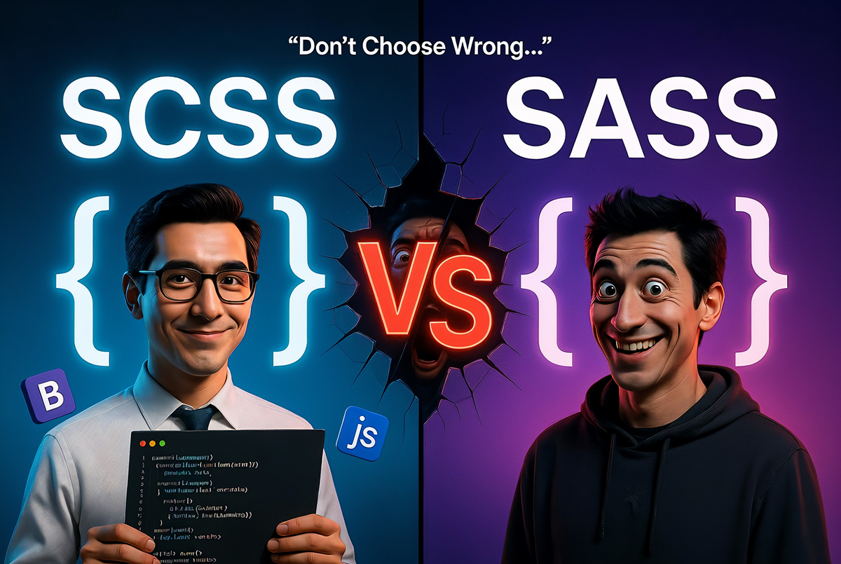
SASS vs SCSS: Developer's Choice for Scalable CSS Watch full video: youtube.com/watch?v=kp8cOq… geekboots.com/story/sass-vs-… #SASSvsSCSS #ScalableCSS #SCSSin2026 #CSSPreprocessors #SCSSTutorial #WebDevelopmentBestPractices

it's incredible what you can do with html/css inside of a <foreignobject> inside of a <svg> inside of a <picture> inside of a <img> inside of a markdown file inside of your gitHub readme

A historical day for CSS 😀🎉 If you write any components used and/or styled by others, you know how huge this is! background: if(style(--variant: success), var(--green)); Even if you don’t, this will allow things like: padding: if(var(--2xl), 1em, var(--xl) or var(--m),…


Code smarter, not harder! 🛠️ Organize your CSS for scalability and reusability. Streamline your stylesheets and enhance your workflow. Start organizing like a pro now! 🚀 #ScalableCSS #CSSArchitecture #CSSOrganization #EfficientStyling #WebDesign
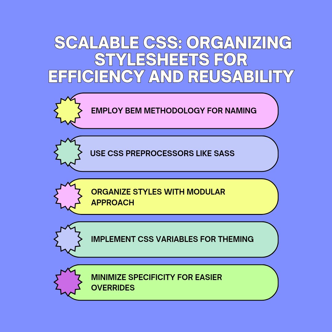
Elevate your CSS game! 🎨🚀 Dive into modular CSS architecture to craft scalable and reusable styles. Transform your coding efficiency and aesthetic appeal now! ✨ #ModularCSS #CSSArchitecture #ScalableCSS #ReusableStyles #CSSModularity


Essential CSS Breakpoints for Web Developers: ➡️ Mobile: Up to 480px ➡️ Extra small devices: 481px to 767px ➡️ Small tablets: 768px to 991px ➡️ Large tablets/laptops: 992px to 1199px ➡️ Desktops: 1200px to 1919px ➡️ Extra large screens: 1920px and up


🚀 Herramienta interactiva para crear escalas proporcionales para tipografía, componentes y contenedores. Cada sección tiene una serie de ajustes con los que se puede personalizar y exportar el código como variables CSS 👇 bit.ly/47UzVct

Tip: The large, small, and dynamic viewport units in CSS are now available in all modern browser engines! Read more about it via @bramus ↓ web.dev/viewport-units/


Decided to not release this tutorial yet but instead do a quick crash course on Sassy CSS the way I use it. It's not advanced, just the basics to get you started and understand more of my tutorials styled using SCSS. Dropping in 3 hours on Doublesouth YouTube channel. Subscribe


In UI design, if you have to detach a symbol just to have an alternative state that doesn't match the rest, you're basically breaking the scalability of the component in the first place. First sign of trouble that may lie ahead during development. #ui #uiengineer #scalablecss

Tip: You can make elements resizable with a single CSS property ✨ Rule? The element's overflow must not be visible! 🧐 .🌭 { resize: horizontal | vertical | both; overflow: hidden | scroll | auto; } Here's a pure CSS Hotdog! 🚀 👉 codepen.io/jh3y/pen/bGYjb… via @CodePen

You can use a *single line* of CSS to create a resizable element 🤯 ‣ resize: both | horizontal | vertical ‣ Constraint with min/max-height/width

¿Sabías que es posible crear CSS desde Javascript de forma nativa? Existe un objeto para crear «CSS Constructables», un objeto nativo del navegador llamado CSSStyleSheet... #javascript #css


Updated our "The Current State of Styling Scrollbars" to make sure we're covering the standardized `scrollbar-width` and `scrollbar-color`, with an example that works across Firefox/Safari/Chrome. css-tricks.com/the-current-st…


If you use viewport units alone, you take away your user’s ability to zoom text in and out. *But* combining it with a fixed unit using calc() (e.g. `font-size: calc(16px + .3vw);` ) restores that ability and works just fine. #CSS #UX #a11y
Yesterday, we looked at CSS variables for managing breakpoints -- now we're going into how to se them to build a flexible grid system. css-tricks.com/responsive-des…

We're taking a two-part look at using CSS custom variables to make responsive layouts. First part: defining variables and breakpoints. css-tricks.com/responsive-des…

Elevate your CSS game! 🎨🚀 Dive into modular CSS architecture to craft scalable and reusable styles. Transform your coding efficiency and aesthetic appeal now! ✨ #ModularCSS #CSSArchitecture #ScalableCSS #ReusableStyles #CSSModularity
Code smarter, not harder! 🛠️ Organize your CSS for scalability and reusability. Streamline your stylesheets and enhance your workflow. Start organizing like a pro now! 🚀 #ScalableCSS #CSSArchitecture #CSSOrganization #EfficientStyling #WebDesign
SASS vs SCSS: Developer's Choice for Scalable CSS Watch full video: youtube.com/watch?v=kp8cOq… geekboots.com/story/sass-vs-… #SASSvsSCSS #ScalableCSS #SCSSin2026 #CSSPreprocessors #SCSSTutorial #WebDevelopmentBestPractices
Something went wrong.
Something went wrong.
United States Trends
- 1. Rams 76.9K posts
- 2. Rams 76.9K posts
- 3. #heatedrivalry 64.2K posts
- 4. Sam Darnold 19.9K posts
- 5. Puka 51.6K posts
- 6. ilya 64.6K posts
- 7. Stafford 21.2K posts
- 8. Al Michaels 2,770 posts
- 9. svetlana 5,326 posts
- 10. #TNFonPrime 6,368 posts
- 11. SCOTT HUNTER 7,075 posts
- 12. McVay 7,813 posts
- 13. connor storrie 15.4K posts
- 14. jacob tierney 4,290 posts
- 15. Rose 167K posts
- 16. Ben Shapiro 42.5K posts
- 17. #PowerForce N/A
- 18. Niners 2,857 posts
- 19. Blazers 2,629 posts
- 20. #zzzSpecialProgram 4,955 posts