#visualhierarchy نتائج البحث

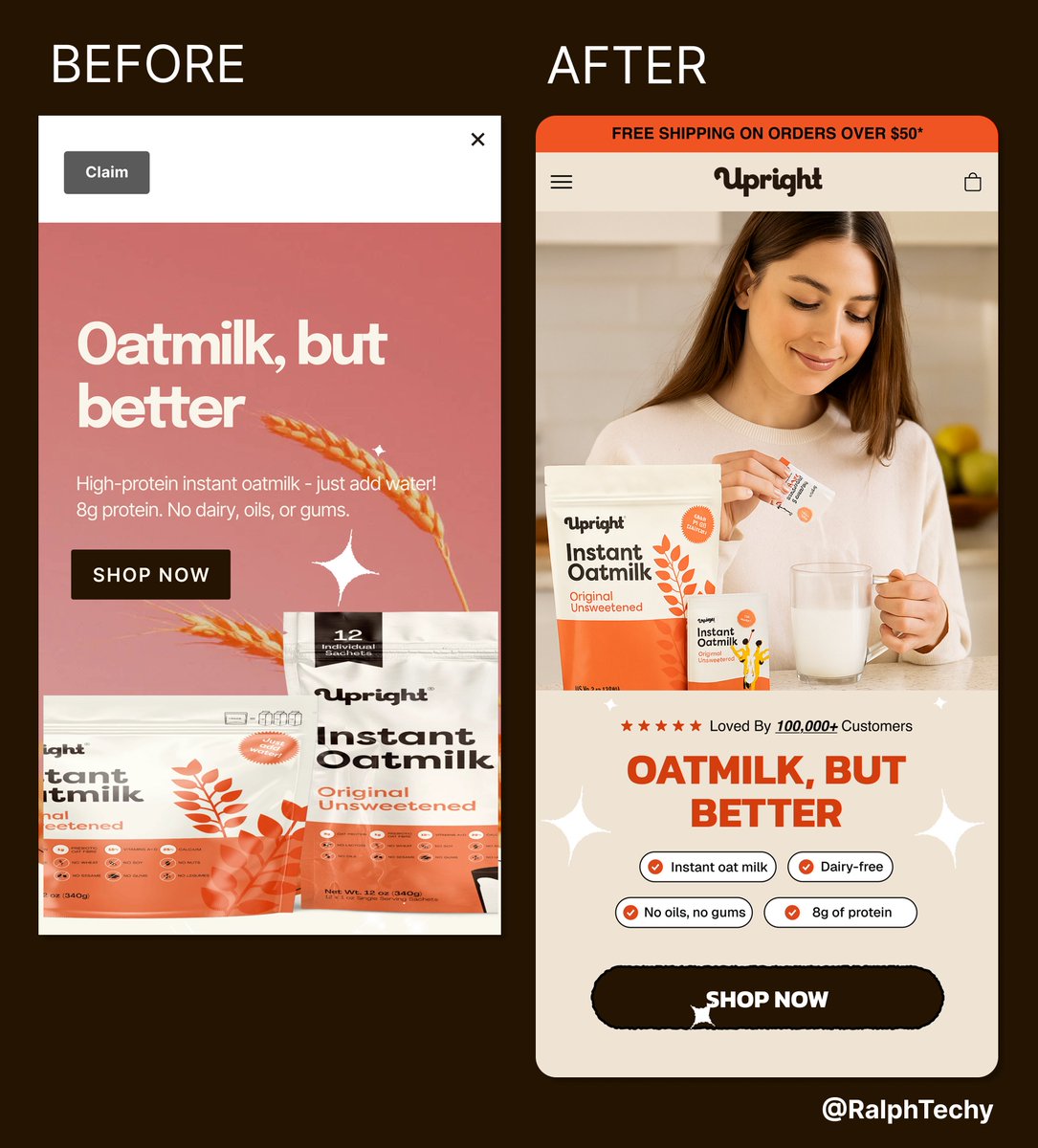
Ever moved one piece of furniture and the whole room felt new? That’s what layout does. Same copy. Same product. New energy. New focus. Design = invisible influence. Before or After?👇 #WebDesign #VisualHierarchy #Figma #Shopify #LandingPageDesign #BeforeAfter

Hierarchy in UI/UX helps guide users’ attention by using size, color, and layout to show what’s most important. It makes interfaces easy to scan and navigate. Stay Fly🥷💫🚀 #UIUX #DesignTips #VisualHierarchy #ProductDesign


🎨 Good UI is about arranging. Starting with visual hierarchy makes the most important element stand out first. Use contrast, spacing, and alignment to guide the eye. Design is 90% communication, 10% decoration. #UIDesign #VisualHierarchy #UXDesign #DesignTips #DailyUITip


Day 18 @devanddesignhq session we were taught the key principles behind clean and readable design. They taught us legibility, visual hierarchy, contrast, font consistency, and proximity, all essential for creating clear layouts. #DesignTips #UIDesign #VisualHierarchy #Figma


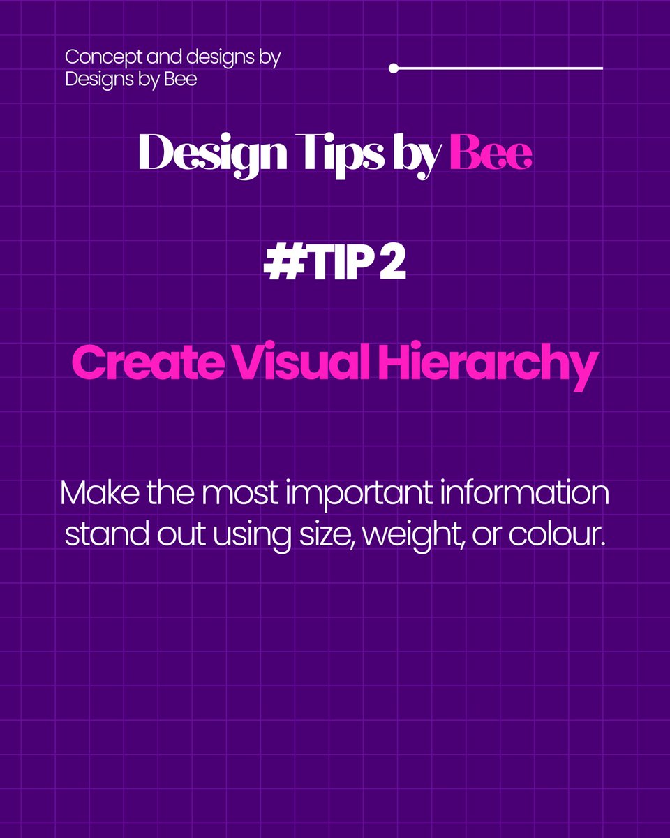
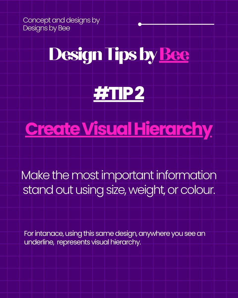
Missed yesterday’s post, sorry guys, life happened 😩 Design Tip 2: Visual Hierarchy Make the key info pop using size, weight or colour. Let your headline shout, subtext talk and the rest whisper 💬✨ #visualhierarchy #designsbybee #creativedesigner


🚦 Dos: Aim for a balanced color scheme. Harmonize hues that complement each other. Establish a visual hierarchy with contrasting colors to guide users through the interface. #BalancedColor #VisualHierarchy 🎨


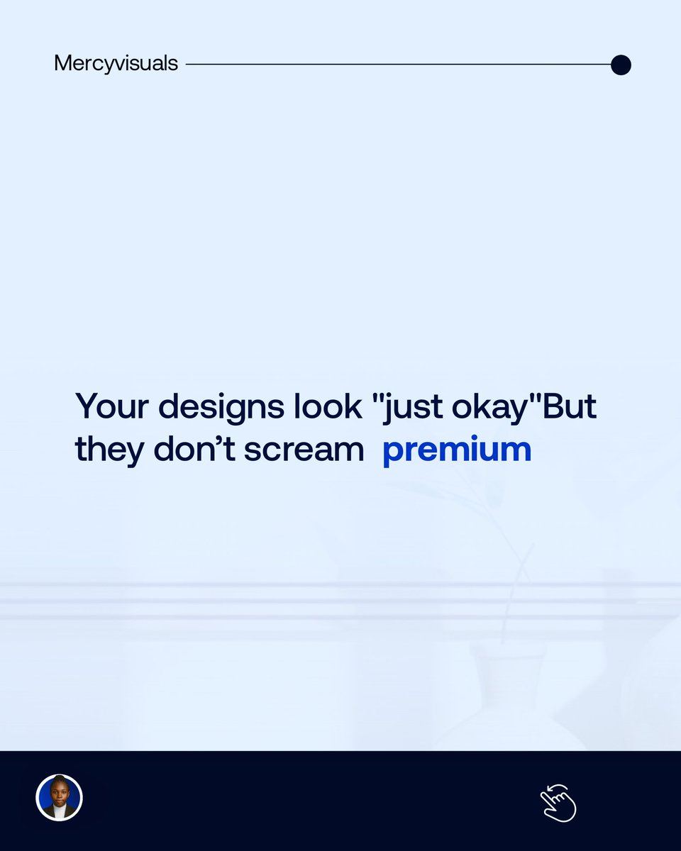
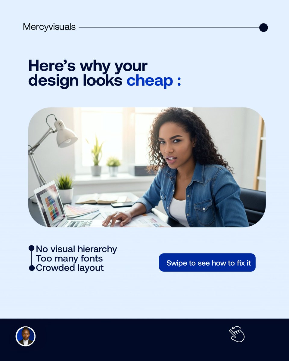
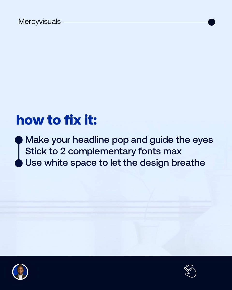
If your design isn’t making people stop and stare... It’s time to fix that. These 3 tweaks are the difference between cheap-looking and client-attracting designs. Save this post or send me a DM let’s make your brand unforgettable. #GraphicDesigner #helpfultips #VisualHierarchy


⚡ A rush of energy wrapped in bold design! 🔥 Passionfruit, pineapple, and citrus collide in a packaging that commands attention. 💥 Let’s create something this electrifying for your brand. Hit us up! #BoldBranding #EnergyPackaging #VisualHierarchy #TypographyMatters


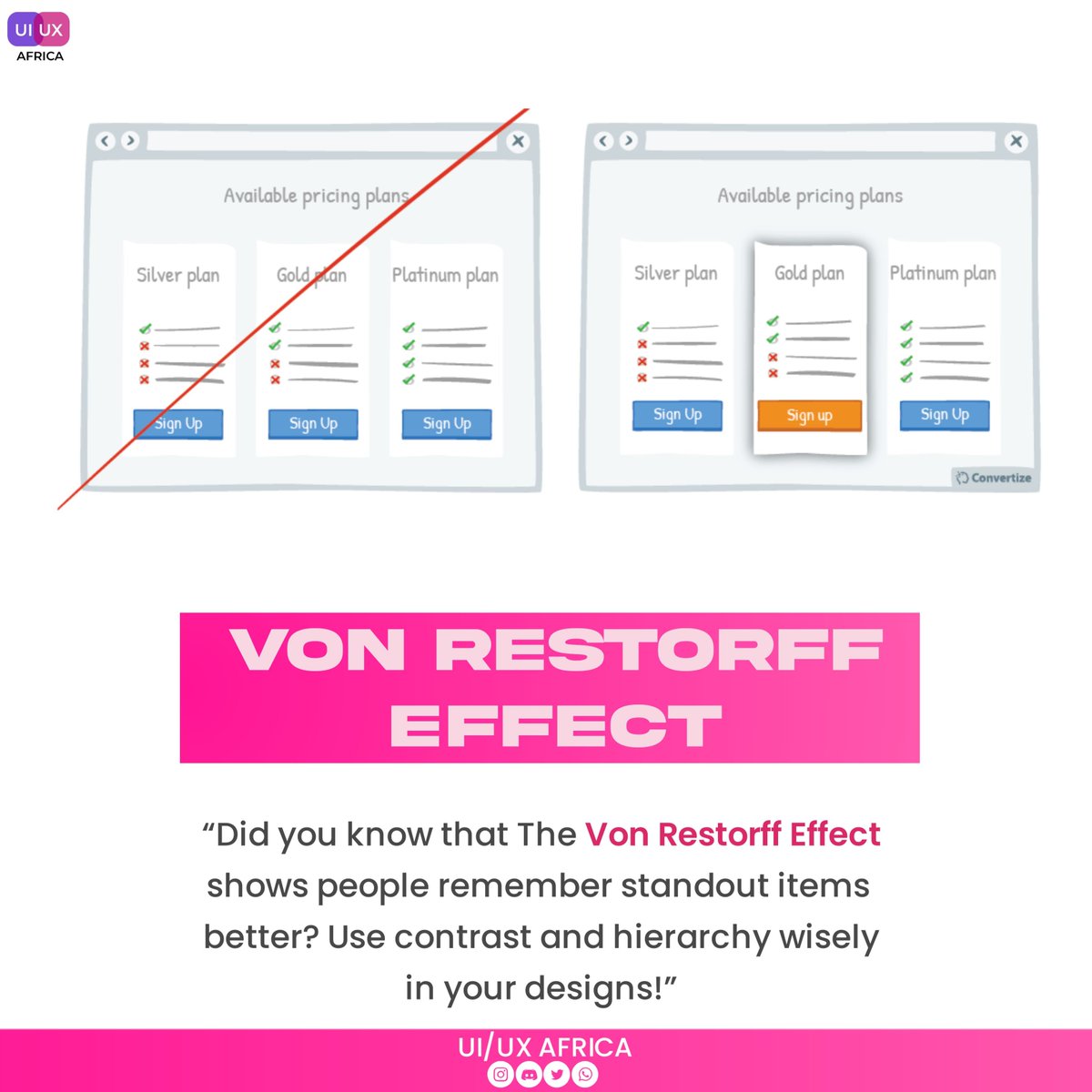
Want to make your designs more memorable? 😉 The Von Restorff Effect might be the key! Learn how contrast can boost user recall. #MemoryInDesign #UXInsights #VisualHierarchy #DesignPrinciples #UIUXCommunity

Adding a rounded card over the background image gives great visual depth & focus. It frames the summary text well, making the value clear before a bold call to action is presented for the report. 🌟 #DesignTips #VisualHierarchy

Ever wonder why some websites are easier to navigate than others? It's all about visual hierarchy! By strategically using size, color, contrast, and spacing, we can guide users' eyes and create a seamless experience. #VisualHierarchy #UIUXDesign #WebDesign #UserInterface


¿Sabías que la jerarquía visual guía a los usuarios a través de tu interfaz? Como desarrollador frontend, aprende a destacar lo más importante y mejorar la experiencia de usuario. #jerarquíavisual #diseñoui #visualhierarchy #uidesign


Mastering UI/UX Dynamics: Explore our blog to unravel the significance of Visual Hierarchy in crafting compelling designs. rb.gy/92aqsi #visualart #visualhierarchy #design #DesignThinking #uiux #DigitalTransformation #blog #MindInventory


Now there's your reminder to use visual hierarchy in your designs to ensure you are communicating effectively. Learn more by following PitchWorx. #visualhierarchy #designstrategy #marketingstrategy #funnelstrategy #communication #gooddesign #designagency #pitchworx

Visual cues are the secret sauce of UX design! 🪄 🚀 By carefully selecting colors, fonts, and layouts, you can create intuitive and enjoyable user experiences. My design shows the inclusion of visual cues.👩🏽💻👩🏽💻🚀 #UXDesign #VisualHierarchy #UserExperience #uiux #productdesign


I'm currently learning how visual cues can improve the UX of our design 👩🏽💻👩🏽💻🚀

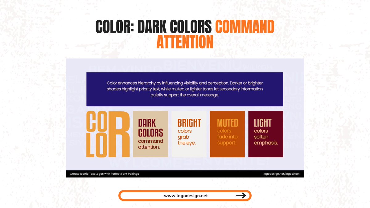
Typography isn’t just design; it’s strategy. Visual hierarchy ensures your audience reads what matters most. Learn more here: logodesign.net/blog/font-pair… #Typography #DesignTips #VisualHierarchy #BrandDesign #LogoDesign


A strong visual hierarchy makes all the difference in UI. Here are 3 tips to improve yours: 1. Don’t use too many colors 2. Make important elements bigger 3. Leverage Gestalt principles for structure More tips: bit.ly/3YCo0xB #VisualHierarchy #UIDesign #DesignTips


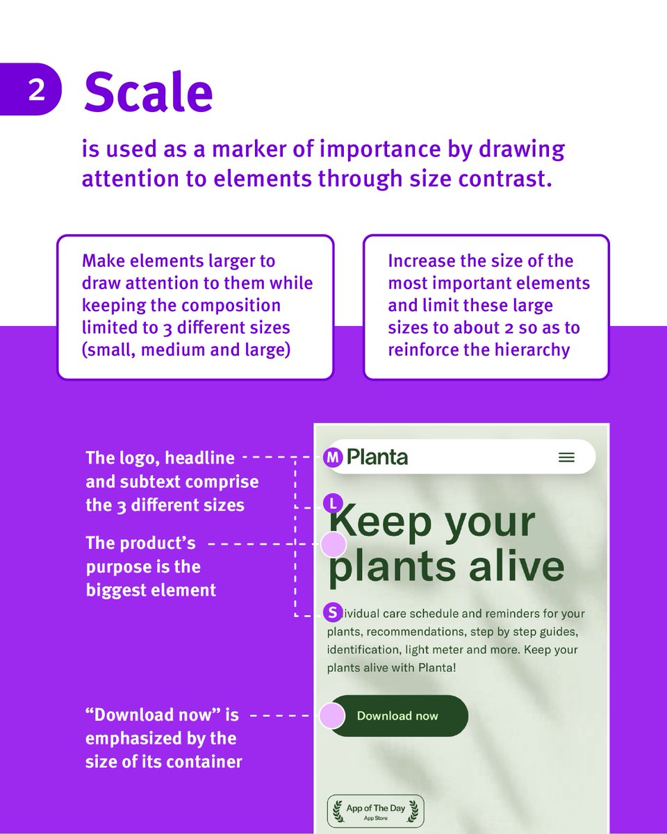


3. Strengthen Your Hierarchy Guide the viewer’s eyes. Make the most important elements bigger, bolder, or more prominent so people know exactly where to look first.


🎨 Design That Directs Eyes — Not Just Decorates 📞 +971 52 527 7360 🌐 360dominance.com 📧 [email protected] #360Dominance #UXDesign #VisualHierarchy #ColorPsychology #CTAAlignment #CreativeAgency #DigitalMarketing #MarketingStrategy #DesignThinking #BrandGrowth


3. Fixing the Visual Hierarchy (Because Clarity = Confidence) I reworked the typography and spacing to create an easier scan path: Bigger percentages where users look first Smaller supporting text
3. Fixing the Visual Hierarchy (Because Clarity = Confidence) I reworked the typography and spacing to create an easier scan path: Bigger percentages where users look first Smaller supporting text

People don't read, they scan What do you want your user to see first? Visual hierarchy is how you guide that scan, not just placing things, but controlling what gets noticed first. Good design adapts to how they actually navigate content.


Design that feels right isn’t an accident — it’s math. The Golden Ratio helps create balance, flow, and visual hierarchy that guides the viewer’s eye effortlessly. Smart design = better communication. #GoldenRatio #DesignPrinciples #VisualHierarchy #GraphicDesignTips #DesignBasic


⚡ Visual hierarchy tip: If everything is bold, nothing is bold.

Guide your audience’s eyes, guide their actions. That’s the power of visual hierarchy! #Proweaver #UXDesign #DesignTips


Visual hierarchy is spot on, packs so much info without the clutter, did you try a darker version? Killer work Laiba🔥
Day 18 @devanddesignhq session we were taught the key principles behind clean and readable design. They taught us legibility, visual hierarchy, contrast, font consistency, and proximity, all essential for creating clear layouts. #DesignTips #UIDesign #VisualHierarchy #Figma
Visual hierarchy is spot on, packs so much info without the clutter, did you try a darker version? Killer work Sumaiya 🔥

Visual hierarchy: making sure your eyes know where the party starts 🎯👀✨ . . Visit For More: @spenzmedia222 . . #VisualHierarchy #DesignTips #GoodDesign #DesignMatters #UIUXDesign #GraphicDesign #Design #ContentDesign #BrandDesign #DesignInspiration #DesignerLife #SpenzMedia


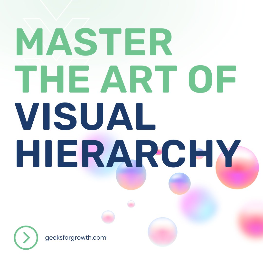
🎨 Want to make your designs more impactful? Mastering visual hierarchy is key. Learn how to guide the viewer’s eye and enhance your compositions. #DesignTips #VisualHierarchy #CompositionSkills ow.ly/6YoY50XbhfT

Hierarchy in UI/UX helps guide users’ attention by using size, color, and layout to show what’s most important. It makes interfaces easy to scan and navigate. Stay Fly🥷💫🚀 #UIUX #DesignTips #VisualHierarchy #ProductDesign

#visualhierarchy #animationprinciples #2danimation #3danimation #animationlife #animationart #animators #mograph #framebyframe #animationtutorial #stagingandcomposition #animationworkflow #motiondesign #animationcommunity #learnanimation #animationindustry

El patrón en F muestra cómo escaneamos una interfaz: arriba, izquierda y trazos cortos hacia abajo. Diseñar con este patrón mejora legibilidad, eficiencia y conversión. ¿Lo aplicas en tus diseños? #UXDesign #VisualHierarchy #Usability #GammaUX


Good design doesn’t just look good — it guides your eyes. 👀 Visual hierarchy helps users focus on what matters most, effortlessly. Design with purpose. Design with direction. #UXDesign #VisualHierarchy #UIDesign #DesignPsychology #Fayafly

🎨 Good UI is about arranging. Starting with visual hierarchy makes the most important element stand out first. Use contrast, spacing, and alignment to guide the eye. Design is 90% communication, 10% decoration. #UIDesign #VisualHierarchy #UXDesign #DesignTips #DailyUITip
Hierarchy in UI/UX helps guide users’ attention by using size, color, and layout to show what’s most important. It makes interfaces easy to scan and navigate. Stay Fly🥷💫🚀 #UIUX #DesignTips #VisualHierarchy #ProductDesign
Ever moved one piece of furniture and the whole room felt new? That’s what layout does. Same copy. Same product. New energy. New focus. Design = invisible influence. Before or After?👇 #WebDesign #VisualHierarchy #Figma #Shopify #LandingPageDesign #BeforeAfter
🎨 Good UI is about arranging. Starting with visual hierarchy makes the most important element stand out first. Use contrast, spacing, and alignment to guide the eye. Design is 90% communication, 10% decoration. #UIDesign #VisualHierarchy #UXDesign #DesignTips #DailyUITip
Ever clicked a site and instantly got it? Not because of the copy, because of the flow. That’s layout doing the heavy lifting. Good design doesn’t just look right. It feels inevitable. Before or After?👇 #WebDesign #VisualHierarchy #Figma #Shopify #LandingPage #BeforeAfter

El patrón en F muestra cómo escaneamos una interfaz: arriba, izquierda y trazos cortos hacia abajo. Diseñar con este patrón mejora legibilidad, eficiencia y conversión. ¿Lo aplicas en tus diseños? #UXDesign #VisualHierarchy #Usability #GammaUX

Your design must prioritize content. Visual Hierarchy is the tool that makes it happen. Read more about #VisualHierarchy on the #KIMPBlog go.kimp.io/Hierarchy #DesignTips #DesignPrinciples #ContentTips #UserExperience #UIDesign #AdDesign

Adding a rounded card over the background image gives great visual depth & focus. It frames the summary text well, making the value clear before a bold call to action is presented for the report. 🌟 #DesignTips #VisualHierarchy
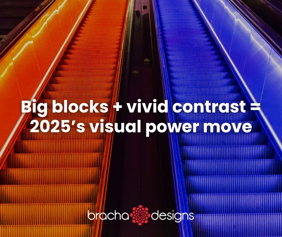
One rising trend in web design: using large block layouts with bold, contrasting colors to organize content visually. It helps the eye, gives structure, and lets elements “pop.” Try applying it to your homepage or service pages. #WebDesignTrends #VisualHierarchy #BrandDesign

Create stunning designs using visual hierarchy for clarity and impact! 🎨 #DesignTips #VisualHierarchy
Missed yesterday’s post, sorry guys, life happened 😩 Design Tip 2: Visual Hierarchy Make the key info pop using size, weight or colour. Let your headline shout, subtext talk and the rest whisper 💬✨ #visualhierarchy #designsbybee #creativedesigner
Typography isn’t just design; it’s strategy. Visual hierarchy ensures your audience reads what matters most. Learn more here: logodesign.net/blog/font-pair… #Typography #DesignTips #VisualHierarchy #BrandDesign #LogoDesign
If your design isn’t making people stop and stare... It’s time to fix that. These 3 tweaks are the difference between cheap-looking and client-attracting designs. Save this post or send me a DM let’s make your brand unforgettable. #GraphicDesigner #helpfultips #VisualHierarchy
🚦 Dos: Aim for a balanced color scheme. Harmonize hues that complement each other. Establish a visual hierarchy with contrasting colors to guide users through the interface. #BalancedColor #VisualHierarchy 🎨
Want to make your designs more memorable? 😉 The Von Restorff Effect might be the key! Learn how contrast can boost user recall. #MemoryInDesign #UXInsights #VisualHierarchy #DesignPrinciples #UIUXCommunity

#design matters. Learn how #visualhierarchy guides users' attention & improves UX. Read more: devinterface.com/en/blog/visual… #devinterface

Ever wonder why some websites are easier to navigate than others? It's all about visual hierarchy! By strategically using size, color, contrast, and spacing, we can guide users' eyes and create a seamless experience. #VisualHierarchy #UIUXDesign #WebDesign #UserInterface

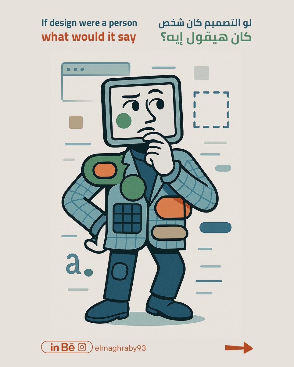
"لو التصميم كان بيتكلم... كان هيقولك إيه؟ 👀 اسمع صوت عناصر التصميم واتعلم منها! #elmaghraby93 #VisualHierarchy #Ux #Ui #WebDesign #white_space #design_tips


¿Sabías que la jerarquía visual guía a los usuarios a través de tu interfaz? Como desarrollador frontend, aprende a destacar lo más importante y mejorar la experiencia de usuario. #jerarquíavisual #diseñoui #visualhierarchy #uidesign
Something went wrong.
Something went wrong.
United States Trends
- 1. #SmackDown 8,992 posts
- 2. Mark Pope 1,210 posts
- 3. #ROHFinalBattle 4,060 posts
- 4. FIFA 458K posts
- 5. Gonzaga 2,907 posts
- 6. Celtics 18.5K posts
- 7. Iowa State 10.7K posts
- 8. Matt Campbell 12.8K posts
- 9. Terror Twins N/A
- 10. Michael Annett 1,083 posts
- 11. #JingleBellJohn N/A
- 12. Wayne Knight N/A
- 13. Jordan Walsh 3,692 posts
- 14. Jimmy Rogers N/A
- 15. Hep B 20.4K posts
- 16. Zags N/A
- 17. #UFC326 4,242 posts
- 18. Goose Crowder N/A
- 19. Frank Gehry 7,471 posts
- 20. Vizio N/A