#csstips wyniki wyszukiwania

🖲️ CSS Cursor Properties #CSSCursor #CSSTips #WebDevelopment #coding #FrontendDevelopment #LearnCSS #react #code #CSSForBeginners #WebDesign #FrontendTips #CSSProperties #DevTips #TechTutorial #CodingWithCSS #CursorStyles #CSSHacks #WebDevShorts #react #fullstack #cursor

⚡CSS Margin Shorthand #CSSMargin #CSSShorthand #CSSTips #javascript #WebDevelopment #FrontendTips #CSSForBeginners #LearnCSS #MarginShorthand #HTMLCSS #react #WebDesignTricks #CodingShorts #coder #coding #FrontendDevelopment #WebDev #CSSHack #DeveloperTips #nodejs #nextjs


Setting max-width to 100% ensures that your photos never exceed the width of their container, ensuring that they scale across different devices. This simple approach can improve the user experience and mobile-friendliness of your website. Have fun coding! 🖥️📱 #CSSTips


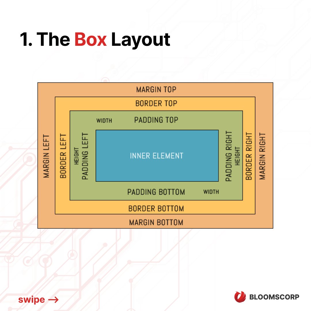
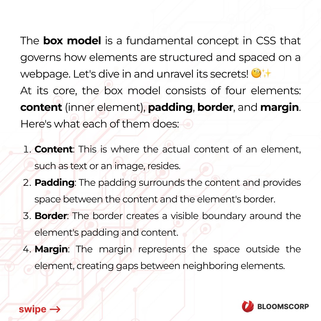
📦 Demystifying the Box Model in CSS 📦 #CSSTips #CSSTricks #CSSInspiration #WebDesignInspo #FrontEndDevelopment #CodeLearning


Use :has() to create parent-aware styling—no JavaScript needed! ✅ Works in modern browsers. Game-changer for styling logic. #CSS #CSSTips #FrontendDev #WebDesign #ModernCSS #CSSHasSelector


INSET CSS PROPERTY #CSS #CSSTips The css 'inset' property defines the offset of an element from the edges of its parent element. It's is shorthand method for the 'top', 'left', 'right', 'bottom' css properties. Browser support: Full. Syntax:check thread


Here’s a cool trick how to make your website dark/light mode “responsive” with only a few CSS lines! #buildinpublic #css #csstips #webdev #webdesign #cssvariables


Learn three different methods of truncating text with CSS. #css #webdev #csstips #csstricks #learncss #quicktip #csstechniques #csstutorial #html #tutorial #textoverflow

Hello CSS-2025 aspirants. Introducing an online essay and précis evaluation session take aap logo ko zyada bhagna na pare jesse hum bhage the. 😊 #csstips #cssaspirants #cssexam #essaywriting #English


This morning I learned how to set a background with color gradient on text with an image overlay for texture. With a shadow for emphasis. The key is: color: transparent; background-clip: text; #CSS #CSSTips


Choosing the right unit for font sizing is crucial in web design. 📏 Learn the differences between font size, percent, em, and rem to ensure a responsive and visually appealing website. 💻🔍 Thread 🧵👇 #WebDesign #Typography #CSSTips #CodingChallenge

🏞️ CSS Tips Easily find missing alt attributes on your image elements in HTML using one line of CSS. — #css #csstips

Ever spent time calculating padding or using hacky wrappers to keep elements proportional? With CSS aspect-ratio, you can keep images, videos, and cards perfectly sized. #FrontendFriday #GleemCommunity #CSSTips #WebDevTips #FrontendDevelopment #CSS #100DaysOfCode #WebDesign


⚠️ Use CSS will-change sparingly! Overuse can strain memory and slow down your site. Apply it only to elements that will change soon, and remove it afterward. #WebDevelopment #CSSTips #WebHosting
Use CSS variables + @media queries for responsive theming without duplicating styles. 🚀 One variable → multiple themes, clean & scalable. #CSS #WebDevelopment #CSSTips #FrontEnd #ResponsiveDesign #WebDesign #CodingTips #CSS3 #WebDev #DeveloperTips #uiuxdesign


box-shadow is such a game changer 😍 Just a few pixels and your card design pops right out! #CSSTips #FrontendDeveloper #WebDesign #LearningJourney #BuildInPublic
💡 CSS Tip of the Day: Use box-shadow to make your elements pop! Example: box-shadow: 0 4px 8px rgba(0,0,0,0.2); Small detail, big impact 👏 #CSSTips #WebDev #Frontend #LearningJourney #BuildInPublic
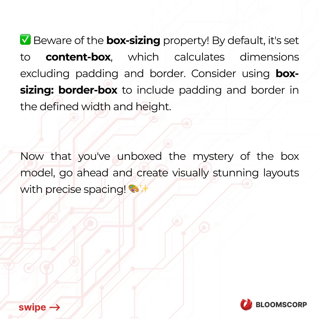
💡 Quick CSS tip: Use * { margin: 0; padding: 0; box-sizing: border-box; } at the start of your stylesheet. It resets default styles and keeps your layout clean! #CSSTips #WebDevelopment #CodingTips #LearningDaily #BuildInPublic

Tailwind’s @layer is underrated. Use it to define reusable utilities @layer utilities { .card-shadow { @apply shadow-lg rounded-2xl p-4; } } Keeps your code DRY + scalable. #TailwindCSS #CSSTips #WebDev


Hide headers, footers, or any element when printing in Elementor with a no-print CSS class. A quick guide to controlling what shows up in print preview. #elementor #csstips #webdesignhacks #csshacks #wordpress

Clean, responsive designs start with small tweaks 💡 Here’s another underrated CSS trick that makes your layout pop 👇 box-shadow: 0 4px 10px rgba(0, 0, 0, 0.1); Tiny detail — huge visual upgrade 💻✨ #frontend #webdev #csstips #CSS Simple, clean shadow = instant modern look


Tabular Numbers in css ........... #CSSTips #WebDesignCommunity #LearnCSS #CodingTogether #TabularNumbers #CSSHelp #DesignInspiration #TechTalks #StyleYourSite #CodingQuestions

Still my favorite CSS trick today 💡 Use clamp() for responsive font sizes that adjust perfectly on any screen. No more tiny mobile text or huge desktop titles 👇 #webdev #frontend #csstips

CSS tip 💡 Use clamp() for responsive font sizes that adjust perfectly on any screen. No more tiny mobile text or huge desktop titles 👇 #webdev #frontend #csstips @EmmaWebDev59


🧠 CSS Reminder: Use em for font size scaling, and rem for layout sizing. It keeps your UI responsive and accessible. #CSSTips

Customizing list markers in CSS ........... #CSSTips #WebDesignIdeas #LearnCSS #CustomMarkers #CodeCommunity #CSSMystery #DesignDiscussion #CreativeCoding #HTMLandCSS #TechTalks

CSS Border Radius Technique ..... #CSSTips #BorderRadiusMagic #WebDesignCommunity #CreativeCoding #RoundTheEdges #DesignInspiration #FrontendFun #UserExperience #TechTalks #CSSChallenges


Box Model 101: Every element in CSS is a box—made of: 1️⃣ Content 2️⃣ Padding 3️⃣ Border 4️⃣ Margin Mastering this is to perfect layouts. #CSSTips #BoxModel #frontenddev
Cascading in CSS means: When there are multiple style rules, the browser decides which one wins based on specificity & order. Think of it as CSS saying: “Last rule wins… unless I say otherwise!” #CSSTips #Coding #WebDesign


🖲️ CSS Cursor Properties #CSSCursor #CSSTips #WebDevelopment #coding #FrontendDevelopment #LearnCSS #react #code #CSSForBeginners #WebDesign #FrontendTips #CSSProperties #DevTips #TechTutorial #CodingWithCSS #CursorStyles #CSSHacks #WebDevShorts #react #fullstack #cursor
⚡CSS Margin Shorthand #CSSMargin #CSSShorthand #CSSTips #javascript #WebDevelopment #FrontendTips #CSSForBeginners #LearnCSS #MarginShorthand #HTMLCSS #react #WebDesignTricks #CodingShorts #coder #coding #FrontendDevelopment #WebDev #CSSHack #DeveloperTips #nodejs #nextjs


CSS Border Radius Technique ..... #CSSTips #BorderRadiusMagic #WebDesignCommunity #CreativeCoding #RoundTheEdges #DesignInspiration #FrontendFun #UserExperience #TechTalks #CSSChallenges
Tabular Numbers in css ........... #CSSTips #WebDesignCommunity #LearnCSS #CodingTogether #TabularNumbers #CSSHelp #DesignInspiration #TechTalks #StyleYourSite #CodingQuestions


📦 Demystifying the Box Model in CSS 📦 #CSSTips #CSSTricks #CSSInspiration #WebDesignInspo #FrontEndDevelopment #CodeLearning
Setting max-width to 100% ensures that your photos never exceed the width of their container, ensuring that they scale across different devices. This simple approach can improve the user experience and mobile-friendliness of your website. Have fun coding! 🖥️📱 #CSSTips

I will start my programming journey #CSSTips #WebDesign #HTML #WebDevelopment #CSS #FrontendDevelopment #WebDesignTips #Coding #WebAccessibility #LearnToCode


Did you know using "transform: translateZ(0)" on an element forces it into its own layer, improving performance especially on animations? Handy for those GPU boosts! 🚀 Try it out! #WebDev #CSSTips #PerformanceMatters Share your results! 💻✨

CSS Tip: Use `currentColor` for a cohesive color scheme. It inherits the text color, so you can apply it to borders, shadows, etc., to maintain consistency easily. Also a lifesaver for SVGs! 💡🎨 #csstips #webdev #frontend #codinghacks

Did you know using CSS custom properties (variables) can make your life a ton easier? They're super useful for maintaining consistency & making quick changes. Plus, you can change them with JavaScript! #CSSTips #FrontEnd #WebDevelopment Share your favorite use for CSS variables!

Ever get annoyed with magic numbers in your CSS? Use `calc()` to make spacing & sizes dynamic! Works wonders for responsive design. 📐✨ Share your favorite `calc()` usage! #WebDev #CSSTips #ResponsiveDesign

Did you know using CSS custom properties (aka CSS variables) can massively clean up your stylesheets? Define once, use everywhere! Great for themes and responsive design. Give it a try! 🎨✨ #webdev #csstips #frontend #codinglife

CSS Tip: Use custom properties (variables) to keep your color scheme & spacings consistent! It makes future changes a breeze & your style more readable. Who knew maintenance could be this easy? 😉 Share your fave CSS secrets! #CSSTips #WebDevelopment #CodingLife

Ever need more control over child elements in CSS? Try `:nth-child()` to style them in a pattern (like every 2nd item). This selector is a game changer for complex layouts! Share your favorite use cases! #CSSTips #WebDev #FrontEnd #DesignMagic ✨🎨

Ever used `currentColor` in CSS? It's a secret weapon! 👀 It lets you use the color value of an element's text for other properties such as border or shadow. Super handy for consistency without repeating hex codes! 🌈 #CSSTips #WebDev #CSSecrets Let's spread the word! 📢

Did you know using the :not() pseudo-class can help you select elements more efficiently? It's a game-changer in keeping your CSS clean! Share your favorite uncommon CSS tricks. #CSSTips #WebDev #CodingLife #CSSecrets

INSET CSS PROPERTY #CSS #CSSTips The css 'inset' property defines the offset of an element from the edges of its parent element. It's is shorthand method for the 'top', 'left', 'right', 'bottom' css properties. Browser support: Full. Syntax:check thread
🤓 Did you know "currentColor" is super handy in CSS? It inherits the text color for properties like border or shadow. A slick way to maintain consistent styling without repeating hex codes! ✨ #CSSTips #WebDev #FrontEnd #CodingTricks

Something went wrong.
Something went wrong.
United States Trends
- 1. Cowboys 63.1K posts
- 2. Cardinals 27.9K posts
- 3. #WWERaw 56.3K posts
- 4. Jerry 43.5K posts
- 5. Logan Paul 9,141 posts
- 6. Kyler 7,339 posts
- 7. Jacoby Brissett 4,388 posts
- 8. Koa Peat 5,703 posts
- 9. Pickens 6,333 posts
- 10. Javonte 3,729 posts
- 11. Bland 11.4K posts
- 12. Cuomo 159K posts
- 13. Dak Prescott 4,346 posts
- 14. Walter Nolen 1,527 posts
- 15. Calais Campbell N/A
- 16. Eberflus 1,984 posts
- 17. Pacers 10.7K posts
- 18. #MondayNightFootball 1,296 posts
- 19. Steele 5,950 posts
- 20. Bethune 3,853 posts