#dataviz4good search results

"PeaceTech Accelerator alum Behar, a native of Kosovo, has found an enthusiastic fan base for his data visualization platform, Keshif." bit.ly/2j38Lcv #ptxMacedonia #dataviz4good #data4transparency @C5Accelerate @PeaceTechLab


But look closer and you can see that one group exceeds the red benchmark and other doesn't. You can also see that one group has data points (green circles) spread apart, and the other is more clustered. With additional study, we can learn much more. #DataViz4Good #Data4BlackLives
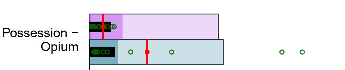
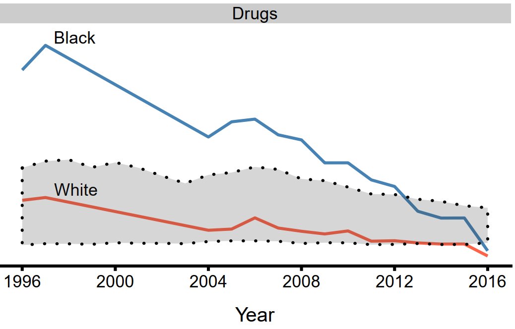
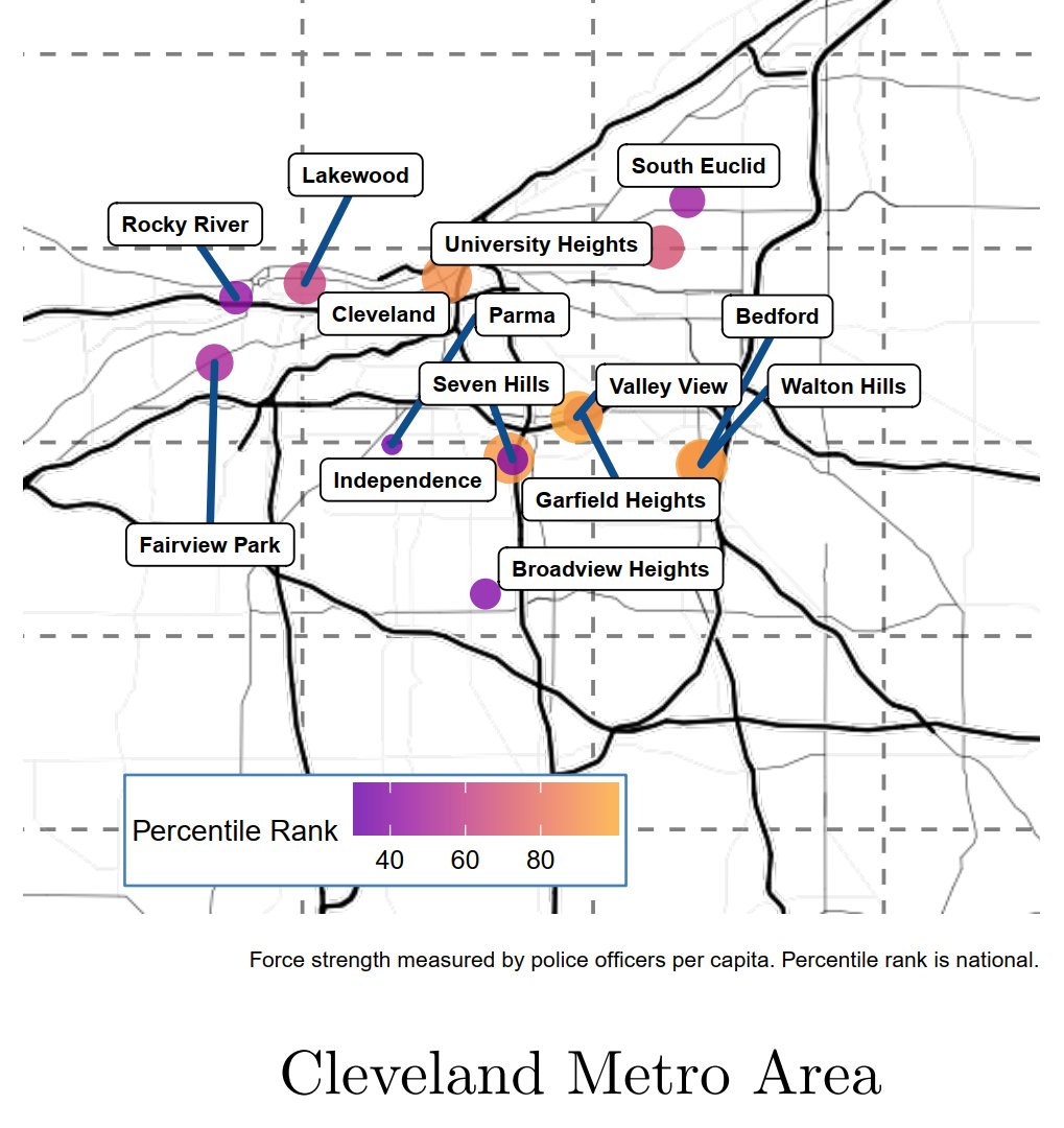
For the fact sheet project --> buff.ly/2Fl0JZS, I chose to highlight three chart types - a bullet chart, a line chart, and a map. These provide immediate information, but also unfurl more insights with increased study by the viewer. #Data4BlackLives #DataViz4Good

Something went wrong.
Something went wrong.
United States Trends
- 1. Thanksgiving 316K posts
- 2. Good Wednesday 28K posts
- 3. #wednesdaymotivation 4,491 posts
- 4. Colorado State 3,200 posts
- 5. #Wednesdayvibe 2,239 posts
- 6. Nuns 7,511 posts
- 7. Mora 21.4K posts
- 8. Stranger Things Day 3,078 posts
- 9. Hump Day 11K posts
- 10. Happy Hump 7,298 posts
- 11. Karoline Leavitt 25.6K posts
- 12. Luka 69.5K posts
- 13. Hong Kong 53.7K posts
- 14. Brett Favre 1,025 posts
- 15. Food Network N/A
- 16. Gretzky N/A
- 17. Clippers 20.1K posts
- 18. El Salvador 48.7K posts
- 19. Witkoff 181K posts
- 20. Tina Turner 5,075 posts