#graphical_presentations 検索結果

Compare values → Bar or Column Chart Show trends → Line or Area Chart Explain composition → Pie or Stacked Bar Chart Show distribution → Histogram or Box Plot Reveal relationships → Scatter or Bubble Plot Show geographical patterns → Map Track KPIs → Cards

Visualizing value: We used a card-based grid to break down complex features into digestible insights. Do you prefer grids or list views for feature sections?


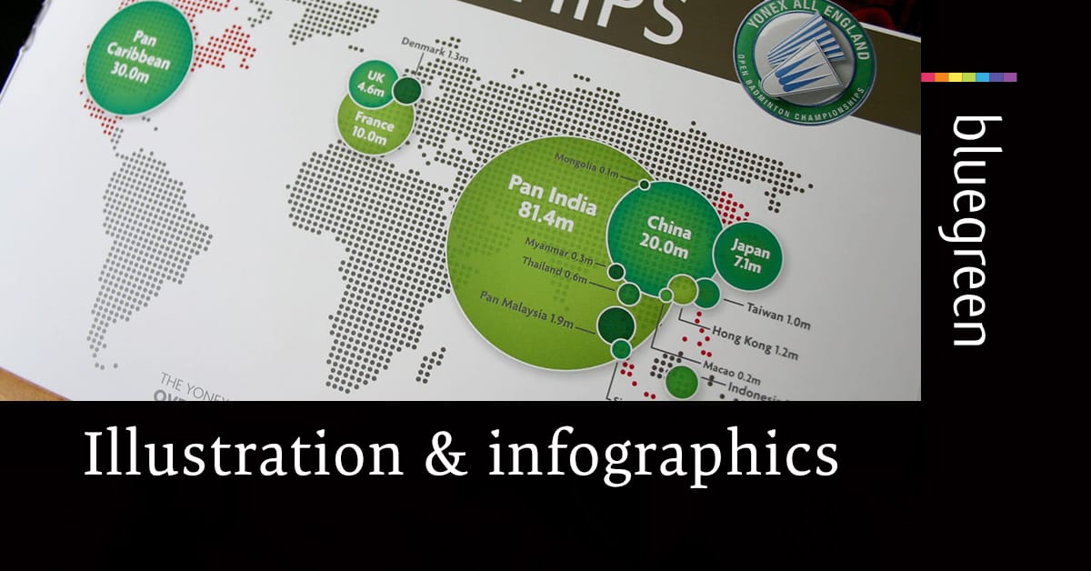
A picture paints a thousand words!🎨🖌️ When a bespoke message, or the need to tell a unique story is required, the power of the drawn image comes into its own > ow.ly/VnS750zWs6y #GraphicDesign #Illustration #Infographics #Images


パワポで作るグラフデザイン。 グラフは形・高さ・長さで“視覚的に処理”できます。強調するポイントを明確にすることで、読み手の理解速度が圧倒的に速くなります。

Turn text into visuals #visual #presentation #graphic youtube.com/shorts/hm27u6y…
youtube.com
YouTube
Turn text into visuals #visual #presentation #graphic

So consider creating a visual when: ➡️ You have data to present. Graphs make data easier to swallow than writing about results. ➡️ You have a complex process to discuss, like an agency decision process, or a factual process, like how a company handled complaints. (5/6)

When I was building Portfolio Analysis at Groww, I experimented with many different visualisations, especially for this kind of data. You can definitely try different kinds of visualisation like treemap, bubble chart, a variation of bar graph with data on LHS and RHS etc. But…

3. 3D Charts Turns data, results, and metrics into compelling 3D visuals.

or a Histogram for understanding data distribution. It also includes visuals like Map Charts for geographical insights, Pie and Donut Charts for proportions, and Scatter Plots for relationships and correlations etc .

A presentation is often the moment your message either sticks—or slips away. Design isn’t decoration, it’s persuasion. Here’s how to build presentations that close deals. thegrove.co/blog/how-to-cr… #PresentationTips #DesignStrategy #Storytelling #SMBMarketing #B2BLeadership


A graph can say what words can’t. Clear visuals make complex data easy to understand. Bar charts for comparisons, line graphs for trends, pie charts for proportions. Label clearly and support with text. 👉🏼 GET 1:1 HELP gradcoach.me/81CZDU 👈🏼


Graphs as presentation of numerical information vs. graphs as eye-catching illustrations statmodeling.stat.columbia.edu/2010/04/03/gra…

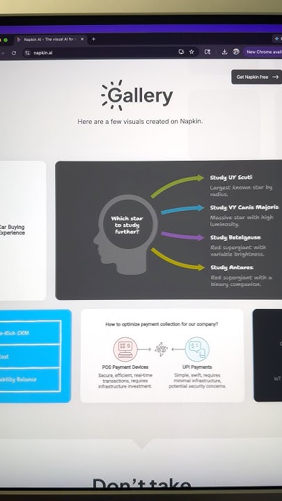
Lots of these graphics have been created. Here's my attempt. If you can spare two mins to provide feedback, I would really appreciate it 🤝


Imagine turning those detailed 2D plans into 3D visuals in no time? Here's a demo generated with graphite3d.xyz 👇


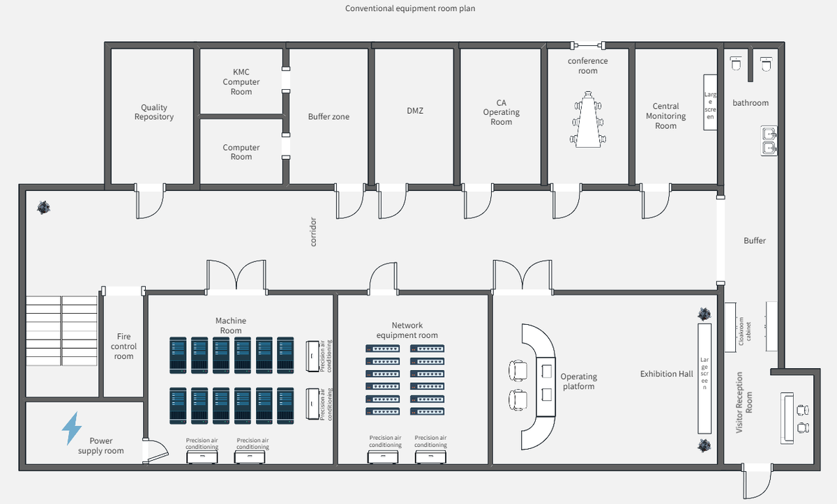
A floor plan turns 3D space into 2D 📐 It shows shape, size & layout with symbols & notes. Hard for beginners? Don’t worry—learn to make pro & beautiful plans with ProcessOn. 🏠 🖊️ processon.io/blog/floor-plan #designs #FloorPlan #architecturelovers #Decoration #flowchart


Geometry + emotion = powerful visuals. Explore how using shapes strategically can make your design speak louder. #GraphicDesign #Illustration #Emotion #Shapes ow.ly/q5zr50XbgPU


To solve for this, we kept the numbers big and bold, used simple visualisations that didn't require a legend or annotation beyond basic labels and clean design with high contrast for maximum visibility.
A picture paints a thousand words!🎨🖌️ When a bespoke message, or the need to tell a unique story is required, the power of the drawn image comes into its own > ow.ly/VnS750zWs6y #GraphicDesign #Illustration #Infographics #Images

I've been using #Gamma #AI to make my presentations prettier - here are some examples of the stunning graphics Gamma is able to create! buff.ly/snnLZbr


Something went wrong.
Something went wrong.
United States Trends
- 1. $NVDA 83.1K posts
- 2. Jensen 27.3K posts
- 3. Peggy 39.4K posts
- 4. Sam Harris N/A
- 5. Sheila Cherfilus-McCormick 6,995 posts
- 6. GeForce Season 6,402 posts
- 7. NASA 57.3K posts
- 8. #Jupiter 3,501 posts
- 9. Arabic Numerals 6,537 posts
- 10. #YIAYalpha N/A
- 11. Martha 21.2K posts
- 12. Potomac N/A
- 13. FEMA 9,038 posts
- 14. Judge Smith 4,904 posts
- 15. Sumrall 2,648 posts
- 16. Stargate 7,877 posts
- 17. Comey 60.7K posts
- 18. #jeopardyblindguess N/A
- 19. Tarris Reed N/A
- 20. WNBA 9,939 posts