#teachingstats search results


Students producing great visualizations for their Science Fair displays... #DataScience #TeachingStats #DataLiteracy
Does taking supplements with antioxidants have beneficial health effects? Like reducing heart attack risk? It turned out that this wasn’t the case - quite the opposite in fact! about.dataclassroom.com/blog/antioxida… #DataScience #TeachingStats #DataLiteracy

Students enjoying working with data at the University of Central Arkansas! #DataScience #TeachingStats #DataLiteracy

Students discovering meaning in their data - now that's learning! #DataScience #TeachingStats #DataLiteracy


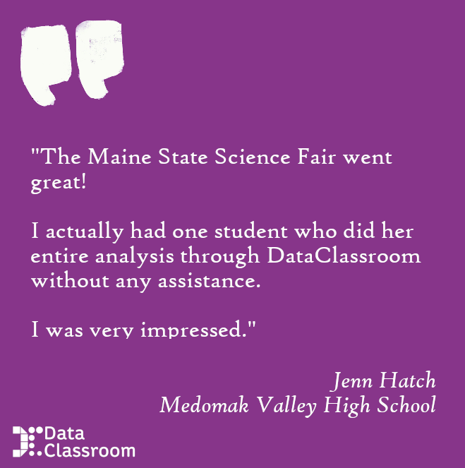
Glad to hear students are really getting something out of using DataClassroom! #DataScience #TeachingStats #DataLiteracy

Great to see students actively selecting DataClassroom as their tool for nailing the IA... #DataScience #TeachingStats #DataLiteracy

Take your own good time and see what the data are telling you... #DataScience #TeachingStats #DataLiteracy

The correlation matrix is a great way to visualize patterns in your data. Patterns can just pop right out at you! about.dataclassroom.com/blog/correlati… #DataScience #TeachingStats #DataLiteracy


Settling down to a fabulous talk by Emma McCoy from LSE on statistics... Using data to inform not confuse 🤩🤩🤩 Amazing stuff!! #MEIConf23 #TeachingStats

The Bridge to R feature lets you build a visualization and run a hypothesis test in DataClassroom - and then generates nice, well-annotated code to do the same thing in R! Read more on the blog: about.dataclassroom.com/blog/bridge-to… #DataScience #TeachingStats #DataLiteracy

How to get a feel for how much data you need to collect for an experiment to give a significant result? Simulations are a great way to get an idea. about.dataclassroom.com/blog/collectin… #DataScience #TeachingStats #DataLiteracy

Colorscales make your data pop! Give your visualization some "pop" with a relevant or eye-catching color gradient. about.dataclassroom.com/blog/color-sca… #DataScience #TeachingStats #DataLiteracy

Students starting to design their surveys? In this blog post we focus on the topics most relevant for making easily-analyzable data, like goals, using survey tools and planning your analysis FIRST! about.dataclassroom.com/blog/survey-de… #DataScience #TeachingStats #DataLiteracy


I've updated my regression writing guide! I also created an @OSFramework project and hope to collect examples of good and bad writing to help emphasize the importance of proper interpretations! #quantpsych #teachingstats osf.io/sjavx osf.io/egm3c/
There's an idea that students must use spreadsheets for everything - because “that’s what they’ll use in the workplace”. But scientists don’t much use spreadsheets for analysis. about.dataclassroom.com/blog/excel-in-… #DataScience #TeachingStats #DataLiteracy
The right tool for the job! u.dataclassroom.com #DataScience #TeachingStats #DataLiteracy #experimentaldesign

The Graph Wizard assists the student in deciding which kind or graph - or graphs - might best illustrate their data. Read more about our Graph Wizard here: about.dataclassroom.com/blog/graph-wiz… #DataScience #TeachingStats #DataLiteracy

We still have places on our upcoming Teaching Stats 1 course - come and talk stats with me!!🥳🥳Online sessions & f2f study days in *London* & *Birmingham* - it really is great fun!!!! #TeachingStats #MathsChat #EduTwitter #MathsCPDChat

Great to see students actively selecting DataClassroom as their tool for nailing the IA... #DataScience #TeachingStats #DataLiteracy
Colorscales make your data pop! Give your visualization some "pop" with a relevant or eye-catching color gradient. about.dataclassroom.com/blog/color-sca… #DataScience #TeachingStats #DataLiteracy
Students producing great visualizations for their Science Fair displays... #DataScience #TeachingStats #DataLiteracy
The correlation matrix is a great way to visualize patterns in your data. Patterns can just pop right out at you! about.dataclassroom.com/blog/correlati… #DataScience #TeachingStats #DataLiteracy
The right tool for the job! u.dataclassroom.com #DataScience #TeachingStats #DataLiteracy #experimentaldesign
Does taking supplements with antioxidants have beneficial health effects? Like reducing heart attack risk? It turned out that this wasn’t the case - quite the opposite in fact! about.dataclassroom.com/blog/antioxida… #DataScience #TeachingStats #DataLiteracy
Students enjoying working with data at the University of Central Arkansas! #DataScience #TeachingStats #DataLiteracy
There's an idea that students must use spreadsheets for everything - because “that’s what they’ll use in the workplace”. But scientists don’t much use spreadsheets for analysis. about.dataclassroom.com/blog/excel-in-… #DataScience #TeachingStats #DataLiteracy
Take your own good time and see what the data are telling you... #DataScience #TeachingStats #DataLiteracy
Glad to hear students are really getting something out of using DataClassroom! #DataScience #TeachingStats #DataLiteracy
The Graph Wizard assists the student in deciding which kind or graph - or graphs - might best illustrate their data. Read more about our Graph Wizard here: about.dataclassroom.com/blog/graph-wiz… #DataScience #TeachingStats #DataLiteracy
Students discovering meaning in their data - now that's learning! #DataScience #TeachingStats #DataLiteracy
How to get a feel for how much data you need to collect for an experiment to give a significant result? Simulations are a great way to get an idea. about.dataclassroom.com/blog/collectin… #DataScience #TeachingStats #DataLiteracy
The Bridge to R feature lets you build a visualization and run a hypothesis test in DataClassroom - and then generates nice, well-annotated code to do the same thing in R! Read more on the blog: about.dataclassroom.com/blog/bridge-to… #DataScience #TeachingStats #DataLiteracy
Students starting to design their surveys? In this blog post we focus on the topics most relevant for making easily-analyzable data, like goals, using survey tools and planning your analysis FIRST! about.dataclassroom.com/blog/survey-de… #DataScience #TeachingStats #DataLiteracy

For true data literacy we need to move on from the simple bar graph and use graphs that show you more. Why? Check out the blog: about.dataclassroom.com/blog/the-end-o… #DataScience #TeachingStats #DataLiteracy

The ability to "play" with data is the very foundation of data literacy! #DataScience #TeachingStats #DataLiteracy

Glad to hear students are really getting something out of using DataClassroom! #DataScience #TeachingStats #DataLiteracy
Students producing great visualizations for their Science Fair displays... #DataScience #TeachingStats #DataLiteracy
Students enjoying working with data at the University of Central Arkansas! #DataScience #TeachingStats #DataLiteracy
Students discovering meaning in their data - now that's learning! #DataScience #TeachingStats #DataLiteracy
The Bridge to R feature lets you build a visualization and run a hypothesis test in DataClassroom - and then generates nice, well-annotated code to do the same thing in R! Read more on the blog: about.dataclassroom.com/blog/bridge-to… #DataScience #TeachingStats #DataLiteracy
Does taking supplements with antioxidants have beneficial health effects? Like reducing heart attack risk? It turned out that this wasn’t the case - quite the opposite in fact! about.dataclassroom.com/blog/antioxida… #DataScience #TeachingStats #DataLiteracy
The correlation matrix is a great way to visualize patterns in your data. Patterns can just pop right out at you! about.dataclassroom.com/blog/correlati… #DataScience #TeachingStats #DataLiteracy
Take your own good time and see what the data are telling you... #DataScience #TeachingStats #DataLiteracy
Colorscales make your data pop! Give your visualization some "pop" with a relevant or eye-catching color gradient. about.dataclassroom.com/blog/color-sca… #DataScience #TeachingStats #DataLiteracy
Great to see students actively selecting DataClassroom as their tool for nailing the IA... #DataScience #TeachingStats #DataLiteracy
How to get a feel for how much data you need to collect for an experiment to give a significant result? Simulations are a great way to get an idea. about.dataclassroom.com/blog/collectin… #DataScience #TeachingStats #DataLiteracy
The ability to "play" with data is the very foundation of data literacy! #DataScience #TeachingStats #DataLiteracy
The right tool for the job! u.dataclassroom.com #DataScience #TeachingStats #DataLiteracy #experimentaldesign
DataClassroom assists migration to coding-based analysis, allowing students to gain confidence along the way. #DataScience #TeachingStats #DataLiteracy

The Graph Wizard assists the student in deciding which kind or graph - or graphs - might best illustrate their data. Read more about our Graph Wizard here: about.dataclassroom.com/blog/graph-wiz… #DataScience #TeachingStats #DataLiteracy
Settling down to a fabulous talk by Emma McCoy from LSE on statistics... Using data to inform not confuse 🤩🤩🤩 Amazing stuff!! #MEIConf23 #TeachingStats
For true data literacy we need to move on from the simple bar graph and use graphs that show you more. Why? Check out the blog: about.dataclassroom.com/blog/the-end-o… #DataScience #TeachingStats #DataLiteracy
Something went wrong.
Something went wrong.
United States Trends
- 1. Pond 212K posts
- 2. $BNKK 1,039 posts
- 3. Kim Davis 2,285 posts
- 4. #IDontWantToOverreactBUT N/A
- 5. #MondayMotivation 39.8K posts
- 6. Semper Fi 6,641 posts
- 7. Go Birds 5,340 posts
- 8. Happy 250th 7,697 posts
- 9. $LMT $450.50 Lockheed F-35 1,109 posts
- 10. $SENS $0.70 Senseonics CGM 1,126 posts
- 11. $APDN $0.20 Applied DNA 1,101 posts
- 12. Good Monday 45.8K posts
- 13. Obamacare 212K posts
- 14. Edmund Fitzgerald 5,586 posts
- 15. #MYNZ N/A
- 16. Victory Monday 2,758 posts
- 17. Obergefell 1,655 posts
- 18. Rudy Giuliani 29.6K posts
- 19. Talus Labs 26.3K posts
- 20. #USMC 1,243 posts