#uxtips hasil pencarian

Typography can make or break your design It’s not just about picking a font - it’s about: ✅ hierarchy ✅ readability ✅ consistency 👉 Save this for your next project #UIDesign #UXTips #TypographyMatters #DesignTips #UserExperience #ProductDesign #UXDesign #TypographyLovers…


Figma Glass Effect Feature: #FigmaDesign #UIDesign #UXTips #FigmaReels #FigmaShorts #glasseffect #appleglasseffect #figmaglassefectfeature #figmanewupdate #FigmaPlayground

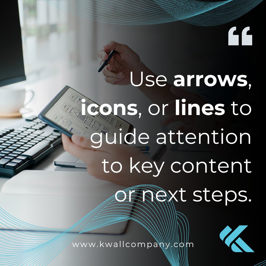
👀 Guide the eye. Arrows, icons, and lines point users to what matters most—no words needed. A small cue can make a big impact on UX. #UXTips #WebDesign #UserJourney #DigitalExperience #KWALL


Good UI = better conversions. Quick Do this, not that for landing pages: ❌ Cluttered layout ❌ Low contrast ✅ Clear hierarchy ✅ One CTA Small UI tweaks → big UX wins. #UIDesign #UXTips #LandingPageDesign #WebDesign #Figma #CRO #UIUX

Let’s be real. One of my early landing page mistakes? Prioritizing visuals over clarity. I built a stunning layout but conversions dropped. The CTA was lost, the message unclear. Now I design with one rule: Clarity > Cleverness. What’s a lesson a mistake taught you? #UXTips

Too many landing pages try to do everything at once sign up, buy, follow, read... That overload kills conversions. One page. One goal. One action. That’s how you win. #CRO #LandingPage #UXTips #Figma #Replo #WebDesign


Ever walked into a restaurant with a 10-page menu? Overwhelming, right? Same goes for websites—TOO MANY OPTIONS CAUSE DECISION FATIGUE. Visitors want clarity, not a maze. Keep it simple, keep it smart. That’s good UX. 😎 #UXTips #WebDesign #UnifiedWebDesign


Road to 250k post impression Road to 200k members reached My LinkedIn is going crazy 😂❤️ Top performing post is over 210k Hard work and consistency #UXDesign #UIDesign #UXTips #DesignInPublic #ProductDesign #Figma #UserExperience #UXMatters


Added 3 small icons. No redesign. No dev work. Just benefits → more clarity. Tiny UX change = big perception shift. #ShopifyDesign #UXTips #CRO #Ecom #EcomTips #UXDesign #CRO #BuildInPublic #DesignThinking #Replo #BeforeAfter

Check out the full video on YouTube: @bynihalsingh youtu.be/3r7JgSTanCE?si… #FigmaDesign #UIDesign #UXTips #FigmaTutorials #glasseffect #appleglasseffect #figmaglassefectfeature #figmanewupdate #FigmaPlayground

Documentation can be very exhausting in tech. Some designers say “docs are boring.” What if they didn’t have to be? 👀 Something’s on the way… #DesignLife #ComingSoon #UXTips #DesignCommunity Happy New Month Dangote Group Labor Day


Top 4 Design Websites Every Creative Needs to Know (UI/UX Inspiration) #uidesign, #uxtips, #designinspiration, #creativeweb, #uistyle, #productdesign, #dailyui, #visualinspo, #creativedesign, #webdesign
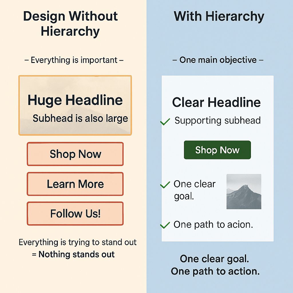
One mistake that changed how I design: I used to make everything on a page “stand out.” The result? Nothing stood out. Now: one goal, one CTA, and everything supports it. Hierarchy > decoration. #UIDesign #UXTips #CRO #LandingPageDesign #WebDesign #UIUX

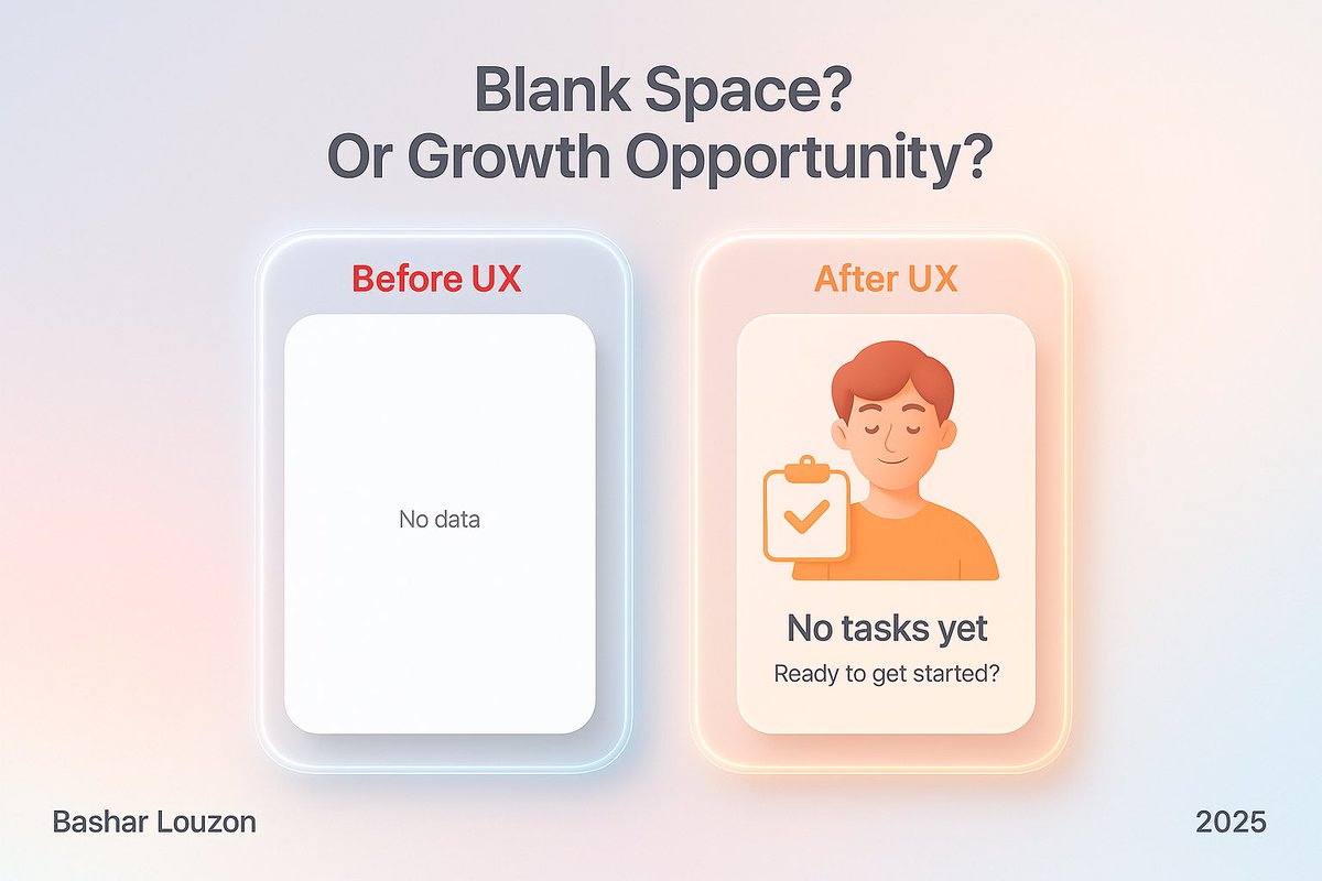
الشاشة الفارغة مو مجرد فراغ… هي فرصة ضائعة. 🟥 قبل: “No data” 🟩 بعد: رسالة ودية + توجيه محفّز ✨ الشاشات الفارغة إما تربك المستخدم أو تبني علاقة. صمّمها بوعي. #تجربة_المستخدم #تصميم_واجهات #UXTips
🔎 Don’t make them hunt. When visitors can quickly find your contact info, it builds trust and shows you're accessible, transparent, and ready to support. A small change that makes a big difference. #UXTips #WebDesign #HigherEdMarketing #DigitalStrategy #ContactUs #KWALL


🎙️Web3 is evolving. So should your design. Watch Visual X & nova decode what it takes to stay relevant in the new design era. 👇😎 #Web3Design #UXTips #VisualX #CryptoCreatives #DesignFuture

4️⃣ Inconsistent UI or design language Inconsistency breaks trust — even subconsciously. Margins off? Button styles changing? Tone unclear? Create rules. Stick to them. Users notice more than you think. #UXTips

The #ProximityPrinciple in UI/UX: Close things feel connected. Distant things don’t. It’s the difference between “meh” and “wow” in user experience. #UIDesign #UXTips #DesignThinking #UserExperience #WebDesign #DesignPrinciples #UXDesign #DigitalDesign #CreativeDesign


Want your website to look 10x more professional instantly? Follow these 3 UI rules: 1️⃣ White space isn’t empty it’s breathing room. 2️⃣ Use max 2–3 fonts. 3️⃣ Keep things consistent. #UIDesign #WebDesignTips #UXTips #FrontendDesign #CreativeDesign

Did you know form length dramatically affects conversions? Reducing the number of form fields from 11 to 4 can increase conversions by up to 120%. #TechTrivia #DidYouKnow #UXTips #FormOptimisation


People love seeing how far they’ve come. A simple progress bar can double your page scrolls. It’s UX psychology at its best. #UXTips #WebDesign #10turtle #UserExperience #SmartSites


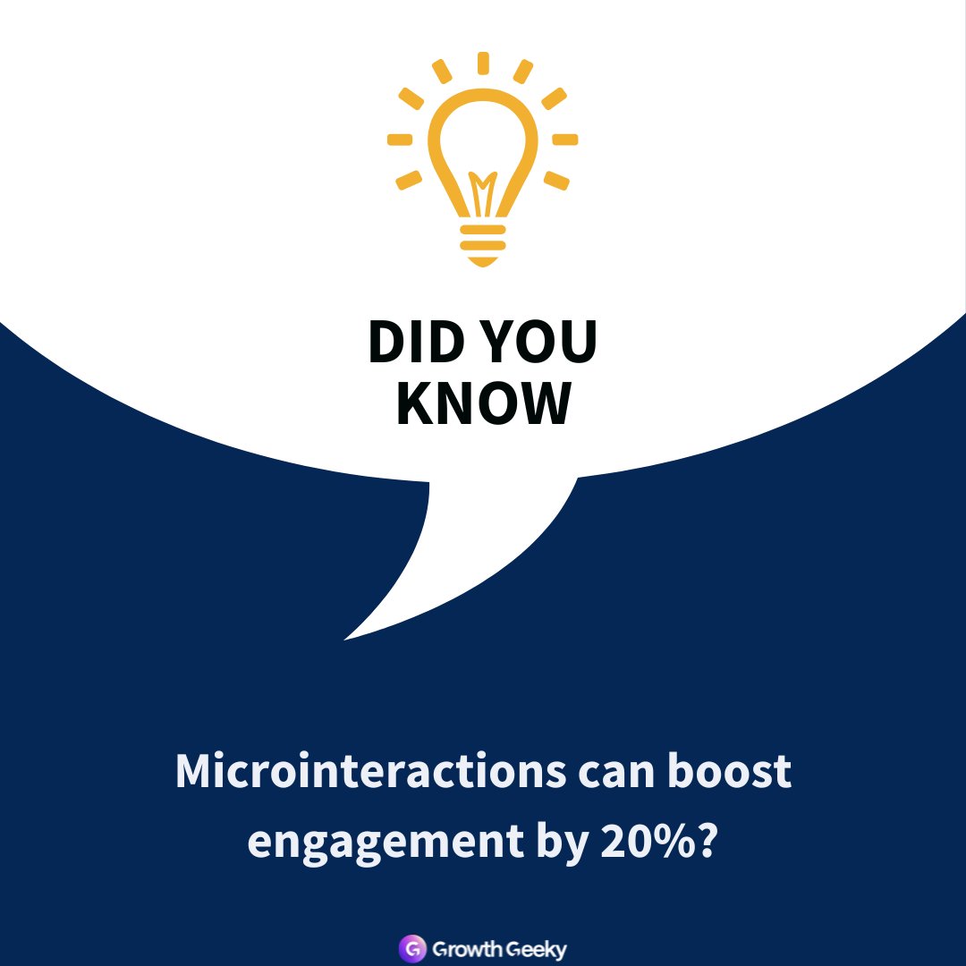
✨ Small details make big impact. Button hovers, loading states, and subtle feedback animations build trust and make your site feel alive. Good design speaks through motion. #WebDesign #UXTips #GrowthGeeky #InteractionDesign #Microinteractions #DesignDetails #UserExperience
🚫 A beautiful design can’t save a frustrating experience. Good UX means fast loading, clear navigation, and smooth interactions that make users feel in control, not confused. #WebDesign #UXTips #GrowthGeeky #UserExperience #DesignStrategy #ConversionOptimization


If your website isn’t accessible, you're turning away potential customers without realizing it. From color contrast to keyboard navigation, it all matters. Read the blog now. #WebAccessibility #UXTips fullserve.ca/why-accessible…

Users don’t care about your gradients — they care about how fast they can get things done. #UXTips #UIUX #ProductDesign
One mistake that changed how I design: I used to make everything on a page “stand out.” The result? Nothing stood out. Now: one goal, one CTA, and everything supports it. Hierarchy > decoration. #UIDesign #UXTips #CRO #LandingPageDesign #WebDesign #UIUX
Good UI = better conversions. Quick Do this, not that for landing pages: ❌ Cluttered layout ❌ Low contrast ✅ Clear hierarchy ✅ One CTA Small UI tweaks → big UX wins. #UIDesign #UXTips #LandingPageDesign #WebDesign #Figma #CRO #UIUX

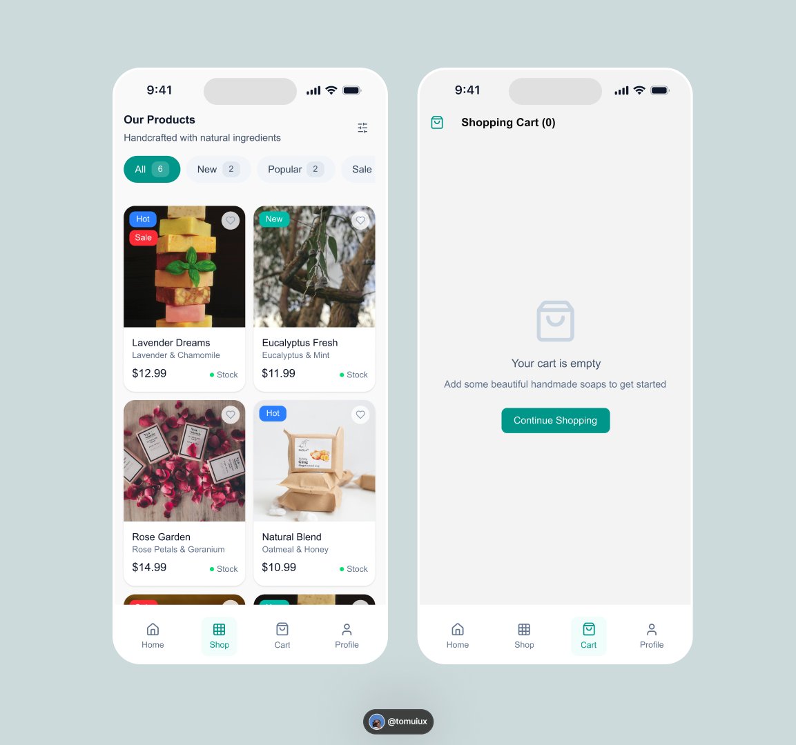
𝙀𝙢𝙥𝙩𝙮 𝙘𝙖𝙧𝙩 𝙨𝙘𝙧𝙚𝙚𝙣𝙨 𝙘𝙤𝙨𝙩 𝙨𝙖𝙡𝙚𝙨. My design focuses on immediate guidance. The "Continue Shopping" CTA and friendly language keep users in the funnel. Did I nail the hierarchy here? #UXTips #UIDesign #Ecommerce

🚀 زر الـ CTA (Call To Action) هو العنصر الأهم في الواجهة 👇 لازم يكون: ✅ واضح للمستخدم ✅ بارز في التصميم ✅ يوجّه المستخدم بخطوة مباشرة الزر الصح = تحويلات أعلى 💰 #UXTips #UI #تجربة_المستخدم #تصميم_الواجهات #UIDesign

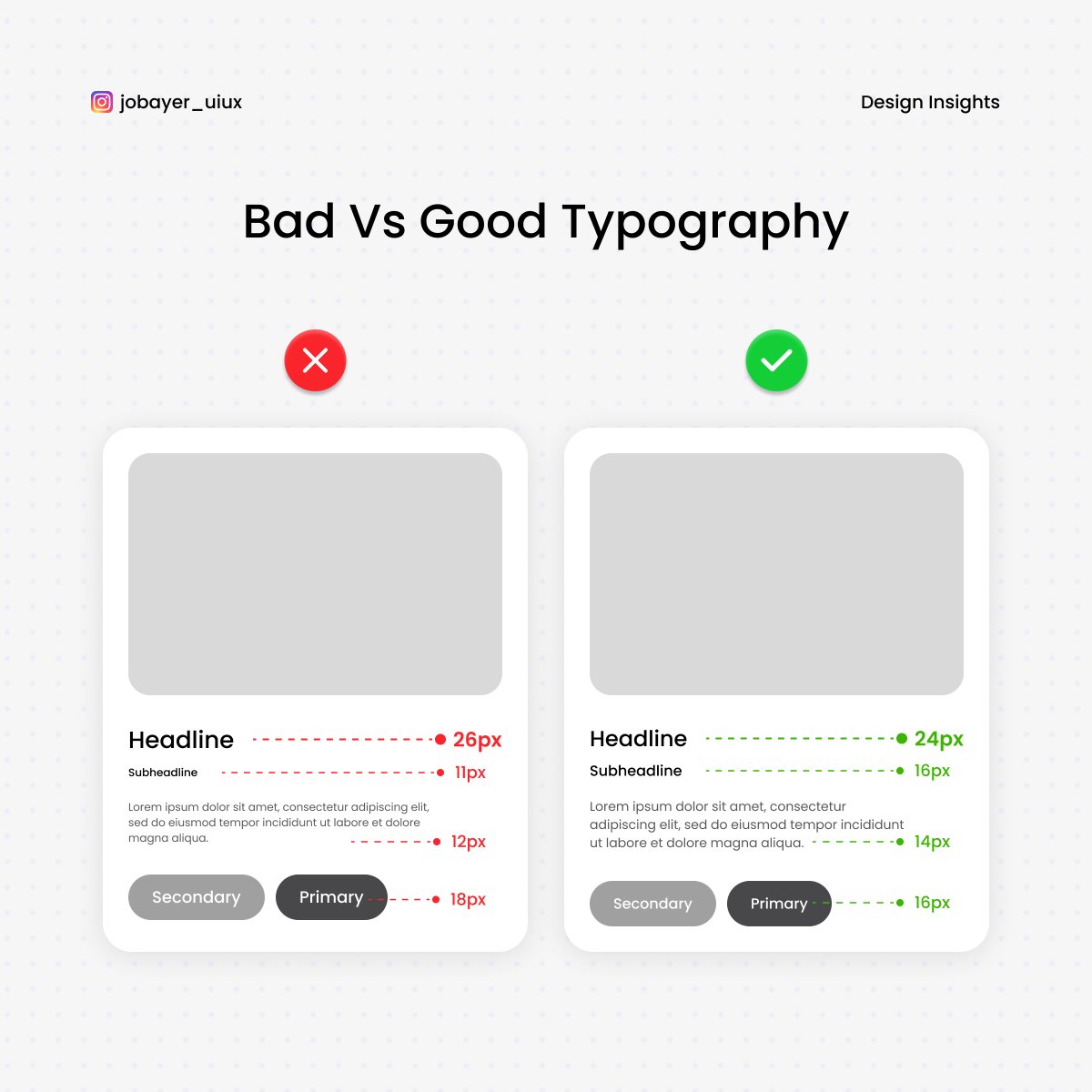
Typography isn’t decoration — it’s communication. ✅ Good typography guides the eyes. ❌ Bad typography causes confusion. Master hierarchy, spacing & contrast. #DesignInsights #UIDesign #UXTips #VisualDesign


👀 Guide the eye. Arrows, icons, and lines point users to what matters most—no words needed. A small cue can make a big impact on UX. #UXTips #WebDesign #UserJourney #DigitalExperience #KWALL
Typography can make or break your design It’s not just about picking a font - it’s about: ✅ hierarchy ✅ readability ✅ consistency 👉 Save this for your next project #UIDesign #UXTips #TypographyMatters #DesignTips #UserExperience #ProductDesign #UXDesign #TypographyLovers…
Ever walked into a restaurant with a 10-page menu? Overwhelming, right? Same goes for websites—TOO MANY OPTIONS CAUSE DECISION FATIGUE. Visitors want clarity, not a maze. Keep it simple, keep it smart. That’s good UX. 😎 #UXTips #WebDesign #UnifiedWebDesign

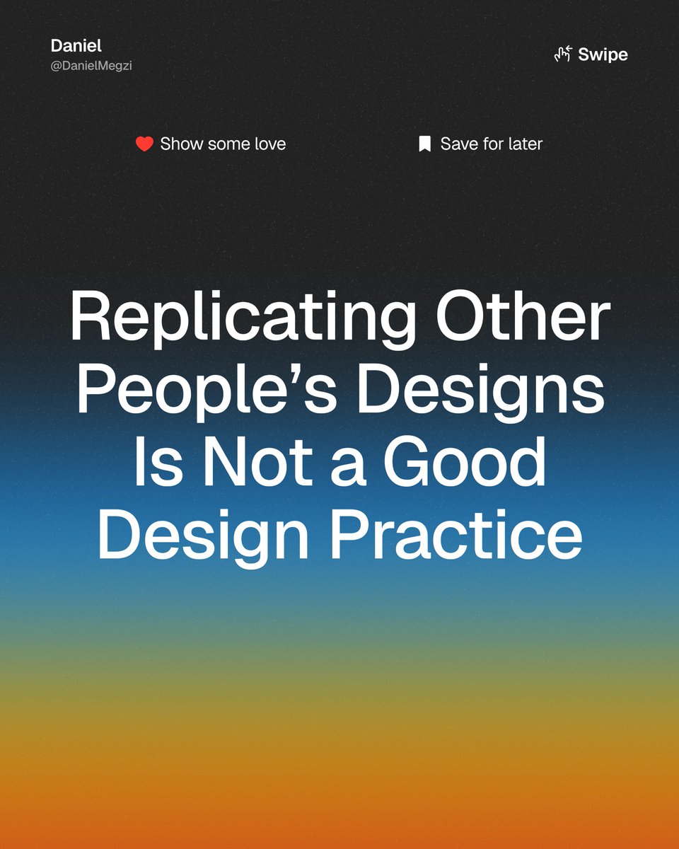
Replicating designs ≠ Learning design It might feel productive to copy cool UI you see on Dribbble or Behance. But if you're not digging into the why, you're only scratching the surface. Let’s talk about a better way to grow as a product designer. 🧵 #ProductDesign #UXTips
Too many landing pages try to do everything at once sign up, buy, follow, read... That overload kills conversions. One page. One goal. One action. That’s how you win. #CRO #LandingPage #UXTips #Figma #Replo #WebDesign
Good UI = better conversions. Quick Do this, not that for landing pages: ❌ Cluttered layout ❌ Low contrast ✅ Clear hierarchy ✅ One CTA Small UI tweaks → big UX wins. #UIDesign #UXTips #LandingPageDesign #WebDesign #Figma #CRO #UIUX
Let’s be real. One of my early landing page mistakes? Prioritizing visuals over clarity. I built a stunning layout but conversions dropped. The CTA was lost, the message unclear. Now I design with one rule: Clarity > Cleverness. What’s a lesson a mistake taught you? #UXTips
One mistake that changed how I design: I used to make everything on a page “stand out.” The result? Nothing stood out. Now: one goal, one CTA, and everything supports it. Hierarchy > decoration. #UIDesign #UXTips #CRO #LandingPageDesign #WebDesign #UIUX
🔎 Don’t make them hunt. When visitors can quickly find your contact info, it builds trust and shows you're accessible, transparent, and ready to support. A small change that makes a big difference. #UXTips #WebDesign #HigherEdMarketing #DigitalStrategy #ContactUs #KWALL
الشاشة الفارغة مو مجرد فراغ… هي فرصة ضائعة. 🟥 قبل: “No data” 🟩 بعد: رسالة ودية + توجيه محفّز ✨ الشاشات الفارغة إما تربك المستخدم أو تبني علاقة. صمّمها بوعي. #تجربة_المستخدم #تصميم_واجهات #UXTips


Principles of Responsive Web Design Every Brand Should Follow . . . #uiuxdesign #uxtips #designstudiouiux #WebDesign #WebDesignTips


Road to 250k post impression Road to 200k members reached My LinkedIn is going crazy 😂❤️ Top performing post is over 210k Hard work and consistency #UXDesign #UIDesign #UXTips #DesignInPublic #ProductDesign #Figma #UserExperience #UXMatters


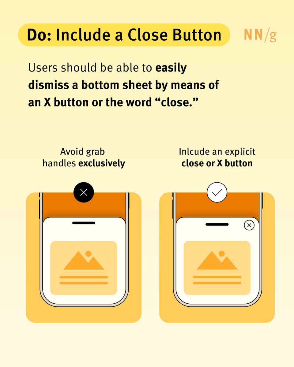
A bottom sheet slides up to offer extra info—no new page needed. But when misused? It’s pure UX chaos. 😵💫 Learn how to avoid the most common design pitfalls: bit.ly/3QWzcRh #UXTips #InteractionDesign #MobileUX


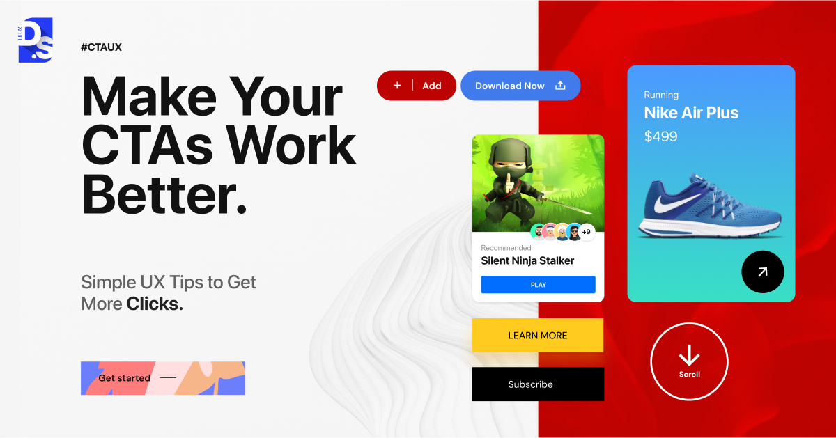
Your CTA button shouldn’t just look good — it should work smart. Here are quick UX tricks to boost clicks and keep users happy. Which one will you try first? . . . #uxdesign #uxtips #uiuxdesign #designstudiouiux


Something went wrong.
Something went wrong.
United States Trends
- 1. Ohtani 184K posts
- 2. Dodgers 230K posts
- 3. Dodgers 230K posts
- 4. Carson Beck 15.7K posts
- 5. $SAWA 1,430 posts
- 6. Miami 98.8K posts
- 7. Louisville 26.8K posts
- 8. Nebraska 17.3K posts
- 9. Brewers 53K posts
- 10. Babe Ruth 2,852 posts
- 11. #SmackDown 54.1K posts
- 12. #BostonBlue 7,646 posts
- 13. NLCS 52.7K posts
- 14. Rhule 4,334 posts
- 15. 3 HRs 9,726 posts
- 16. Minnesota 48K posts
- 17. George Santos 75.9K posts
- 18. Jeff Brohm 2,897 posts
- 19. 10 Ks 4,047 posts
- 20. Raiola 3,540 posts