
PureInterface
@PureInterface
Senior UI/UX Designer · Building clean interfaces & sharing ideas

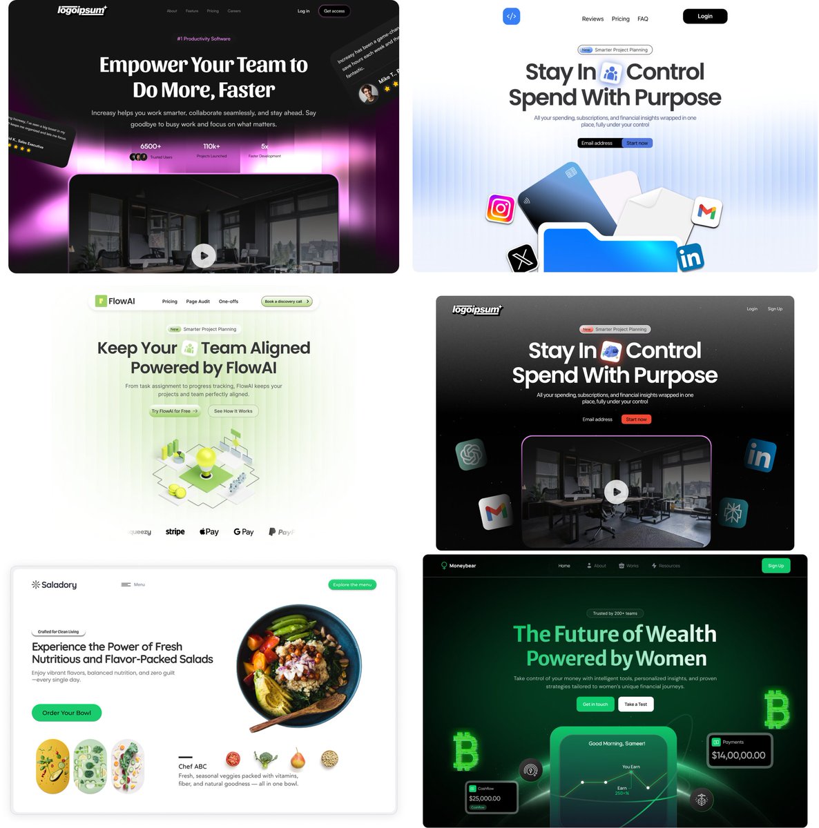
’m giving away ready-to-use Figma Hero Designs (worth hundreds of dollars) completely FREE. - Perfect for websites, startups, and landing pages. Here’s how to grab your copy: - Follow me - Like this post - Retweet - Comment “Hero” below Clean, simple, and effective 👇
Trying out AI to make mockups more efficient Is it good enough to work on a final version also?

Am I the only one having trouble with ChatGpt following instructions? Would say 2/10 times it actually does what I’m trying to ask or generate
Thought of the day: The moment your UI stops explaining itself, your users start leaving.
90% of people are still “polishing” their first idea. The other 10% launched, learned, and improved three versions ago. Execution > Perfection
| ̄ ̄ ̄ ̄ ̄ ̄ ̄ ̄ ̄ ̄ ̄ ̄| Ship it! It’s good enough |____________| \ (•◡•) / \ / —— | | |_ |_
Momentum beats perfection — always. Launch, learn, adjust. Learnt the hard way many times, pixel perfection is often not the best way to start
Startups fail because they design for themselves, not for the user who doesn’t care yet.
Thought of the day: Design isn’t about creativity — it’s about clarity. Every button, label, and layout is a choice that says: “Here’s what matters.”
Before you tweak colors or spacing, fix your hierarchy. Users don’t read — they scan. So guide their eyes. Visual order is invisible design
Great UI isn’t about making things look better — it’s about helping users think less. Every pixel, shadow, and space exists to guide attention, not grab it. That’s the difference between decoration and design.
Design clarity = business clarity. When users understand instantly, they trust immediately.

Something that took me a while to understand: Simplicity isn’t the lack of detail. It’s the presence of clarity.
This might be an unpopular opinion but I strongly believe we should bring back the 3d logos. Companies have wandered off and made their logos soulless these last years, let’s change that


What many companies forget is that your UI is your sales pitch — it either builds trust instantly or breaks it.
Unpopular opinion, If your users need a tutorial to use your app → your design failed.
Which is harder: – Designing a clean interface – Or saying “no” to features that ruin it?
People don’t remember your gradients or typography. They remember how easy you made their life.


United States Tendenze
- 1. Bills 99.5K posts
- 2. Bills 99.5K posts
- 3. phil 116K posts
- 4. Bijan 14.5K posts
- 5. Josh Allen 9,376 posts
- 6. Drake London 3,173 posts
- 7. McDermott 2,475 posts
- 8. phan 89.4K posts
- 9. Columbus 254K posts
- 10. #DaBears 1,938 posts
- 11. #BUFvsATL 2,227 posts
- 12. #RaiseHail 3,765 posts
- 13. Starship 65.5K posts
- 14. Beane 1,144 posts
- 15. #RiseUp 1,031 posts
- 16. Penix 2,936 posts
- 17. SpaceX 100K posts
- 18. Brisker 1,091 posts
- 19. Palmer 10.4K posts
- 20. Jayden 10.1K posts
Something went wrong.
Something went wrong.