I'd like to share my portfolio on Behance. Take a look! behance.net/gallery/224564…
Working on small project 👀

I tested ChatGPT 5 and Grok 4 with same critical prompts. The results will blow your mind. ChatGPT 5 Vs. Grok 4 (Video demos are included)

UI/UX Tip / Icon labels Master these tips to improve user experience for your next design project. Bookmark it for later 💜

The guy literally stole our design and says it's his 💀
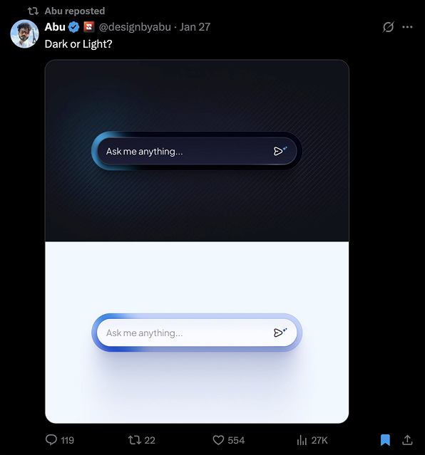

Dear designers of Wise, you have all of my respect

Learn to master UI spacing with these key tips!

Showcasing UI and UX design abilities! 📱

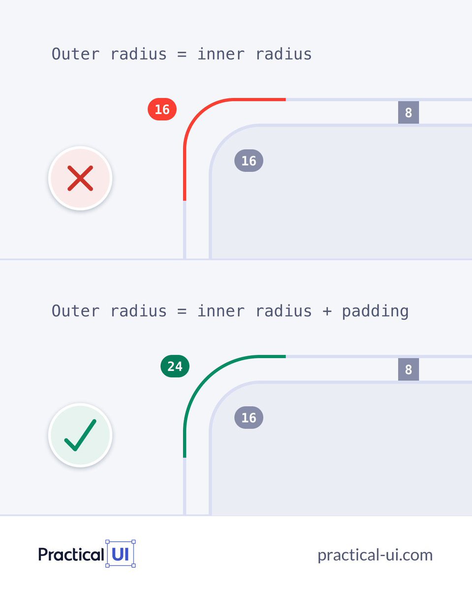
Correct corner radius: Outer = Inner + Padding. Avoid setting them equal!
Bold take: Your landing page CTA at the bottom is more powerful than the one in the hero. Why? Because when visitors first land, they don’t fully understand what you offer. But as they scroll, they get clarity. By the time they reach the bottom, they’re warmed up and ready to…

clean.
One bold vision. A new category. Enterprise security, reimagined by @Ramotion for @island_io. We crafted a calm, confident brand identity for the world’s first Enterprise Browser — built to earn trust and scale fast. Full case study in bio.
One bold vision. A new category. Enterprise security, reimagined by @Ramotion for @island_io. We crafted a calm, confident brand identity for the world’s first Enterprise Browser — built to earn trust and scale fast. Full case study in bio.
🤩
Material Design just leveled up! 🚀 M3 Expressive is here to help you build more engaging, easy-to-use products. ✨ Dive into the details → goo.gle/42VU2qP #TheAndroidShow #MaterialDesign
United States 트렌드
- 1. #SurvivorSeries 123K posts
- 2. Auburn 20.1K posts
- 3. Liv Morgan 26.6K posts
- 4. Vandy 16.3K posts
- 5. Bama 19.1K posts
- 6. John Cena 30.1K posts
- 7. Nikki 34.6K posts
- 8. Ty Simpson 1,983 posts
- 9. Roxanne 6,266 posts
- 10. Oklahoma 33.3K posts
- 11. Bron Breakker 1,901 posts
- 12. Norvell 5,439 posts
- 13. Lash Legend 6,998 posts
- 14. Stephanie Vaquer 7,606 posts
- 15. Rhea 20.1K posts
- 16. #RollTide 2,388 posts
- 17. Tennessee 45.6K posts
- 18. Miami 96.7K posts
- 19. Heupel 3,364 posts
- 20. Mateer 8,152 posts
Something went wrong.
Something went wrong.


