


I tested ChatGPT 5 and Grok 4 with same critical prompts. The results will blow your mind. ChatGPT 5 Vs. Grok 4 (Video demos are included)


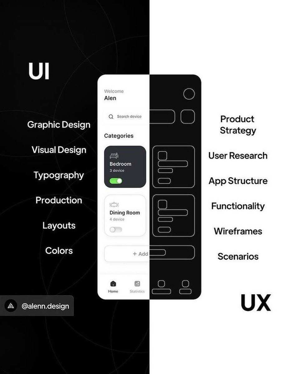
UI/UX Tip / Icon labels Master these tips to improve user experience for your next design project. Bookmark it for later 💜


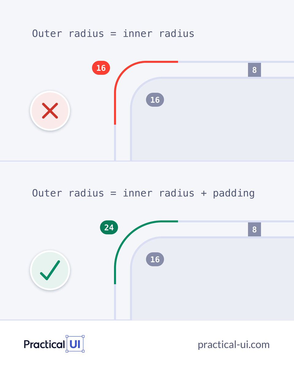
Correct corner radius: Outer = Inner + Padding. Avoid setting them equal!

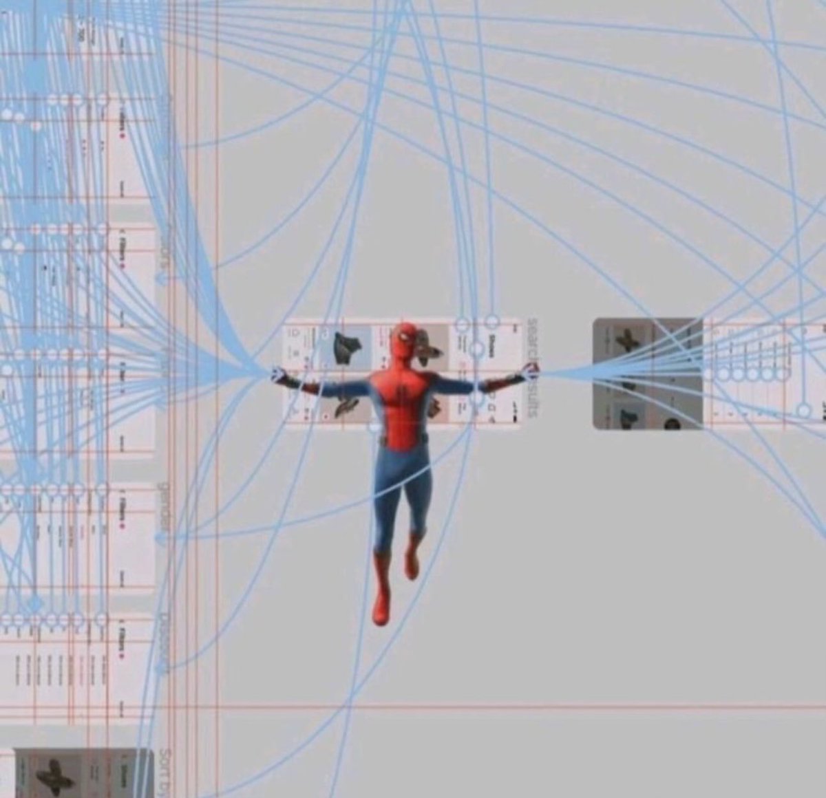
Bold take: Your landing page CTA at the bottom is more powerful than the one in the hero. Why? Because when visitors first land, they don’t fully understand what you offer. But as they scroll, they get clarity. By the time they reach the bottom, they’re warmed up and ready to…

clean.

One bold vision. A new category. Enterprise security, reimagined by @Ramotion for @island_io. We crafted a calm, confident brand identity for the world’s first Enterprise Browser — built to earn trust and scale fast. Full case study in bio.
One bold vision. A new category. Enterprise security, reimagined by @Ramotion for @island_io. We crafted a calm, confident brand identity for the world’s first Enterprise Browser — built to earn trust and scale fast. Full case study in bio.

🤩


Material Design just leveled up! 🚀 M3 Expressive is here to help you build more engaging, easy-to-use products. ✨ Dive into the details → goo.gle/42VU2qP #TheAndroidShow #MaterialDesign


United States 趨勢
- 1. #ForTT_Telegram_sam11adel N/A
- 2. Happy New Month 248K posts
- 3. Broncos 48.2K posts
- 4. Mariota 13.3K posts
- 5. Good Monday 20.9K posts
- 6. #BaddiesUSA 27.9K posts
- 7. Commanders 33.8K posts
- 8. Riley Moss 2,310 posts
- 9. Bo Nix 10.2K posts
- 10. #RaiseHail 5,825 posts
- 11. #ITWelcomeToDerry 21.4K posts
- 12. Root 41.5K posts
- 13. Washington 121K posts
- 14. Chrisean 10.3K posts
- 15. Dolly 15K posts
- 16. BURKS 16K posts
- 17. Deebo 3,154 posts
- 18. Ertz 3,140 posts
- 19. #RHOP 13.2K posts
- 20. Cyber Monday 21.8K posts
Something went wrong.
Something went wrong.