
Zach Ermolovich
@ZachUXUI
E-Commerce UX/UI Designer • I help your website convert without having a spaceship UI.
Read this if you don't want people to forget about your project in 7 seconds. Hero sections are crucial — judging by them, most of people decide if they are staying or leaving your website. A huge part of your project's success depends on how you present it here. Here's a…
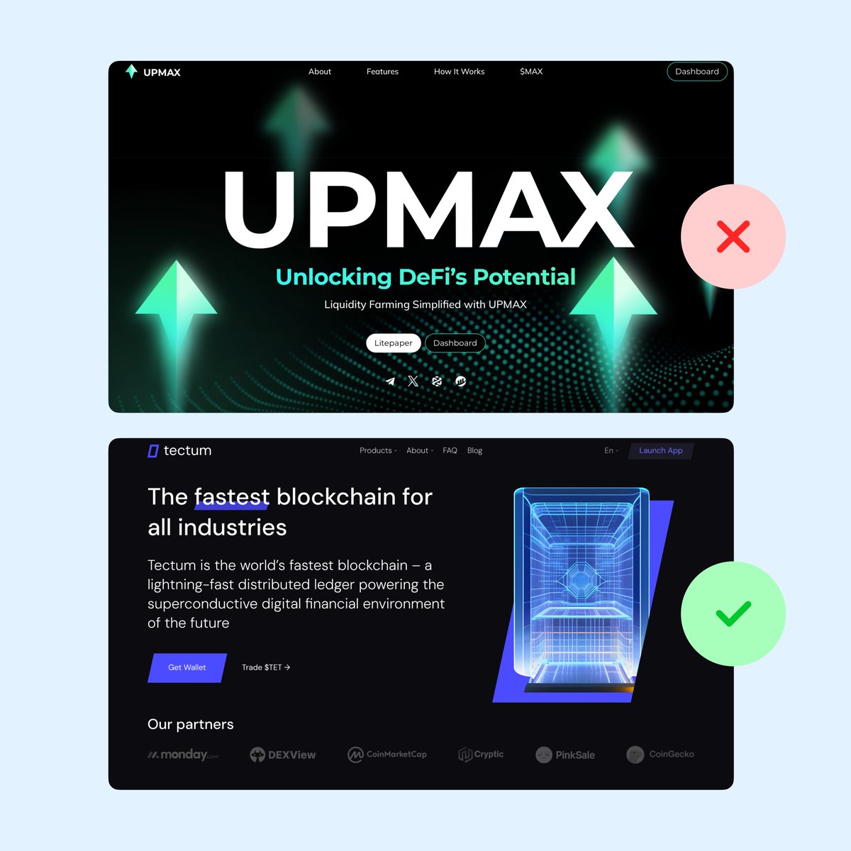
Website designs on Awwwards are amazing! They're focusing on art and cool animations instead of being boring and effective—that's what ✨design✨ is about, isn't it? You have to explore the website for a couple of minutes to even understand what it's about—that's what holds the…
I really hope a lot of people see this. We are in the "overly-designed massive amount effects on everything around" Twitter design era, where to impress people you have to do anything but not simple core-driven design, and might trick newcomers into thinking that it is the…

If you're new to UI/UX design, don't get ahead of yourself chasing fancy visual effects. Nail down the basics - develop good habits and really understand the logic behind principles. Invest the time upfront to build those core skills and best practices. If you don't lay a…
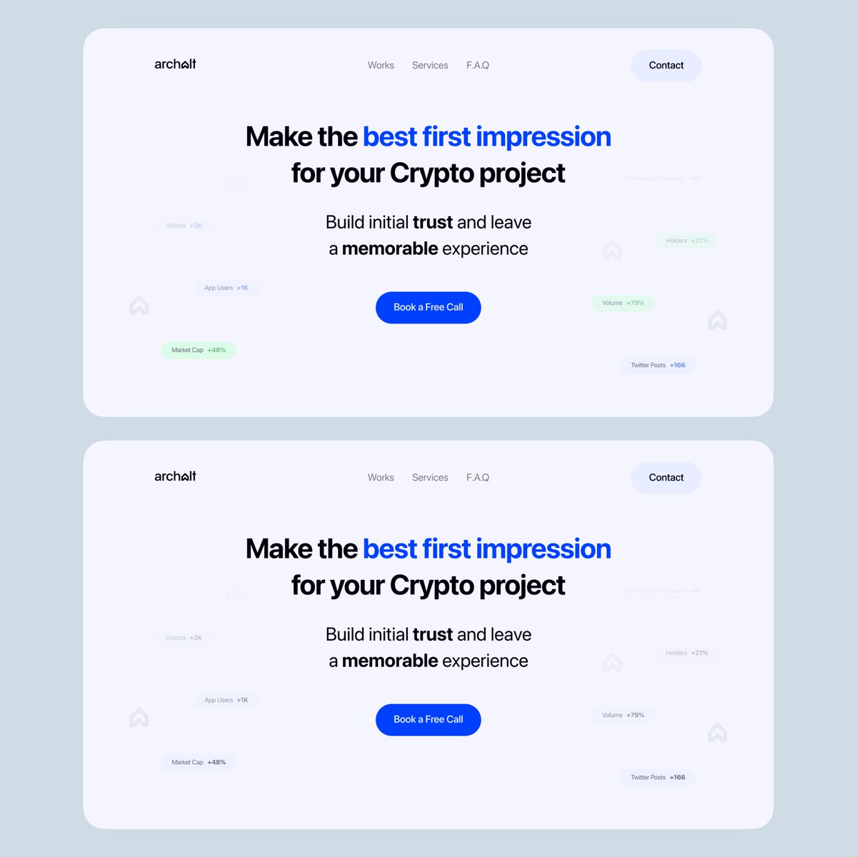
Some landing pages I worked on a while ago Still think they're golden!
This is the UX you want to have. Focused on helping the user achieve their goals on a website. Don't hide anything if possible (design wise possible!), add relevant sections, imagine yourself as the customer and try to understand what would they want to see.

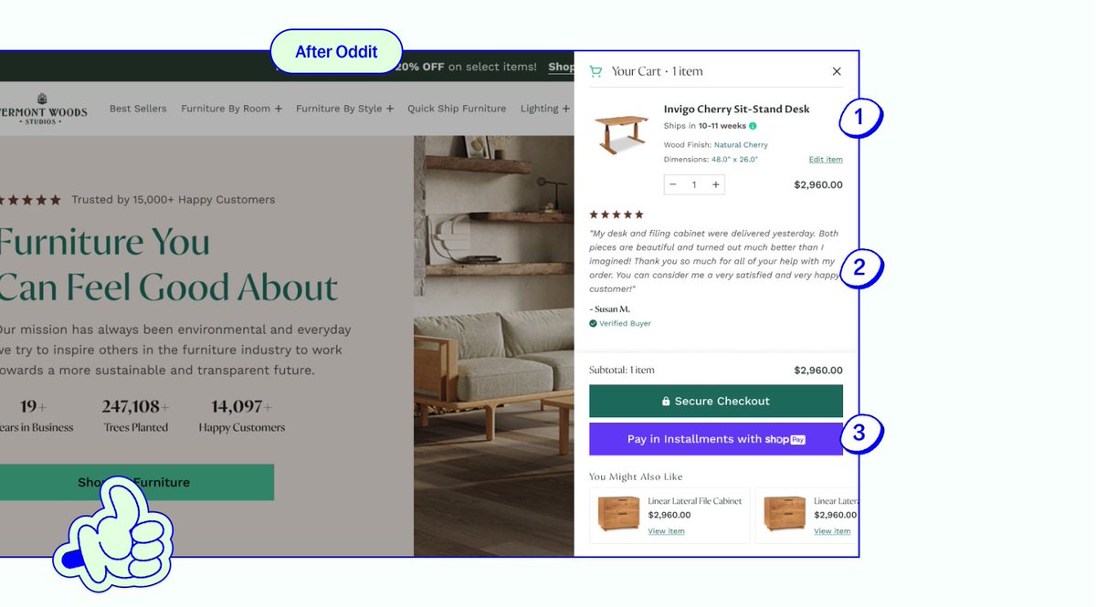
Yes, the main goal of the cart is for customers to review their order, and take action – but that doesn't mean you can't make things easier on them and build some trust along the way. Here's 3 changes for a higher converting cart:
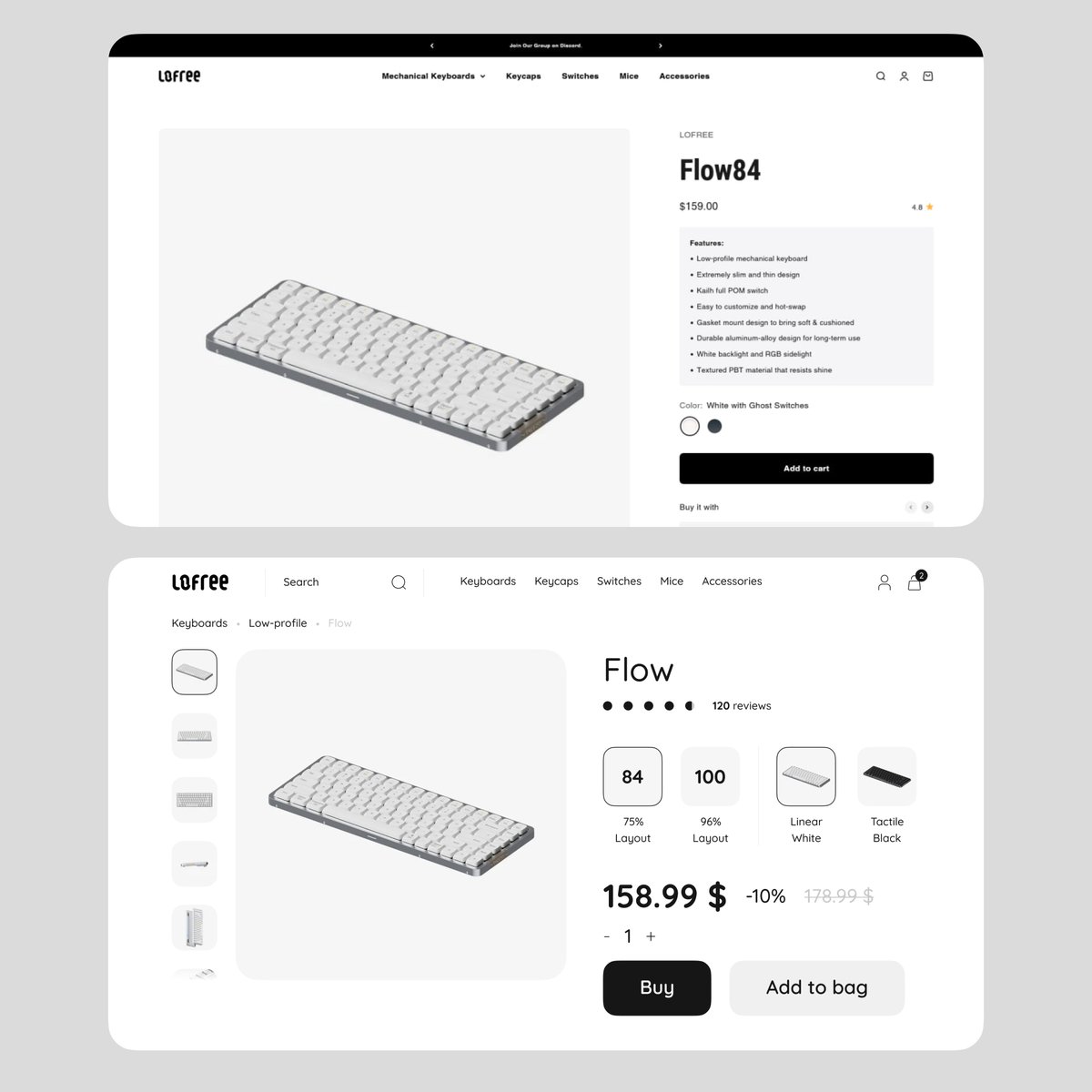
Before & After @lofreeco 1. Emphasized the price 2. Revealed search in the header 3. Increased font size 4. Added more specification choices Tip: Designing in grayscale is the best way to ensure you don't overuse colors and build a solid layout!
More than 60% visitors will close the second website in the first 5-10 seconds. Why? Because it's wasting people's time. The second website is not as understandable and straight-forward as the first one. You have to make twice as many actions to know what the project is about.…
Let's be honest — does anyone consider Awwwards websites usable? They're pretty, no questions asked, but when it comes to actually trying to use them instead of just appreciating the art — aren't they kinda... one of the worst? 🤔
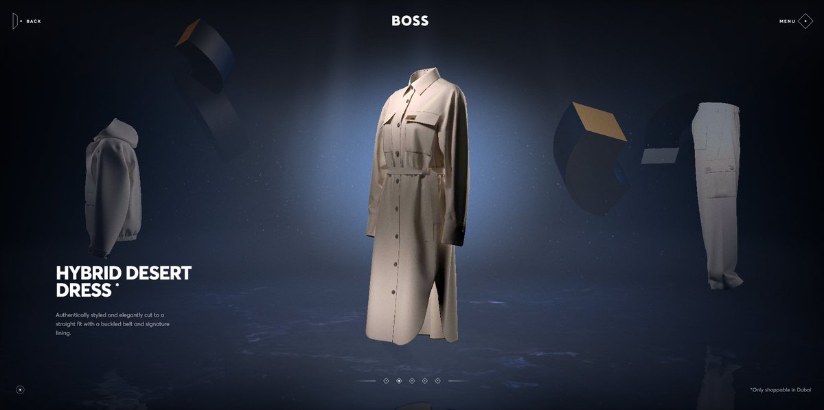

no stages. no live demos. just simple, clear product animations. this is the new standard for product announcements.


United States Tendências
- 1. #FanCashDropPromotion 1,791 posts
- 2. Good Friday 60.9K posts
- 3. #FridayVibes 5,051 posts
- 4. Kenyon 1,037 posts
- 5. #FursuitFriday 11.2K posts
- 6. #FridayFeeling 2,663 posts
- 7. Happy Friyay 1,345 posts
- 8. LINGORM DIOR AT MACAU 595K posts
- 9. Sedition 361K posts
- 10. #FridayMotivation 3,643 posts
- 11. Ja Rule 1,236 posts
- 12. RED Friday 3,750 posts
- 13. Maggie 30.5K posts
- 14. Eric Swalwell 3,960 posts
- 15. Traitor 132K posts
- 16. ON SALE NOW 11.7K posts
- 17. Knox 6,334 posts
- 18. woozi 34.2K posts
- 19. Dubai Air Show 49.4K posts
- 20. Haier EST SUPHA 181K posts
Something went wrong.
Something went wrong.