

One of the PowerBI project with students @ ESanalysis. Writing DAX and structuring Dashboard is only hard when you learn the wrong way. To join the next cohort contact @edwige_songong
I teach my students how to design and get used to white backgrounds because it’s clean, professional, easy to read, and puts your visuals in the spotlight. Master clarity before creativity. #Datafam #Dashboarddesign


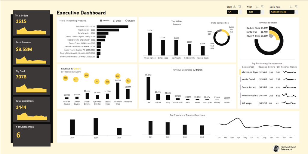
Decided to recreate @ObohX excel project visualization using excel All I can say is that Excel is really underestimated for real #Excel


New to dashboards and feeling overwhelmed by the UI/UX? Here are 7 sites to spark your dashboard design creativity: Pinterest.com TableauPublic.com PowerBIGallery.com Dribbble.com #DataViz #DashboardDesign #PowerBI #Tableau #UXUI #Inspiration


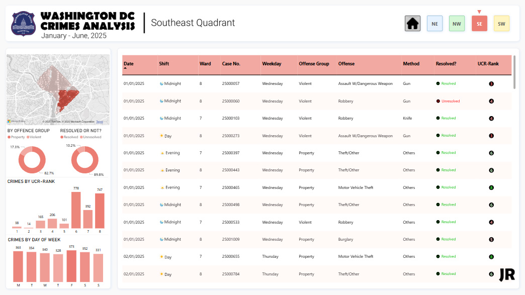
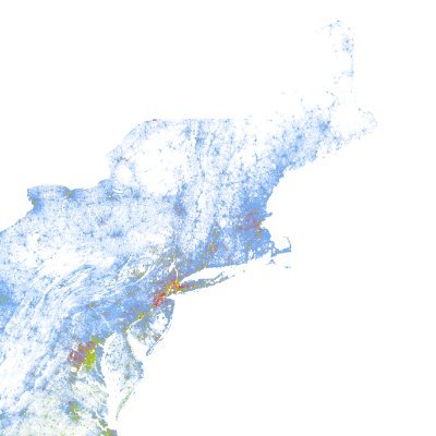
Hi #DataFam, this month I decided to look into crimes in Washington D.C. DC is divided into four quadrants, and that’s the perspective I chose. Here's what I found: - The Northwest quadrant accounts for nearly half of all reported crimes. - Theft-related offenses dominate…


Hey #DataFam Just finished building one of my favorite dashboards yet and this time, I did it differently. I wanted to build something different this time. Not sales. Not finance Just something more visual, fun, and personal. Interact here👇 app.powerbi.com/view?r=eyJrIjo… #PowerBI


Morning guys, due to popular demand, Below is the link to this dashboard. The dataset, Analysis and the Dashboard You can Explore it and possibly Recreate it Have fun. 👇👇 docs.google.com/spreadsheets/d… #Datafam
I've been getting some questions in my DM lately. Here’s what #TheFirst30 is: - You’ll master common data analysis tools. - You’ll write actual SQL queries. - You’ll build and share dashboards. - You’ll get one short lesson in your inbox every day. It’s everything you need to…

25 Data Analyst Projects ideas for your portfolio + Datasets. A thread🧵 Grocery Retail 🛍️🛒 1. Grocery Demand Forecasting Using Sales Data 2. Market Basket Analysis 3. Customer Loyalty Trend Analysis 4. Customer Segmentation Analysis
This is value-filled. Join in or listen when you're less busy x.com/i/spaces/1mrGm…


I completed another data project using Power BI. Thanks @Rita_tyna! It was insightful learning from you 🥰 Link to Dashboard: app.powerbi.com/view?r=eyJrIjo… Enjoy!
I learned an amazing technique this week—how to display all negative values on one side and positives on another, in Power BI charts. It was an insightful analyzing the data to uncover insights. Feeling proud of how it turned out! 😍 Explore in Power BI: app.powerbi.com/view?r=eyJrIjo…


United States 趨勢
- 1. Baker 37.9K posts
- 2. 49ers 36.1K posts
- 3. Packers 33.4K posts
- 4. Bucs 12.1K posts
- 5. Flacco 12.6K posts
- 6. #BNBdip N/A
- 7. Cowboys 75.1K posts
- 8. Fred Warner 12.7K posts
- 9. Niners 5,833 posts
- 10. Cam Ward 3,066 posts
- 11. Zac Taylor 3,299 posts
- 12. #FTTB 4,507 posts
- 13. #GoPackGo 4,219 posts
- 14. Panthers 76.5K posts
- 15. #TNABoundForGlory 8,791 posts
- 16. Titans 24.7K posts
- 17. Mac Jones 6,063 posts
- 18. Egbuka 6,583 posts
- 19. #Bengals 3,332 posts
- 20. Browns 67.7K posts
Something went wrong.
Something went wrong.