#dataviz search results

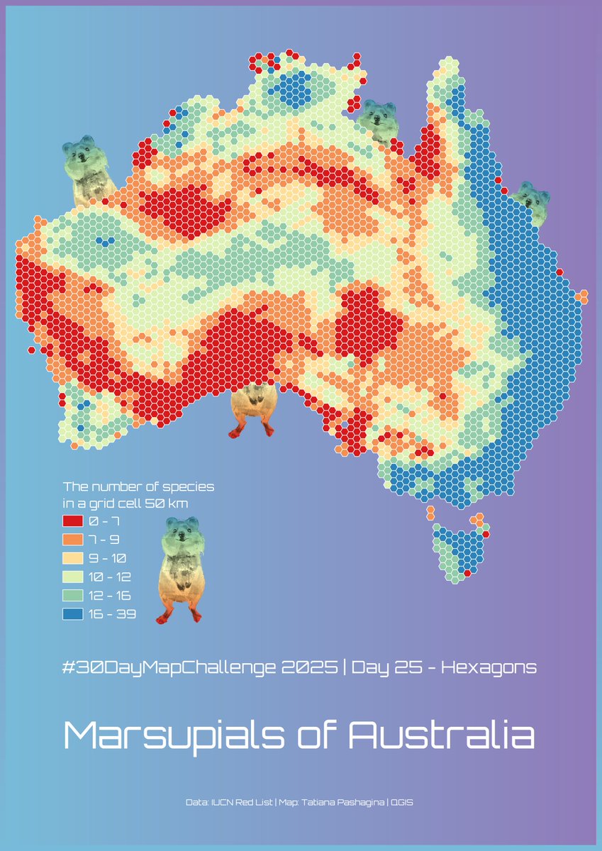
#30DayMapChallenge Day 25 – Hexagons. Marsupials of Australia🤷♀️☺️🦘🐨🌏🇦🇺 ❤️🧡💛💚💙💜🤍 #map #dataviz #QGIS


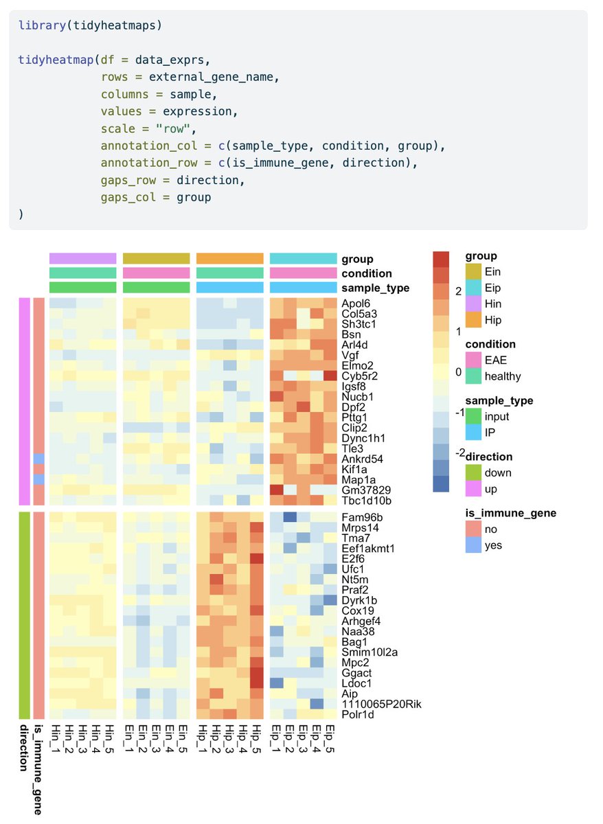
This is how you can visualize gene expression data in #tidyheatmaps 🤩 jbengler.github.io/tidyheatmaps/ #rstats #dataviz #phd

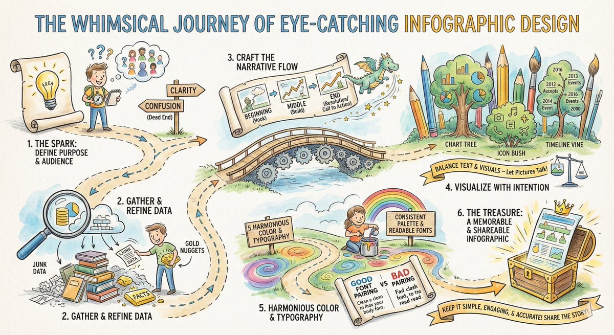
From the "Spark" of an idea to the final "Treasure" in the chest! 🏴☠️✨ Designing an infographic isn't just about making things pretty; it's about mining for data gold and building a narrative bridge. Here is your roadmap to visual storytelling. 🗺️ #Infographic #DataViz…
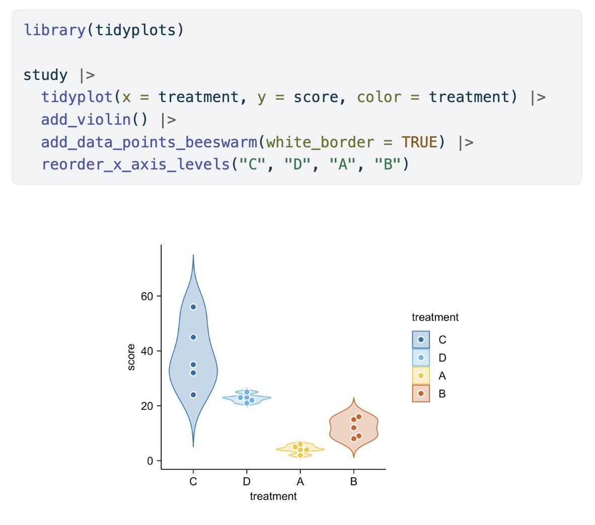
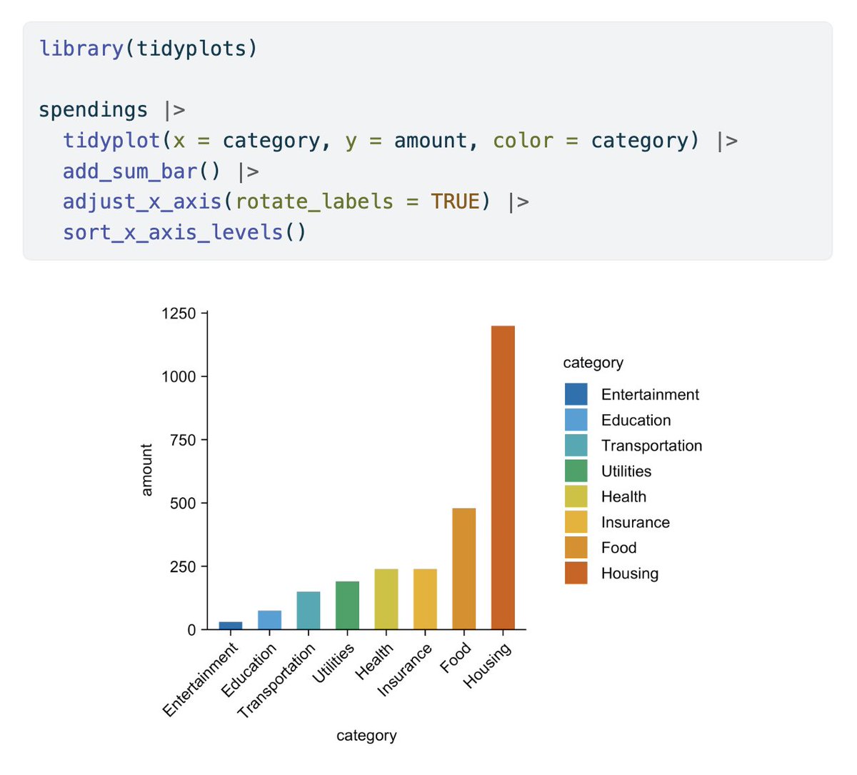
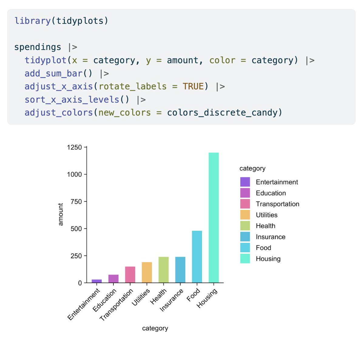
In its first year tidyplots.org has become the go-to data viz for many life science researchers, got 620+ stars on Github, ~30K CRAN downloads, and 11 citations. Thank you for using, sharing, citing, and feedback! There is more to come 🤩 #rstats #dataviz #phd


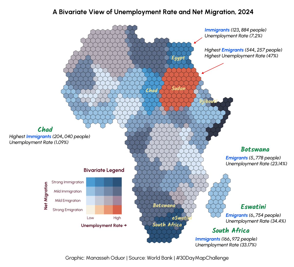
Day 25 of #30DayMapChallenge ~ Hexagons. Unemployment Rate and Net Migration in Africa. #rstats #dataviz #gis #map #spatial

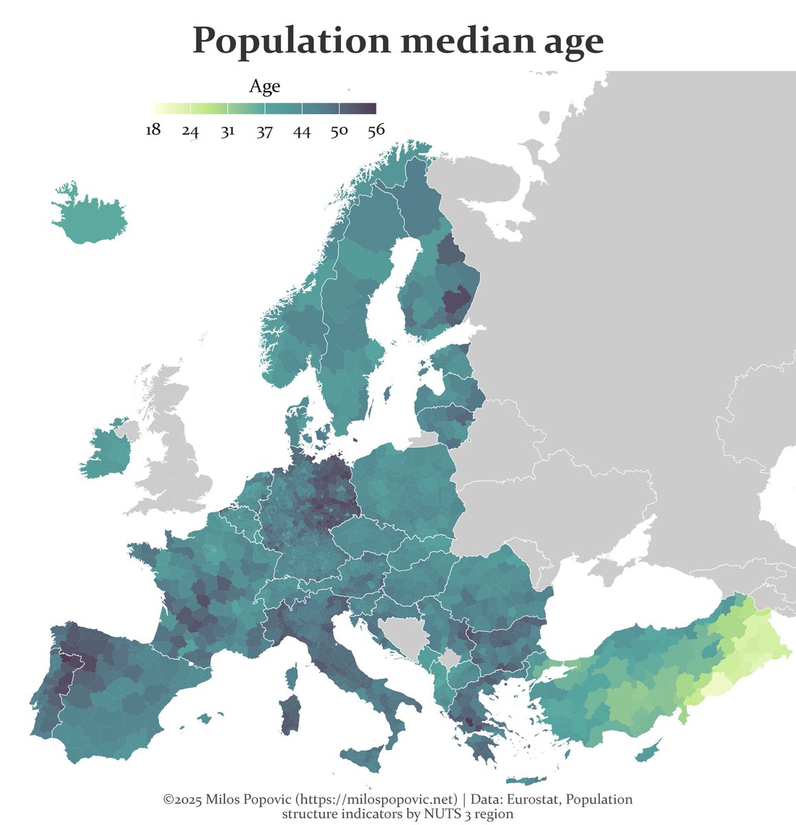
A map of Europe’s future is written in its age. Turns out Europe is called the "old continent" for a good reason #Mapping #DataViz #Demography #GIS #Geospatial #Europe #Population #Rstats
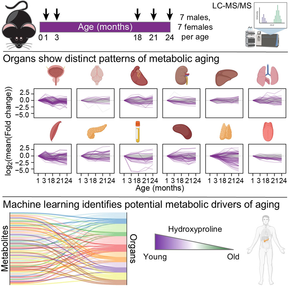
Thank you for citing #tidyplots 🙏 Steven E. Pilley et al. A metabolic atlas of mouse aging. Cell Metabolism (2025). doi.org/10.1016/j.cmet… #rstats #dataviz #phd

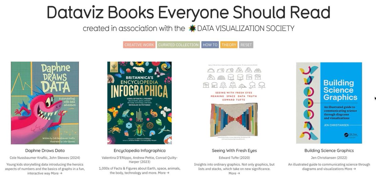
#Dataviz books everyone should read 📚 - a community sourced #charticle informationisbeautiful.net/visualizations… Created in association with @DataVizSociety #iibwab

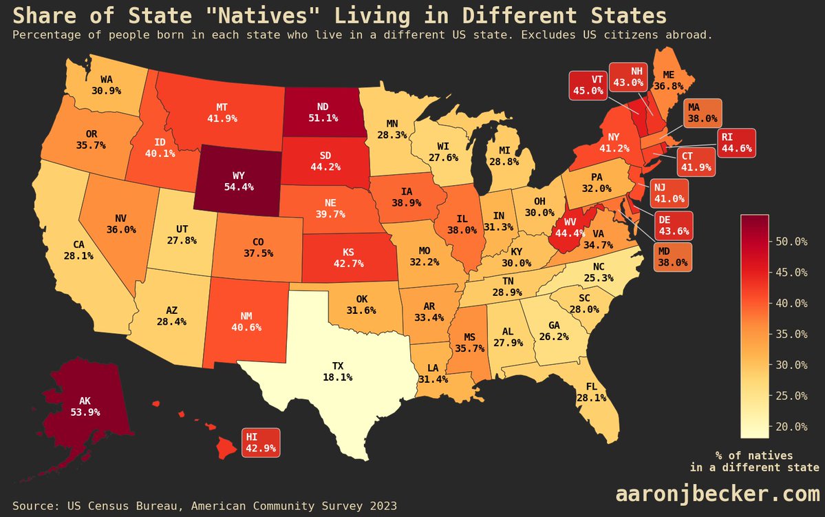
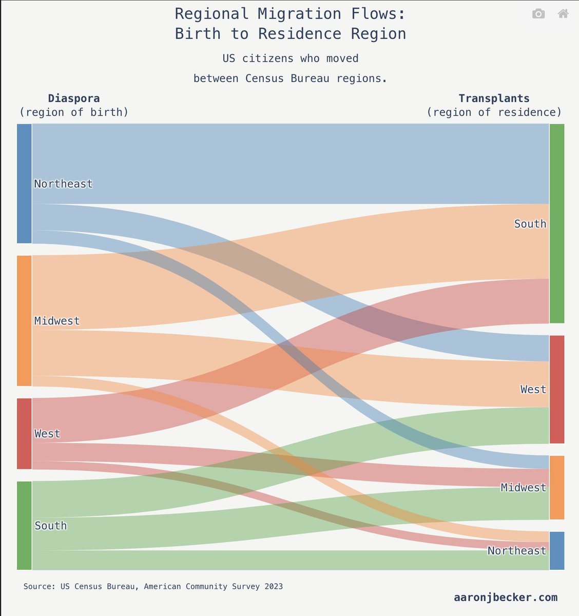
Two thirds of Americans born here live in the state where they were born-- this map shows the percentage of "natives" in each state that left: aaronjbecker.com/posts/diaspora… #dataviz #maps #USA
#30DayMapChallenge Day 10 – Air. An homage to old atlases🌐🗺️ (or maybe to an old tattoo shop, I'm not sure😁), showing one year in the life of Earth's atmosphere🌬️☁️🌍🌎 #dataviz #map #gis

💯🌟❤️📊📈 Beautifully published #DataViz books by @jschwabish Better Data Visualizations: amzn.to/3s2jIMX Others (e.g, Data Visualization in Excel): amzn.to/3sPSLCt ————— #DataStorytelling #DataLiteracy #Statistics #DataScience #DataScientists #BI #Analytics


Check out this nifty EU Funding & Tenders dashboard by @LovelyDataCZ – explore grants, projects & more! Built with @marimo_io for interactive data magic. 👉 lovelydata.cz/data-app/eu-fu… #DataViz #EUFunding #OpenData


Discover EU funding & tender opportunities—clearly organized in an easy-to-use table! Perfect for businesses, startups, researchers & NGOs looking for European grants or contracts. 👉 Explore now: lovelydata.cz/data-app/eu-fu… #EUFunding #GrantsEU #TendersEU #EUOpportunities

People who leave their US region of birth overwhelmingly move to the South, but it's not a one-way flow: aaronjbecker.com/posts/diaspora… #dataviz #USA
From the "Spark" of an idea to the final "Treasure" in the chest! 🏴☠️✨ Designing an infographic isn't just about making things pretty; it's about mining for data gold and building a narrative bridge. Here is your roadmap to visual storytelling. 🗺️ #Infographic #DataViz…

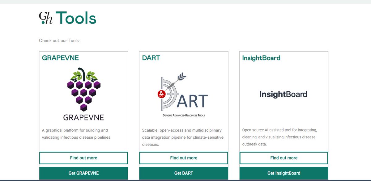
Our new Tools tab is live 💻🛠️🦠 — a hub for open-access resources that strengthen outbreak preparedness and response. Explore GRAPEVNE, DART, and InsightBoard, with more tools coming soon. #Outbreaks #DataViz #Analysis #Insights 👉global.health/tools/
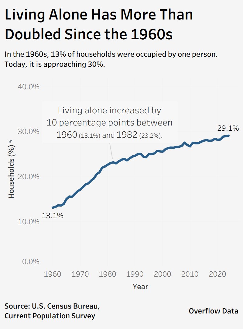
Living alone in the U.S. has more than doubled since 1960. Back then, just 13% of households were one person. Today? Nearly 30%. A massive demographic shift with big implications for housing, community, and well-being. Source: U.S. Census Bureau #dataviz #datadriven
Thank you for citing #tidyplots 🙏 Steven E. Pilley et al. A metabolic atlas of mouse aging. Cell Metabolism (2025). doi.org/10.1016/j.cmet… #rstats #dataviz #phd
Thank you for citing #tidyplots 🙏 Julio Cesar Santos-Pelaez et al. Synergistic effects of potassium and gibberellin on the yield and quality of yellow pitahaya fruits in the Peruvian Amazon, Frontiers in Agronomy (2025). doi.org/10.3389/fagro.… #rstats #dataviz #phd


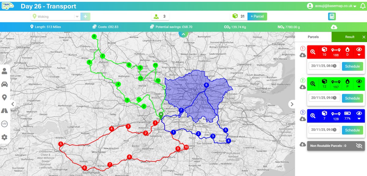
Day 26 of the #30DayMapChallenge Transport Using EVR, we planned 3 routes from Woking to deliver 31 parcels — including how ULEZ affects petrol/diesel vehicles. The EV could complete all routes, saving ~£70, 140 kg CO₂, and 7.8 g NOx. #DataViz #Transport #Routing #EVs #EVR
Day 25 of #30DayMapChallenge ~ Hexagons. Unemployment Rate and Net Migration in Africa. #rstats #dataviz #gis #map #spatial

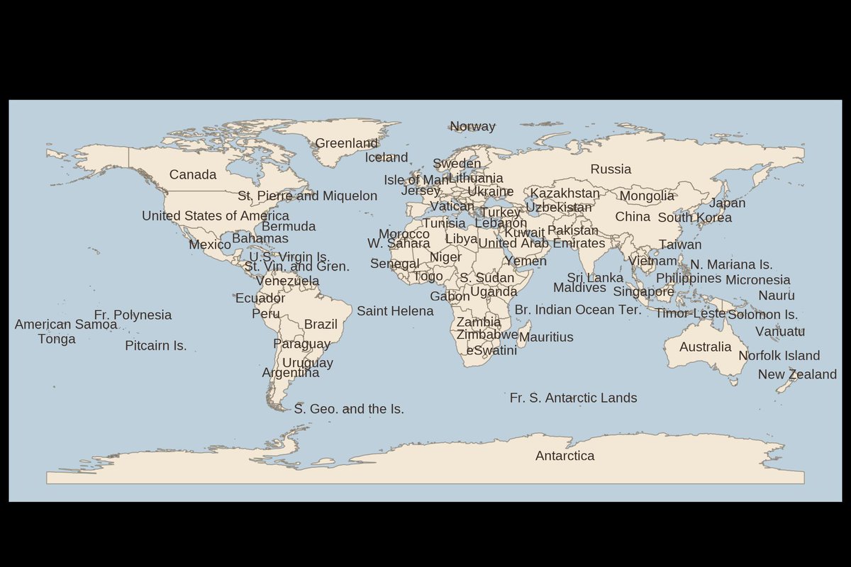
Day 24 — Places & Their Names 🌍 A simple world map labelled with English country names, built in R with Natural Earth + ggplot2. Clean, minimal, and ready for the eye to explore. #30DayMapChallenge #RStats #DataViz #GIS #sf #ggplot2

Here is the link to my Tableau profile where you will find sizzling and live dashboard from my practice archive: public.tableau.com/app/profile/da… #dataanalytics #dataviz #tableau #visualization

Chart.js was my favorite for simple, interactive charts in React. Not anymore. Now, Recharts.js is my favorite. What's everyone else using for complex data viz? D3.js? #React #JavaScript #DataViz

🔥 Unlock the Power of Data with Sankey Master! 🚀 Sankey charts are your go-to for visualizing complex flow systems! #DataViz #SankeyMaster #Analytics #ChartMagic #SankeyChart #sankeymaster #sankey 👉apps.apple.com/app/apple-stor…

📊 La visualisation de données facilite l'accès aux informations complexes pour les non-spécialistes. #DataViz #Accessibilité

The instinct is to build something you're proud of before showing anyone but that's precisely when you've invested too much to hear criticism well. The earlier you get stakeholder input, the more it feels like collaboration. storytellingwithdata.com/podcast/why-da… #dataviz #datavisualization


#30DayMapChallenge Day 25 – Hexagons. Marsupials of Australia🤷♀️☺️🦘🐨🌏🇦🇺 ❤️🧡💛💚💙💜🤍 #map #dataviz #QGIS
A map of Europe’s future is written in its age. Turns out Europe is called the "old continent" for a good reason #Mapping #DataViz #Demography #GIS #Geospatial #Europe #Population #Rstats


This is how you can visualize gene expression data in #tidyheatmaps 🤩 jbengler.github.io/tidyheatmaps/ #rstats #dataviz #phd


#Dataviz books everyone should read 📚 - a community sourced #charticle informationisbeautiful.net/visualizations… Created in association with @DataVizSociety #iibwab
💯🌟❤️📊📈 Beautifully published #DataViz books by @jschwabish Better Data Visualizations: amzn.to/3s2jIMX Others (e.g, Data Visualization in Excel): amzn.to/3sPSLCt ————— #DataStorytelling #DataLiteracy #Statistics #DataScience #DataScientists #BI #Analytics
In its first year tidyplots.org has become the go-to data viz for many life science researchers, got 620+ stars on Github, ~30K CRAN downloads, and 11 citations. Thank you for using, sharing, citing, and feedback! There is more to come 🤩 #rstats #dataviz #phd

My #dataviz, "APT :Voices For Human Dignity" has won the second place in the 2025 #DataViz Competition🎉 🥈 Thank you @womenindataorg @DataConnectConf @wia_community and @ApexonGlobal for organizing the event. #WomenInAnalytics #DataConnectConf #DataStorytelling #DCC2025


Goos evening! @Hyperpiexyz_io isn’t just a tool. It’s a shortcut to clarity. Visualize data, spot insights, and share stories faster than ever. Not many know it yet — but those who do? They move quicker. ⚡🥧 #HyperPie #DataViz #NextLevel

A woman's age vs. the age of the men who look best to her vs the same chart for men. (classic #dataviz of @Okcupid data)

Thank you for citing #tidyplots 🙏 Steven E. Pilley et al. A metabolic atlas of mouse aging. Cell Metabolism (2025). doi.org/10.1016/j.cmet… #rstats #dataviz #phd
Something went wrong.
Something went wrong.
United States Trends
- 1. Thanksgiving 377K posts
- 2. Golesh 1,860 posts
- 3. Fani Willis 10.4K posts
- 4. Trumplican 2,642 posts
- 5. Hong Kong 76.5K posts
- 6. Stranger Things 158K posts
- 7. #TejRan 4,152 posts
- 8. Riker N/A
- 9. Khabib 6,045 posts
- 10. Ruth 14K posts
- 11. Elijah Moore N/A
- 12. Tom Hardy 1,044 posts
- 13. Pete Skandalakis N/A
- 14. NextNRG Inc N/A
- 15. #Wednesdayvibe 3,519 posts
- 16. #sstvi 47.1K posts
- 17. Nuns 10.4K posts
- 18. #wednesdaymotivation 6,584 posts
- 19. Ribs 11.7K posts
- 20. #WednesdayWisdom 1,192 posts