
simplechart
@simplechart_
Create a chart in 30 seconds. Sharing interesting charts.
You might like


We don't want to lose time creating charts that are very simple. That's why we created simplechart.online. Try it out and let us know what you think. Suggestions are welcome!

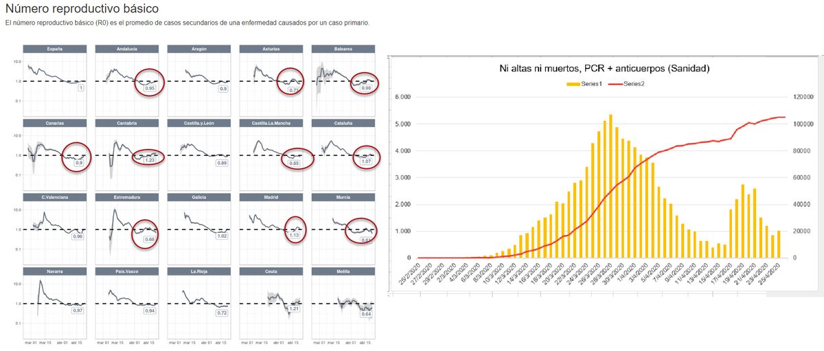
6. The graph of the column “neither discharged nor dead” with the Health Ministry data and the latest data for the reproduction number, R, fromi the Carlos III for the different Spanish regions. Is the upturn due to quick tests, the partial return to work, or another factor?

I have consistently recognized Malaysia among the successful countries. Posted this graph yesterday

This is the most pointless graph ever.

Wow this is a good infographics!

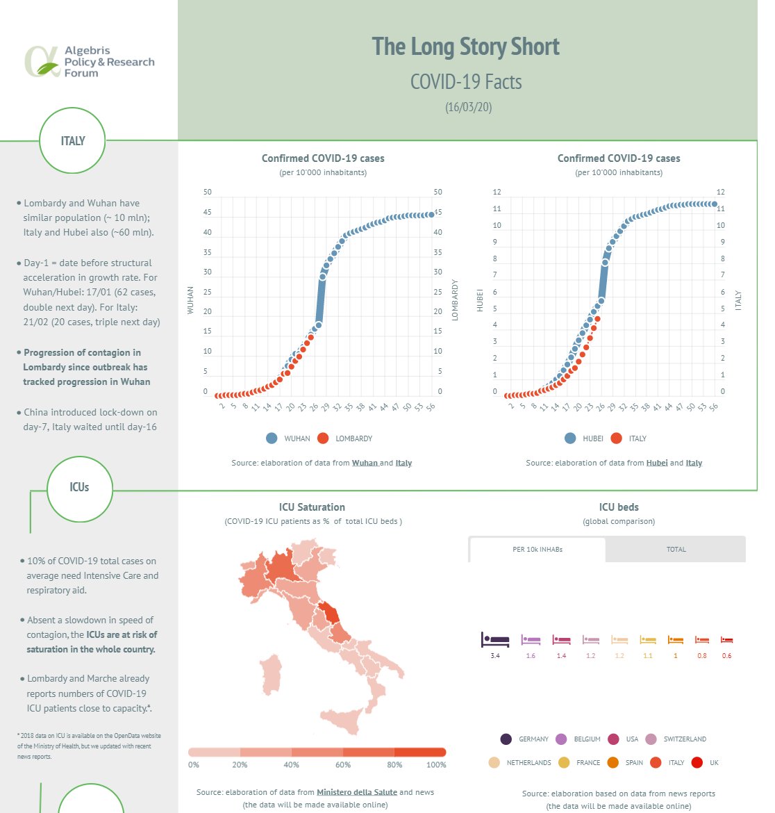
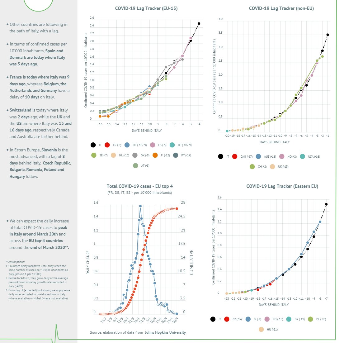
📊UPDATED #COVID19 Lag Tracker. Screenshots here, interactive charts at the link in pinned tweet. 📈UPLOADED an excel with ICU capacity across 🇮🇹 regions and cross countries. It's work in progress, if you have sources on missing countries please tell me! dropbox.com/s/skabm9ct71qu…


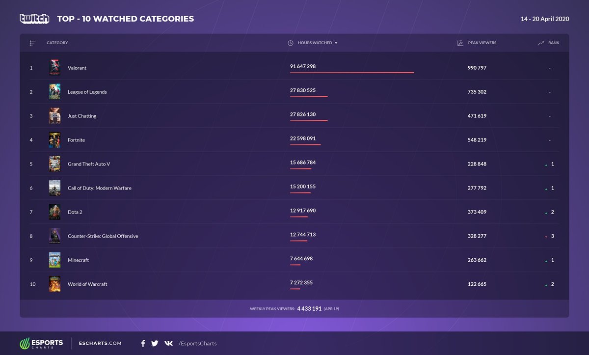
Popular categories on Twitch over the past week (April 14-20). Twitch stats: escharts.com/stats

How coronavirus disrupted US air travel, in 2 charts: Flight cancellations and TSA traveler counts vox.com/the-goods/2020…
vox.com
How the coronavirus is disrupting US air travel, in 2 charts
The TSA screened more than 2 million people per day in April of last year. Now, it screens about 100,000 daily.

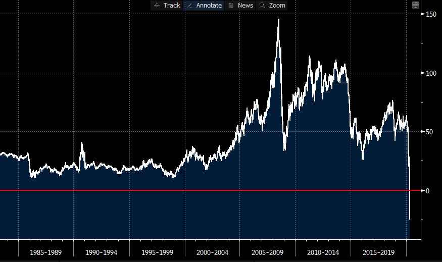
HISTORIC CHART: WTI May oil futures settle at -$37.63 a barrel (yes, that's negative price). Of course, it goes without saying: that's an all-time low | #OOTT #OilPriceWar #covid19 via @TheTerminal

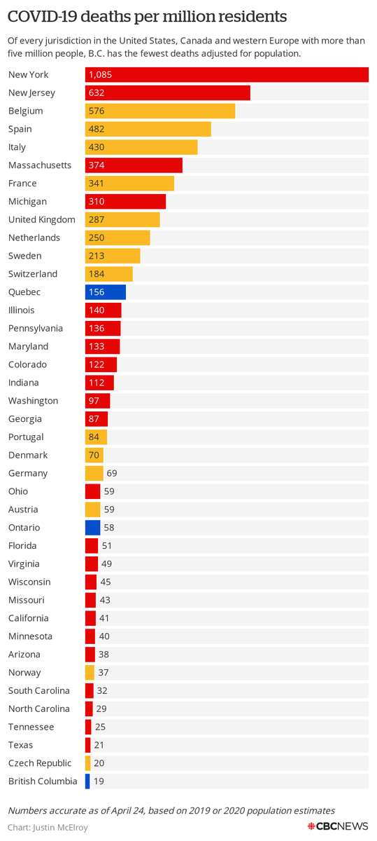
Here's the chart showing that B.C. has the lowest #COVID19 deaths per capita of any jurisdiction with at least five million people in Canada, the United States and western Europe
This is not a simple chart :)

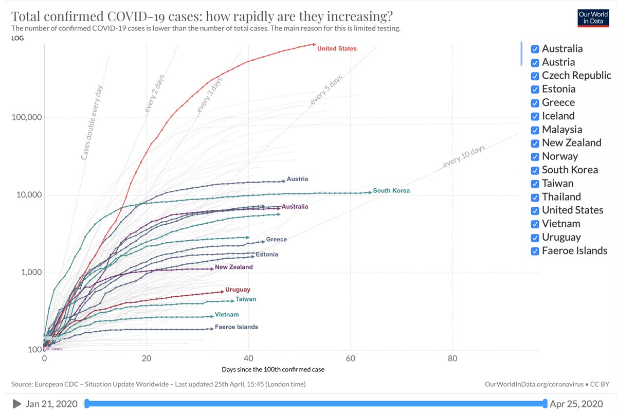
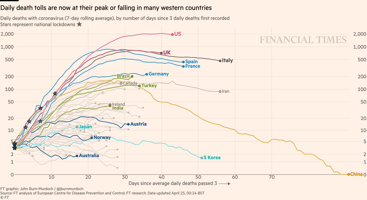
NEW: Fri 24 April update of coronavirus trajectories Daily deaths • Still too early to say if US has peaked • Looks like UK has • But descents look much slower than ascents • Brazil 📈 • Successes in dark blue: Australia, Norway, Austria Live charts ft.com/coronavirus-la…

Largest US Cities from 1890 to 2010 | Racing Bar Graph reddit.com/r/infographic/…

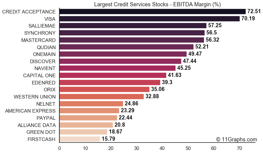
(1/6) Most profitable largest #CreditServices #Stocks by EBITDA Margin: 1. 🇺🇸 CREDIT ACCEPTANCE $CACC: 72.5% 2. 🇺🇸 VISA $V: 70.2% 3. 🇺🇸 SALLIEMAE $SLM: 57.3% 4. 🇺🇸 SYNCHRONY $SYF: 56.5% 5. 🇺🇸 MASTERCARD $MA: 56.3%

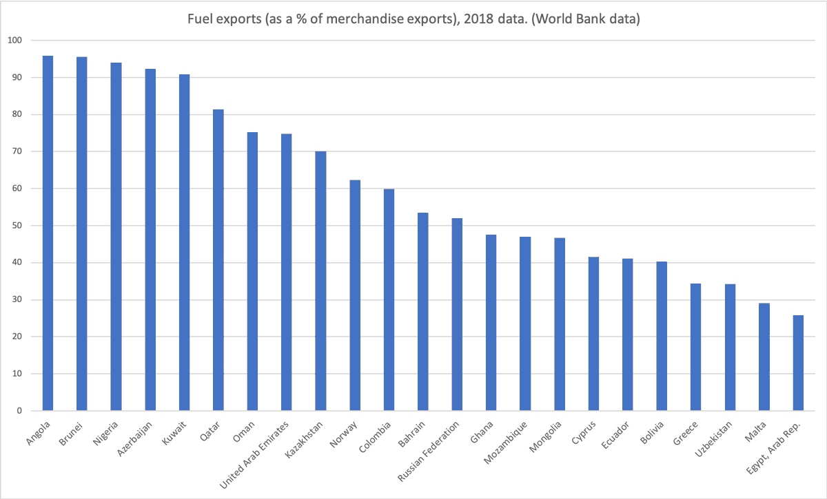
On a serious note is there a risk of sovereign defaults from nations that rely heavily on oil exports? Here's 2018 data for heavily exposed countries h/t @timpastoor for the idea
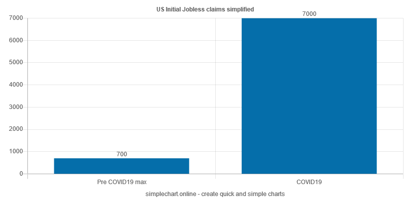
Did you have to open #excel just to #plot a couple of points? No need for that with simplechart.online just enter the #data and create it.


United States Trends
- 1. Catherine O’Hara N/A
- 2. Don Lemon N/A
- 3. Home Alone N/A
- 4. Schitt's Creek N/A
- 5. FACE Act N/A
- 6. SCTV N/A
- 7. Bill Gates N/A
- 8. Moira Rose N/A
- 9. Best in Show N/A
- 10. Kwesi N/A
- 11. First Amendment N/A
- 12. #SmackDown N/A
- 13. Grand Jury N/A
- 14. Kevin N/A
- 15. The Studio N/A
- 16. Journalists N/A
- 17. IndyCar N/A
- 18. Christopher Guest N/A
- 19. John Candy N/A
- 20. 1st Amendment N/A


Something went wrong.
Something went wrong.