
AnyChart
@AnyChart
Cross-Platform Data Visualization Tools 📊 #JavaScript #charts 📈 #Qlik extensions ➕ more for #DataViz & #Analytics ✨ #webdev #frontend #qliksense #qlikconnect
You might like


Qlik Connect 2025 — what a ride! 🚀 From buzzing crowds at our booth to the debut of our Excel-style Spreadsheets extension for Qlik Sense, the energy was so real! 📸 Just published a recap, check it out: qlik.anychart.com/news/qlik-conn… #QlikConnect #QlikSense #Excel #Spreadsheets #Qlik

The right JavaScript Gantt chart library can save weeks of development. A new deep dive reviews six top options across features, integration, and real-world fit. 🧩 Which one stands out for you? 👉 anychart.com/blog/2025/11/0… #ProjectManagement #DataVisualization #JavaScriptCharts

Gathered some compelling new data visualization examples 👇 The latest #DataVizWeekly features: 📍 EU solar grid pressure 📍 China vs U.S. in trade 📍 Sleepless Ukraine 📍 Cats' laziness 🐈 See how visuals make data clearer: anychart.com/blog/2025/10/3… #DataVisualization #DataViz


🧲 The biggest magnet at our #QlikConnect booth this year? Our new Spreadsheets extension for #QlikSense! • Excel-like UI • Formulas & charts • Writeback ...and more, right in your #Qlik apps 🪄 Here's the flyer that presented Spreadsheets at our booth @ Qlik Connect, ICYMI.


How to make complex data easy to grasp? Visualization helps bring meaning into view 📈 #DataVizWeekly shows how it works. Latest examples 👇 - AI industry links - U.S. funding halt - TikTok watch-time - Sea temps anychart.com/blog/2025/10/2… #datavisualization #storytelling #dataviz

Still thinking about Qlik Connect, going through photos & videos. This one from near the end at our booth really stood out. So packed, just wow! 😍 Thanks to everyone who came by and made it all so awesome, and to @Qlik for another amazing #QlikConnect 🙌 #DoDataDifferently #Qlik
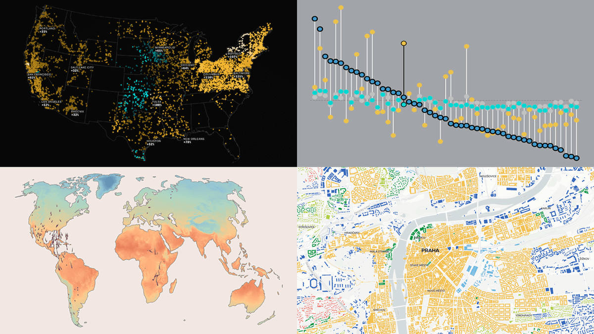
See how visualization brings data to life ✨ #DataVizWeekly spotlights four compelling new projects: 🕊️ Bird migration & climate 💵 U.S. living costs ⚡ AI & electricity prices 🏙️ Urban patterns in Europe 👉 anychart.com/blog/2025/10/1… #DataVisualization #DataAnalytics #DataViz

Build a Dynamic Waterfall Chart in PHPRunner Using AnyChart (Step-by-Ste... youtu.be/pRj4HxRFTlg?si… via @YouTube

youtube.com
YouTube
Build a Dynamic Waterfall Chart in PHPRunner Using AnyChart (Step-b...

Raw data rarely speaks clearly. Visuals give it a voice 📊 The latest #DataViz Weekly shows great new examples: • Causes of death in reality vs. media • EU healthcare priorities • U.S. school redistricting • Religion & marriage in 🇦🇺 anychart.com/blog/2025/10/1… #DataVisualization

Booth buzz at #QlikConnect was nonstop: demos, conversations, giveaways 🌀 📽️ All the while, this video ran on loop on our booth monitor. See what we brought front & center this year: Spreadsheets, Decomposition Tree, and Gantt Chart — built to power up what you can do in #Qlik.
When data needs to be explored or explained, visualization helps 📈📉 New #DataViz Weekly shows how it works in practice: 🔸 U.S. funding and #shutdown 🔸 #H1BVisa workers at U.S. research institutions 🔸 #USAID medical supply issues 🔸 Air alerts in #Kyiv anychart.com/blog/2025/10/0…

Bring #Excel templates to life inside @Qlik Sense 📄📥 The Spreadsheets extension enables import of templates as is, linking them to live #Qlik data, using formulas 🟰, and keeping everything interactive & editable just like in Excel: 📽️ youtube.com/watch?v=RmR-ub… #BI #DataAnalytics
Want to see how data can turn into clarity? 📊 #DataVizWeekly is back with a selection of new visuals worth checking out: 📌 Epstein–Maxwell emails 📌 Vaccination backslide 📌 Clothing sizes 📌 2024 election by precinct anychart.com/blog/2025/09/1… #dataviz #storytelling #analytics

Visualization makes data easier to grasp, helping generate insight 📈 #DataVizWeekly gathers compelling cases where this becomes clear. See the latest picks: ❇️ Pay by occupation ❇️ U.S. billionaires ❇️ Africa's real size ❇️ Zodiac drift anychart.com/blog/2025/09/1… #DataVisualization

Getting better at data visualization is easier when you see how others put it into practice. #DataViz Weekly shows new examples worth a look: ⊛ Military purge 🇨🇳 ⊛ Hospital harassment 🇲🇽 ⊛ AI bias 🇺🇦 ⊛ Methane risk 🇺🇸 anychart.com/blog/2025/09/0…

#BI tools keep getting smarter. Yet people still open #Excel. For formulas, quick what-ifs, or just out of habit. 🎯 Now you can have that right inside #Qlik! 🎥 See how to build an Excel-like spreadsheet in a #QlikSense app using our newest extension: youtube.com/watch?v=RL6kwD…

Pinch-to-Zoom in Stock Charts — JavaScript Chart Tips anychart.com/blog/2025/03/0…
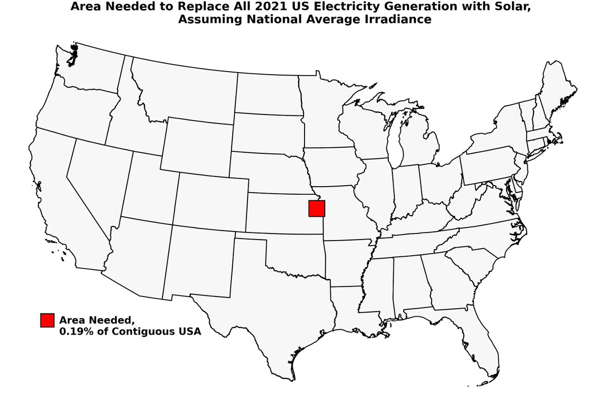
Visuals help data work 📊 See how in the new #DataViz Weekly, with 4 projects that recently caught our attention — showing how #charts & #maps get put to work: ✱☀️ U.S. summer shifts ✱🏥 Health workforce cuts ✱⚡ Grid stability ✱🏙️ Toronto parking land anychart.com/blog/2025/08/2…

📈 @EODHD_APIs launched a free currency converter with live & historical rates for 1K+ currency & crypto pairs 💱 @AnyChart-powered charts bring price movement and trends into focus ✨ Learn more & check it out: ➡️ anychart.com/blog/2025/04/2… #dataviz #fintech #javascript #forex #api


United States Trends
- 1. Seahawks 21.5K posts
- 2. Giants 67.1K posts
- 3. Bills 138K posts
- 4. Bears 60K posts
- 5. Daboll 11.9K posts
- 6. Jags 6,825 posts
- 7. Dart 26.2K posts
- 8. Caleb 49.1K posts
- 9. Dolphins 32.8K posts
- 10. Rams 16.8K posts
- 11. Josh Allen 16.1K posts
- 12. Texans 38.2K posts
- 13. Russell Wilson 4,024 posts
- 14. Browns 38K posts
- 15. Patriots 107K posts
- 16. Ravens 38K posts
- 17. Trevor Lawrence 2,537 posts
- 18. Bryce 15.8K posts
- 19. Henderson 17.5K posts
- 20. Niners 3,285 posts


Something went wrong.
Something went wrong.