#30daysmapchallenge search results

Day 13 of the #30DaysMapChallenge: A New Tool ⚙️ 🎓Ciudad Universitaria at sunset, created with Aerialod (geodata processing done in R). Source: OSM, CDMX Datos abiertos #rstats #UNAM


#30DaysMapChallenge Day2:Lines I visualized Tokyo's subway network in neon colors. I created it using #Tableau. public.tableau.com/app/profile/hi…


November has officially begun, which means the 🗺️ #30DaysMapChallenge 🗺️ has started. In the latest Data Vis Dispatch, we've listed our favorites, along with even more (highly interactive) maps. 👉🏻 Read the full blog post: datawrapper.de/blog/data-vis-…


We're doing the #30DaysMapChallenge at LiveEO and Day 7, with the theme Vintage, is my turn. I took OpenStreetMap data of Berlin and used Manuel Claeys Bouuaert's FerrarGIS template to render the data in the style of the Ferreris Map.


🌍 #30DaysMapChallenge | #Day1 This map highlights the lakes and water bodies of Hosur, Tamil Nadu. Shaped by its unique topography, the city hosts a mix of flowing and still waters, essential to its ecosystem.


Pour ce jour 9 du #30daysmapchallenge, consacré à l'IA, j'ai demandé à ChatGPT/DallE, de me générer une carte du Tour du Monde en 80 jours de Jules Verne. Malgré mes demandes de corrections, on est loin du compte 😁 (même si c'est esthétique)

#30daysmapchallenge #day27 2020년 총선-서울 선거구별 당선자와 후보 리뷰 2020 National Assembly election - A review of the winners and candidates by electoral district in Seoul 와. 지각했다..


Mapping my taste 🗺️🍴: ⚙️ Made with this adorable tool: pampam.city 🔍 Take a peek at my finished map: pampam.city/p/icyqKPEHR8l4… 🧐🙌Drawing inspiration from @ceren_do's amazing work for the #30daysmapchallenge (Day 30: Favorites).

#30daysmapchallenge #day30 2023년 수도권 아파트/연립다세대 행정동별 평균실거래가. 60-85m2 기준, 매매 5건 이하 행정동은 제외 Average real estate transaction price by administrative district(DONG) in 2023: apartment/multi-household house, 60-85m2

#30DaysMapChallenge : Day 5 - a journey, The livestock movement from Ethiopia to Somaliland border, to Berbera port including cattle and camels.

November has officially begun, which means the 🗺️ #30DaysMapChallenge 🗺️ has started. In the latest Data Vis Dispatch, we've listed our favorites, along with even more (highly interactive) maps. 👉🏻 Read the full blog post: datawrapper.de/blog/data-vis-…

🌍 #30DaysMapChallenge – Day 2 Ligne Carte des flux de réfugiés et personnes déplacées en 2017 selon leur pays de résidence et/ou d’origine, réalisée avec FlowmapBlue. 🌐 #GIS #Migration #OpenData #FlowmapBlue #MappingChallenge
🚀 #30DaysMapChallenge – Jour 3 (Polygone) Carte de Djibouti-ville représentant la hauteur des bâtiments avec les données Google Open Buildings 2.5D. 🌆 Un peu en retard pour la publication, mais les contributions continueront tout au long du challenge ! #GIS #QGIS #Urbanisme

#30DaysMapChallenge Day4:My Data I plotted the photos I took during last month's trip on a map. I created it using #Tableau and #Canva. public.tableau.com/app/profile/hi…
#30DaysMapChallenge Day3:Polygons I visualized the vegetation around Tateyama. There were so many types of vegetation that I struggled to decide how to assign the colors. I created it using #Tableau. public.tableau.com/app/profile/hi…


#30daysMapChallenge, day2 "lines". This map shows the flight paths of the airlines depating from the Istanbul airport.


Me uno al reto📍 Día 1 – #30DaysMapChallenge ¡Me uno al reto con este mapa de los Refugios de Fauna Silvestre en Venezuela! Cada punto representa hábitats clave para especies como la tortuga arrau, flamencos y caimanes. Hecho en #QGIS 🗺️ #GIS #Cartografía #Venezuela

#30DaysMapChallenge Day2:Lines I visualized Tokyo's subway network in neon colors. I created it using #Tableau. public.tableau.com/app/profile/hi…
I'm joining the #30DaysMapChallenge for the first time! I plan to create and share as many works as I can, mainly using #Tableau and #QGIS. For Day 1: "Points", I visualized popular tourist spots in Kanazawa, the city where I currently live. public.tableau.com/app/profile/hi…


gokil salut banget #30DaysMapChallenge alhamdulillah punya insight baru untuk visualisasi peta kedepannya

#30DaysMapChallenge Día 14 ¿Cuál es la disponibilidad de transporte en el área metropolitana de la CDMX por tipo? Parece que la mayoría tenemos más cerca una ruta de transporte concesionado github.com/FerDoranNie/Re…


Turns out when you normalize data, things look a little different! 2024 Olympic Champions per capita #30DaysMapChallenge

Day 13 of the #30DaysMapChallenge: A New Tool ⚙️ 🎓Ciudad Universitaria at sunset, created with Aerialod (geodata processing done in R). Source: OSM, CDMX Datos abiertos #rstats #UNAM
Pour ce jour 9 du #30daysmapchallenge, consacré à l'IA, j'ai demandé à ChatGPT/DallE, de me générer une carte du Tour du Monde en 80 jours de Jules Verne. Malgré mes demandes de corrections, on est loin du compte 😁 (même si c'est esthétique)

It's late, it's still work in progress, and yes I know there;s loads of other Tolkien-style maps out there. But this is one I've wanted to make for a long-time, and as I look back on where I started in my #30DaysMapChallenge journey a few years ago I'm happy

Day 13 of the #30DaysMapChallenge: A New Tool ⚙️ 🎓Ciudad Universitaria at sunset, created with Aerialod (geodata processing done in R). Source: OSM, CDMX Datos abiertos #rstats #UNAM
Me uno al reto📍 Día 1 – #30DaysMapChallenge ¡Me uno al reto con este mapa de los Refugios de Fauna Silvestre en Venezuela! Cada punto representa hábitats clave para especies como la tortuga arrau, flamencos y caimanes. Hecho en #QGIS 🗺️ #GIS #Cartografía #Venezuela


#30daysmapchallenge #day27 2020년 총선-서울 선거구별 당선자와 후보 리뷰 2020 National Assembly election - A review of the winners and candidates by electoral district in Seoul 와. 지각했다..
Pour ce jour 9 du #30daysmapchallenge, consacré à l'IA, j'ai demandé à ChatGPT/DallE, de me générer une carte du Tour du Monde en 80 jours de Jules Verne. Malgré mes demandes de corrections, on est loin du compte 😁 (même si c'est esthétique)
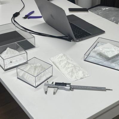
#30daysmapchallenge #day12 왜 교가에는 산 이름이 들어가나? - 교가에 산이 들어있는 서울의 고등학교들 / High schools in Seoul with 'mountain' in their school song

We're doing the #30DaysMapChallenge at LiveEO and Day 7, with the theme Vintage, is my turn. I took OpenStreetMap data of Berlin and used Manuel Claeys Bouuaert's FerrarGIS template to render the data in the style of the Ferreris Map.


🌍 #30DaysMapChallenge | #Day1 This map highlights the lakes and water bodies of Hosur, Tamil Nadu. Shaped by its unique topography, the city hosts a mix of flowing and still waters, essential to its ecosystem.

Pour le jour 23 du #30DaysMapChallenge l’#AtlasdelaSuisse vous montre une carte avec les émissions de gaz à effet de serre selon les sources pour les pays en Europe. Grâce à une symbolisation spéciale en #3D, plusieurs informations peuvent être représentées par le même symbole.


Something went wrong.
Something went wrong.
United States Trends
- 1. Steelers 53.1K posts
- 2. Rodgers 21.4K posts
- 3. Mr. 4 4,957 posts
- 4. Chargers 38.3K posts
- 5. Tomlin 8,423 posts
- 6. Resign 111K posts
- 7. Schumer 231K posts
- 8. Tim Kaine 21.3K posts
- 9. Sonix 1,255 posts
- 10. Rudy Giuliani 11.2K posts
- 11. 8 Democrats 9,876 posts
- 12. Dick Durbin 13.9K posts
- 13. #BoltUp 3,096 posts
- 14. Angus King 17.8K posts
- 15. #ITWelcomeToDerry 4,930 posts
- 16. Keenan Allen 5,095 posts
- 17. 8 Dems 7,690 posts
- 18. #RHOP 7,148 posts
- 19. Maggie Hassan 18K posts
- 20. Voltaire 7,850 posts