#interactiveatlas search results

See what the world 🌎 could look like at different levels of warming in the coming decades. 🌡️ +1.5°C 🌡️ +2°C 🌡️ +3°C 🌡️ +4°C Check out the #IPCC Working Group I #InteractiveAtlas ➡️ bit.ly/WGIatlas #IPCCAtlas #IPCCData #ClimateReport @predictia @IFCA_CSIC_UC
#MENAClimateWeek, the Middle East & North Africa Regional Climate Week opens in Riyadh next week! #IPCC Working Group I #InteractiveAtlas shows what that region could look like at different levels of warming in the coming decades. 🌡️ +1.5°C 🌡️ +2°C ➡️bit.ly/WGIatlas
See what the 🌎 world could like at different levels of warming in the coming decades. 🌡️ +1.5°C, +2°C, +3° & +4°C Check out the new #IPCC Working Group I #InteractiveAtlas ➡️ bit.ly/WGIatlas #IPCCAtlas #IPCCData #ClimateReport @predictia @IFCA_CSIC_UC


A new and exciting output of the #IPCC report is the #InteractiveAtlas for exploring Climate Futures! 👇🌍🔥🌊 A novel tool for flexible spatial and temporal analyses of observed and projected climate change information, including regional synthesis for Climatic Impact-Drivers.

IPCC 18 h · See what the world 🌎 could look like at different levels of warming in the coming decades. 🌡️ +1.5°C 🌡️ +2°C 🌡️ +3°C 🌡️ +4°C Check out the #IPCC Working Group I #InteractiveAtlas ➡️ bit.ly/WGIatlas #IPCCAtlas #IPCCData #ClimateReport
See what the 🌍 world could look like at different levels of warming in the coming decades. 🌡️ +1.5°C 🌡️ +2°C 🌡️ +3°C 🌡️ +4°C Check out the #IPCC Working Group I #InteractiveAtlas ➡️ bit.ly/WGIatlas #IPCCAtlas #IPCCData #ClimateReport @predictia @IFCA_CSIC_UC

⚠️ سوخت های فسیلی ادامه بدیم، دور از انتظار نخواهد بود. برای اطلاعات بیشر میتونین به سایت آی پی سی سی مراجعه کنید. 🌡️ +۱.۵ °C 🌡️ +۲ °C 🌡️ +۳ °C 🌡️ +۴ °C #climatechange #IPCC #InteractiveAtlas
See what the world 🌐 could look like at different levels of globwarming in the coming decades. 🌡️ +1.5°C 🌡️ +2°C 🌡️ +3°C 🌡️ +4°C Check out the #IPCC Working Group I #InteractiveAtlas ➡️ bit.ly/WGIatlas via @IPCC_CH

Which brings us to the other main pillar of the Interactive Atlas, #FAIR principles: Findability Accessibility Interoperability Reusability They were the guiding philosophy behind the #InteractiveAtlas

@IPCC_CH: 'See what the 🌎 world could like at different levels of warming in the coming decades. 🌡️ +1.5°C, +2°C, +3° & +4°C Check out the new #IPCC Working Group I #InteractiveAtlas ➡️ bit.ly/WGIatlas #… https://t.co/rcq7LaOUxx, see more tweetedtimes.com/v/460?s=tnp
شاهد كيف يمكن أن يبدو العالم🌎 عند مستويات مختلفة من الاحتباس الحراري في العقود القادمة. +1.5 درجة مئوية +2 درجة مئوية +4 درجة مئوية تعرف على مجموعة العمل الأولى #IPCC #InteractiveAtlas 📷 bit.ly/WGIatlas #شركاء_بالمسؤولية #شركاء_بالمعرفة #شركاء_بالكوكب…

See what the world 🌎 could look like at different levels of warming in the coming decades. 🌡️ +1.5°C 🌡️ +2°C 🌡️ +3°C 🌡️ +4°C Check out the #IPCC Working Group I #InteractiveAtlas ➡️ bit.ly/WGIatlas via @IPCC_CH

See the animations of what the world could look like at different levels of #globalwarming in the future. Check out the #IPCC Working Group I #InteractiveAtlas bit.ly/WGIatlas #IPCCAtlas #IPCCData #ClimateReport @predictia @IFCA_CSIC_UC

>> @IPCC_CH: 'See what the 🌎 world could like at different levels of warming in the coming decades. 🌡️ +1.5°C, +2°C, +3° & +4°C Check out the new #IPCC Working Group I #InteractiveAtlas ➡️ bit.ly/WGIatlas… https://t.co/IxtT2DTria, see more tweetedtimes.com/UNBELFUTURO?s=…

… Predictia will take care of developing the #DataViewer, drawing from successful experiences such as the User Interface Platform for the PRIMAVERA Project (uip.primavera-h2020.eu) or the #InteractiveAtlas for the @IPCC_CH Sixth Assessment Report (interactive-atlas.ipcc.ch) [2/5]
The @IPCC_CH #InteractiveAtlas reached half a million visitors during its first month online alone! (Check it out here: interactive-atlas.ipcc.ch) [3/5]
![EERIE_Project's tweet image. The @IPCC_CH #InteractiveAtlas reached half a million visitors during its first month online alone!
(Check it out here: interactive-atlas.ipcc.ch) [3/5]](https://pbs.twimg.com/media/FwzTOBoXwAA-nO6.jpg)

What are the 10 largest islands in the world? Map them! 2.sas.com/6013Bc0kh #geography #interactiveatlas

#RT @UNFCCC: RT @IPCC_CH: See what the 🌎 world could like at different levels of warming in the coming decades. 🌡️ +1.5°C, +2°C, +3° & +4°C Check out the new #IPCC Working Group I #InteractiveAtlas ➡️ bit.ly/WGIatlas #IPCCAtlas #IPCCData #…
See what the world 🌎 could look like at different levels of warming in the coming decades. 🌡️ +1.5°C 🌡️ +2°C 🌡️ +3°C 🌡️ +4°C Check out the #IPCC Working Group I #InteractiveAtlas ➡️ bit.ly/WGIatlas via @IPCC_CH
شاهد كيف يمكن أن يبدو العالم🌎 عند مستويات مختلفة من الاحتباس الحراري في العقود القادمة. +1.5 درجة مئوية +2 درجة مئوية +4 درجة مئوية تعرف على مجموعة العمل الأولى #IPCC #InteractiveAtlas 📷 bit.ly/WGIatlas #شركاء_بالمسؤولية #شركاء_بالمعرفة #شركاء_بالكوكب…
See the animations of what the world could look like at different levels of #globalwarming in the future. Check out the #IPCC Working Group I #InteractiveAtlas bit.ly/WGIatlas #IPCCAtlas #IPCCData #ClimateReport @predictia @IFCA_CSIC_UC
See what the world 🌎 could look like at different levels of warming in the coming decades. 🌡️ +1.5°C 🌡️ +2°C 🌡️ +3°C 🌡️ +4°C Check out the #IPCC Working Group I #InteractiveAtlas ➡️ bit.ly/WGIatlas #IPCCAtlas #IPCCData #ClimateReport @predictia @IFCA_CSIC_UC

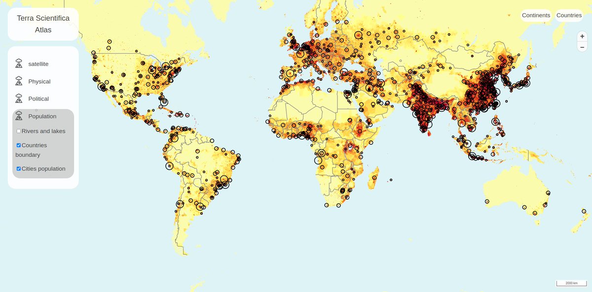
🌍 Introducing Terra Scientifica's all-new Interactive Digital Atlas! 🗺️ 👉 Start your journey today: atlas.terrascientifica.com #TerraScientifica #InteractiveAtlas #GeospatialData #DiscoverTheWorld #Atlas
#MENAClimateWeek, the Middle East & North Africa Regional Climate Week opens in Riyadh next week! #IPCC Working Group I #InteractiveAtlas shows what that region could look like at different levels of warming in the coming decades. 🌡️ +1.5°C 🌡️ +2°C ➡️bit.ly/WGIatlas

Read about the @IPCC_CH Working Group #InteractiveAtlas in this article: linkedin.com/pulse/ipccs-in… #IPCCAtlas #climatereport #climateaction
linkedin.com
IPCC's Interactive ATLAS
IPCC has come out with an interactive Atlas as part of its Sixth Assessment Report. Since 1988 IPCC has been publishing many climate assessment reports with current scientific knowledge.
See what the world 🌐 could look like at different levels of globwarming in the coming decades. 🌡️ +1.5°C 🌡️ +2°C 🌡️ +3°C 🌡️ +4°C Check out the #IPCC Working Group I #InteractiveAtlas ➡️ bit.ly/WGIatlas via @IPCC_CH
⚠️ سوخت های فسیلی ادامه بدیم، دور از انتظار نخواهد بود. برای اطلاعات بیشر میتونین به سایت آی پی سی سی مراجعه کنید. 🌡️ +۱.۵ °C 🌡️ +۲ °C 🌡️ +۳ °C 🌡️ +۴ °C #climatechange #IPCC #InteractiveAtlas
See what the world 🌎 could look like at different levels of warming in the coming decades. 🌡️ +1.5°C 🌡️ +2°C 🌡️ +3°C 🌡️ +4°C Check out the #IPCC Working Group I #InteractiveAtlas ➡️ bit.ly/WGIatlas #IPCCAtlas #IPCCData #ClimateReport @predictia @IFCA_CSIC_UC
IPCC 18 h · See what the world 🌎 could look like at different levels of warming in the coming decades. 🌡️ +1.5°C 🌡️ +2°C 🌡️ +3°C 🌡️ +4°C Check out the #IPCC Working Group I #InteractiveAtlas ➡️ bit.ly/WGIatlas #IPCCAtlas #IPCCData #ClimateReport
See what the world 🌎 could look like at different levels of warming in the coming decades. 🌡️ +1.5°C 🌡️ +2°C 🌡️ +3°C 🌡️ +4°C Check out the #IPCC Working Group I #InteractiveAtlas ➡️ bit.ly/WGIatlas #IPCCAtlas #IPCCData #ClimateReport

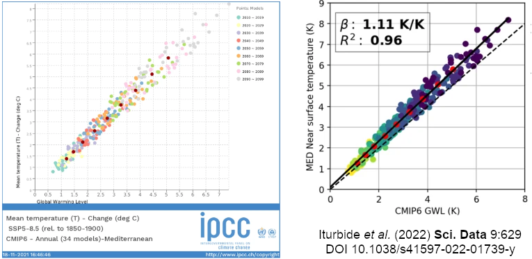
The Atlas repository has a strong focus on the re-usability of the resources provided. The paper provides an example to use regionally aggregated data to reproduce #InteractiveAtlas figures on your own rdcu.be/cXCgC
See what the world 🌎 could look like at different levels of warming in the coming decades. 🌡️ +1.5°C 🌡️ +2°C 🌡️ +3°C 🌡️ +4°C Check out the #IPCC Working Group I #InteractiveAtlas ➡️ bit.ly/WGIatlas #IPCCAtlas #IPCCData #ClimateReport @predictia @IFCA_CSIC_UC

See what the world 🌎 could look like at different levels of warming in the coming decades. 🌡️ +1.5°C 🌡️ +2°C 🌡️ +3°C 🌡️ +4°C #ClimateCrisis #climatechange #InteractiveAtlas #IPCC interactive-atlas.ipcc.ch

Climate change at a glance! The IPCC just published a tool where you can see how the world will look like at different levels of warming in the coming decades. #IPCC #ClimateCrisis #interactiveatlas interactive-atlas.ipcc.ch

From @IPCC_CH — See what the world 🌎 could look like at different levels of warming in the coming decades. 🌡️ +1.5°C 🌡️ +2°C 🌡️ +3°C 🌡️ +4°C Check out the #IPCC Working Group I #InteractiveAtlas ➡️ bit.ly/WGIatlas
See what the world 🌎 could look like at different levels of warming in the coming decades. 🌡️ +1.5°C 🌡️ +2°C 🌡️ +3°C 🌡️ +4°C Check out the #IPCC Working Group I #InteractiveAtlas ➡️ bit.ly/WGIatlas #IPCCAtlas #IPCCData #ClimateReport @predictia @IFCA_CSIC_UC
A new and exciting output of the #IPCC report is the #InteractiveAtlas for exploring Climate Futures! 👇🌍🔥🌊 A novel tool for flexible spatial and temporal analyses of observed and projected climate change information, including regional synthesis for Climatic Impact-Drivers.
See what the world 🌐 could look like at different levels of globwarming in the coming decades. 🌡️ +1.5°C 🌡️ +2°C 🌡️ +3°C 🌡️ +4°C Check out the #IPCC Working Group I #InteractiveAtlas ➡️ bit.ly/WGIatlas via @IPCC_CH
The @IPCC_CH #InteractiveAtlas shows what the world could look like at different levels of warming. Join the Turning Point Dialogues: Climate Edition in the lead-up to #COP26 & explore the realities of the climate crisis from climate activists! turningpointdialogues.org #Act4SDGs
The @IPCC_CH #InteractiveAtlas reached half a million visitors during its first month online alone! (Check it out here: interactive-atlas.ipcc.ch) [3/5]
What are the 10 largest islands in the world? Map them! 2.sas.com/6013Bc0kh #geography #interactiveatlas

We all know it’s what’s on the inside that counts. If only there was a way to see underneath the biggest human organ. *cough* bit.ly/2Ior7V0 *cough* #Anatomy #BodilySystems #InteractiveAtlas #Organs #Health #Wellness

The Atlas repository has a strong focus on the re-usability of the resources provided. The paper provides an example to use regionally aggregated data to reproduce #InteractiveAtlas figures on your own rdcu.be/cXCgC
🌍 Introducing Terra Scientifica's all-new Interactive Digital Atlas! 🗺️ 👉 Start your journey today: atlas.terrascientifica.com #TerraScientifica #InteractiveAtlas #GeospatialData #DiscoverTheWorld #Atlas
Something went wrong.
Something went wrong.
United States Trends
- 1. Thanksgiving 387K posts
- 2. Golesh 2,340 posts
- 3. Fani Willis 13.9K posts
- 4. Trumplican 3,040 posts
- 5. #WipersDayGiveaway N/A
- 6. Hong Kong 81.6K posts
- 7. Khabib 7,307 posts
- 8. Camp Haven 7,033 posts
- 9. Tom Hardy 1,418 posts
- 10. NextNRG N/A
- 11. Stranger Things 163K posts
- 12. Riker N/A
- 13. Africans 26.9K posts
- 14. Ruth 14K posts
- 15. #TejRan 4,137 posts
- 16. Idris 7,676 posts
- 17. Elijah Moore 1,025 posts
- 18. #Wednesdayvibe 3,704 posts
- 19. Fassbender N/A
- 20. Karoline Leavitt 29.5K posts