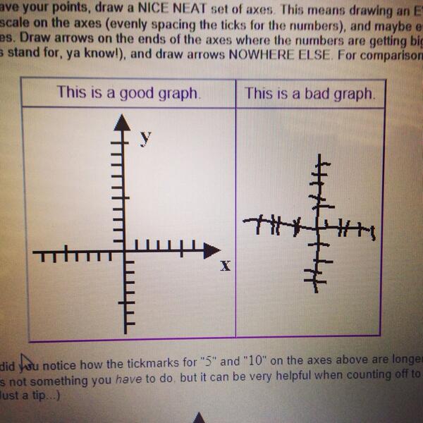
#badgraph search results

Is this an #InterestingGraph, or a #BadGraph? ... perhaps a bit of both. Which animals kill the most people?


This is a #BadGraph

Morning reds, interesting conversation with our source yesterday They believe the Wirtz deal took so long because club had to juggle finances between Wirtz AND Isak during negotiations, so club's financial outlay aligns with their long term PSR plan Things could move very quick


Did you factor in COVID and all the jobs and businesses lost by the Democrats shutting down the economy. I don’t think you did and you most likely did it on purpose. #badgraph
Another #BadGraph for the election. Why not make these bar charts, with 3 bars that can be easily compared?
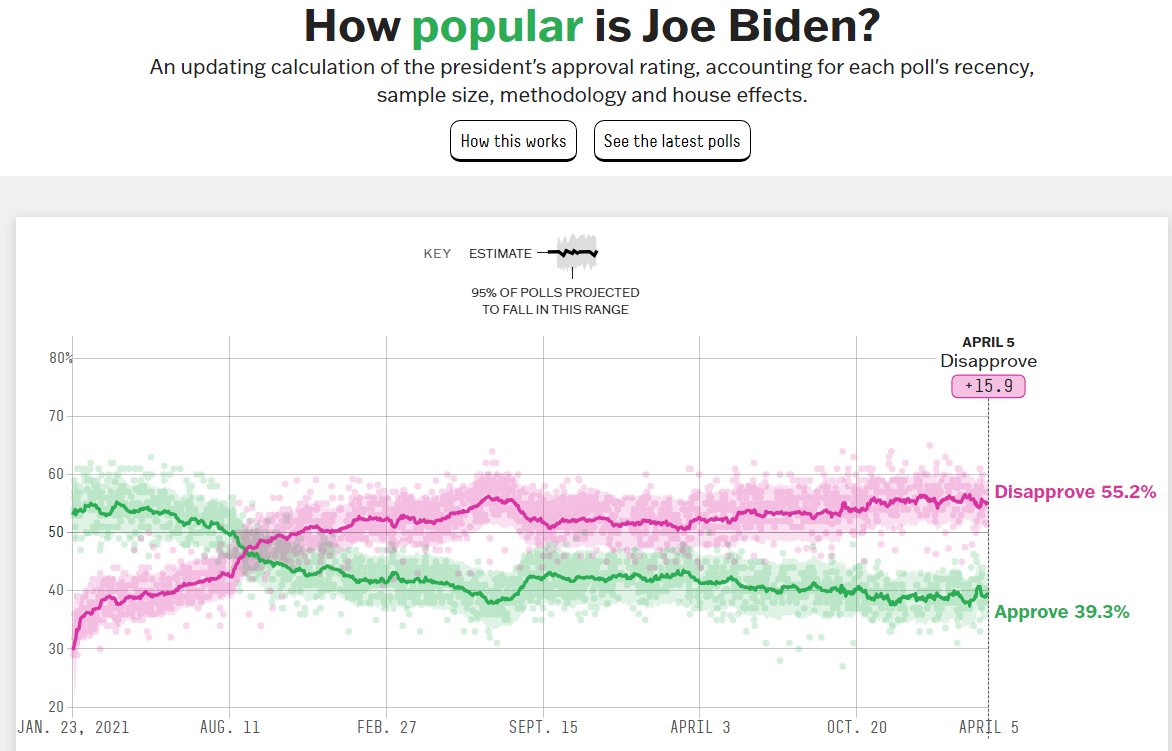
A #BadGraph (from fivethirtyeight) on the president's un/popularity. The graph would be *much* better if they would show clearly-defined yearly divisions on the time axis (who can quickly tell, at a glance, what time period is covered?)

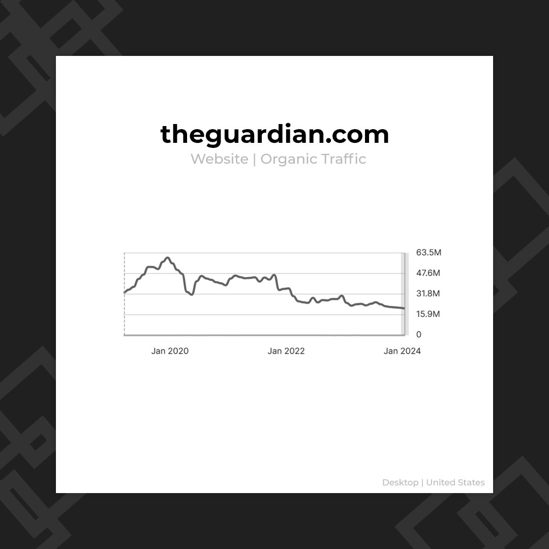
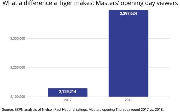
no excuse for this y axis to not start at 0 #badgraph


I’m a bit sad that I have to call out the ABS, but this is a #BadGraph. #MathsChat

It's International Day of Women and Girls in Science. The proportion of Natural and Physical science qualifications held by women has reached 50%! 🙌👩🔬🧪🔬

Another #BadGraph to watch out for...

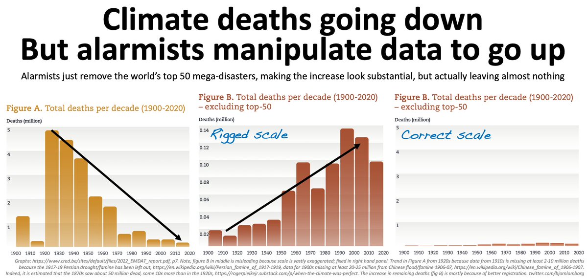
Climate alarmists are annoyed that global climate-related disaster deaths have declined dramatically Then they discovered how to cherry-pick deaths to look like they’re increasing — just remove the top 50 most deadly mega-disasters and rig the scales 🧵
This #BadGraph could easily be so much better!

Pennsylvania is on track for a major Republican victory. The gap between 2024 and 2020 is now over 600k, which almost 10% of the entire electorate!

Plot them all on a 0-100 scale, rather than auto-scaling. #BadGraph
Start that y-axis at zero for this type of data! (another #BadGraph)

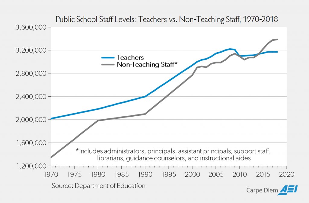
In recent years the number of non-teaching staff members overtook teaching staff members at public schools.

"We put a chart on so you KNOW its good. Goes from red to blue, even. And look at those damn PEAKS. Pretty rad, huh?"
This #BadGraph is a little deceptive ... the y-axis should start at zero.

Sorry to beat a dead horse, but can we go back to what happened here?

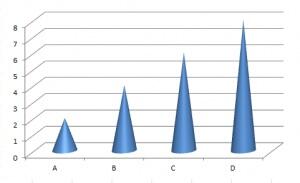
Another #BadGraph ... this 3d effect adds nothing to the graph, and makes it harder to read.

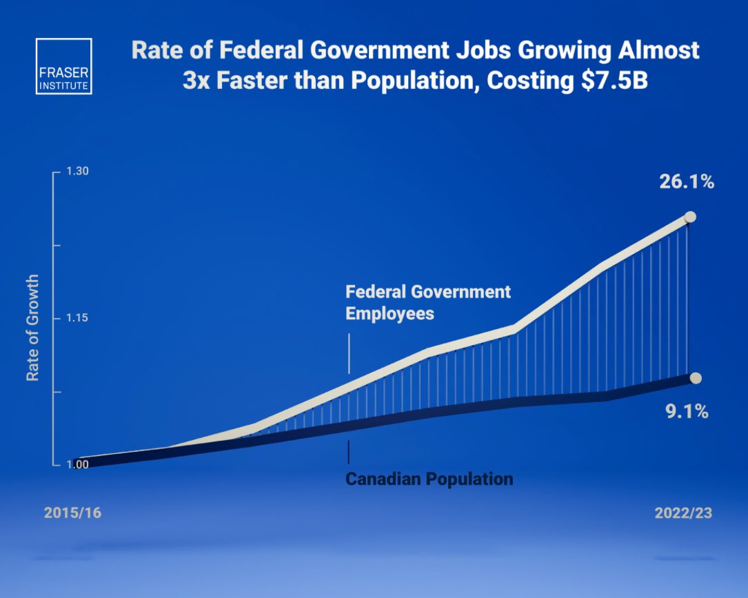
The size and cost of the federal bureaucracy is out of control. Cut, cut, cut.
An #InterestingGraph ... but also a #BadGraph. Does the line under the number, or the live over the number, correspond to the value?
Another #BadGraph ... why not put the 'Left' bars on the left side of the graph???

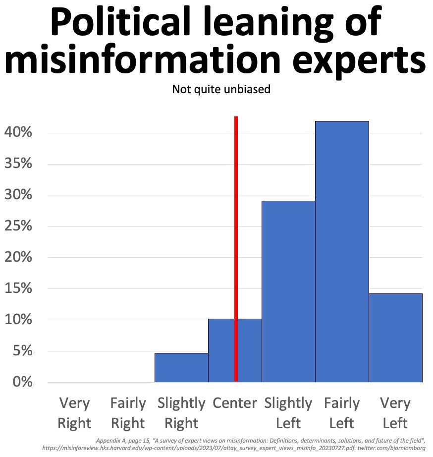
🚨Harvard surveyed 150 misinformation experts and determined they "strongly leaned toward the left of the political spectrum." Less than 5% identified as "slightly right." Do you recall when the terms misinformation and disinformation were introduced into public discourse?…
Another #BadGraph for the election. Why did they use the traditional blue/red (dem/rep) colors for years?!?

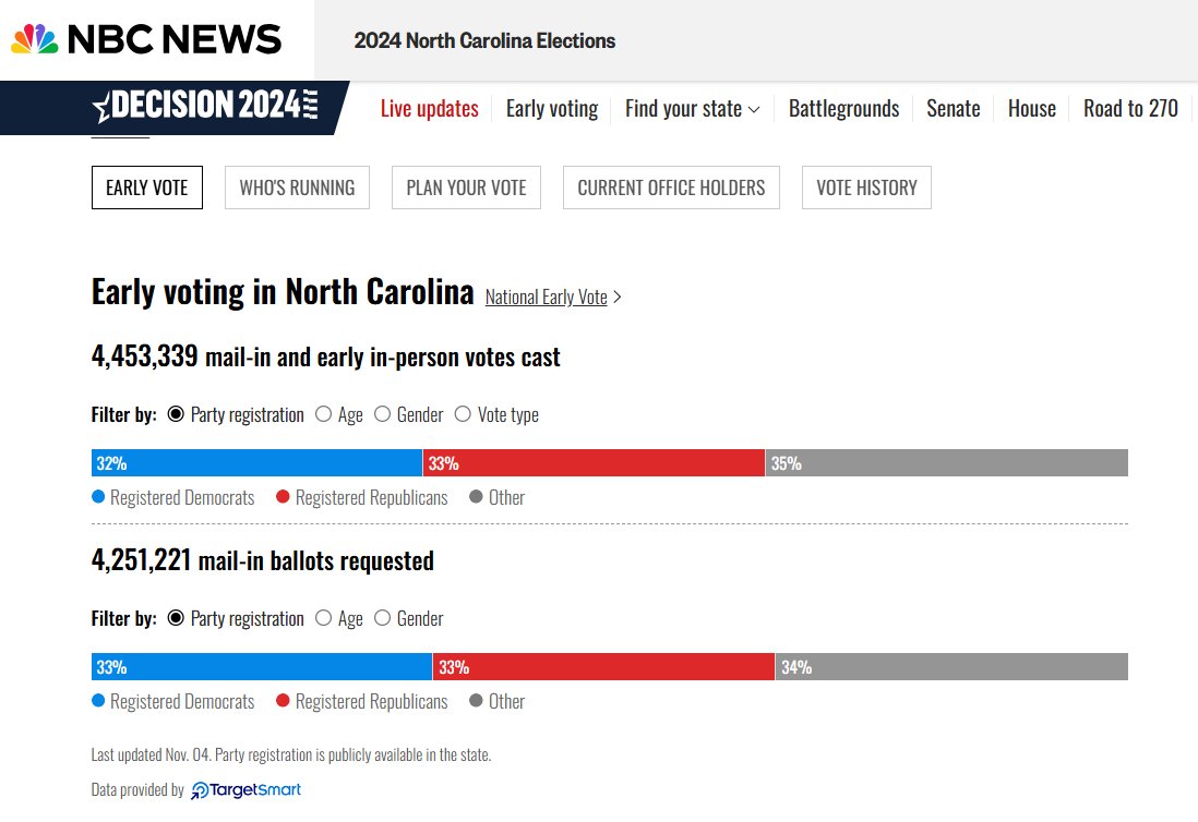
#NCEV update 10/29 am. R lead has resumed growing and is now 34k (was D lead by 316k in 2020). I think R lead would grow further to ~70k range by 11/2, but even if it doesn’t grow further, Rs are in a good place. Rs usually win the E-day vote. Trump should handily win NC.

"We put a chart on so you KNOW its good. Goes from red to blue, even. And look at those damn PEAKS. Pretty rad, huh?"
no excuse for this y axis to not start at 0 #badgraph
This is a #BadGraph
Morning reds, interesting conversation with our source yesterday They believe the Wirtz deal took so long because club had to juggle finances between Wirtz AND Isak during negotiations, so club's financial outlay aligns with their long term PSR plan Things could move very quick
Start that y-axis at zero for this type of data! (another #BadGraph)
In recent years the number of non-teaching staff members overtook teaching staff members at public schools.
Another #BadGraph ... this 3d effect adds nothing to the graph, and makes it harder to read.
The size and cost of the federal bureaucracy is out of control. Cut, cut, cut.
Yet another #BadGraph ... if they want to show the point they're making in their text ("drained half"), they need to start the y-axis at zero.

I'm going to use this obviously stupid tweet to vent that it is an under-reported scandal that Biden drained half of our Strategic Petroleum Reserve for a headline and then neglected to refill it

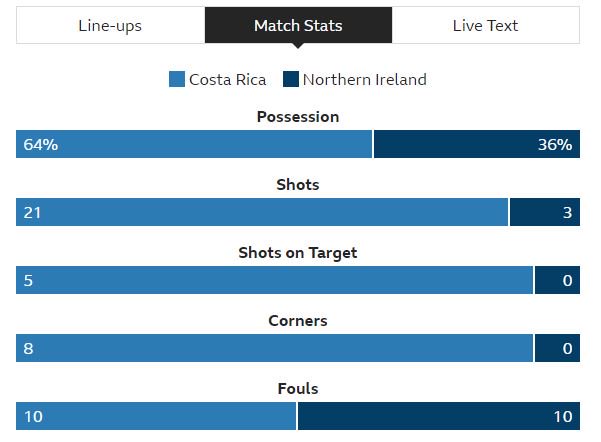
A somewhat #BadGraph ... if the red & blue bars were side-by-side, it would be much easier to compare them, which is the main purpose of the graph.

Democrats spent more than 2x what Republicans did on political advertising in swing states ($197M vs $393M)

This #BadGraph is a little deceptive ... the y-axis should start at zero.
Sorry to beat a dead horse, but can we go back to what happened here?
Another #BadGraph for the election. Why not make these bar charts, with 3 bars that can be easily compared?
Another #BadGraph for the election. Why did they use the traditional blue/red (dem/rep) colors for years?!?
#NCEV update 10/29 am. R lead has resumed growing and is now 34k (was D lead by 316k in 2020). I think R lead would grow further to ~70k range by 11/2, but even if it doesn’t grow further, Rs are in a good place. Rs usually win the E-day vote. Trump should handily win NC.
This #BadGraph could easily be so much better!
Pennsylvania is on track for a major Republican victory. The gap between 2024 and 2020 is now over 600k, which almost 10% of the entire electorate!
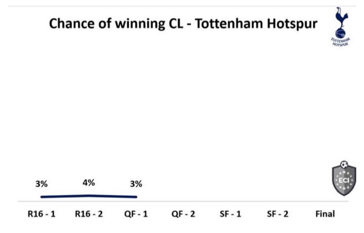
Seems like a #BadGraph -- if it's cumulative, then how did the pink area go down, right before it started climbing in the middle of the graph?


Plot them all on a 0-100 scale, rather than auto-scaling. #BadGraph
An #InterestingGraph ... but also a #BadGraph. Does the line under the number, or the live over the number, correspond to the value?
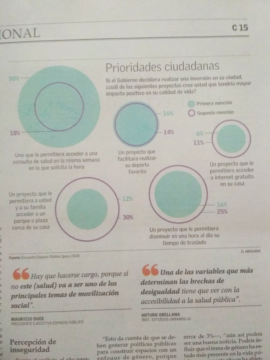
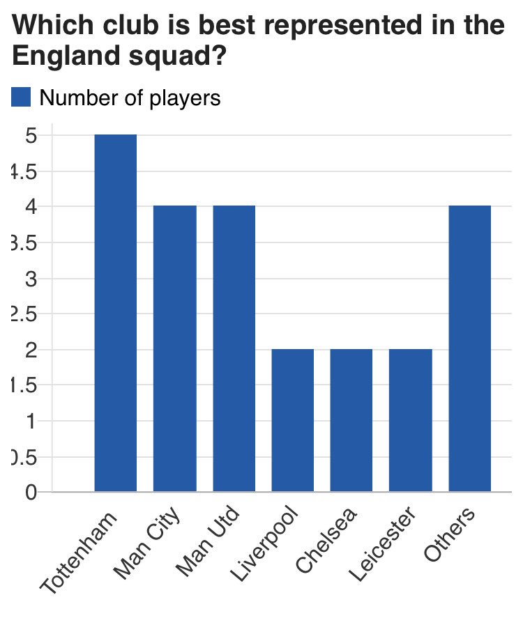
Another #BadGraph ... interesting, but bad. Why not plot the 2020 with the other 10's bars, and then make the single-year bars 'different' (maybe skinnier)...

You have to understand: China's population is declining at an accelerating rate. Each year will be like losing an entire small European country. This will change the world.

Another #BadGraph ... the y-axis in this type of graph should really start at zero. (and the numbers along the axes need to be in a larger font, so we can easily read them)

Did you know that if birth rates continue to plummet, human civilization will end?
A #BadGraph (from fivethirtyeight) on the president's un/popularity. The graph would be *much* better if they would show clearly-defined yearly divisions on the time axis (who can quickly tell, at a glance, what time period is covered?)
An interesting #BadGraph ... they don't say whether it's worldwide or just US, they don't list the data source, and the y-axis should start at zero for this kind of data.

The young arent driving, fucking, and drinking because high energy activity is fundamentally incompatible with modern ethics. If you're always told to be harmless (but also guilty!) then your innate will to power withers. You vegetate. Man, the greatest animal, turned to plant


We hate early games in Clifford. Rumour has it #Busters would only play us in that slot. We'll lick our wounds and be back. #BadGraph


Something went wrong.
Something went wrong.
United States Trends
- 1. #BaddiesUSA 58.7K posts
- 2. Rams 29.1K posts
- 3. #LAShortnSweet 20.8K posts
- 4. Scotty 9,675 posts
- 5. Cowboys 100K posts
- 6. Chip Kelly 8,542 posts
- 7. Eagles 140K posts
- 8. #TROLLBOY 1,945 posts
- 9. Raiders 67.2K posts
- 10. Stafford 14.9K posts
- 11. #ITWelcomeToDerry 15K posts
- 12. Bucs 12.2K posts
- 13. Stacey 25.5K posts
- 14. #RHOP 11.8K posts
- 15. sabrina 60.1K posts
- 16. Baker 20.8K posts
- 17. Ahna 7,013 posts
- 18. Vin Diesel 1,197 posts
- 19. billie 18.6K posts
- 20. DOGE 165K posts