#dataviz search results

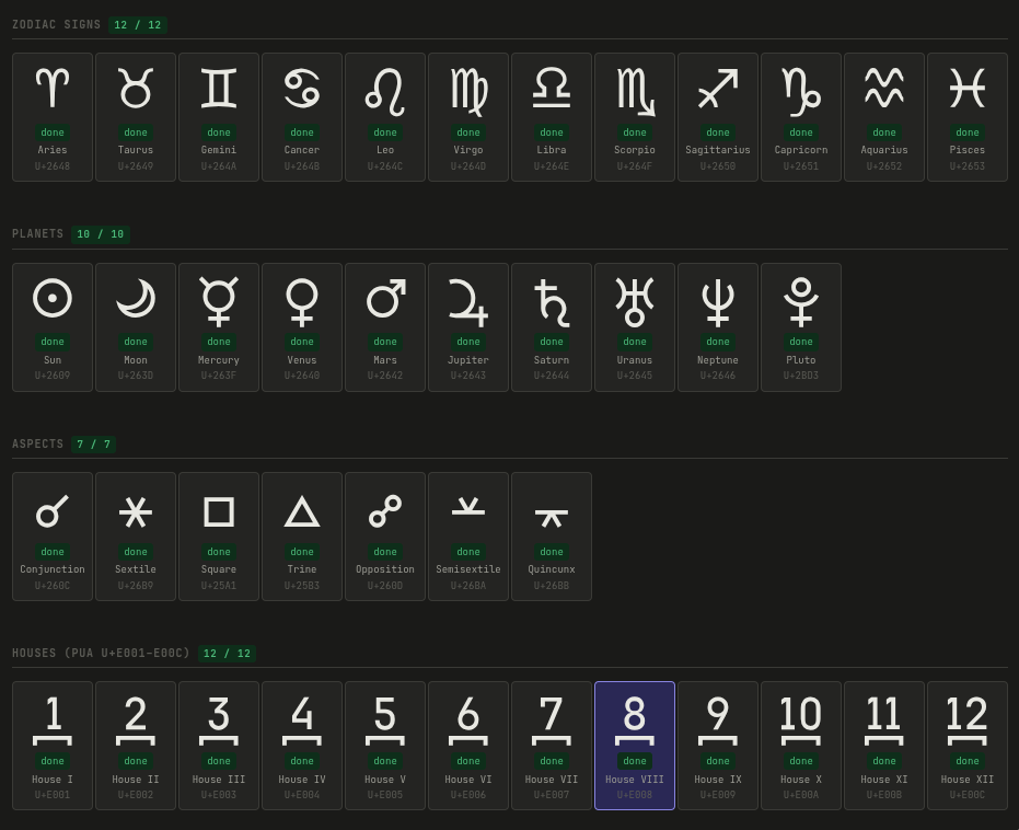
Built a monospace icon font for astrology symbols — readable at 10px. 41 glyphs, pixel-perfect on a 10px grid, JetBrains Mono metrics for easy integration. Free & open source. Live Demo: paulbunch.github.io/astropan-mono GitHub: github.com/PaulBunch/astr… #Typography #OpenSource #DataViz

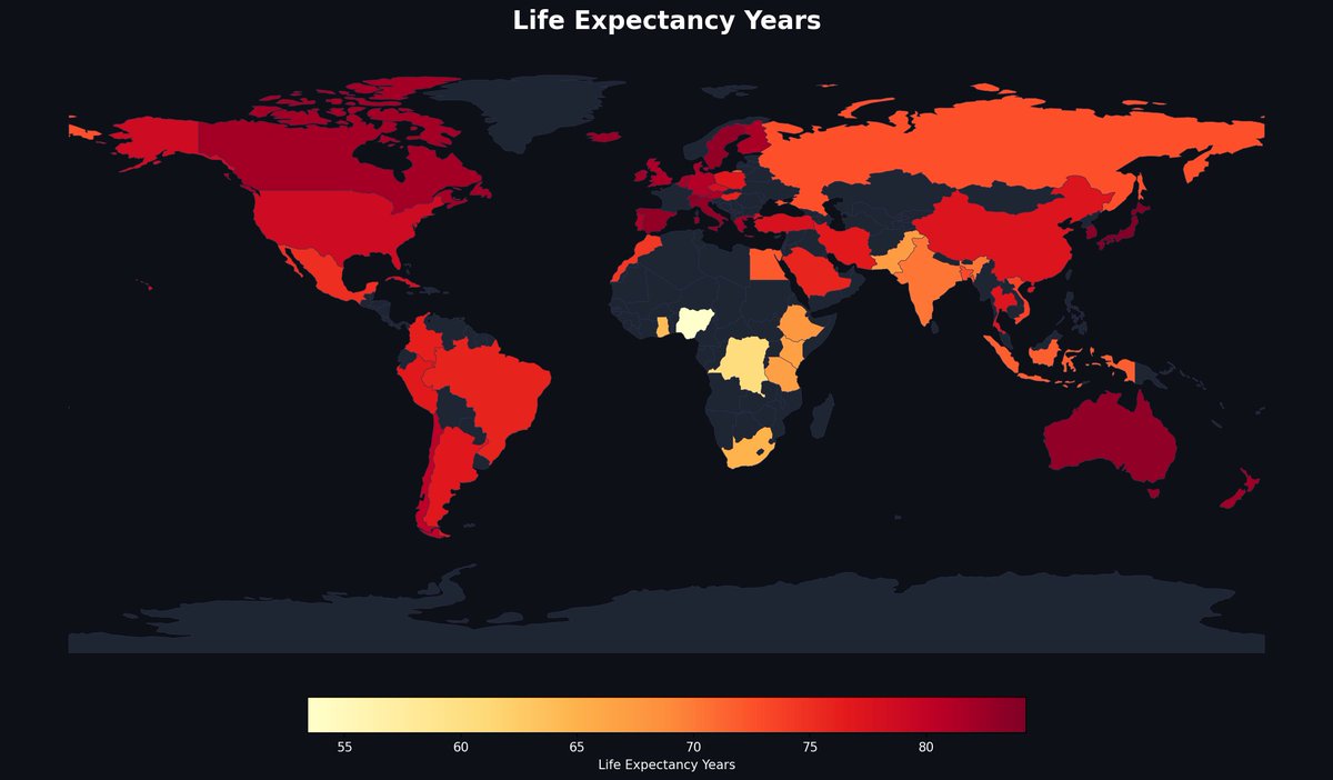
Guess which region has the highest life expectancy on this map? Russia and Central Asia lead the orange zone, topping out around 73 years — while parts of Central Africa dip below 55. — @MapPorn_Zone55 · link in bio #MapPorn #dataviz

Horror without the fluff? 🔪⏳ I’ve visualized 10 games that respect your time and get straight to the point without unnecessary backtracking. #DataViz #Gaming #HorrorGames @DualShockers

¿Terror sin relleno? 🔪⏳ He visualizado 10 juegos que respetan tu tiempo y van directo al grano sin dar vueltas innecesarias. #Gaming #DataViz #HorrorGames


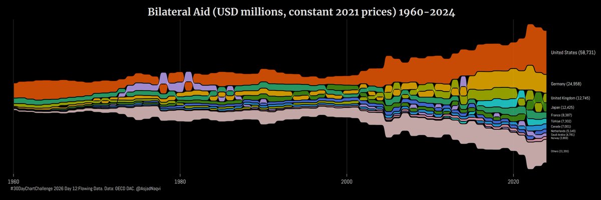
#30DayChartChallenge 2026 Day7: Multiscale The Sankey below shows the complete cycle of energy production and consumption in the #EU27 in 2024. #dataviz #stataviz #energybalances


2AM deck panic is officially cancelled. ChartGen AI turns messy data into charts, insights, and presentation-ready PPTs — before your coffee gets cold. This is what “AI for work” should feel like. #AI #Productivity #DataViz #PowerPoint #Analytics

Reciepits of Ballot Fraud: The Heritage Foundation's Election Fraud Map is an interactive tool providing a sampling of proven instances of election fraud across the U.S. From @HeritageDataviz via @Heritage electionfraud.heritage.org/case/200734 #ElectionIntegrity #DataViz


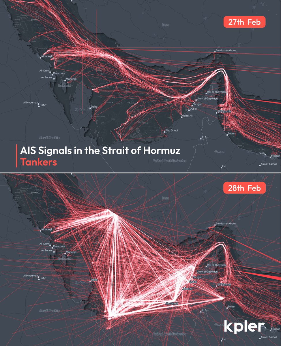
#threejs continues to impress me - protoyping some rapid-response frameworks for visualising ais data that doensn't rely on overnight renders 😅! I'm always fascinated by the pattern of activity in busy shipping locations - good candidates to test the tool! #ais #dataviz
#30DayChartChallenge 2026 Day12: Flowing Data The latest OECD aid data shows a second year of decline in bilateral aid flows in real terms. Similar contractions have happened in the past usually around other major geopolitical events. #dataviz #OECD #DAC
SpaceTimeCube: Strait of Hormuz Refined this #dataviz to explore GNSS interference + vessel movement patterns. Scrub through time to see 6hrs of AIS activity, spot outliers, and detect “non-normal” behavior. Still evolving-curious how others would use this? #ais #StraitOfHormuz
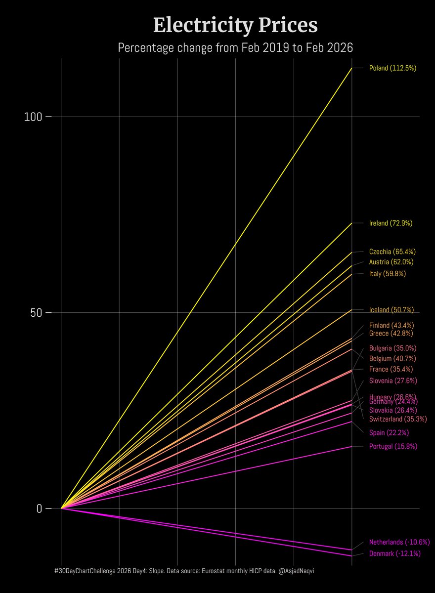
#30DayChartChallenge 2026 Day4: Slope The figure shows the change in electricity prices in selected EU countries between Feb 2019 (pre-COVID) and Feb 2026 (post geoeconomic shocks) #dataviz #Stataviz
Strait of Hormuz timelapse for vessels > 100m from 12:00 17/04 -> 07:00 18/04. Lots of u-turns last night but seemingly more activity this morning. Interesting to see how this unfolds throughout the weekend 👀 data via @kpler #dataviz

HyperCoast now supports visualizing Wyvern hyperspectral data with only one line of code. GitHub: github.com/opengeos/Hyper… Notebook example: hypercoast.org/examples/wyvern #hyperspectral #hypercoast #dataviz

2AM deck panic is officially cancelled. ChartGen.AI turns messy data into charts, insights, and presentation-ready PPTs — before your coffee gets cold. This is what “AI for work” should feel like. #AI #Productivity #DataViz #PowerPoint #Analytics
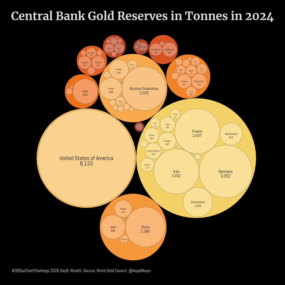
#30DayChartChallenge 2026 Day9: Wealth. The figure shows the stock of gold reserves in tonnes held by central banks at the end of 2024. Larger circles represent regions. #dataviz #stataviz

I will be presenting at this cool Data x Storytelling Webinar: How data evolves from numbers → insight → immersive understanding. Join us next week online! Register for 3D maps, data visualisation, GeoAi & more ⬇️ #Dataviz #GIS


My Project 1 is coming along! 📉 Exploring data visualization with @MSPowerBI Still refining the design, but the insights are already flowing. Any tips for a beginner? #PowerBI #DataViz #Microsoft365

Built a monospace icon font for astrology symbols — readable at 10px. 41 glyphs, pixel-perfect on a 10px grid, JetBrains Mono metrics for easy integration. Free & open source. Live Demo: paulbunch.github.io/astropan-mono GitHub: github.com/PaulBunch/astr… #Typography #OpenSource #DataViz
Guess which region has the highest life expectancy on this map? Russia and Central Asia lead the orange zone, topping out around 73 years — while parts of Central Africa dip below 55. — @MapPorn_Zone55 · link in bio #MapPorn #dataviz
2AM deck panic is officially cancelled. ChartGen.AI turns messy data into charts, insights, and presentation-ready PPTs — before your coffee gets cold. This is what “AI for work” should feel like. #AI #Productivity #DataViz #PowerPoint #Analytics
¿Terror sin relleno? 🔪⏳ He visualizado 10 juegos que respetan tu tiempo y van directo al grano sin dar vueltas innecesarias. #Gaming #DataViz #HorrorGames
Horror without the fluff? 🔪⏳ I’ve visualized 10 games that respect your time and get straight to the point without unnecessary backtracking. #DataViz #Gaming #HorrorGames @DualShockers
2AM deck panic is officially cancelled. ChartGen AI turns messy data into charts, insights, and presentation-ready PPTs — before your coffee gets cold. This is what “AI for work” should feel like. #AI #Productivity #DataViz #PowerPoint #Analytics
Reciepits of Ballot Fraud: The Heritage Foundation's Election Fraud Map is an interactive tool providing a sampling of proven instances of election fraud across the U.S. From @HeritageDataviz via @Heritage electionfraud.heritage.org/case/200734 #ElectionIntegrity #DataViz
#30DayChartChallenge 2026 Day26: Trend. This figure shows weekly deaths in Austria from 2000-2024. The COVID-19 phase (2020–2022) stands out with high and prolonged spikes in deaths. The trends have reverted back but still remain slightly elevated. #dataviz #stataviz

#30DayChartChallenge 2026 Day25: Space. #Austria has an area of 83,879 sq km. 64% is woodland, 28% is cropland, and 8% is buildup area. The rest are wetlands. Cereals occupy a bit over 17%, and vineyards are ~1% of total area. #dataviz


Advanced Power BI: Expert Data Analysis and Visualization ⏱️ 7.8 hours ⭐ 4.48 👥 32,109 🔄 Nov 2025 💰 $17.99 → 100% OFF comidoc.com/udemy/advanced… #PowerBI #DataAnalysis #DataViz #udemy


📊 Make Your Data Speak! AA Simple Chart Display for Joomla brings your numbers to life with 6 sleek, interactive charts powered by Chart.js ⚡ Fast. Responsive. Beautiful. 🔗 aaextensions.com/product/aa-sim… #Joomla #DataViz #WebDesign #Trending

My Project 1 is coming along! 📉 Exploring data visualization with @MSPowerBI Still refining the design, but the insights are already flowing. Any tips for a beginner? #PowerBI #DataViz #Microsoft365

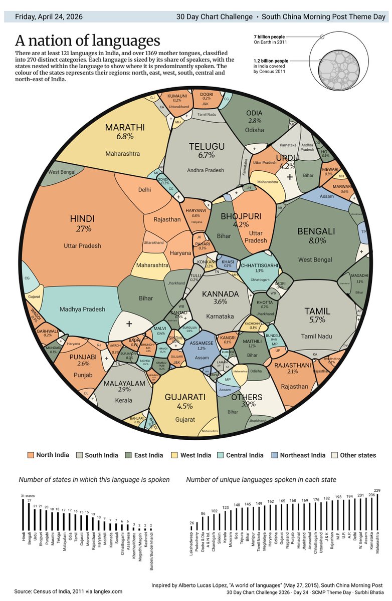
#Day24: South China Morning Post Theme Day इনடఇಅ/India, a living mosaic of diverse languages. Inspired by @aLucasLopez's genius: multimedia.scmp.com/culture/articl… @SCMPgraphics #30DayChartChallenge #dataviz
Surprisingly, the US outranks most of Western Europe on GDP per capita — hitting ~$80,000, while much of the EU sits in the pale yellow range. — @MapPorn_Zone55 · link in bio #MapPorn #dataviz


PivotTable.js vs @WebDataRocks: which one fits your project better? If you need faster integration, a modern UI, and smoother data handling, check our new comparison👇 webdatarocks.com/blog/updating-… #DataViz #JavaScript


Look at the stars... 🌟🌌 120,000 real stars from the HYG catalog, rendered in 3D. Every point is a real star, positioned in space relative to our Sun. Impressive where a .csv and ~2 hours with Claude Code can get you nowadays. stars.dataviz.ar #DataViz #AI #React
The US makes this list — and it's not even close to #1. The real winner has more languages than most continents combined. — @MapPorn_Zone55 · link in bio #MapPorn #dataviz


![dataviztools's profile picture. a curated guide to the best tools and resources for data visualization and interactive storytelling. [curated by @carlvlewis, seeking others!]](https://pbs.twimg.com/profile_images/797970304513540096/bbHxXaEf.jpg)


#30DayChartChallenge 2026 Day26: Trend. This figure shows weekly deaths in Austria from 2000-2024. The COVID-19 phase (2020–2022) stands out with high and prolonged spikes in deaths. The trends have reverted back but still remain slightly elevated. #dataviz #stataviz

Grafana — Guide to practical Data Analytics, interactive Dashboards, and Observability [2nd edition]: amzn.to/44lxhLP v/ @PacktDataML ———— #CDO #BI #DataViz #ML #TimeSeries #Monitoring #IoT #IIoT #DataEngineering
![KirkDBorne's tweet image. Grafana — Guide to practical Data Analytics, interactive Dashboards, and Observability [2nd edition]: amzn.to/44lxhLP v/ @PacktDataML
————
#CDO #BI #DataViz #ML #TimeSeries #Monitoring #IoT #IIoT #DataEngineering](https://pbs.twimg.com/media/HDeD-agW4AAyezy.jpg)
#30DayChartChallenge 2026 Day25: Space. #Austria has an area of 83,879 sq km. 64% is woodland, 28% is cropland, and 8% is buildup area. The rest are wetlands. Cereals occupy a bit over 17%, and vineyards are ~1% of total area. #dataviz
#30DayChartChallenge 2026 Day9: Wealth. The figure shows the stock of gold reserves in tonnes held by central banks at the end of 2024. Larger circles represent regions. #dataviz #stataviz
#30DayChartChallenge 2026 Day7: Multiscale The Sankey below shows the complete cycle of energy production and consumption in the #EU27 in 2024. #dataviz #stataviz #energybalances
This is a beautiful, extraordinarily well published book: "Better Data Visualizations" by @jschwabish 🌟🌟🌟🌟🌟 See all his books: amzn.to/48VYd5s ———————— #DataViz #BI #DataStorytelling #Statistics #DataScience #DataScientist

#30DayChartChallenge 2026 Day4: Slope The figure shows the change in electricity prices in selected EU countries between Feb 2019 (pre-COVID) and Feb 2026 (post geoeconomic shocks) #dataviz #Stataviz
I will be presenting at this cool Data x Storytelling Webinar: How data evolves from numbers → insight → immersive understanding. Join us next week online! Register for 3D maps, data visualisation, GeoAi & more ⬇️ #Dataviz #GIS

Build this Calendar Picker in Power BI 100% Native ✅ Follow for more Power BI tips & tricks 🙌🏻 #powerbi #dataviz #ux #reportdesign


Visualize This — The FlowingData Guide to Design, Visualization, and Statistics (2nd Ed.): amzn.to/440tCTm by @FlowingData 🌟📊📈 —————— #BI #DataViz #DataScience #DataScientist #DataStorytelling

#30DayChartChallenge 2026 Day12: Flowing Data The latest OECD aid data shows a second year of decline in bilateral aid flows in real terms. Similar contractions have happened in the past usually around other major geopolitical events. #dataviz #OECD #DAC

Customizing #Esri Vector Basemaps: Updates tinyurl.com/2ha9y2w6 #DataViz #GIS #arcgis #mapping #maps @esri @EsriFederalGovt @EsriSLGov @ArcGISOnline @URISA


ATTN all #genomics, #datascience, and #dataviz enthusiasts Checkout the latest #openaccess repository of publicly available genomic datasets for plants and animals built on #FAIR data sharing principles. Paper in #G3journal: 🔗 buff.ly/4HLehT5

Building on the previous visual, this static view of pre-processed AIS tanker data (27–28 Feb) exposes where interference is most aggressive. An eye-opener for the navigational complexity it introduces in the Strait of Hormuz. #AIS #StraitOfHormuz #DataViz

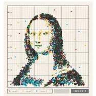
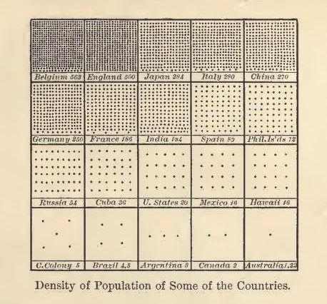
Had to think of this cool vintage graphic from 1906. I love how it displays population density in a beautifully simple way. Best practice #dataviz if you ask me. Source: buff.ly/3AA35vO
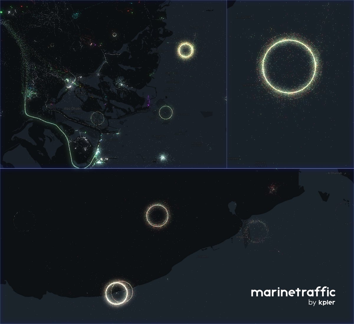
Lots of talk around GNSS interference this week in the Strait of Hormuz and many of our animations at @Kpler show the effect via timelapse but seeing those "interference vortex" in a static view is fascinating... ais data via @MarineTraffic #ais #dataviz #StraitofHormuz

Los datos perfectos solo existen en la presentación del cliente, los resultados reales empiezan cuando aceptas el caos. Utiliza datos reales para aprender, practicar o crear tu portfolio de análisis de datos. Te dejo mi lista de favoritos:👇 #dataviz #stats #Analytics #ML #ai


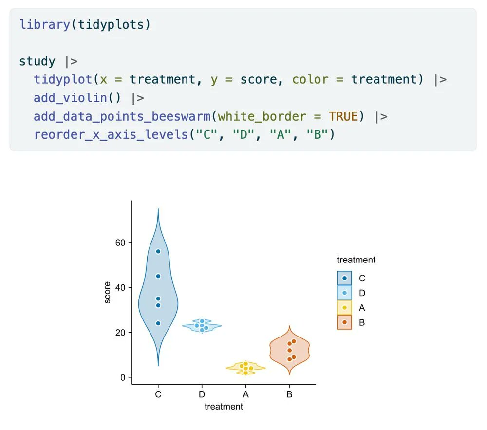
This is the anatomy of #tidyplots 🩻 They come in 50 x 50 mm, but can be resized to your linking using `adjust_size()` 🧰 #rstats #dataviz #phd

Something went wrong.
Something went wrong.
United States Trends
- 1. Aaron Nola N/A
- 2. Cole Allen N/A
- 3. Secret Service N/A
- 4. Damon N/A
- 5. White House N/A
- 6. The Bruins N/A
- 7. Jimmy Kimmel N/A
- 8. Dana Bash N/A
- 9. Chris Sale N/A
- 10. Luis Gil N/A
- 11. WHCD N/A
- 12. Mobley N/A
- 13. Ballroom N/A
- 14. Doan N/A
- 15. Michkov N/A
- 16. Caltech N/A
- 17. McAvoy N/A
- 18. Quintana N/A
- 19. Hampus Lindholm N/A
- 20. #ENHYPEN_Bloom_As_SevEN N/A