#dataplotly 검색 결과

📊 Fin de notre série #QGIS + #DataPlotly sur sigterritoires.fr ! 📄 1. Intégrer des graphiques dans un Atlas PDF 📈 2. Construire un tableau de bord interactif dans QGIS 🔗 sigterritoires.fr #SIG #DataViz #OpenSource


Plotly: crea gráficos interactivos con datos espaciales rviv.ly/7s5Z1u #DataPlotly #matplotlib #Plotly #Python

Plotly: crea gráficos interactivos con datos espaciales rviv.ly/7s5Z1u #DataPlotly #matplotlib #Plotly #Python
Cómo crear #gráficos en #QGIS con Data Plotly mappinggis.com/2020/04/como-c… #dataplotly #diagramas


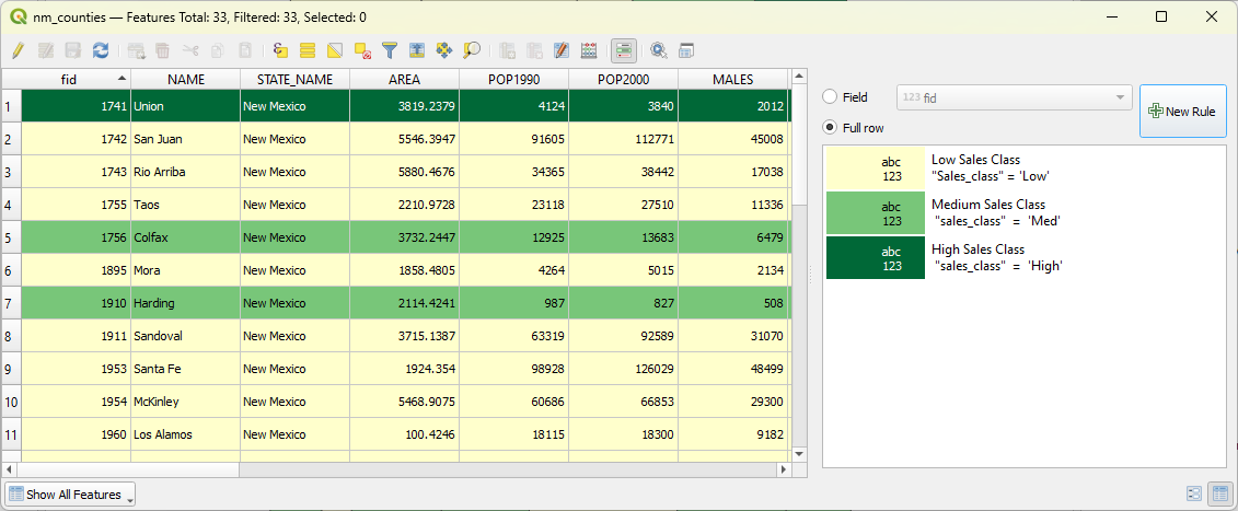
Day 6 #30DaysofDQ3x2nd Part 2 Ex#2 you learn to work with tables. Use SQL to query features by attributes, query by location, add/remove fields, calculate values, use case statements, generate histograms, create charts via #DataPlotly & set up conditional table formatting #QGIS


And the legend of the resulting #DataPlotly pie chart can now be easier matched with the legend of a layer in #QGIS 3.26+! youtu.be/Q_8DmhgrD1s

youtube.com
YouTube
Match QGIS Data Plotly Legend with Colours of the Layer (Update)
👉L'intervento di @ghtmtt al @foss4g , fatto insieme a @etrimaille di #3Liz ha evidenziato delle novità in campo #DataPlotly in #Lizmap, tra le quali molti miglioramenti e nuovi stimoli per continuare a sviluppare nuove features.
A great result from the #QGIS Contributor Meeting in Firenze: easily use the colours of a layer for the legend of #DataPlotly plugin plots. Thanks a lot @ghtmtt @nyalldawson @etrimaille! #FOSS4G
Cómo crear #gráficos en #QGIS con Data Plotly mappinggis.com/2020/04/como-c… #dataplotly #diagramas

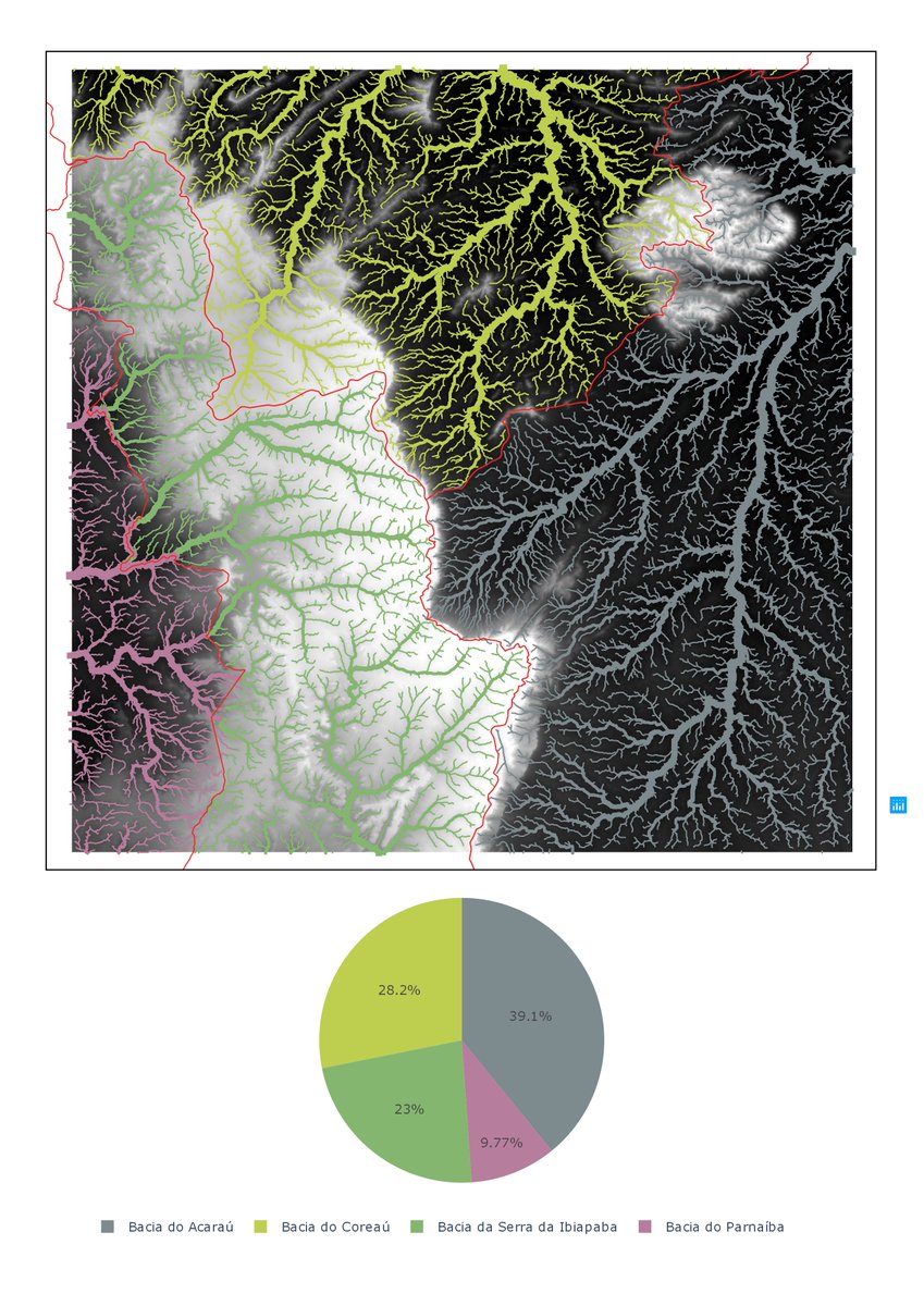
Loyout tá simples mas o importante é ressaltar consegui fazer o gráfico pelo #DataPlotly no @qgis com as mesmas cores das feições de referencia. A drenagem tá dividida considerando a bacia e a classificação de strahler

And the corresponding #DataPlotly in #QGIS box plots show the slight increases in the #ClimaticClimateChange(s) of the containing set of *30-year max temp geographically scalar climatic objects* (1992–2021) Climate & #NMFire


Gosh Sorry for so many mistakes yesterday and last night Here again is the #DataPlotly in #QGIS box plot for this set of *geographically scalar max temp climatic objects* (1992–2021) containing the area of the #HermitsPeakFire/#CalfCanyonFire as of yesterday morning, 11 May 2022
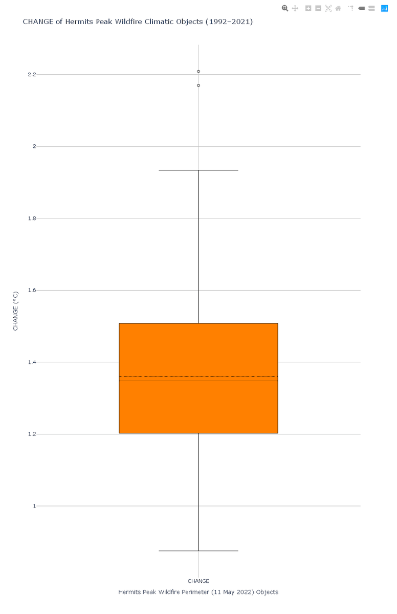
Here is a #DataPlotly in #QGIS box plot of that small set of Spring (MAMJ) climatic objects containing the #CalfCanyonFire #HermitsPeakFire The two suspected outliers are the objects in the northwest which underwent 1.67 and 1.65 °C warming over the last thirty years

In Chapter 6 on the calculation of the percentage of land cover per subcatchment, we have added the steps to match the colours of the #dataplotly pie chart with the legend of the layer. 5/9
Cómo crear #gráficos en #QGIS con Data Plotly mappinggis.com/2020/04/como-c… #dataplotly #diagramas

Tutorial showing how to make a simple and dynamic color map with #charts in QGIS by @underdarkGIS The purpose of this tutorial is to show how to make a design map using #QGIS and #DataPlotly with the use of variables. Vía #boletínNosolosig anitagraser.com/2022/04/21/dyn…
anitagraser.com
Dynamic Infographic Map Tutorial
This is a guest post by Mickael HOARAU @Oneil974 As an update of the tutorial from previous years, I created a tutorial showing how to make a simple and dynamic color map with charts in QGIS. In th…

The tutorial is available, thanks @underdarkGIS for sharing, hosting and her really inspiring work on anitagraser.com #QGIS #Dataplotly #QuickOSM


And the usual accompanying #DataPlotly in #QGIS box plots for NE's cooling and warming object sets It's a relief sometimes to get back out onto the Plains where the geographically scalar climatic objects are big and the gaps between their medians and means closes somewhat

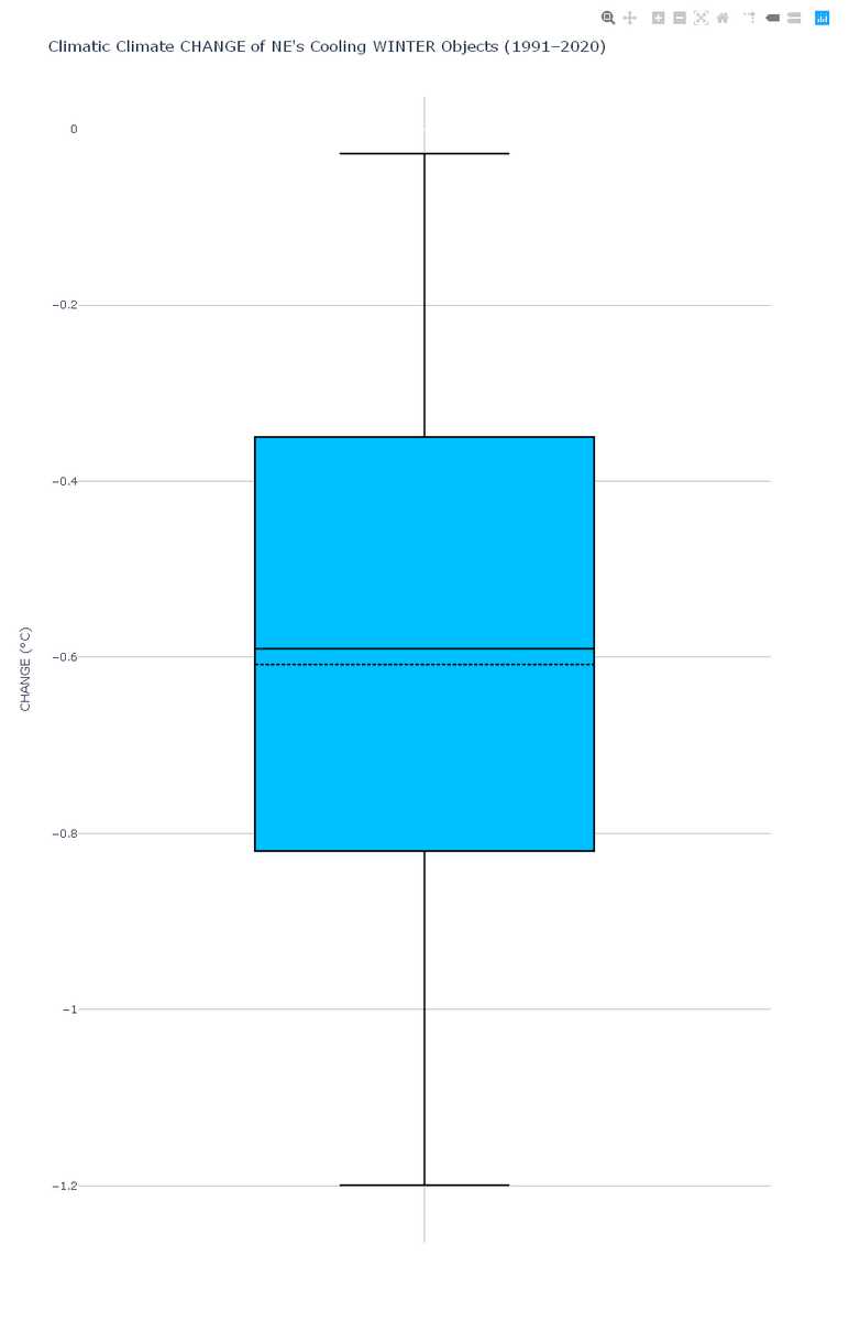
And the usual accompanying #DataPlotly in #QGIS box plots for those that are interested in the range of #ClimaticClimateChange in CO winters


Something went wrong.
Something went wrong.
United States Trends
- 1. D’Angelo 279K posts
- 2. Brown Sugar 20.4K posts
- 3. Pentagon 109K posts
- 4. Young Republicans 13K posts
- 5. #PortfolioDay 15.7K posts
- 6. Politico 166K posts
- 7. Scream 3 N/A
- 8. Drew Struzan 27.3K posts
- 9. Big 12 N/A
- 10. Black Messiah 10.5K posts
- 11. Venables 3,552 posts
- 12. Soybeans 4,891 posts
- 13. Merino 13.8K posts
- 14. World Cup 333K posts
- 15. Voodoo 21.2K posts
- 16. Baldwin 20.8K posts
- 17. David Bell N/A
- 18. Jeff Albert N/A
- 19. Presidential Medal of Freedom 58.2K posts
- 20. VPNs 1,444 posts