#nanoucodingcy risultati di ricerca


Beautiful Conic Gradient 👇🏻 Code: div { background-image: conic-gradient(aqua, deeppink, orange, aqua); width: 400px; height: 400px; border-radius: 50%; } #nanoucodingcy

Pure CSS Drop 💧 #nanoucodingcy .drop { background: linear-gradient(220deg, #affbff 10%, #0093b1 100%); border-radius: 50% 0% 50% 50%; box-shadow: inset 10px -5px 2px 3px rgba(0,0,0,0.1), inset -15px -5px 2px 5px rgba(255,255,255,0.1); transform: rotate(-45deg); }

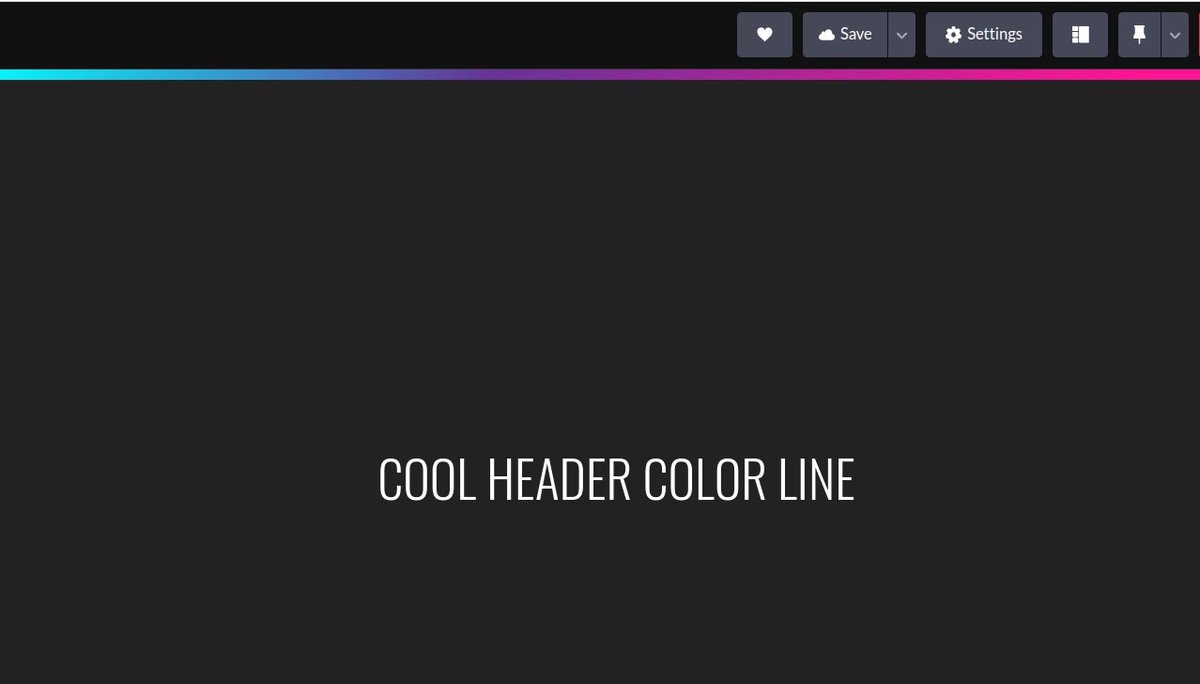
Easiest Header Line to use in your projects or portfolio! .header { position: relative; height: 10px; background: linear-gradient(141deg, cyan 0%, rebeccapurple 40%, deeppink 90%); } #nanoucodingcy
Day 7: 📱 Mobile-Centered Elements: When working on responsive design, use media queries to adjust your centering techniques for different screen sizes. #nanoucodingcy
Most Important CSS Properties to help you build a website 👇 #nanoucodingcy 🖌 Background-color 📝 Margin 📝 Padding 🐁 Cursor 🆗️ Font-size 🆗️ Font-family 🖱 :hover 🎨 Color 🔥 Display 🌠 Opacity 📏 Width 📏 Height 🔳 Border ⏺ Border-radius 🚀 Float 🔠 Letter-spacing…
CSS 3D Transform using perspective 👇 .red { width: 100px; background-color: red; height: 100px; transform: perspective(400px) rotateY(45deg); } #nanoucodingcy
Super easy Triangle Background! ✏️ Code: body { margin: auto; } div { width: 100vw; height: 100vh; } .triangle:after { content: ' '; position: absolute; border-top: 100vh solid #63B7B7; border-right: 100vw solid orange; } #nanoucodingcy
Difference between: width: 100%; and width: auto; .box1 p { background: white; border: 2px solid black; padding: 1em; width: 100%; } .box2 p { background: white; border: 2px solid black; padding: 1em; width: auto; } #nanoucodingcy
Find a Remote job, here 👇 🌐 Upwork 🌍 Freelancer 🎨 Fiverr 💼 Remote .co 🔍 FlexJobs 💻 We Work Remotely 🚀 GitHub Jobs 😇 AngelList 🔎 Indeed #nanoucodingcy
Day 8: 🌐 Centering a Block of Text: For text centering, apply "text-align: center;" to the parent element containing the text. #nanoucodingcy
HTML/CSS project ideas 🌻 #nanoucodingcy 📰 Image generator website 🧮 Random numbers generator ✏️ Personal Portfolio 🔥 Weather landing page 📞 Contact form ☕️ Dev Resume 🪐 3D Model Solar System 📹 Video Background Site 🎨 Album Layout
Day 2: 🎯 Centering Vertically: For vertical centering, you can use "display: flex;" on the parent container and "align-items: center;" to center child elements vertically. #nanoucodingcy
Day 9: 🔍 Centering with CSS Transforms: Transforms like "translate" can also be used for centering. Apply "transform: translate(-50%, -50%);" to horizontally and vertically center an element. #nanoucodingcy
Day 6: 🔗 Grid for Centering: Grid layout also offers simple centering. Use "display: grid;" on the parent and "place-items: center;" to center child elements. #nanoucodingcy
Day 1: 💡 Centering Horizontally: To horizontally center an element, use "margin: 0 auto;" on the element. It's a quick and easy way to center block-level elements. #nanoucodingcy
Day 3: 🌟 Centering Both Horizontally and Vertically: To center an element both horizontally and vertically, combine the "flex" method for the parent and "margin: auto;" for the child element. #nanoucodingcy
Day 5: 📐 Centering an Element with Absolute Positioning: For precise control, use "position: absolute;" along with "top: 50%;" and "left: 50%;" to center elements within a relative parent. Then, adjust with negative margins. #nanoucodingcy
CSS 3D Transform using perspective 👇 .red { width: 100px; background-color: red; height: 100px; transform: perspective(400px) rotateY(45deg); } #nanoucodingcy
Super easy Triangle Background! ✏️ Code: body { margin: auto; } div { width: 100vw; height: 100vh; } .triangle:after { content: ' '; position: absolute; border-top: 100vh solid #63B7B7; border-right: 100vw solid orange; } #nanoucodingcy

Find a Remote job, here 👇 🌐 Upwork 🌍 Freelancer 🎨 Fiverr 💼 Remote .co 🔍 FlexJobs 💻 We Work Remotely 🚀 GitHub Jobs 😇 AngelList 🔎 Indeed #nanoucodingcy
Beautiful Conic Gradient 👇🏻 Code: div { background-image: conic-gradient(aqua, deeppink, orange, aqua); width: 400px; height: 400px; border-radius: 50%; } #nanoucodingcy
Pure CSS Drop 💧 #nanoucodingcy .drop { background: linear-gradient(220deg, #affbff 10%, #0093b1 100%); border-radius: 50% 0% 50% 50%; box-shadow: inset 10px -5px 2px 3px rgba(0,0,0,0.1), inset -15px -5px 2px 5px rgba(255,255,255,0.1); transform: rotate(-45deg); }
Easiest Header Line to use in your projects or portfolio! .header { position: relative; height: 10px; background: linear-gradient(141deg, cyan 0%, rebeccapurple 40%, deeppink 90%); } #nanoucodingcy
Something went wrong.
Something went wrong.
United States Trends
- 1. Happy Halloween 221K posts
- 2. Dolphins 41.2K posts
- 3. YouTube TV 48.3K posts
- 4. #SinisterMinds 6,660 posts
- 5. Ryan Rollins 12.5K posts
- 6. Ravens 56.1K posts
- 7. Mike McDaniel 5,180 posts
- 8. Lamar 52.8K posts
- 9. Talbot 1,083 posts
- 10. #T1WIN 7,739 posts
- 11. Mary Ann N/A
- 12. YTTV N/A
- 13. Fiala 1,738 posts
- 14. #RUNSEOKJIN_epTOUR_ENCORE 95.3K posts
- 15. Hulu 18.9K posts
- 16. #Jin_TOUR_ENCORE 92.8K posts
- 17. #DBX4 1,831 posts
- 18. frank iero 1,755 posts
- 19. Henry 56.6K posts
- 20. Corey Perry N/A