你可能會喜歡


To perfectly understand a phenomenon is to perfectly compress it, to have a model of it that cannot be made any simpler. If a DL model requires millions parameters to model something that can be described by a differential equation of three terms, it has not really understood…

K-Means has two major problems: - Number of clusters must be known - Doesn't handle outliers But there's a solution! Introducing DBSCAN, a Density based clustering algorithm. 🚀 Read more...👇


BS DETECTION DUJOUR Fabiano must be the most stupid person to get an MD in the entire history of Medicine. R^2 = .025 as ACKNOWLEDGED by the authors of the paper. Has ZERO clinical & practical significance.


🚀 Mastering Boosting: See Functional Gradient Descent in Action If you work in data science, one of the best ways to really understand an algorithm is to implement it from scratch. Gradient Boosting Decision Trees (GBDT) – the engine behind CatBoost, XGBoost, and LightGBM –…

Many dimensionality reduction algorithms share a few central principles. 1. Construct a graph that captures the data's local structure 2. Measure "geodesic" distances between points using the graph 3. Project the points to a lower dimension while preserving these distances
The ladder of intelligence is the ladder of abstraction. L1: Memorizing answers (no generalization) L2: Interpolative retrieval of answers, pattern matching, memorizing answer-generating rules (local generalization) L3: Synthesizing causal rules on the fly (strong…

Here's a probability puzzle that breaks everyone's brain: How many people do you need in a room for a >50% chance that at least two of them share a birthday? What's your guess? 100? 150? 183? The answer is shockingly small. [1/5]

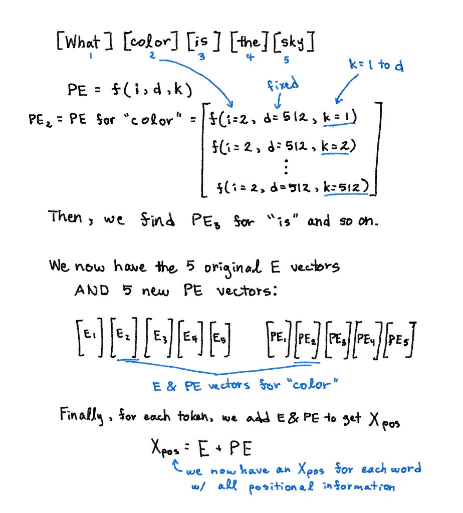
I spent months illustrating how Transformers actually work. Not just what they do, but why they’re built this way. The history, design choices, and intuition behind every layer. From RNNs → Attention → Multi-Head → FFNs → Positional Encoding. Here's everything I wish I…

In machine learning, we use the dot product every day. However, its definition is far from revealing. For instance, what does it have to do with similarity? There is a beautiful geometric explanation behind:


LLM's are just big language models. And language models are pretty easy to understand:

Zero-sum games are where one player's gain is an opponent's loss. This is the core concept behind Generative Adversarial Networks (GANs) in machine learning. A "Generator" network wins by creating fake data that fools a "Discriminator," whose win is catching fakes. This constant,…

The math of LLMs is a fusion of three key areas: 1) Probability: They are massive statistical models that predict the next word based on the probability of what's come before. 2) Linear Algebra: All words and concepts are encoded as high-dimensional vectors (embeddings). The…


Why Do Language Models Hallucinate? disq.us/t/4vrk6k8
kdnuggets.com
Why Do Language Models Hallucinate? - KDnuggets
In this article, we look at five revelations from the paper "Why Do Language Models Hallucinate?"


Recordeu que si no feu res les vostres dades de X (piulades, likes i altres), l'Elon Musk les fa servir per entrenar el seu Grok, que és la seva joguina d'IA generativa. Cal que ho desactiveu anant a {Configuació i assistència}{Privacitat i seguretat}{Personalització de Grok}


In Germany, a Muslim woman gets furious when she sees two younger girls without hijab. They respond: “This is a public place in Germany. People can kiss, drink, dress, and do whatever they want. If you don’t like it, go somewhere else!”

No.

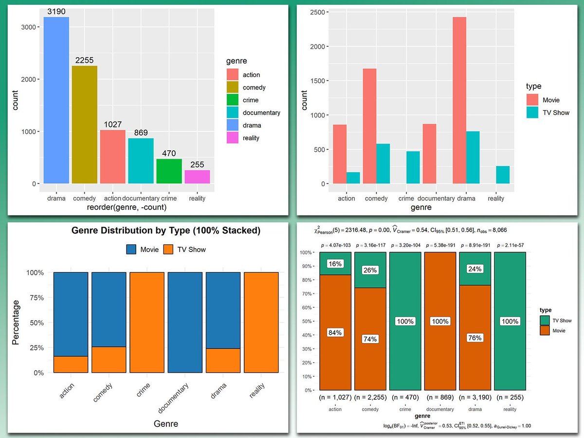
At first glance, bar charts might seem like a simple visualization type. But with a little creativity, they can be enhanced in countless ways to reveal deeper insights and make your data shine. From summarizing counts to comparing proportions, bar charts are a powerful and…


United States 趨勢
- 1. Comet 25.7K posts
- 2. Amorim 32.4K posts
- 3. Ugarte 8,035 posts
- 4. #MUFC 17.4K posts
- 5. West Ham 17K posts
- 6. #MUNWHU 6,862 posts
- 7. Manchester United 38.9K posts
- 8. Brian Cole 46.6K posts
- 9. Dorgu 4,172 posts
- 10. Eurovision 143K posts
- 11. Dalot 10.2K posts
- 12. #TrumpAffordabilityCrisis 7,900 posts
- 13. Cunha 14K posts
- 14. Sac State N/A
- 15. Brennan Marion N/A
- 16. #EndRevivalInParis 21.2K posts
- 17. Mainoo 8,213 posts
- 18. Sun Belt Billy N/A
- 19. Wan Bissaka 5,291 posts
- 20. Capitol 25.2K posts
你可能會喜歡
-
 Data Science Council of America
@DASCA_Insights -
 Cristian Ianculovici
@CrisIanculovici -
 Steve Roemerman
@SDRoem -
 Kazim Bahar
@Kazim_Bahar -
 Alexacene
@AlexaceneEra -
 Dirk Lukaschik
@Dirk_Lukaschik -
 Thomas Poetter p/acc
@ThomasPoetter -
 Paul Gurnett
@quepasachico -
 Prudence
@Kojo_p_ -
 BC
BC
@icecoldBC -
 Paul Viorel
@PaulFogoros -
 John Hassman
@JohnHassman -
 Jordi Casas-Roma
@jcasasr
Something went wrong.
Something went wrong.