
Yan Holtz
@R_Graph_Gallery
Software engineer who ❤️ #dataviz. Creator of http://data-to-viz.com and the R, Python, D3 and React graph galleries. ➡️ http://productive-r-workflow.com 📈 🌊 🍺
You might like


😅 Finally! 🍾 ➡️ 6 months of work later, I'm launching my productive-r-workflow.com project! ❤️ If you're using #Rstats for data analysis, you will very likely enjoy it! 🙏 Thanks so much to the 200+ early adopters! ⏰ Pre-launch price available until the end of the day
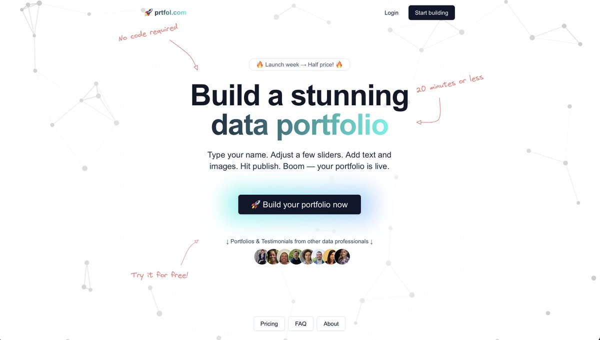
I just released prtfol.com ➡️ a tool to build a good looking portfolio in a few minutes! If your work is more or less related with #data, I think you'll like it!
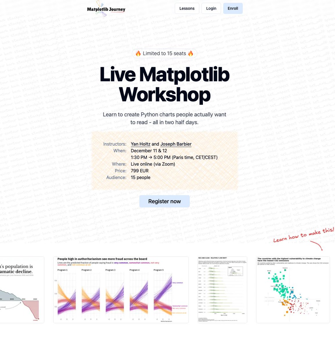
🎉 Want to build better charts with #Python and @matplotlib ? Join me and @joseph_barbier for a brand new #dataviz workshop! We’ll spend 2 half-days together, alternating between impactful explanations and hands-on exercises. Only 15 spots available! matplotlib-journey.com/workshop
Want to improve your #dataviz design eye? ➡️ I just released a little game: You have to spot the better version of a chart and learn the fundamental concepts along the way. matplotlib-journey.com/bonus/design-p… What's your score!? 😀
❌ Made a list of the 37 most common #dataviz caveats - Rank your groups - what's wrong with boxplots - Dual Y axes - overplotting - misleading error bars ... ➡️ lnkd.in/gGC5digF I'll use in my matplotlib-journey.com and ggplot2-uncharted.com Any I should add?


#dataviz is a long, iterative process. If you want to learn the required steps to create a great graph with R and ggplot2, we are building something for you with @CedScherer ! ggplot2-uncharted.com
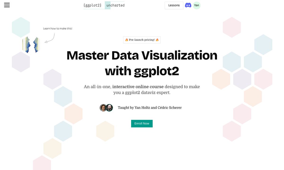
😀🍾 Big, big news!! 🎉😱 ➡️ I'm starting a new #dataviz project with @CedScherer It's an interactive online course designed to turn you into a ggplot2 dataviz expert! ➡️ ggplot2-uncharted.com Pre-launch until Sunday. If you like making charts with R, you'll love it!
New Python Tutorial: Choropleth + Histogram as a legend with @matplotlib Original work by @Koen_VdE, with Python code written by @joseph_barbier! python-graph-gallery.com/web-choropleth…

🚨 66% of R and Python users do NOT use a formatter 😳 A formatter takes messy code and automatically improves its layout: ✅ Better indentation ✅ Proper spacing ✅ Reasonable line length Poll and explanation in my latest post: 👉 blog.yan-holtz.com

"Python creates only ugly charts" ❌ I wonder how many times I've heard this wrong statement! Matplotlib is very powerful! It's not the most intuitive API, but look what Roy built after investing a few hours in matplotlib-journey.com! Code: github.com/debatreyo/mini…

🎉 10,000 people! 🍾 Every week, I share one short, impactful #dataviz tip in my newsletter. Something you can apply at work the next day. And it looks like people enjoy it: 10k joined in just a year! 😳 Huge thanks to everyone for the feedback 🙏 blog.yan-holtz.com


It's now incredibly easy to build calendar heatmaps! Thanks @joseph_barbier for your dayplot library! Documentation: josephbarbierdarnal.github.io/dayplot/tuto/a… If you like making charts with Python, come learn with us at matplotlib-journey.com!

Chord diagrams are a great way to represent flows. BUT, they become very hard to read when there are too many connections. In this chart, Ansgar Wolsing smartly used small multiples to avoid this trap Love it! ❤️ r-graph-gallery.com/best-r-chart-e…

🍾 Yay! Excited to release a new project! It's a visual exploration of our aging world. It made it to the long list for the Information Is Beautiful Awards! 🚀 Tech stack: React + D3.js, of course ❤️ react-graph-gallery.com/example/popula…
🔥 New Python library for #dataviz! "morethemes" gives your graph a better theme in 1 line of code! It currently offers 10 themes inspired by famous journals such as The Wall Street Journal, andThe Economist. Learn more: lnkd.in/eh5WGt7g Congrats @joseph_barbier !

⏰ Last call! If you want to create stunning charts with Python, there are a 8 hours left only to join Matplotlib Journey! matplotlib-journey.com Thanks so much to the 414 people who joined already! 🙏 Graph by the awesome @CedScherer, python repro by @joseph_barbier

Want to make better charts at work? Only 1 way: 🙇♀️ Practice 🤝 Get feedback ♻️ Repeat! The charts below are a glimpse of what students created in Matplotlib-Journey.com. They use the course Discord to share, get feedback, and refine their code! Only 2 days left to join🚀

Many ppl ask me why I compete with Coursera, Datacamp, Udemy.. But I create very different content! 🎮 Highly interactive 📈 Learn #dataviz AND #coding. Not just one. 👷♂️ Practice for real (like a lot!!) ⛏️ In depth: understand matplotlib for REAL matplotlib-journey.com


United States Trends
- 1. Rams 25.1K posts
- 2. Seahawks 31K posts
- 3. Commanders 103K posts
- 4. 49ers 21K posts
- 5. Lions 85K posts
- 6. Canada Dry 1,344 posts
- 7. Stafford 9,271 posts
- 8. Niners 5,192 posts
- 9. DO NOT CAVE 12.8K posts
- 10. Dan Campbell 3,332 posts
- 11. #OnePride 4,772 posts
- 12. Bills 143K posts
- 13. Cardinals 11.1K posts
- 14. Lenny Wilkens 3,190 posts
- 15. #RaiseHail 3,585 posts
- 16. Joe Whitt 1,818 posts
- 17. Daboll 15.2K posts
- 18. Gibbs 8,188 posts
- 19. Giants 71.9K posts
- 20. Vilma 2,339 posts


Something went wrong.
Something went wrong.