


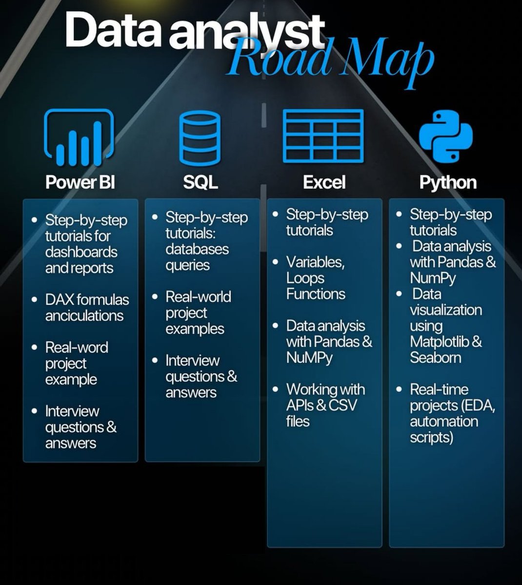
Ready to launch your career in data? 🚀 If you dream of becoming a Data Analyst but need a clear plan, this roadmap is your essential guide to success! This 6-step roadmap will help you stay employable, stand out, and thrive in the data-driven world that’s changing fast. The…


Please guys Interact with this dashboard and let me know what you think. app.powerbi.com/view?r=eyJrIjo…
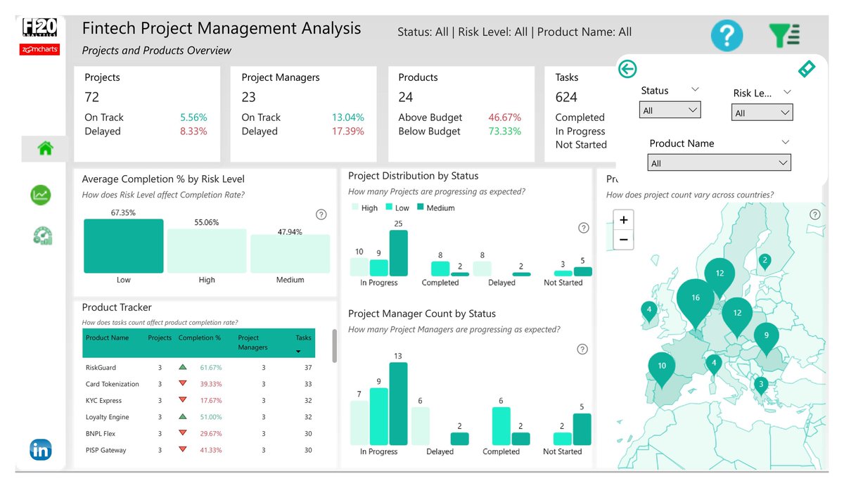
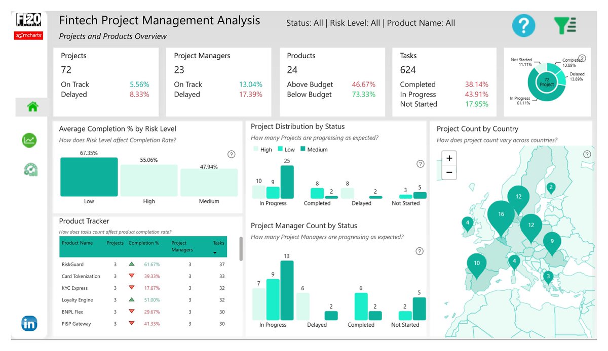
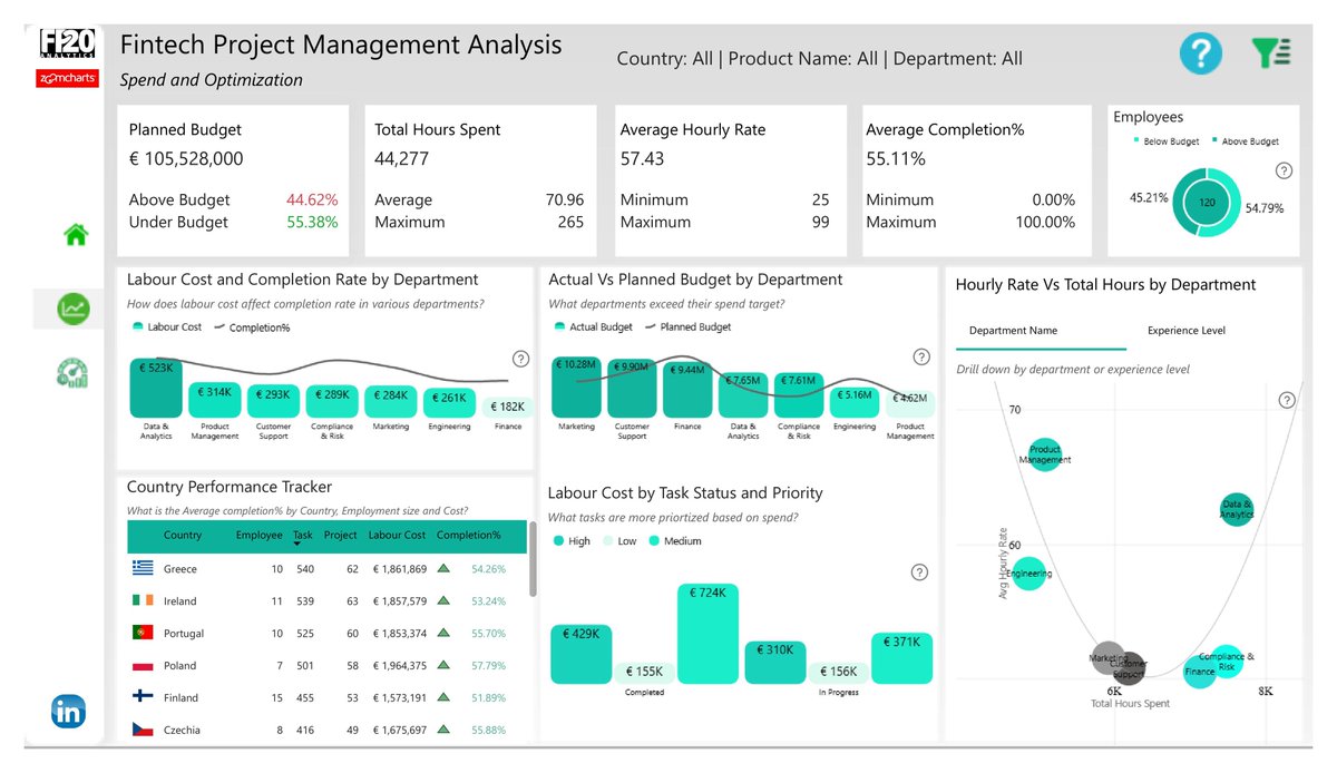


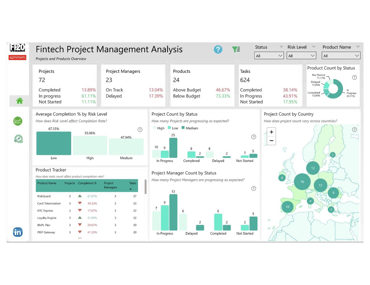
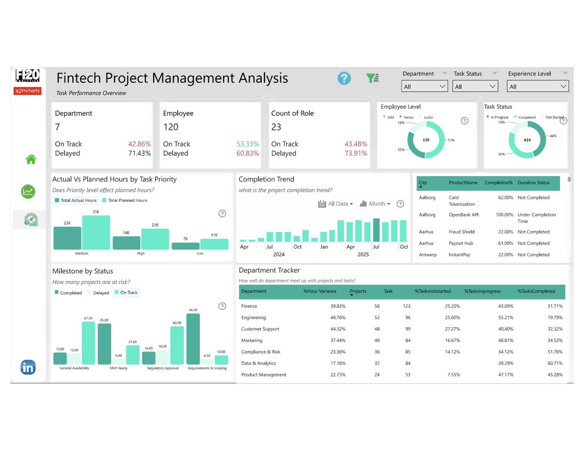
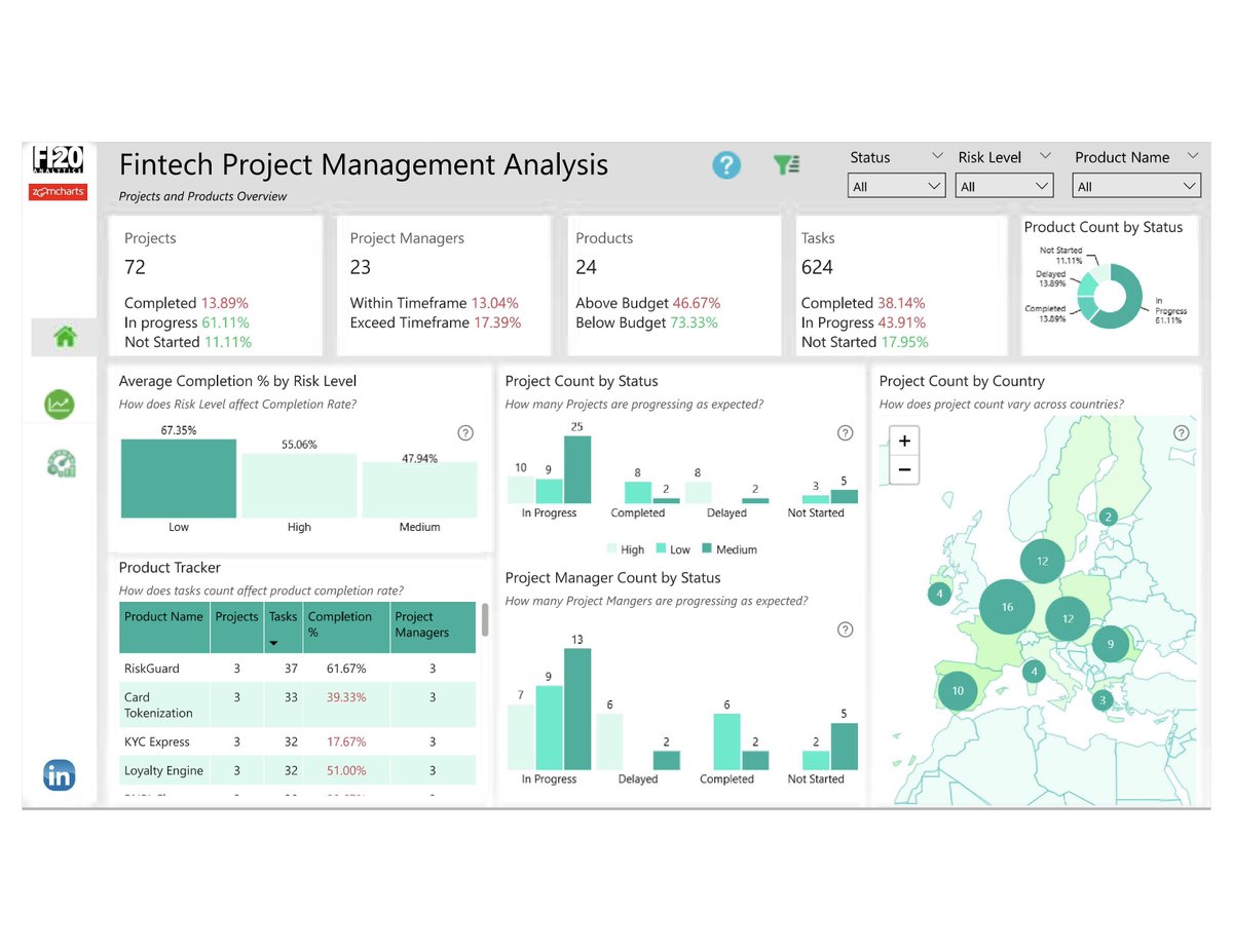
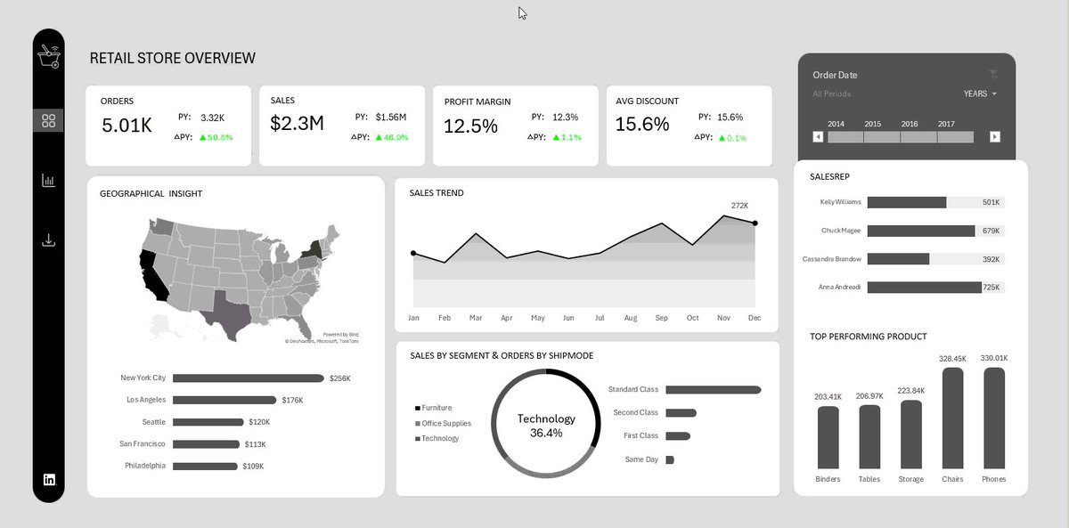
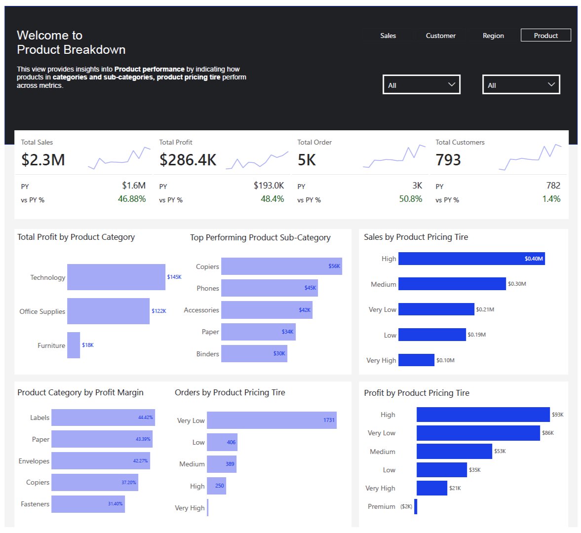
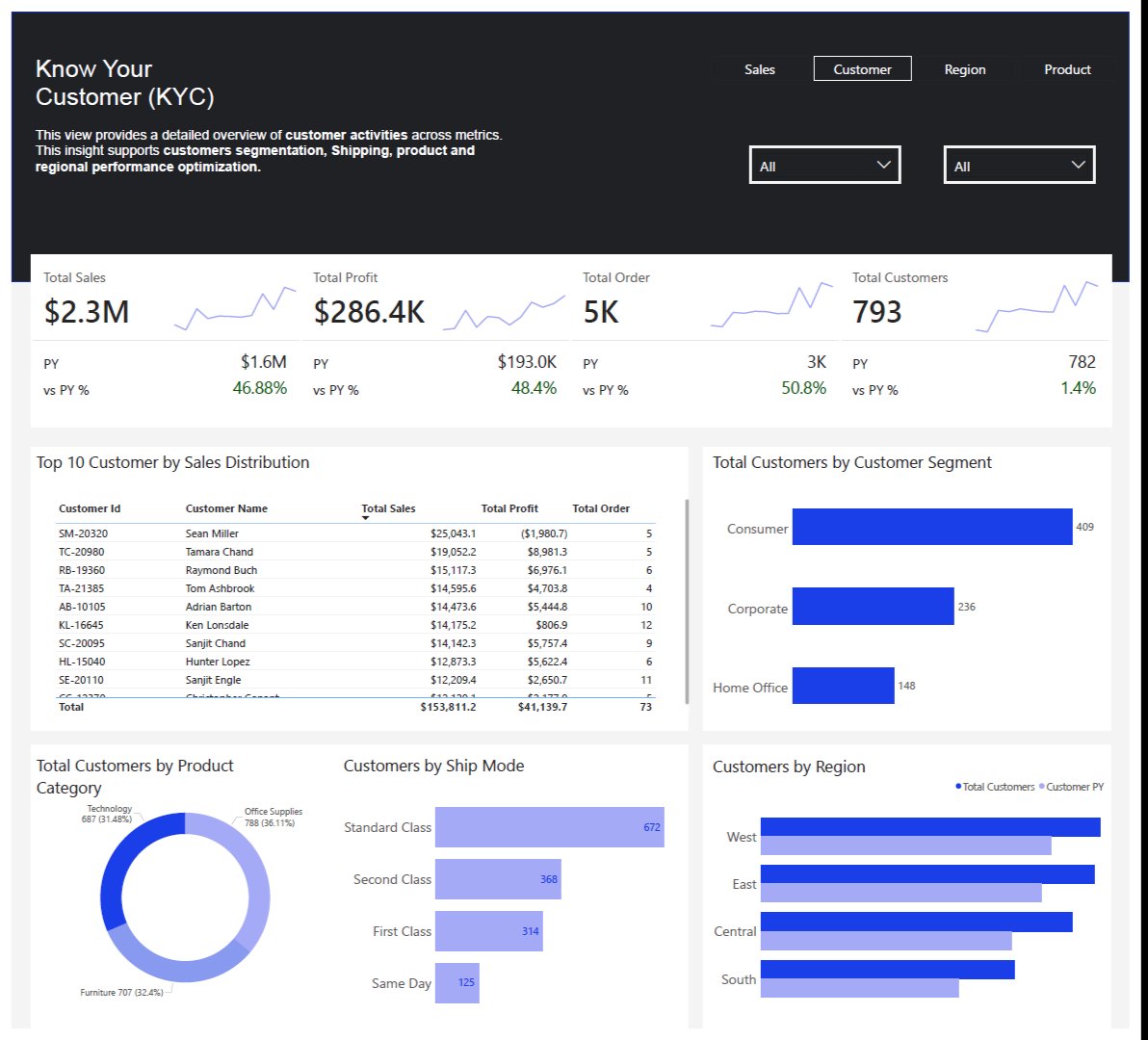
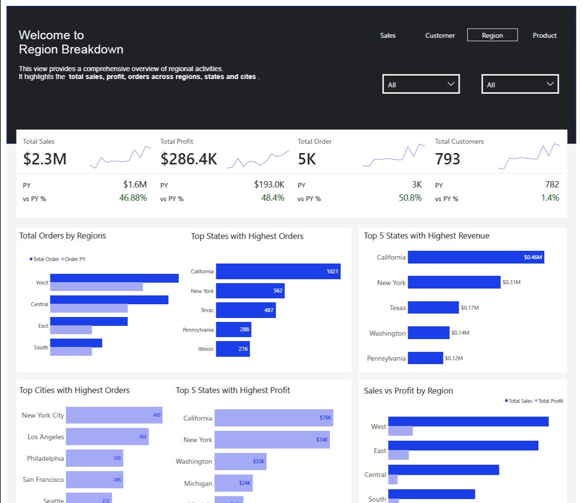
Officially done with this project @MSPowerBI I utilized the visuals from @ZoomCharts except cards, tables and slicers. The link to the interactive dashboard will be published soon.
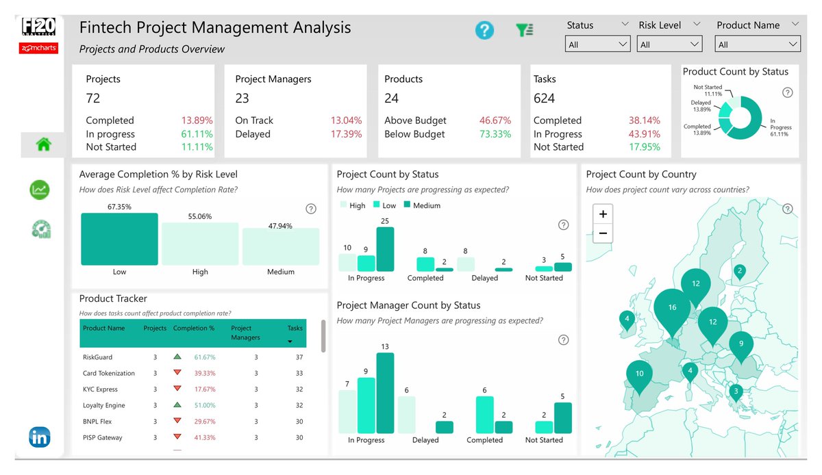
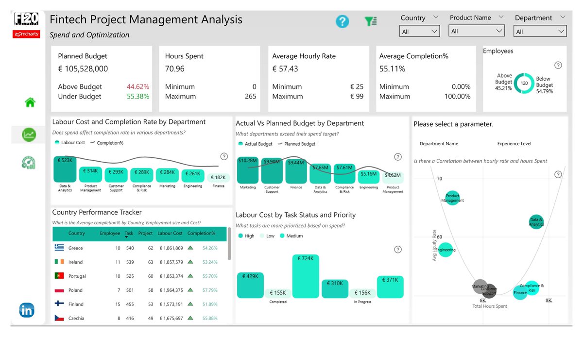
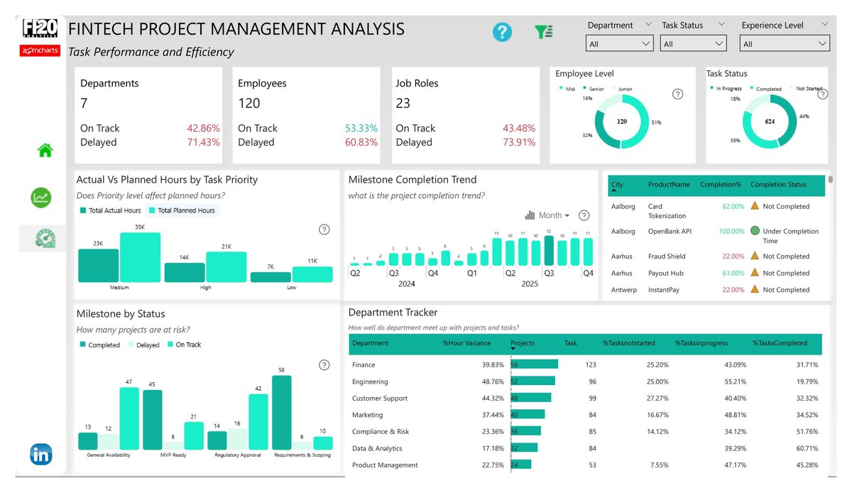
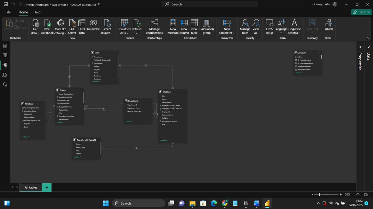
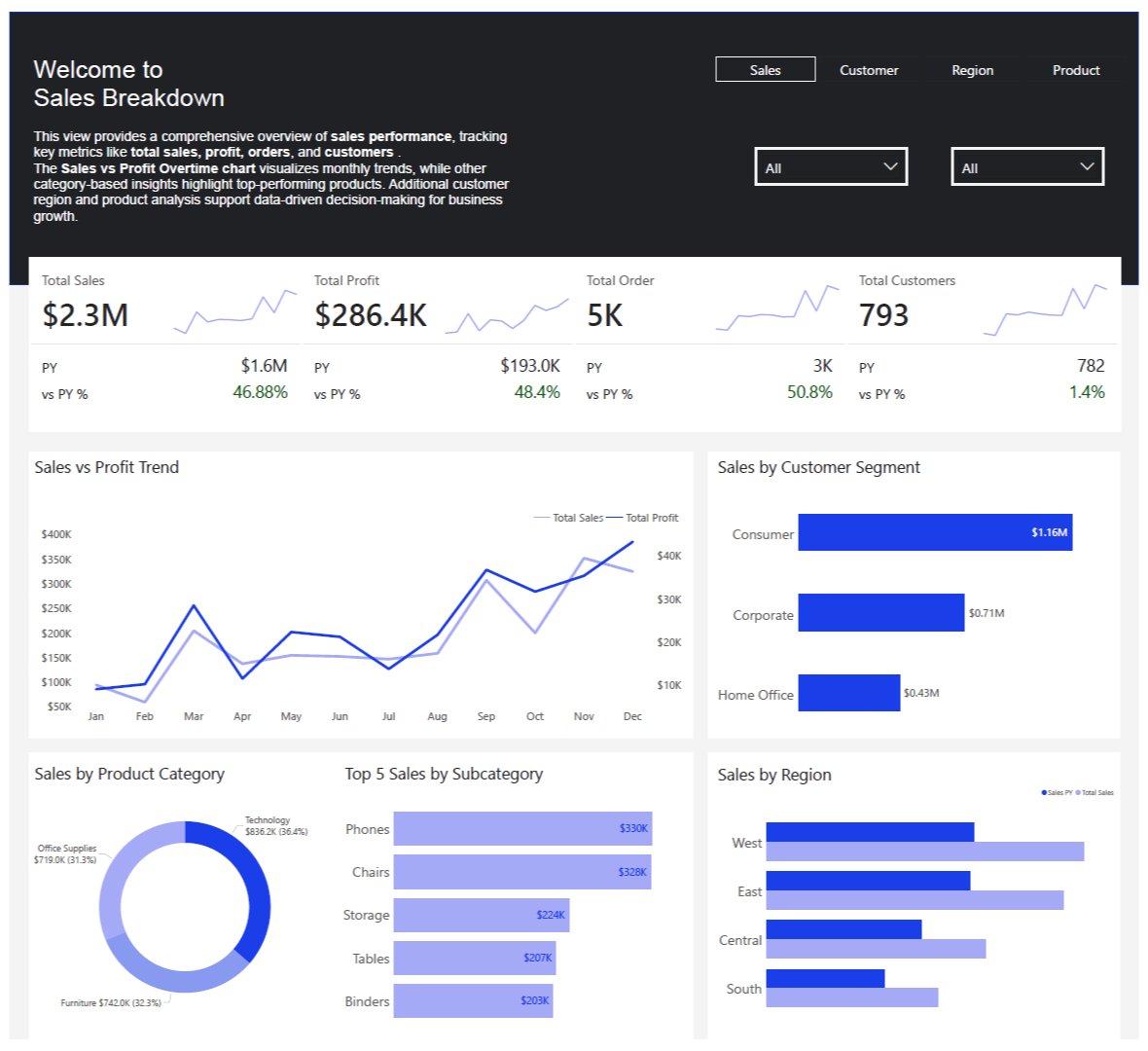
I reused the wireframe from page 1 in page 3 and it made so much sense. 20 measures, 10 calculated columns and counting.

Claude Opus 4.5 is now available for all Perplexity Max subscribers. Enjoy!
One card Four KPIs 11 mini kpis I love the new card feature
Frame 1: My first dashboard Frame 2: My most recent dashboard If you like give up.


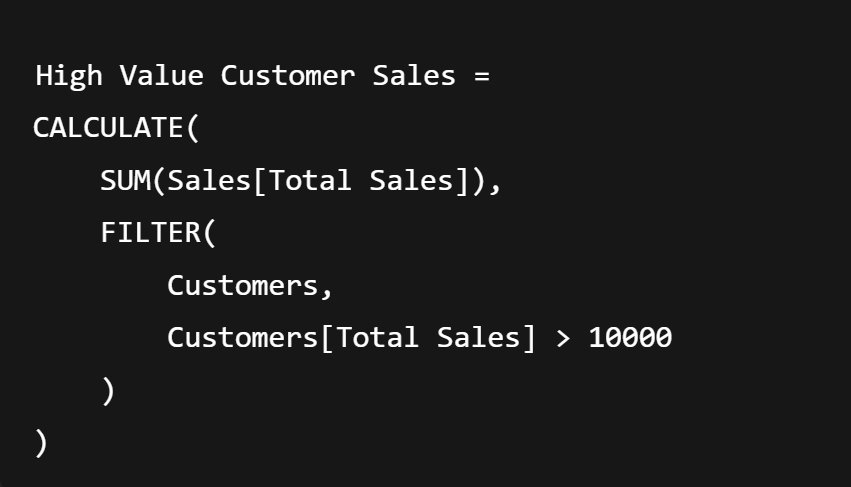
💡 Quick DAX Tip 💻 Use FILTER() Inside CALCULATE() for Complex Conditions 👉 The FILTER() function lets you apply advanced logic (like multiple conditions or comparisons across columns) when a simple filter won’t do. ✅ How it works: CALCULATE() changes the filter context.…
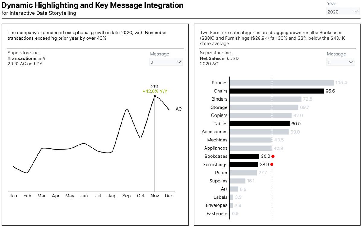
🎨 Interactive storytelling in Power BI — powered by dynamic highlighting + key messages 🔗 medium.com/microsoft-powe… 📊 app.powerbi.com/view?r=eyJrIjo… 👉 For more: powerbi-masterclass.short.gy/linktree #PowerBiMasterclass #PowerBI #DataVisualization #dataviz #DataAnalytics #DataScience


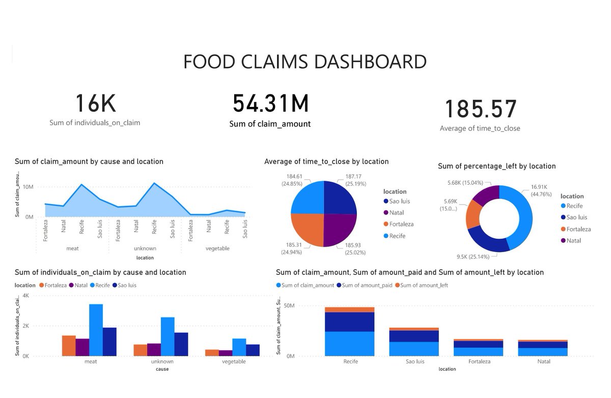
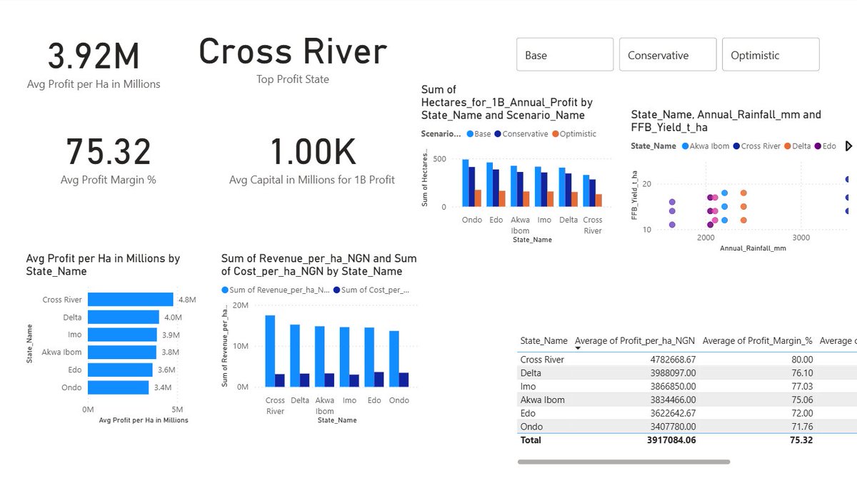
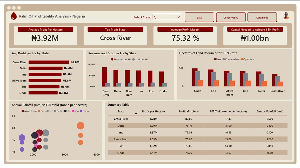
HNG Internship Stage 4: Palm Oil Profitability Analysis - Nigeria 🌴 I designed an interactive dashboard that displays the breakdown of yields, costs, and profit potential across major producing states.
Want to learn how I built this project? Join us on Saturday! How to join? Check quoted tweet.
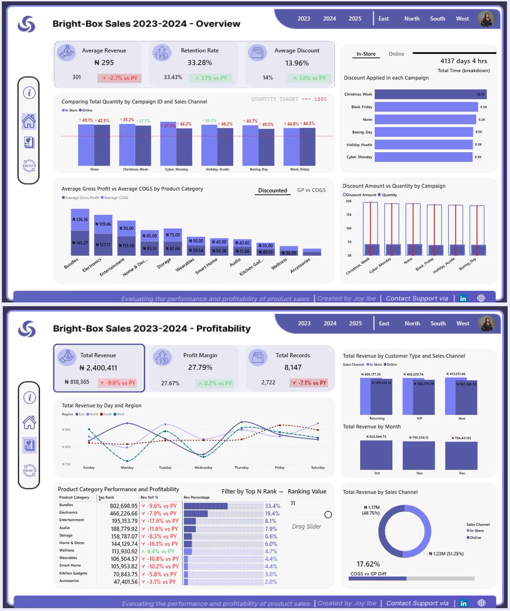

The journey of Building with Power BI has been all about learning by doing, exploring practical techniques. Our final session is here! Join us this Saturday at 4 PM (WAT) @joyibe_ walks us through another end-to-end Power BI project. Register: bit.ly/482WRHY

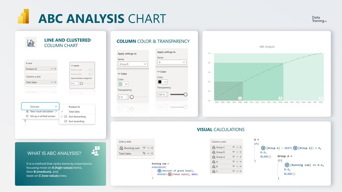
✨ABC Analysis Chart in Power BI A clean way to visualize product importance. This setup combines clear segmentation with a running total line for instant understanding of cumulative impact. Step 1: Build the Combo Chart Start with a Line and Clustered Column Chart. Place your…
Dashboard is finally ready 😅🤭 I embarked on this project to answer one question: In the last seven years, has it been EASIER or HARDER to get admitted into the University of First Choice @UnilagNigeria via the UTME route?
Okay guys, back to this project of mine 😅 So the data I scraped was Unilag cut off points for all faculties from 2019-2025. I was able to scrape the data from Unilag's website and change it to the structure in frame 2 thanks to Unpivot feature in Power Query. Dashboard ⏭️


Dear Data Analyst!! If you didn’t read the book “storytelling with data” Here is the summary🔥🔥
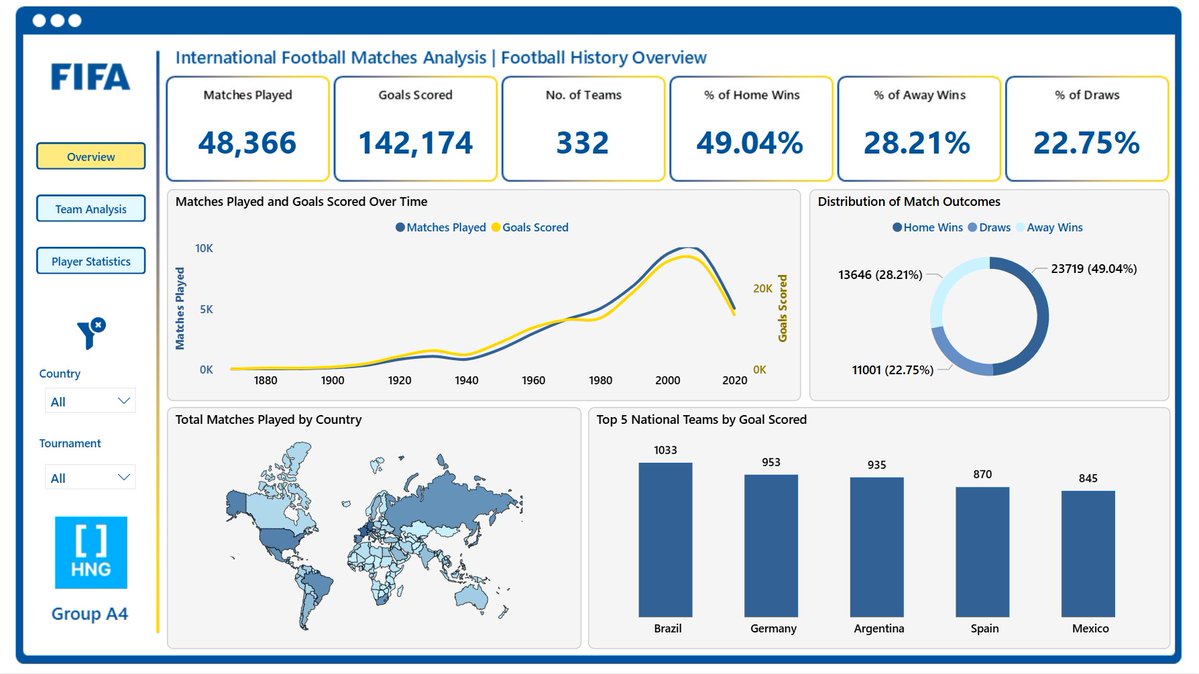
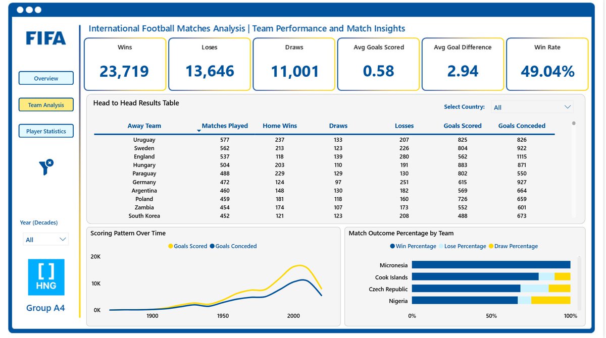
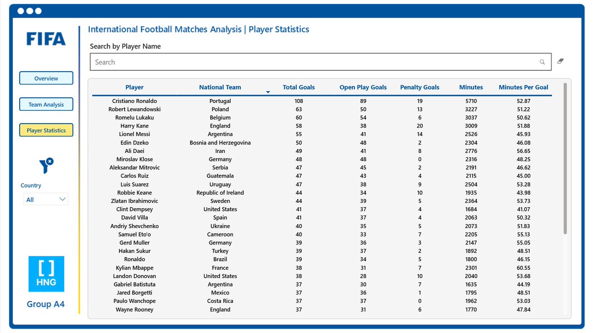
HNG Internship Task 3A was a group task. We stepped into the shoes of a data analyst at FIFA and analyzed over 150 years of international football data to uncover hidden insights and trends. I really enjoyed this one because it was something I could relate with.


United States 趨勢
- 1. #DMDCHARITY2025 746K posts
- 2. #TusksUp N/A
- 3. #AEWDynamite 20.9K posts
- 4. #TheChallenge41 2,221 posts
- 5. Diddy 75.4K posts
- 6. #Survivor49 2,905 posts
- 7. seokjin 158K posts
- 8. Earl Campbell 2,155 posts
- 9. Yeremi N/A
- 10. Free Tina 13.7K posts
- 11. Steve Cropper 6,524 posts
- 12. Jamal Murray 7,385 posts
- 13. Monkey Wards N/A
- 14. Milo 12.8K posts
- 15. Achilles 5,643 posts
- 16. Californians 6,702 posts
- 17. Ryan Nembhard 3,821 posts
- 18. fnaf 2 17.4K posts
- 19. Rizo N/A
- 20. Halle Berry 3,172 posts
Something went wrong.
Something went wrong.