#datavisualization 검색 결과

Looker Studio updates filters, charts, and connectors in November releases ppc.land/looker-studio-… #LookerStudio #DataVisualization #GoogleUpdates #MarketingAnalytics #ChartingTools

❌ COMMON MISTAKES TO AVOID: • Using bars for time trends (that's what line charts are for!) • Cramming 20+ categories (gets messy fast) • Leaving data unsorted alphabetically (sort by value for insight! #PowerBI #DataVisualization #DataAnalytics #DataStorytelling

Oregon researchers created a mobile app showing real-time homelessness data by district. Legislators used it during floor debates. #PolicyTech #DataVisualization


#Developers! We pitted @plotly against SciChart, with advanced #BigData capabilities as the test. Want to see the results?? Course you do: scichart.com/scichart-vs-pl… #datavisualization #frontenddev #chartlibrary #javascript #fullstackwebdeveloper #webapps

Open joki Histogram, Boxplot, Scatter Plot, Bar Chart, Pie Chart, Line Plot, Heatmap, dan diagram lainnya fee 55-65k tergantung kesulitan #DataVisualization #DataScience

A clear figure can reveal trends that get lost in tables of numbers. Thoughtful data visualization—like choosing the right graph type or highlighting key comparisons—makes research insights much easier to share and discuss 🎨 #DataVisualization #TalkingPapersThoughtLoop

Animated Arrow Stacked Bar Chart in Excel with advanced PowerPoint design transforms portfolio strategy into a clear visual story. Show financial stability across real estate, metals, securities, and business in one dynamic infographic. #ExcelDashboard #DataVisualization

#30DayMapChallenge Day 6 – Dimensions Taking our maps to the next dimension! #GIS #DataVisualization #Dimensions #3DMapping #Geospatial #UrbanPlanning #Cartography


How TeeChart for .NET Helps Walter + Bai Visualize the Strength of Materials Blog post: steema.com/wp/blog/2025/1… #charting #chartinglibraries #datavisualization #dataacquisition #dataanalysis #forcemeasurement #materialstesting #dotnet #datamonitoring #torsiontesting

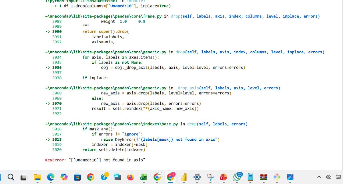
My biggest fear? Writing code and getting hit with a long trail of errors. Heart skips a beat instantly. But we move; errors won’t stop the grind. I'm enjoying the Python libraries. #DataAnalytics #Python #datavisualization


Using the data to tell the thrilling story of humanity’s journey to the stars 🌌 I built a dashboard tracking all space missions launches (1957–2022) Full documentation: mavenshowcase.com/project/53981 Data truly tells our journey to the stars. #DataVisualization #Excel #Datafam


Pernah ngerasa hidup kuliah tuh nggak jauh-jauh dari buka HP? 🤭 Ternyata, kebiasaan itu bukan kamu doang, lho. Kalau kamu sendiri, aplikasi mana yang paling susah kamu tinggalin? Drop di komen ya! 👇🔥 #PopSurvey #DibantuPopSurvey #Datavisualization #mahasiswa #GenZ


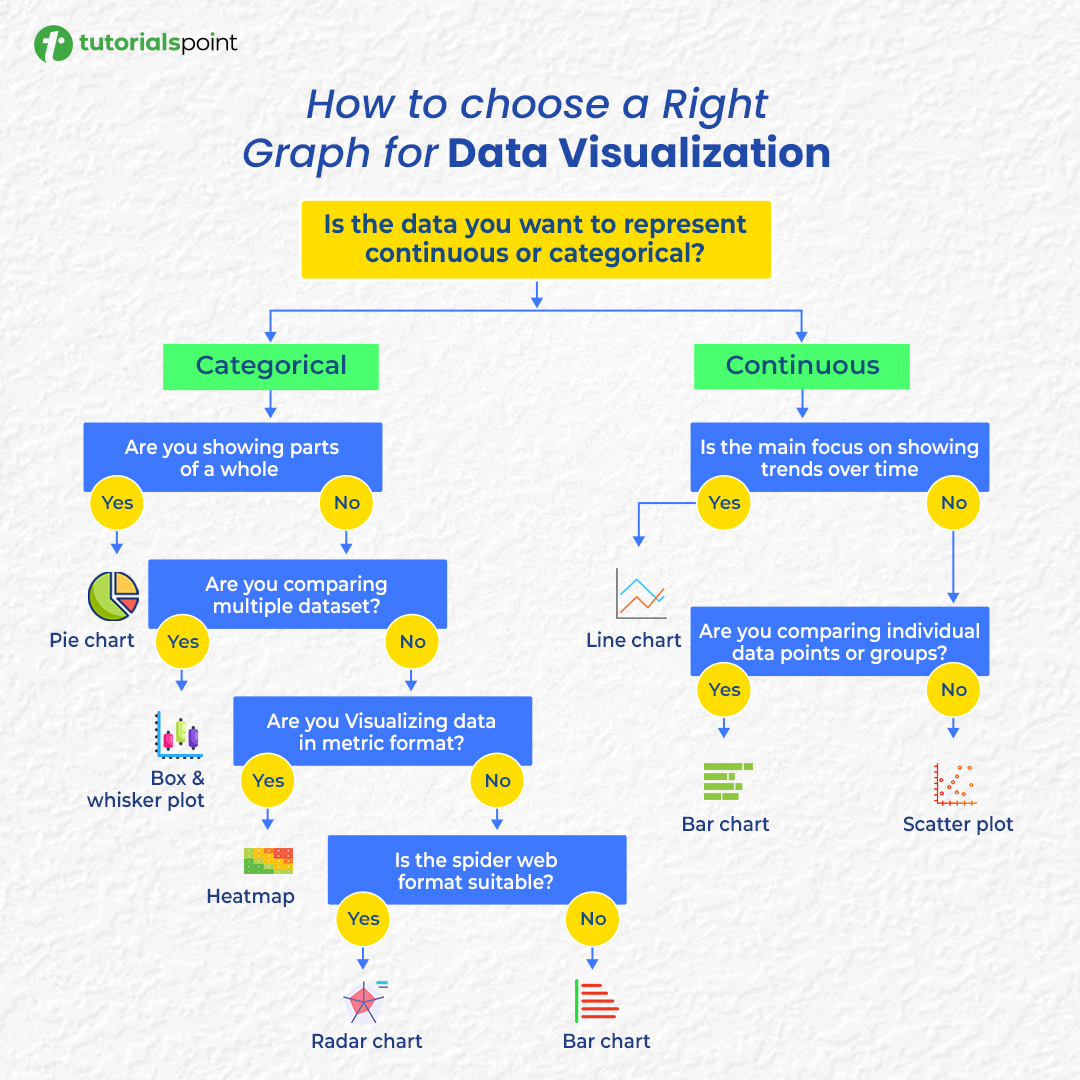
Confused about which chart to use? 📊 Here’s your cheat sheet to choose the right graph for any data visualization! #DataVisualization #DataAnalysis #DataScience #Infographics

Interactive Chart visualization improves clarity and helps users interpret data more effectively. React Charts help you visualize complex data with smooth performance and built-in interactivity. Here’s what makes it powerful 👇 #ReactJS #DataVisualization #WebDevelopment…
A dashboard should be both insightful and informative , but great design matters too. Sharing the before-and-after transformation of my dashboard. Let’s call it progress. See you next time! #DataAnalytics #DataVisualization


I'm in my 𝗹𝗮𝘀𝘁 𝗱𝗮𝘆𝘀 of building dashboards for "him" 👀 So I'll be trying a 𝗹𝗼𝘁 𝗼𝗳 𝘀𝘁𝘂𝗳𝗳 in the coming months 🚀 Check out this 𝘄𝗶𝗿𝗲𝗳𝗿𝗮𝗺𝗲 and tell me what you think 👇 #Datafam #PowerBI #DataVisualization


Week 3 of the Metro Bank Analytics Challenge at #LetsTalkExcelWithFreedom This week’s focus: Transactions. Built KPIs, tested insights with Pivot Tables, and designed a dashboard that highlights where money flows & which channels drive activity. #Excel #Datavisualization


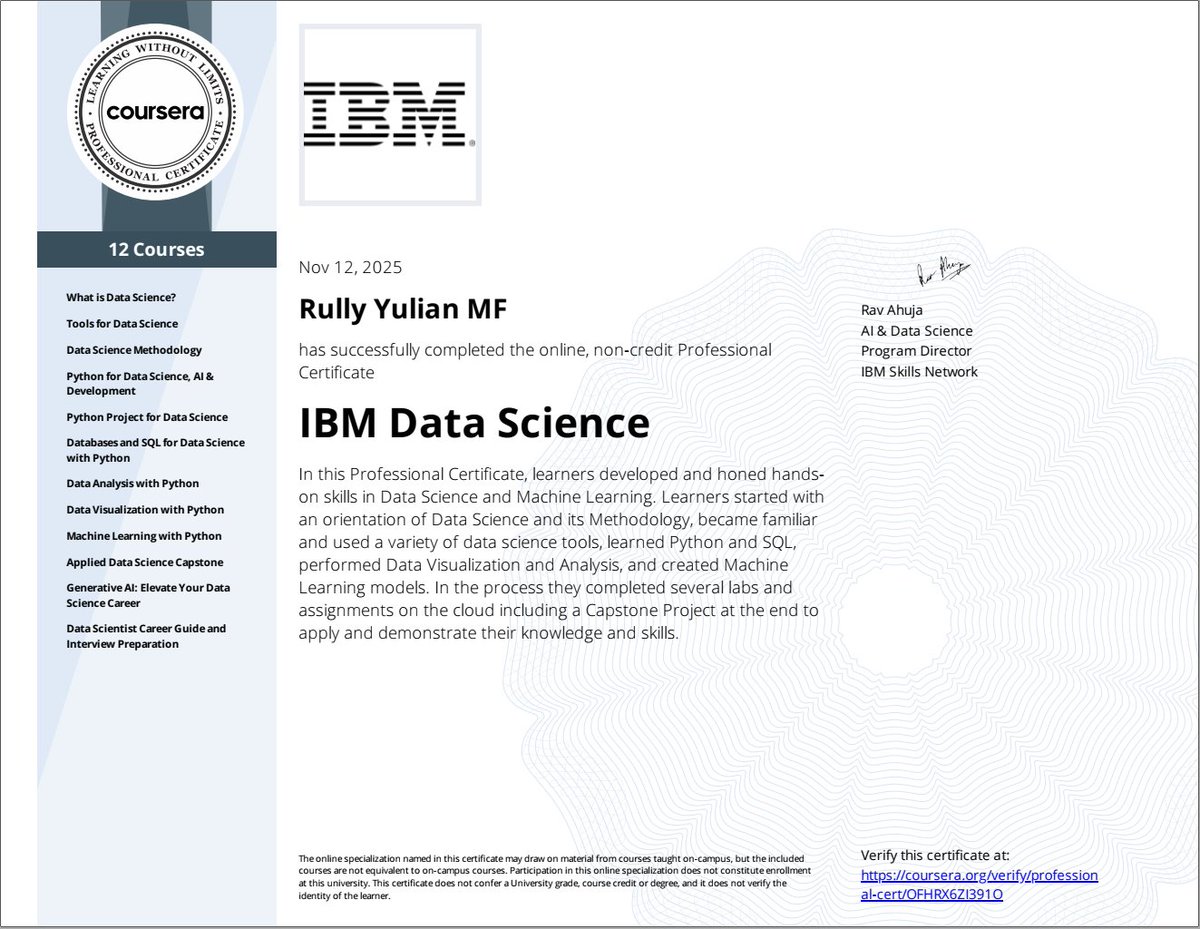
Alhamdulillah. It's a wrap! After passing 12 stages certification, finally received professional certification. @IBM Data Science Professional issued by @coursera Now it's time to rest first 😊 #DataScience #DataAnalysis #DataVisualization #MachineLearning #AI #GenAI #Python

👉 In this article, you’ll learn how accessible hotel analytics boost decision speed, align teams, build confidence, and drive better performance. #datavisualization #analytics #BI #hotel #hotelindustry #hospitality revfine.com/why-hotel-anal…


Gathered some compelling new data visualization examples 👇 The latest #DataVizWeekly features: 📍 EU solar grid pressure 📍 China vs U.S. in trade 📍 Sleepless Ukraine 📍 Cats' laziness 🐈 See how visuals make data clearer: anychart.com/blog/2025/10/3… #DataVisualization #DataViz


Something went wrong.
Something went wrong.
United States Trends
- 1. Caleb 56.4K posts
- 2. Bears 83.9K posts
- 3. Packers 70.9K posts
- 4. Jeff Kent 6,464 posts
- 5. Texans 21.7K posts
- 6. #BaddiesUSA 7,397 posts
- 7. #GoPackGo 12.1K posts
- 8. Notre Dame 173K posts
- 9. #ChiefsKingdom 3,523 posts
- 10. Ben Johnson 7,122 posts
- 11. Collinsworth 1,852 posts
- 12. DJ Moore 3,321 posts
- 13. #ITWelcomeToDerry 7,976 posts
- 14. Mattingly 3,761 posts
- 15. Mattingly 3,761 posts
- 16. Raiders 36.6K posts
- 17. Nico Collins 1,608 posts
- 18. #SNFonNBC N/A
- 19. Kmet 1,829 posts
- 20. Patrick Mahomes 4,778 posts